Google Display ads are a part of the Google Display Network, which spans over two million websites and apps that show ads. These are paid ads that typically appear as banners within websites, mobile apps, social media, and other platforms.
Here’s an example of a display ad on a media site:
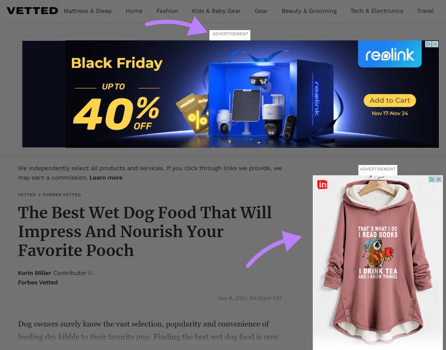
Display ads reach the vast majority of people on the Internet. And thanks to laser-focused targeting, you know exactly the type of audience that will see them.
Following display ads best practices can bring a massive ROI for your paid campaigns.
To make sure you get the most out of your display ads, we’ve prepared some tips to help you generate better results from your campaigns.
Display Ad Design and Visuals
To communicate clearly with potential customers, focus on optimizing the design and visual elements of your ads.
Improving the design can also combat what is known as “banner blindness.” This is when users simply ignore banners or display ads altogether.
One study from 2023 found that banner blindness occurred in 7% to 32% of experiments.
In other words, a significant portion of the audience exposed to your banner ads may never notice the ad at all. If they don’t notice the ad, then there’s a low probability that they’ll click on it or convert.
How can you make sure your ads grab their attention?
Keep Designs Simple
Stay away from busy display ads with complex graphics.
Research from Microsoft Canada found that between 2000 and 2015, the average human attention span dropped from 12 seconds to 8 seconds. Your designs should be simple enough to capture a viewer’s attention—fast.
This example from Mailchimp uses extremely simple images and design to draw in the viewer’s eye.

Image Source: Franz Lang
How can you embrace simplicity?
- Focus on one image: Use a single, clear image to quickly communicate a single idea
- Improve readability: Contrasting colors and good use of negative space allow users to quickly grasp the message of the ad
- Use custom images: Create your own custom images rather than taking design elements from online sources
- Enforce consistency: Improve brand awareness across multiple campaigns by using images that are unique, memorable, and on-brand
Add Your Logo
Whenever you can, use your logo in your display ads to maintain brand consistency.
Adding your logo is a display ads best practice that will help improve brand recognition and recall. This means people who view your ads are more likely to be familiar with your brand.
This can also amplify other parts of your marketing strategy, such as SEO.
For example, someone may see your ads consistently without clicking. But if they recall your brand, they might later type your company into a search engine.
Nike is one of the most well-known brands in the world. And they consistently use their logo in each ad and campaign.
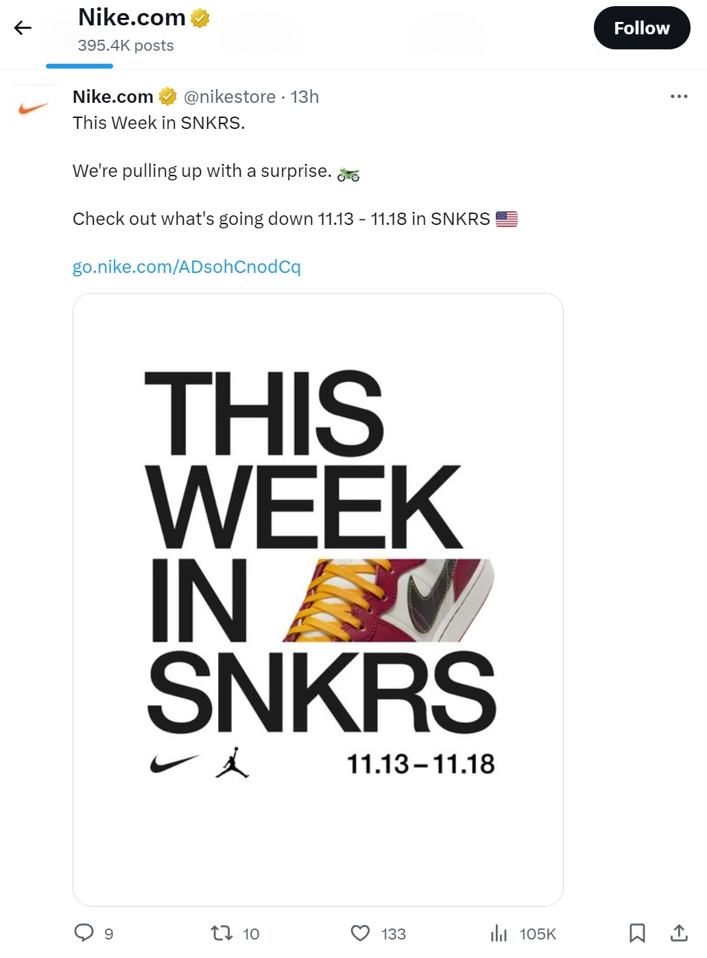
However, you can’t just plaster your logo anywhere you feel like and call it a day.
Google’s display ad guidelines spell out some key considerations:
- Adhere to accepted logo aspect ratios (e.g., 1:1, 4:1)
- Your logos should not have extra flair or colorful backgrounds
- The logos should be high-quality images, cropped and adjusted accordingly
Use Easy-to-Read Fonts
The fonts you use in your display ad campaigns should be easy to read for all audiences so they can understand the ad immediately.
There are over 200,000 fonts in the world, but many brands stick to only a handful. The reason is simple—they are familiar and easy to read on different screen sizes.
Some of the best fonts for readability include:
- Georgia
- Helvetica
- Verdana
- Open Sans
- Arial
Choose Memorable, Eye-Catching Imagery
Choose a striking image that is (ideally) related to your offer or value proposition. (Make sure not to break Google’s rules. Don’t include misleading or irrelevant content.)
This example from Ridge makes a striking comparison between their wallet and generic competitors’:

Image Source: yellowHEAD
This is especially effective because it makes the key message clear without stating it directly. Ridge wallets are slimmer and more compact. You can understand this benefit without even reading the ad.
Your brain processes images more quickly than text. So, it makes sense to give images the same amount of space (if not even more) compared to text.
Test Multiple Sizes and Formats
The size of your display ads will affect the results of your campaigns.
Google states that there are five top-performing ad sizes:
- 728 x 90
- 336 x 280
- 300 x 250
- 300 x 50
- 160 x 600
These five are a safe bet and an excellent starting point. However, you can do an A/B test (or “split test”) to find the size(s) that work for your specific use case.
Once you’ve chosen the right size for your display ad, you’ll need to decide on the format.
In terms of formats, there are two choices you can make:
- Static ads: Banners appear in the same size as you upload them
- Responsive display ads: Adapt to the size of the available ad space
Which type of ad will work best for your campaign?
The only way to know is to test them.
But you can’t just use any size, aspect, and ratio that comes to mind. Google has a list of supported ad sizes sorted by pixels that you should adhere to.
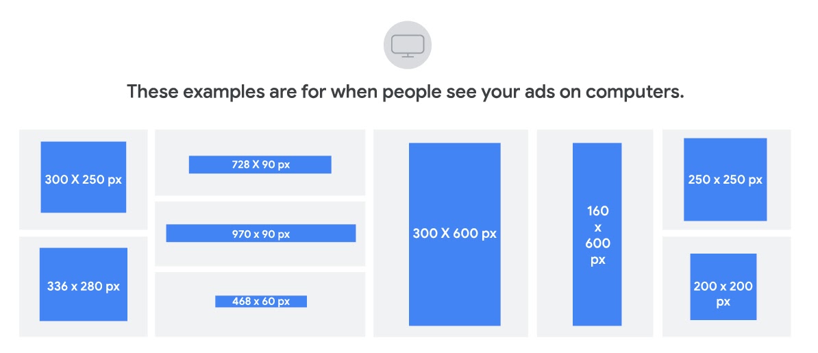
You can also test out different formats of display ads.
Here are the most common ad formats for Google Ads:
- Banner ads: Visual display ads on websites, social media, and apps
- Text ads: Text-based display ads on websites, social media, and apps
- Interstitial ads: Full-screen ads that cover the entire page of an app or a website
- Lightbox ads: Ads that appear in a lightbox, dimming everything else around it
- Video ads: Videos that appear in many of these supported ad formats
- 360-degree video ads: Interactive videos where the viewer can spin the video to see it from different angles
You can do extensive testing and run competing creatives against each other.
This way, you can find out which size and format works best for your target audience.
Test Animated Banners vs. Static Banners
Within the banner ad format, you should also test:
- Static images: Standard banners with content that doesn’t change
- Animated banners: GIFs or other image formats like HTML5 that involve motion, transitions, or other animated content
Both can be incredibly effective. Your choice will depend on many factors, such as the ad space, the product you’re selling, the visuals you’re using, and more.
Here’s an example of an animated banner ad from the brand COSMEDIX:
Let’s say you’re trying to show the effectiveness of a new fruit juicer. An animated banner showing the product in action may work better than a static one.
Ultimately, you’ll have to test these formats to see which is most effective and most cost-effective for your campaigns.
Display Ad Messaging
Your message (and how you convey it) has a major impact on the success of your display ads. Coupled with great design, powerful messaging can make someone casually scrolling more likely to stop and click or convert.
Target (Segment) Your Messaging
Target your messaging to align with the targeting of your ad. Create separate messages for separate campaigns, ad groups, and target customers.
Segmentation means splitting your display ads into different groups according to criteria such as age or location. The more personalized an ad is for a certain audience, the more they identify with it and the higher the likelihood of a conversion.
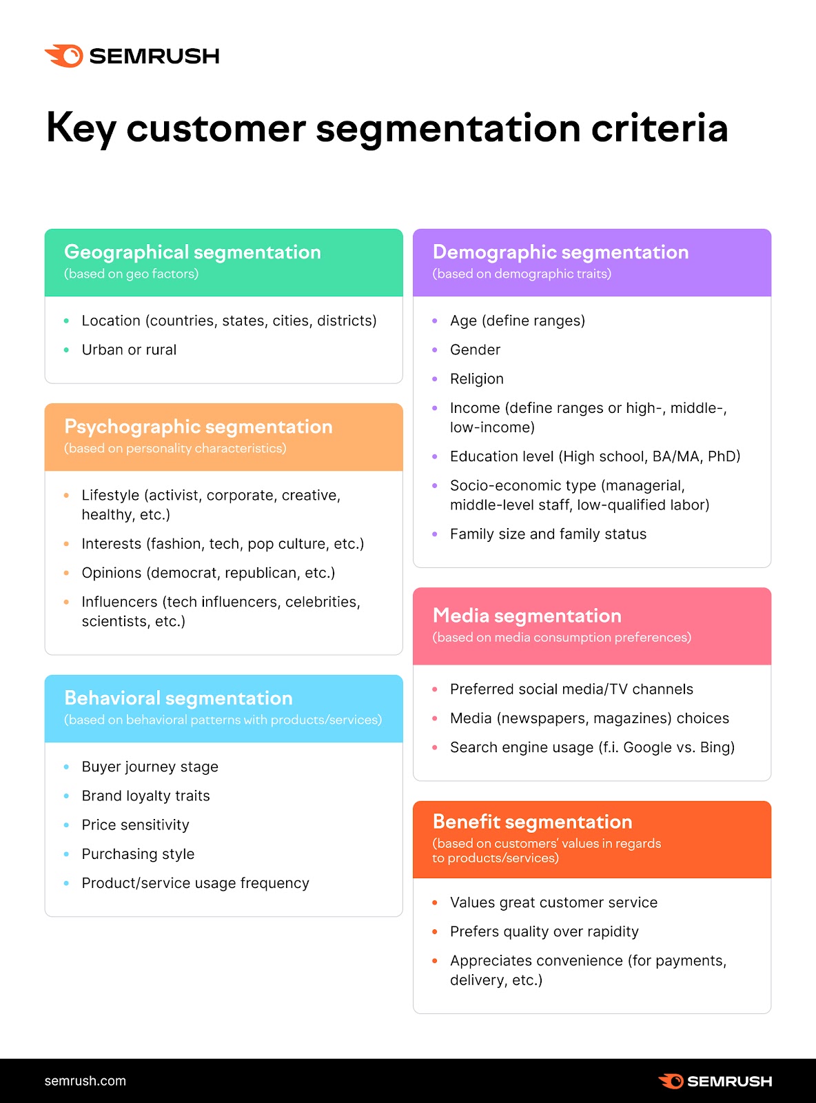
Here’s an example:
You’re trying to sell a nutrition and exercise plan to men in their 30s.
Within that demographic group, you might segment your audience based on the sites they’re visiting:
- Fitness websites
- Recipe websites
- Business websites
Each segment could see a different version of your ad.
Perhaps you target the fitness websites with a message about how important diet is along with exercise. And maybe you target the recipe website viewers with information about how important exercise is along with a healthy diet.
Ideally, you should create different versions of your ads for each segment in your display ads campaign.
Use Semrush’s One2Target to define and segment your target audience.
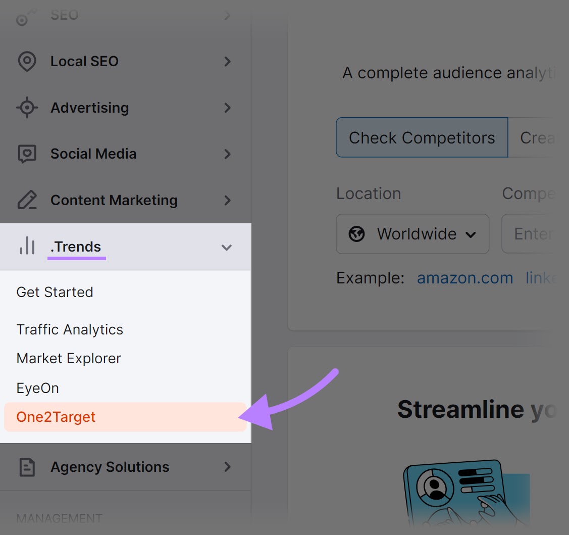
From within Semrush: Click “Trends” > “One2Target.”
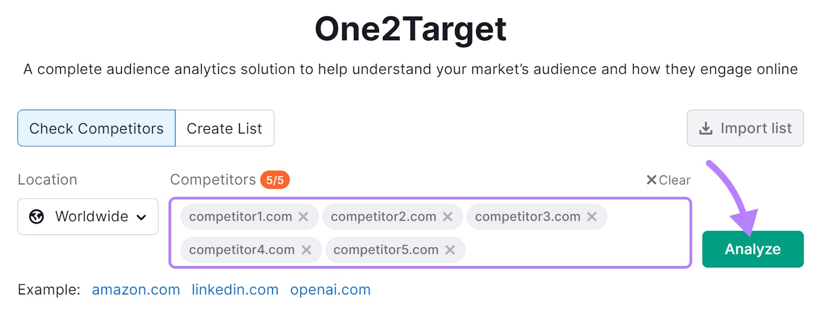
Add the websites of up to five competitors to the text box. Then, click “Analyze.”
The tool will gather information about their audience’s demographics, socioeconomics, and behavior.
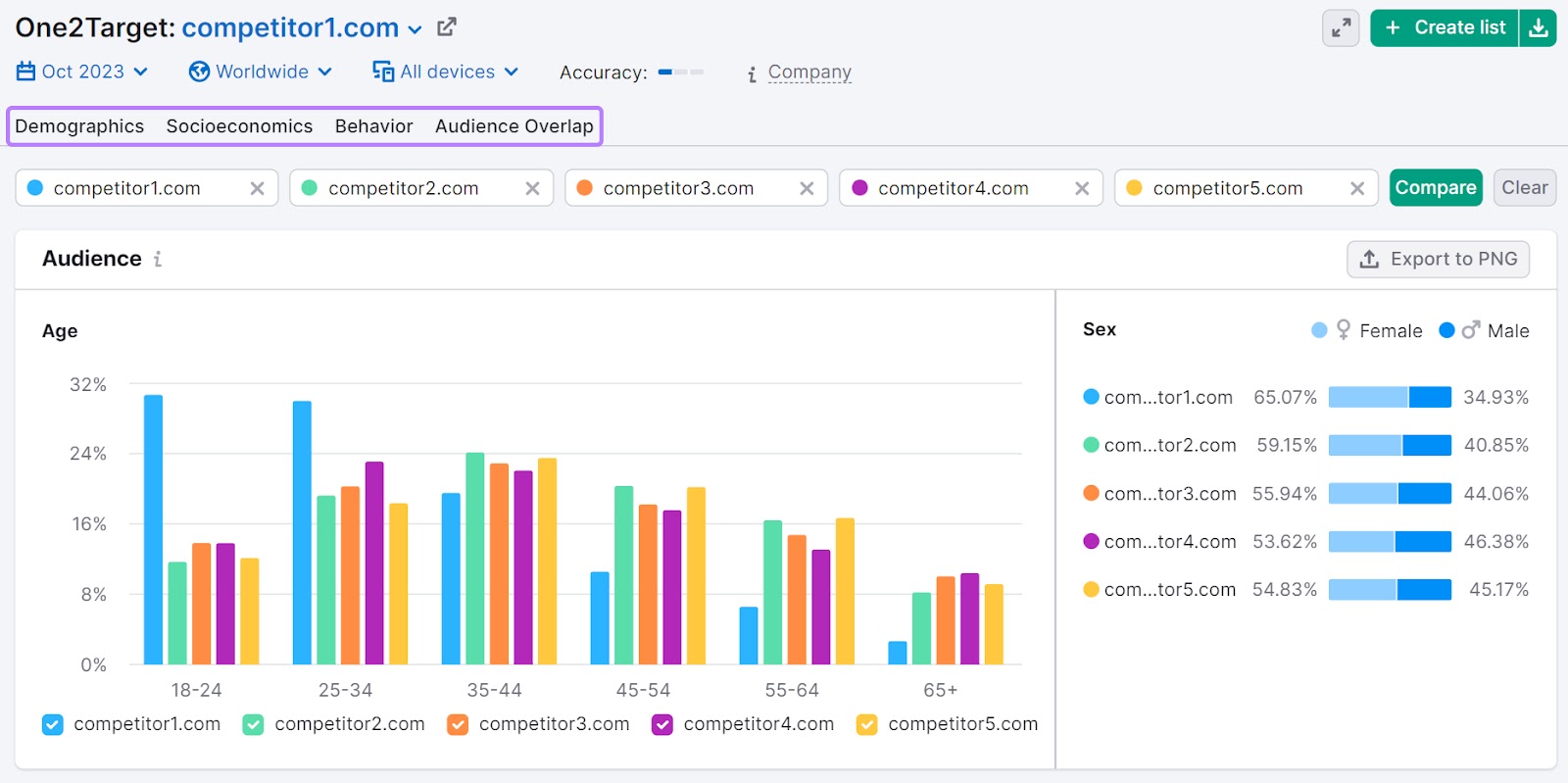
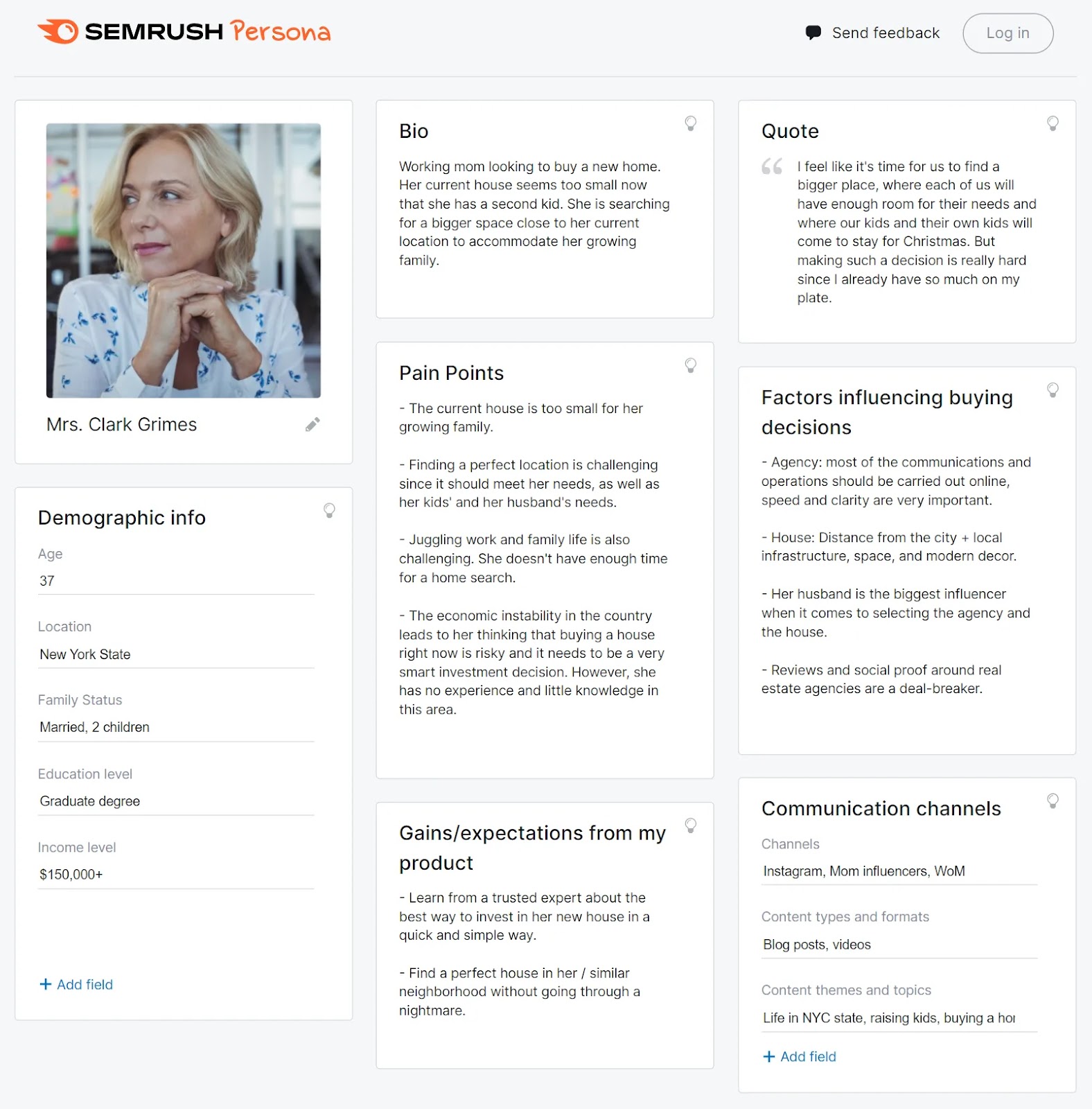
Using this data, you can build comprehensive customer personas. These are representations of your target customers, including different segments of buyers.
You can use this intelligence with the Semrush Persona tool. These templates make it easy to put together actionable customer personas for your marketing campaigns.
Present a Clear Value Proposition
A value proposition is what your brand promises to the ad viewer if they accept your offer. The easier they can see how you solve their pain point, the more likely they are to click through and convert.
This is an example from a banner ad on Investopedia:

You can see the products and services offered (new accounts, home line of credit [HELOC], and wealth management) on the right.
But what’s the main message of the ad?
“Uncork your next adventure.”
That’s the value proposition. The ad promises to help customers achieve something memorable from their bucket list.
It’s clear that the valuebeing offered is more than just “buy our stuff.”
And that makes the ad compelling to buyers who are interested in ways to get more adventure in their life.
For potential customers to click on your ads, the ad copy should clearly show what they stand to gain from clicking.
Examples include:
- Subscribe now and save 40%
- Buy now and get free shipping
- Enroll in our annual plan and save 20% compared to paying monthly
All of these examples tell the reader exactly what they get if they click through.
Does your offer have to include a discount or special pricing?
No.
But it should use something persuasive to encourage action. If that’s not a discount or deal, then it could be limited-time availability, the promise of something new, or another clear benefit of taking action.
Choose a Powerful Call to Action (CTA)
A strong call to action gets the viewer to click through and take the action suggested by the ad. It should represent the actual goal that they’ll take after clicking.
The “action” part can be anything:
- Getting a free trial of a product
- Downloading a whitepaper, ebook, or other lead magnet
- Providing their email for later retargeting
To write an eye-catching CTA, keep the following in mind:
- Use action verbs: “Get the ebook,” “Buy now,” “Download the guide”
- Provide value: “Get my custom plan,” “Show me how”
- Start with the imperative verb: “Get my free demo” vs. “Your demo is waiting”
- Use a striking design: Make the CTA button stand out against the rest of the display ad by using a contrasting color, different font, or icon to draw attention
Create Urgency
Use time-based offers to make the audience realize that your offer is only valid for a short period.
Creating urgency means enticing the target audience to act quickly because there is a limited supply of what you’re selling. Or, it’s only selling for a limited time.
This is actually backed by science.
In a research report, a group of scientists showed that people are more likely to do unimportant tasks given a sense of urgency rather than truly important tasks without that urgency.

Image Source: OptinMonster
The principle of urgency is one of the basics of digital marketing. Here are some ways to create urgency:
- Limited-time offer: Offer available only until a certain ****
- Limited quantities: On sale while supplies last
- Upcoming price increase: Prices are going up next week
Ideally, the urgency should be genuine and not made up for the sake of higher conversion rates.
Display Ad Campaign Strategy
Your campaign strategy is your overall plan for turning visitors and ad viewers into paying customers.
Once someone clicks on an ad, it’s merely the beginning of their journey. You want to ensure that they have all the information they need to click on the “buy” button.
Here’s how:
Align Display Ads with Your Landing Page
Make sure that your landing page messaging and design align with the ads in your campaign.
The ad’s job is to simply generate a click (or build brand awareness).
The landing page’s job is to generate an actual conversion.
For example, say the ad campaign offers a free report. Then the landing page should allow users to quickly and easily access that report.
Like this:
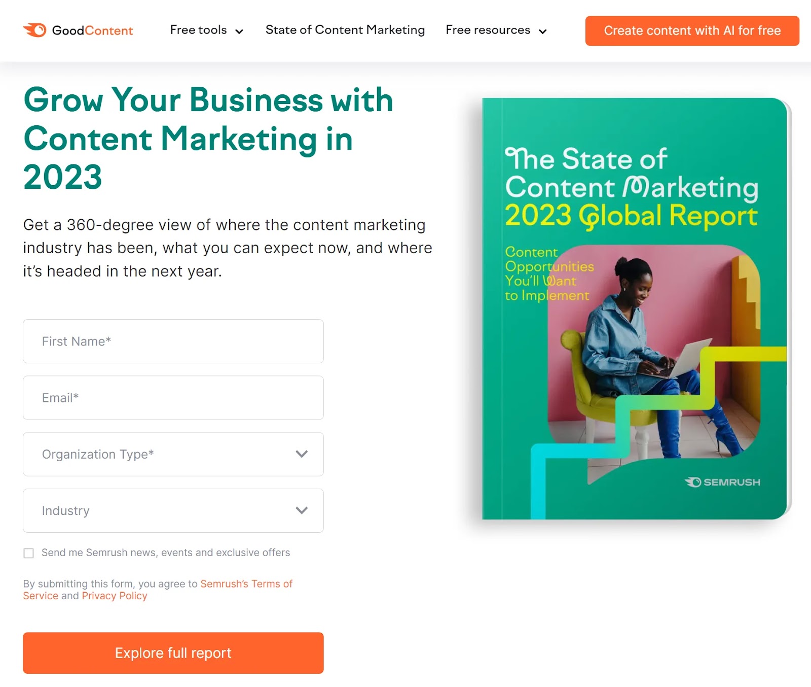
If your ad is for a specific product sold on your ecommerce site, then the landing page should be for that specific product. Not your homepage.
Don’t make the user do extra work to find the offer that you promised them.
Sometimes, the problem with your campaign strategy isn’t the banner ad. It’s what happens when users click through.
If you have a high click-through rate (CTR) but no conversions, there is a chance that your ad and landing page are not aligned.
For example, you could be offering a 20% discount on running shoes in your display advertising campaign. The banner ad offers the discount, but the link leads to a different campaign with a 10% discount.
The user is confused. They’ll probably leave.
Instead, make sure that you create a consistent user experience.
This means that your landing page doesn’t just echo the same information from the ad. It should also feel consistent. The design, language, and branding should all align.
Think of the landing page as a continuation of the ad itself.
Google seems to see it that way. In fact, a better landing page can improve your ad quality score. And a higher score can reduce the amount you pay for the ad.
Align Display Ads with Search Ads
Build an integrated marketing strategy that includes both banner or display ads and Google search ads.
Display ads appear on websites and apps based on the targeting that you choose and the content shown on the page.
Search ads appear in Google search results. And they’re targeted based on specific terms that the user types into the search engine.
Here’s an example of a search ad that appears when a user searches for “buy firm mattress online”:
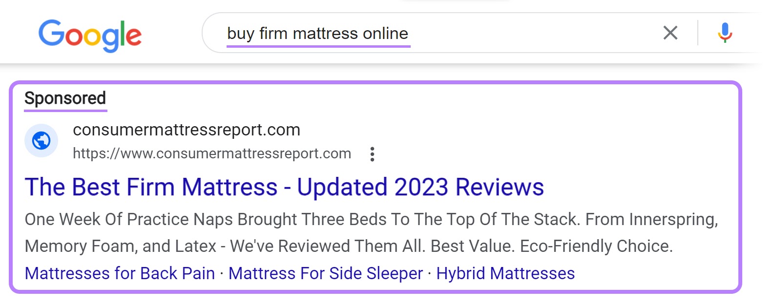
These two types of PPC campaigns can serve different purposes.
But they can also work together.
For example, display ad placements can generate brand awareness or general awareness for the type of solution or product that you provide.
Say your customer saw this ad for H&M’s wide-leg pants:

The user might remember H&M specifically and search for them later. Or they may simply remember the product, feature, or functionality mentioned in the banner ads.
Now, if they search Google for “wide-leg pants,” they might see a search ad from H&M.
Users may be more likely to click that ad because they recall the banner they saw originally advertising the product. Even if they didn’t remember the brand.
This can help you optimize your search ad campaigns. And it can bring down your overall cost of acquisition (CAC) and improve other metrics that measure your overall marketing performance.
Remarketing (also called retargeting) is the process of targeting users with ads based on their past behavior. Generally, when they’ve previously visited your website or looked at specific pages.
Here’s an example:
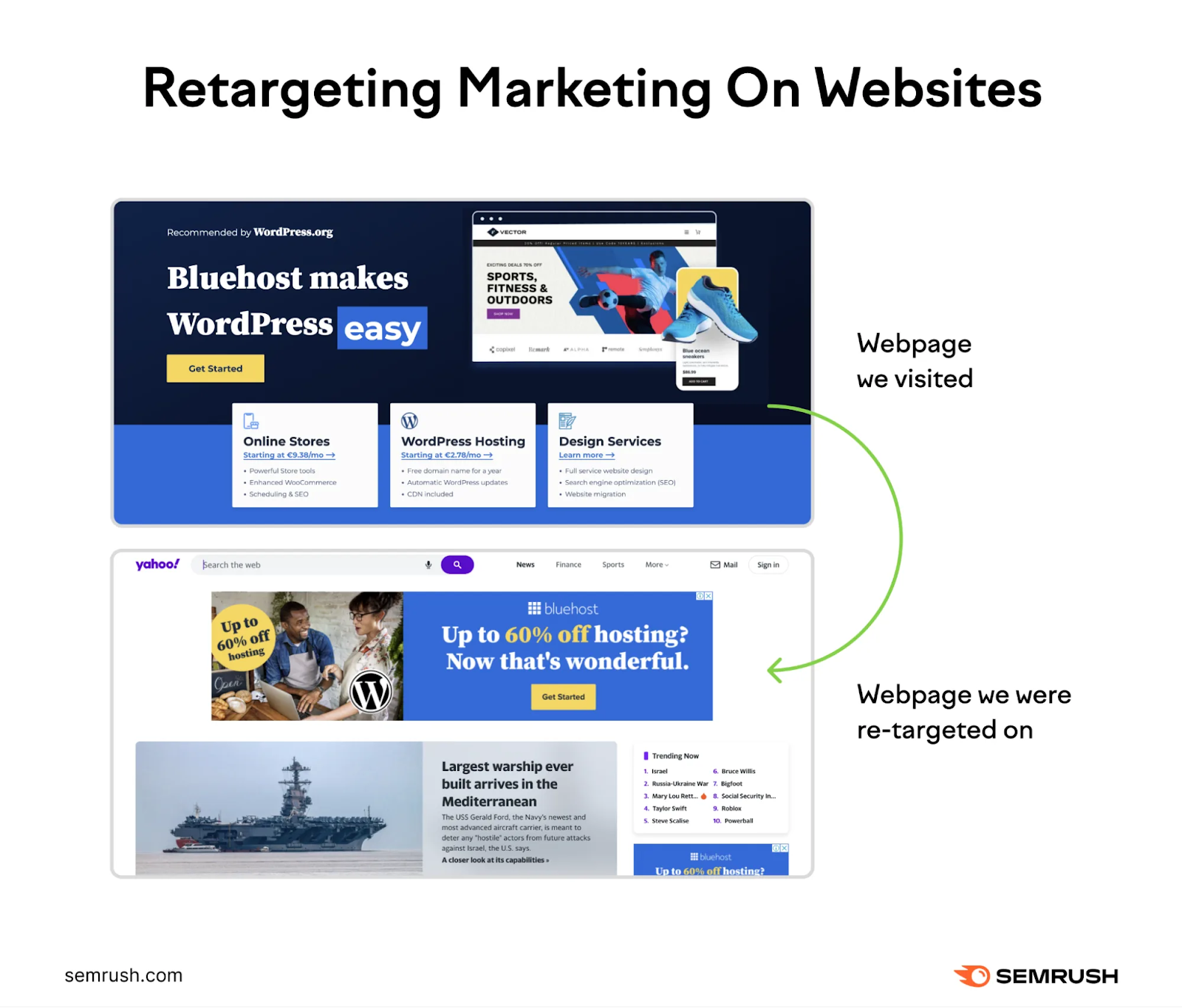
You can use remarketing campaigns to increase brand exposure and target potential customers who are already familiar with your brand. This can amplify the impact of your ad campaigns and dramatically improve performance and ROI.
Remarketing is an effective way to boost campaign performance. Because when you run a retargeting campaign, you have more information about the potential customer you’re targeting.
Namely, you know that they have demonstrated some interest in your specific product or service.
That allows you to tailor your messaging based on the specific actions they’ve taken. You can create more targeted value propositions, messaging, and offers to appeal to that specific segment of your audience.
See What’s Working in Your Industry
Display ads are one of the most effective marketing channels that can help businesses see near-immediate ROI from every click someone makes.
Do them right and they can ignite your business and drive huge amounts of revenue.
Do them wrong and watch as your ad budget burns before your eyes. Poof.
With these display ads best practices in mind, it’s time to review your campaigns and optimize their performance.
But before you dive in, get a sense of what’s working in your market.
Use AdClarity to conduct a competitive analysis of the display and banner campaigns being run by other companies in your industry. See what creative and messaging they’re using and what’s working best for their business.
Then, use those learnings and these best practices to launch campaigns that will deliver big for your business.
Source link : Semrush.com
