Online shopping is a cornerstone of modern commerce.
Shoppers are increasingly likely to turn to the internet before heading out to their local shopping center. This has opened up a massive opportunity for ecommerce businesses.
Ecommerce business owners willing to put the work in to optimize their website will benefit most from the opportunity.
But where do you begin?
Here’s a list of 16 unmissable ecommerce best practices we’ve put together to guide you.
1. Build Trust with Your Audience
Convincing potential customers of your credibility is an essential first step to converting them into buyers.
Build trust with users by making your online business website appear trustworthy. That means using consistent branding, high-quality product images, and modern web design.
To really make an impact, use established online trust signals. These are visible elements on your site that customers associate with credibility.
For example, a site-wide SSL certificate reassures your users that their personal data and credit card information are safely encrypted.
Websites with an SSL certificate display a lock icon in browser search bars.
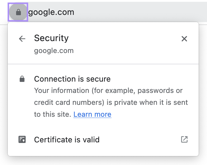
Security indications build trust. They can also boost your visibility. Google factors security into its assessment of a website’s search engine optimization (SEO).
Here’s how:
The encryption provided by an SSL certificate allows URLs to use the HTTPS protocol—a confirmed Google ranking signal since 2014.
Customer reviews, testimonials, and case studies are another type of trust signal. They act as social proof, showing potential customers that the site isn’t a scam.
Amazon, one of the biggest ecommerce sites, puts reviews front and center on every product page.
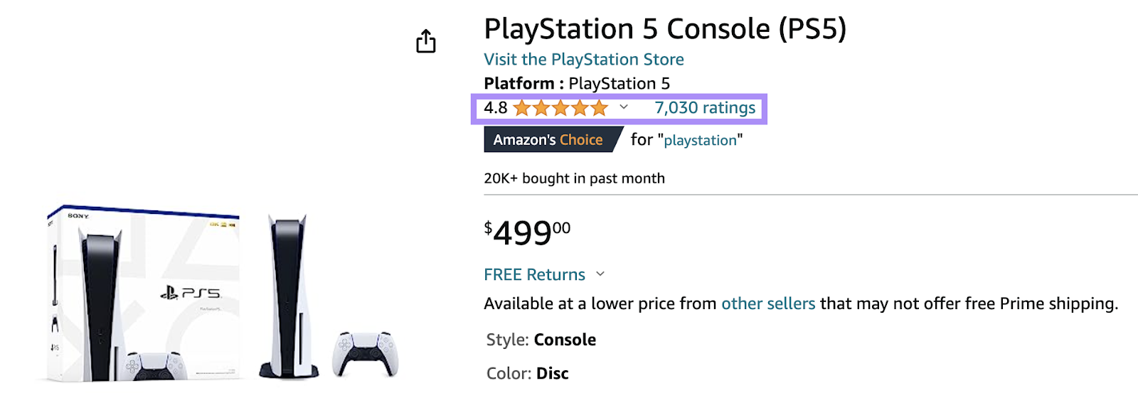
Other common trust signals for ecommerce sites include:
- Badges representing awards or certifications won
- Logos of prominent customers (used by websites that sell to other businesses)
- Badges showing membership to reputable organizations, like the Better Business Bureau Accreditation
2. Use High-Quality Images
Good product images can make a big difference in ecommerce performance, influencing customers’ purchasing decisions.
They’re one of the most important elements of product pages. 50% of online shoppers say images help them decide what to buy.
The right product photos can show off quality and features that are hard to articulate in writing.
The screenshot below shows the top image results for “red men’s t-shirt.” Each result is a high-quality image from a retail brand’s product page.
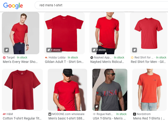
A great image opens these vendors up to new traffic from searchers browsing image results instead of the regular website links.
Best practices for producing images that help convince people to buy include:
- Photographing your products in good lighting with a high-quality camera
- Uploading photos from multiple angles. It gives customers a sense of what the physical product looks like.
- Compressing images to reduce their impact on page speed
3. Invest in On-Page SEO
On-page SEO boosts visibility, driving more organic traffic by making it easier for potential customers to find your site.
On-page SEO involves optimizing webpage elements to increase search engine rankings. It focuses on commercial or transactional keywords—types of keywords people search when they’re researching products or want to make a purchase.
Those keywords appear in elements like the page text, headers, and image descriptions. (This is different from off-page SEO, which focuses on optimization that happens outside of your website.)
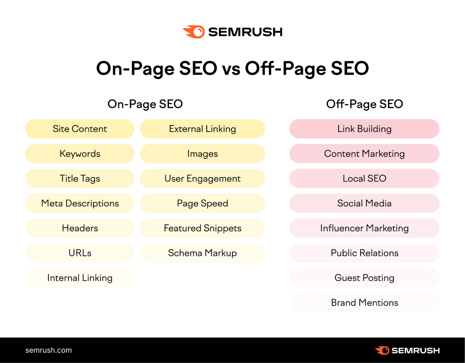
The category and product pages that make up the bulk of most ecommerce sites are both great places to rank for these crucial keywords. Because these are the pages that meet users’ search intent of finding and buying products.
Boost your chances of ranking for target keywords with these on-page SEO steps:
- Carry out keyword research using a tool like Semrush’s Keyword Magic. It can help you generate keyword ideas to attract traffic in your niche.
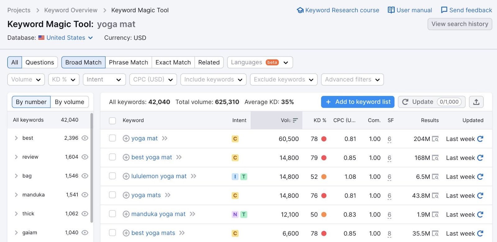
- Use the target keywords you find in each page’s main content, title tag, meta description, and H1 (make sure to use them naturally and avoid keyword stuffing)
- Look for other opportunities to insert your target keywords, including in the alt text for images on the page
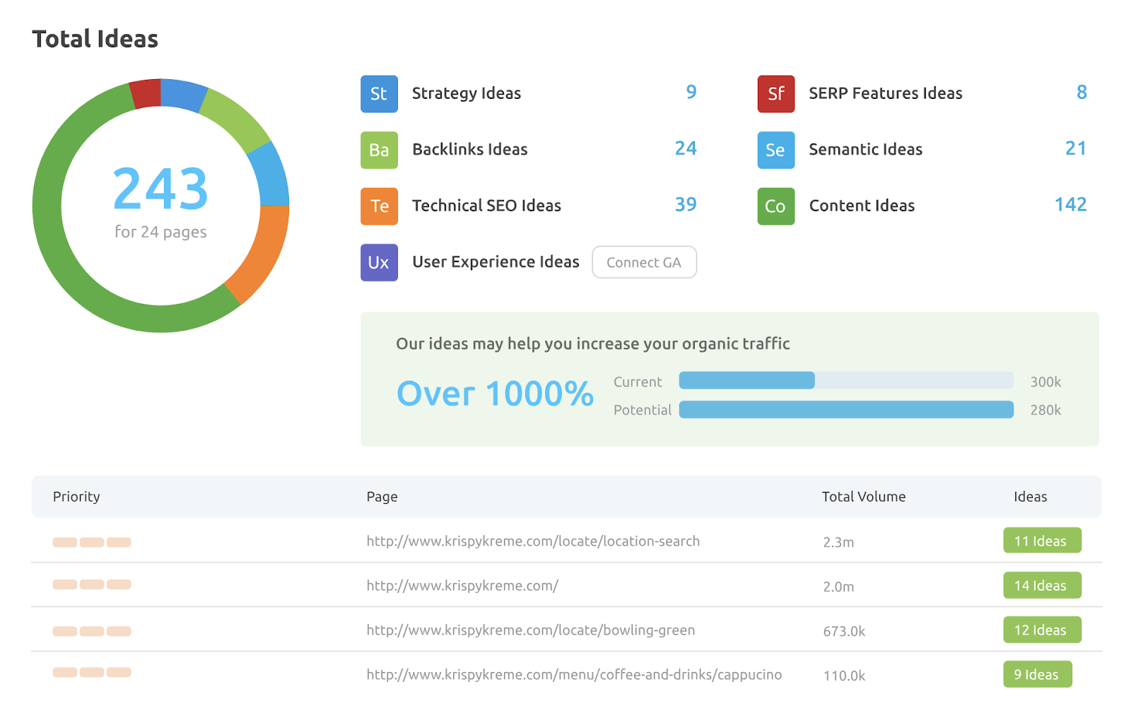
- Use a tool like Semrush’s On Page SEO Checker to make sure you’ve covered every optimization opportunity
The On Page SEO Checker dashboard shows you areas of weakness across your site. Plus recommendations for strengthening performance in each area.
4. Prioritize a Great User Experience
Optimize your website for user experience (UX) factors to increase traffic, maximize user retention, and boost sales.
UX factors determine how easy and enjoyable your site is to use. This, in turn, determines how long people spend on your site.
The longer users spend on your site, the greater the chance they’ll buy something from you.
There are countless UX design factors to consider. Look at those that streamline the experience for your website visitors. Like intuitive store navigation or easy payment options.
It’s also important to consider factors that Google’s search ranking algorithm takes into account. These include:
- Accessibility: Features that ensure all users can understand and interact with your website content, regardless of physical or cognitive disabilities. Like image alt text and screen reader compatibility.
- Readability: Techniques to make your page content highly legible on desktop and mobile devices. For example, using an appropriate font size and a high-contrast color scheme.
- Core Web Vitals: A set of three page-loading performance metrics for how long it takes for content to appear (Largest Contentful Paint), the response time to the user’s first interaction (First Input Delay), and how much the main content layout shifts unexpectedly (Cumulative Layout Shift)
You can measure these three core web vitals with a tool like Google’s proprietary PageSpeed Insights.

The report will show you results for both mobile and desktop devices. And provide suggestions on how to improve your scores.
5. Minimize Website Load Times
Optimizing how fast your website pages load can both increase your keyword rankings and boost user retention.
Here’s why:
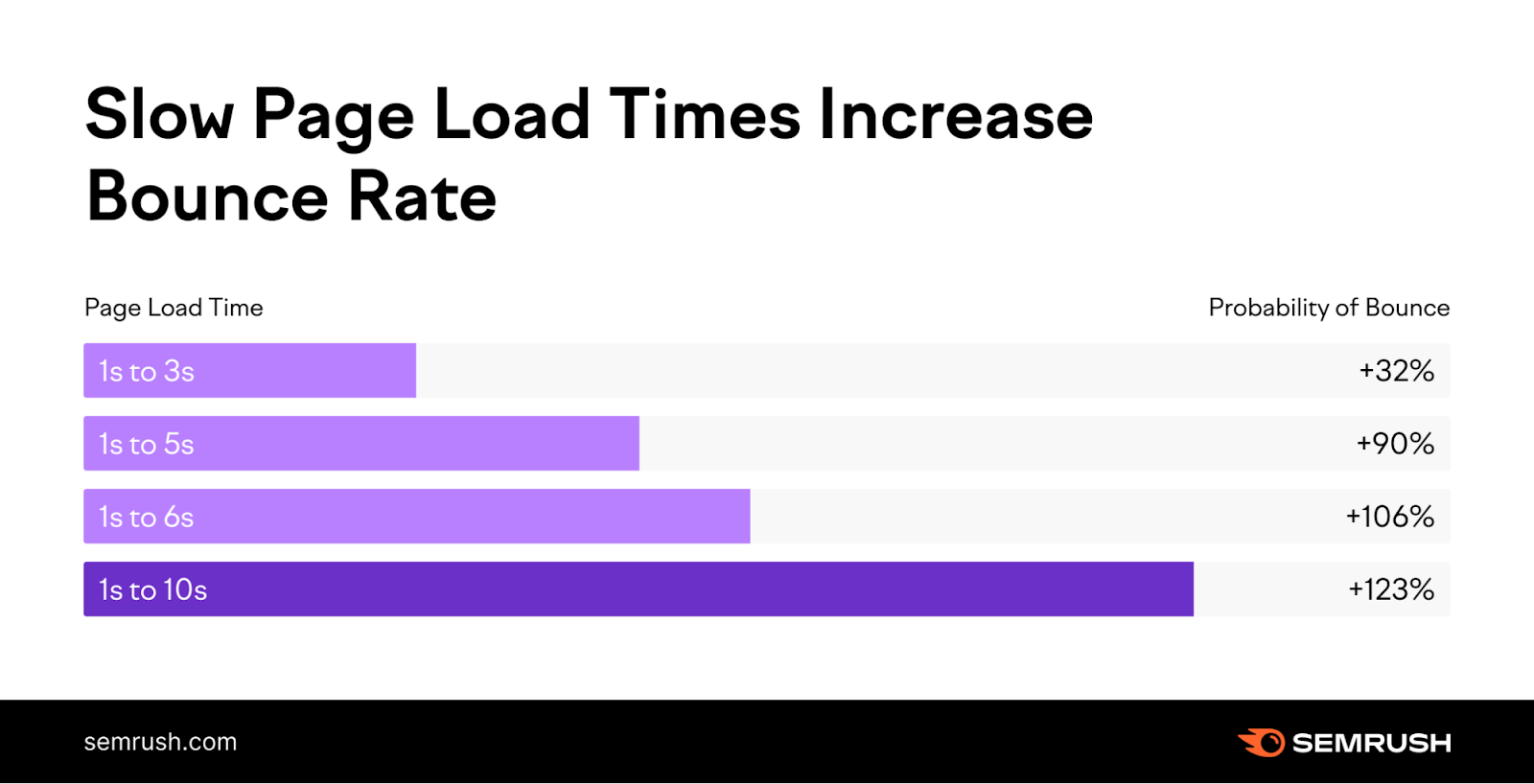
Loading speed directly impacts bounce rate. This metric measures the percentage of users who leave your site without interacting with it.
The probability of a user leaving your website before it loads increases dramatically after three seconds.
PageSpeed Insights can identify slow-loading pages on your website. You can run URLs through it to get a comprehensive report including:
- Separate tabs for mobile and desktop performance
- A detailed Core Web Vitals assessment
- A speed performance score out of 100
- Specific tips on how to improve page load speed
All of that information is contained in one report dashboard. Like this:
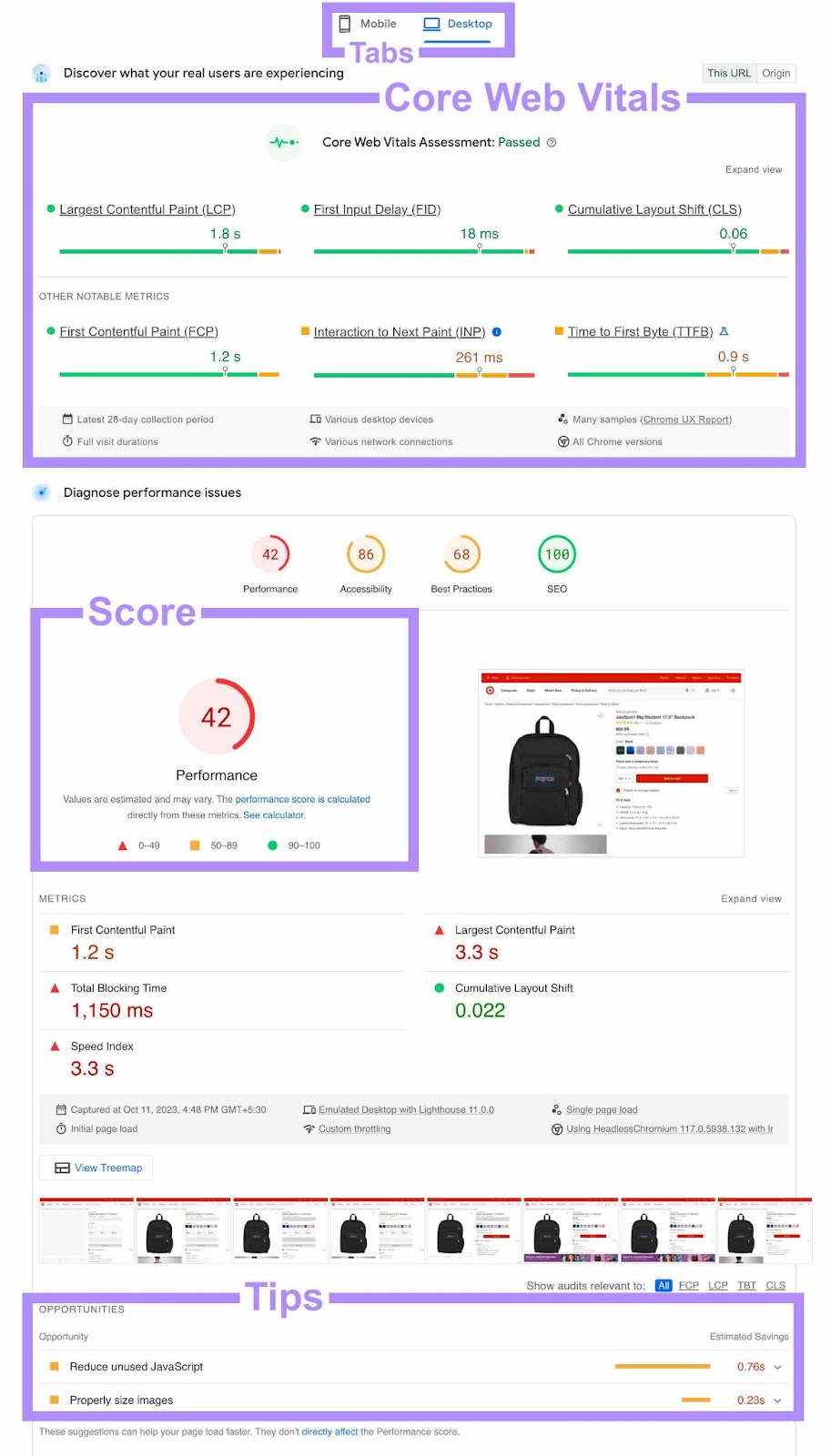
The report makes diagnosing and fixing any site speed issues simple.
PageSpeed Insights lets you run a report for one page at a time. For a complete overview of your website’s overall page speed performance, use a tool like Semrush’s Site Audit.
If you haven’t set up a project in Semrush yet, start by entering your website’s URL in the search bar. Click the “Start Audit” button.

You’ll see this dashboard when the audit completes:
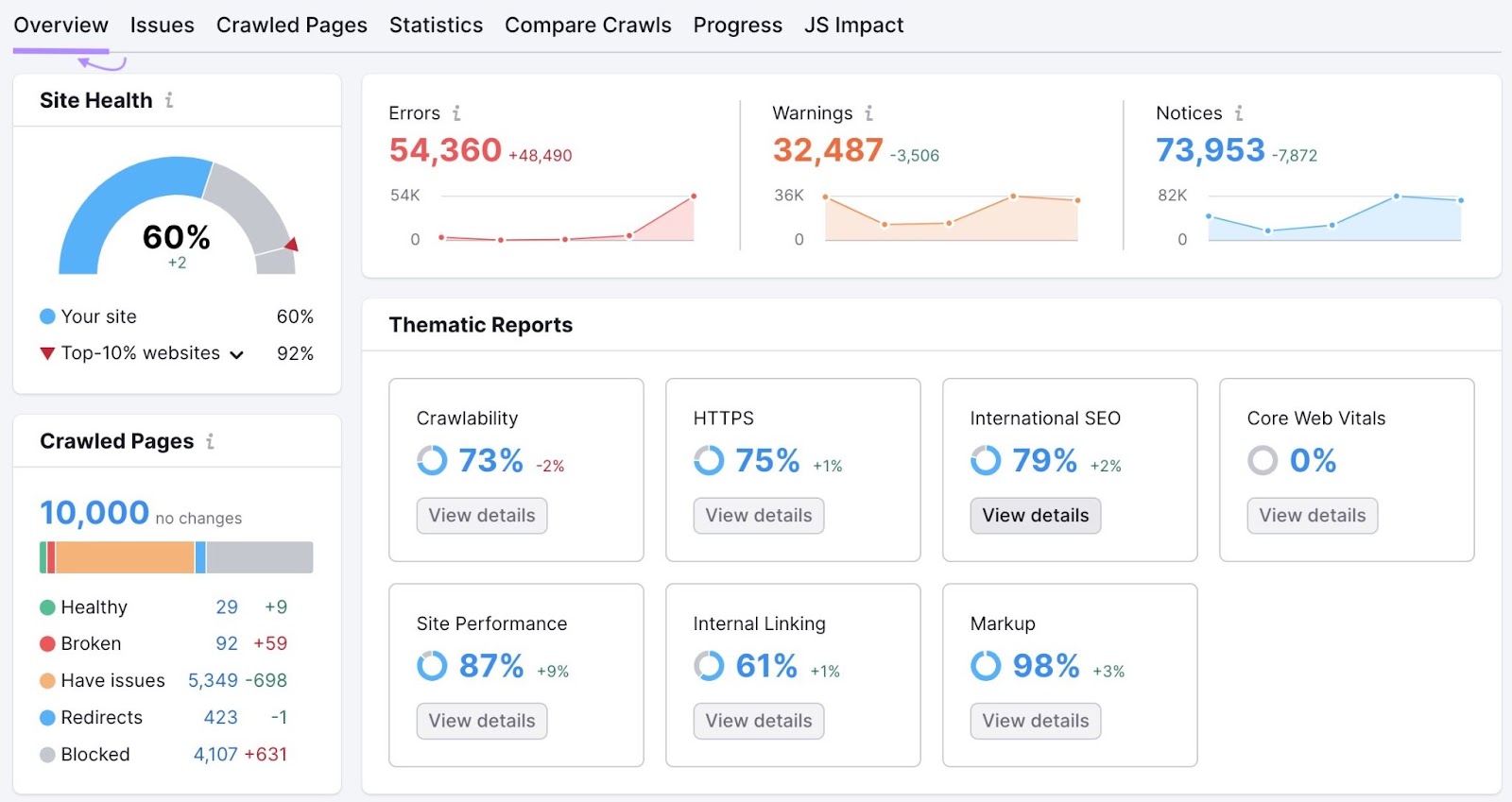
For information on your site load times, click on the “View details” button in the “Site Performance” box.
This will open a summary of technical performance. Including a breakdown of page speed across your entire website.
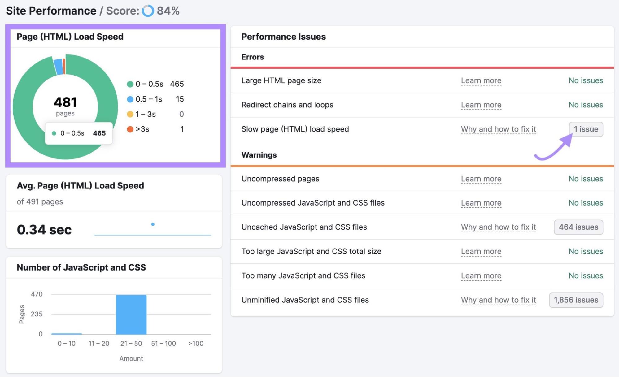
Click on the “X issues” button next to “Slow page (HTML) load speed.” You’ll find out where your page speed is lagging and get suggestions for how to fix it.
6. Optimize for Mobile Users
Around 70% of ecommerce website traffic comes from users on mobile devices. Make the most of your biggest traffic source by prioritizing a great mobile customer experience.
Further reading: Get data and insights on mobile strategies in Semrush’s latest ecommerce report, Futureproof Your Business With Ecommerce Market Insights.
Your content should be easy to read and interact with on smaller devices. This means you should pay attention to things like:
- Using an appropriate font size
- Large call-to-action buttons
- Short paragraphs
- Plenty of white space
The best way to ensure your site is mobile-friendly is to use a responsive design.
What does this mean?
Responsive design is a website development technique that automatically reformats content to suit different screen sizes.
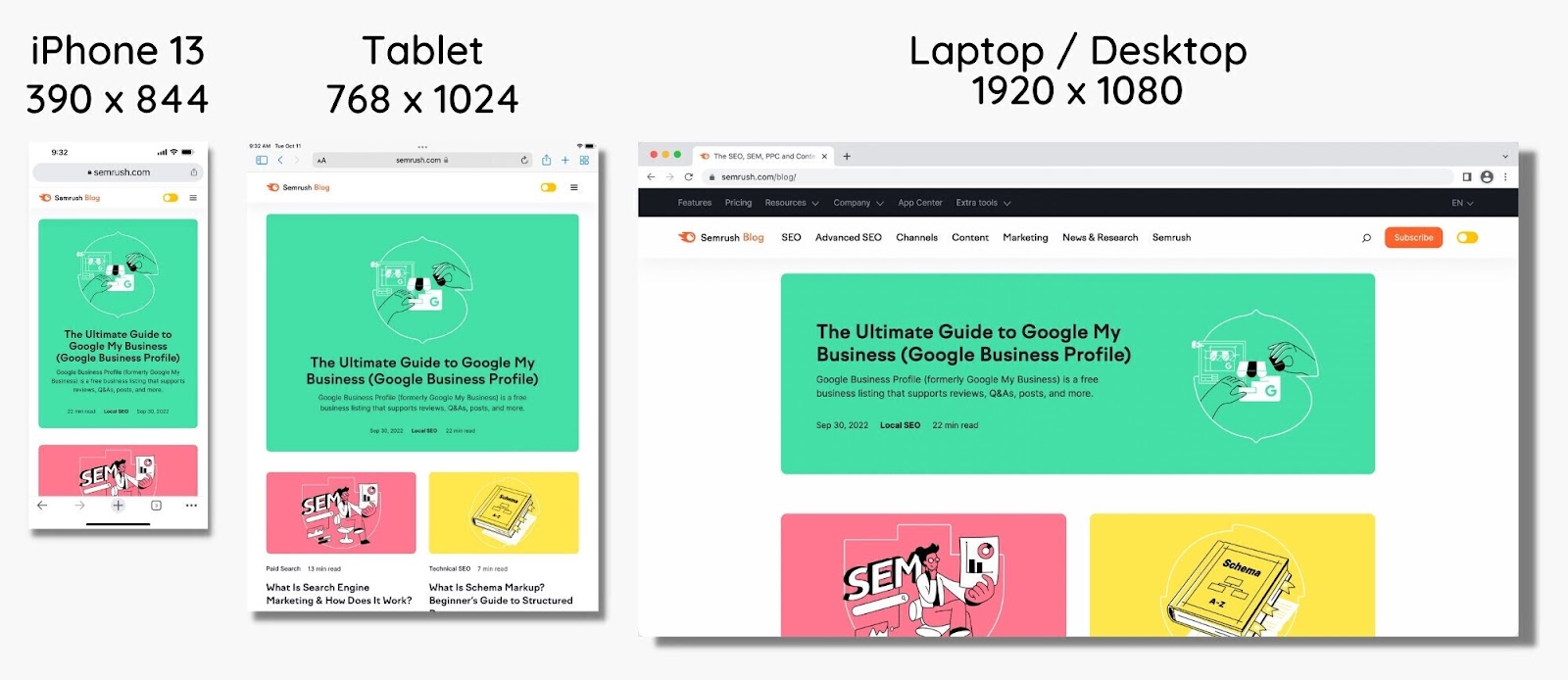
You can manually tweak your website design to be responsive. Or pick one of many templates available from site-building tools and designers to do the work for you.
Google also pays attention to responsiveness. A responsive design indicates to the search engine that you’re applying its mobile-first best practices. Meaning more visibility for your site.
7. Make Navigation Simple and Intuitive
Tailor your website navigation so users can find what they’re looking for quickly. This will prevent them from getting frustrated and visiting a competitor instead.
Website architecture, or the hierarchy of pages and how they’re connected, can be complex for ecommerce sites.
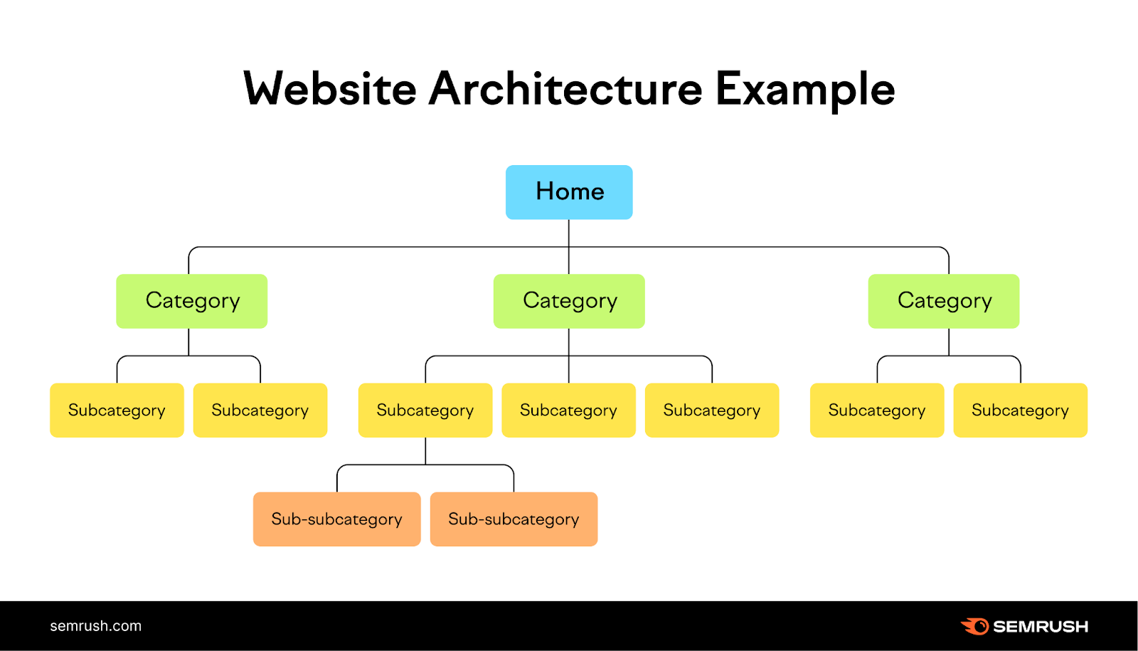
The more categories, subcategories, and product pages your site has, the harder it is for users to navigate through. And a disorganized site structure only makes things more difficult.
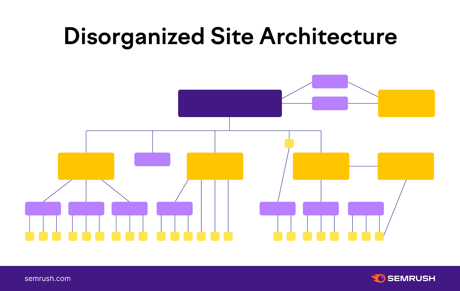
Offer the best user experience by focusing on a simple and intuitive website structure. Starting with a well-organized page hierarchy.
You can do this with URL subfolders so that each page sits beneath its parent page.
example.com
example.com/category-1
example.com/category-1/subcategory-1
example.com/category-2
example.com/category-2/subcategory-1
example.com/category-2/subcategory-2
But you should reinforce that URL structure with intuitive navigation options.
How do you achieve that exactly?
By making sure every parent page has at least one link to every subcategory or product page that sits beneath it. Every subpage should have a link back to its parent page.
This doesn’t just affect user navigation. It also ensures that Google can find every important page when crawling your website.
That means Google can store those pages in its index, which is necessary for them to rank for their target keywords.
8. Look Out for Internal Linking Opportunities
Internal links are links from one page on your website to another. Include them to make it easy for users to get to the pages they’re looking for.
Internal links provide an alternative to the search bar. They also prompt users down new paths, presenting them with more opportunities to explore your ecommerce website.
There are four main internal link types to use on an ecommerce site:
- Links in the main navigation bar, which typically appears on every page and includes all category pages
- Homepage links to start users off on their journey. These also typically lead to the main category pages.
- Sidebar links on category and subcategory pages to hop between different categories
- In-text hyperlinks to push users from blog posts or other informational landing pages toward commercial pages or other relevant information
There isn’t much room to get creative with the main navigation menu. Most ecommerce sites use it the same way: as an overview of all category pages.
But you can find plenty of opportunities elsewhere.
For example, a banner on your homepage to put a spotlight on new category or subcategory pages as they go live.
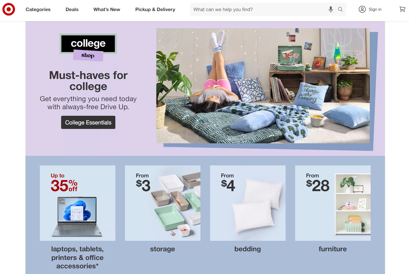
You can also add a “related products”’ section to all product pages, linking to the most similar product pages. This should keep users on-site if the product they want is out of stock or not quite right.

As your site gets larger, internal links become more important. Use them effectively to ensure every page on your website is reachable by both users and Google’s crawlers.
Pro tip: Learn how to make the most of your internal links with Internal Links: Ultimate Guide + Strategies.
9. Build Useful Product Filters
Product filters on category pages help users sort your products to focus on what they’re interested in. This improves their experience (and the chances they’ll stay on your page and buy).
Product filters are especially important for ecommerce sites that stock lots of products.
Individual category pages can contain hundreds or thousands of products. Filters allow users to narrow down their view by particular features or specifications.
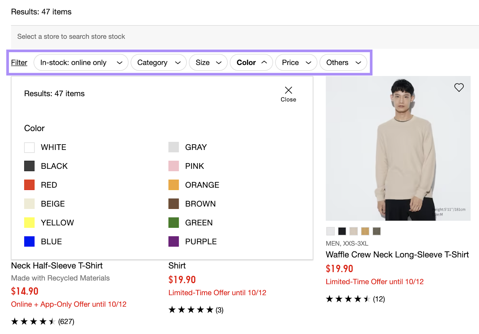
What filter options to provide depends on what you’re selling.
For instance, a men’s t-shirt category page on a fashion ecommerce store might include the following filters:
- Size
- Color
- Fit
- Price
- Material
Make sure you understand what’s important to your users. Then build filters that are relevant and useful to them.
10. Write Effective Product Descriptions
Good product descriptions can help increase your conversion rate and generate more revenue.
A product description’s first and most important job is to reduce or remove barriers to conversion. It anticipates and overcomes reservations, addresses the user’s pain points, and explains how it solves them.
What does this mean in practice?
For some products, it’s going into detail about the quality of construction in an FAQ section. For others, it involves listing features or capabilities.
It might even be as simple as stating that shipping is free.
The product description below contains plenty of useful information for potential customers, including technical specifications.
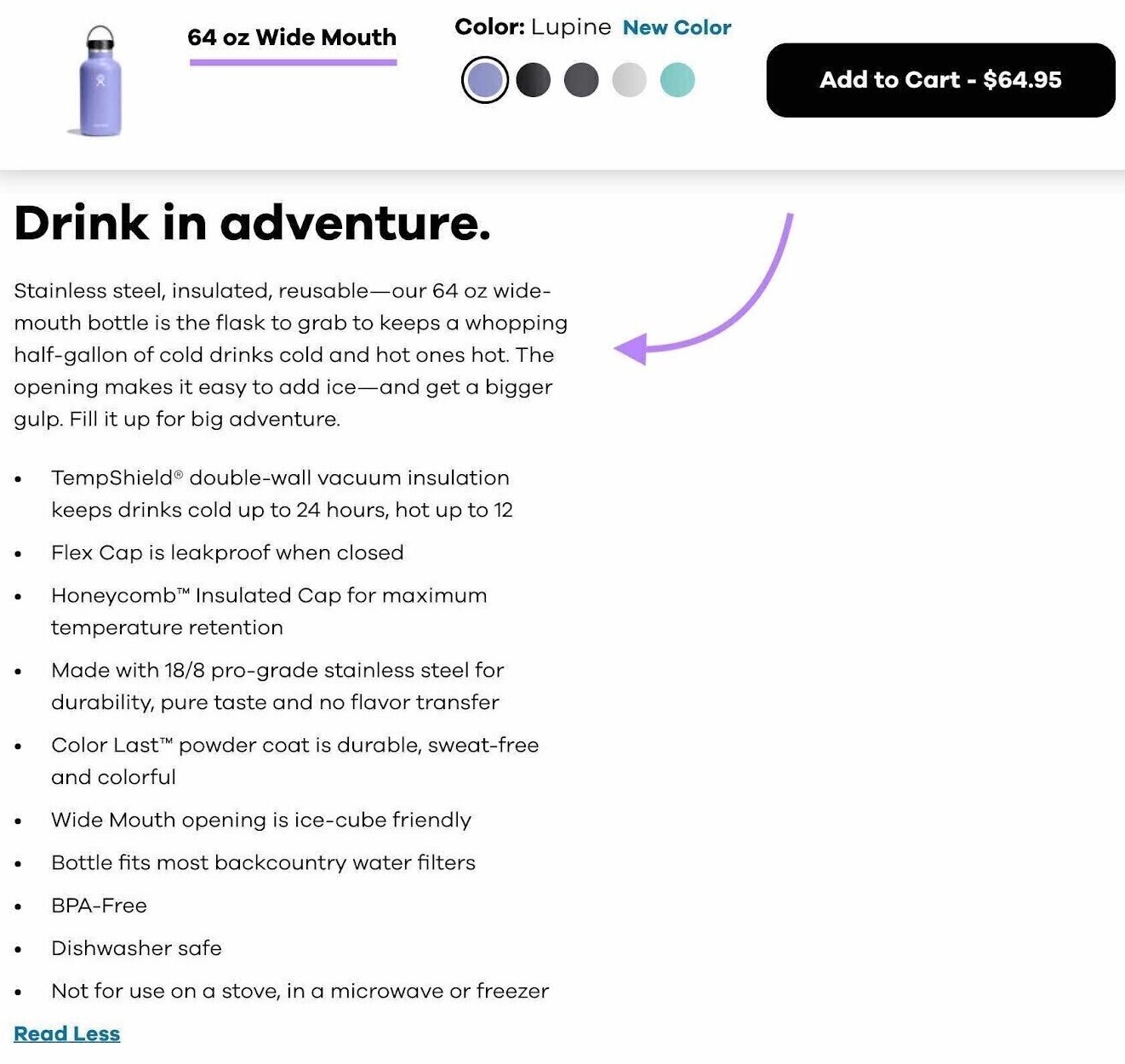
Use your descriptions to encourage hesitant potential customers to purchase. How? By addressing obstacles they might be concerned about.
Make sure your descriptions are easy to read and present the right tone for your brand.
And consider the effects on SEO.
SEO-friendly product descriptions aren’t just persuasive. They’re also optimized around the page’s target keywords.
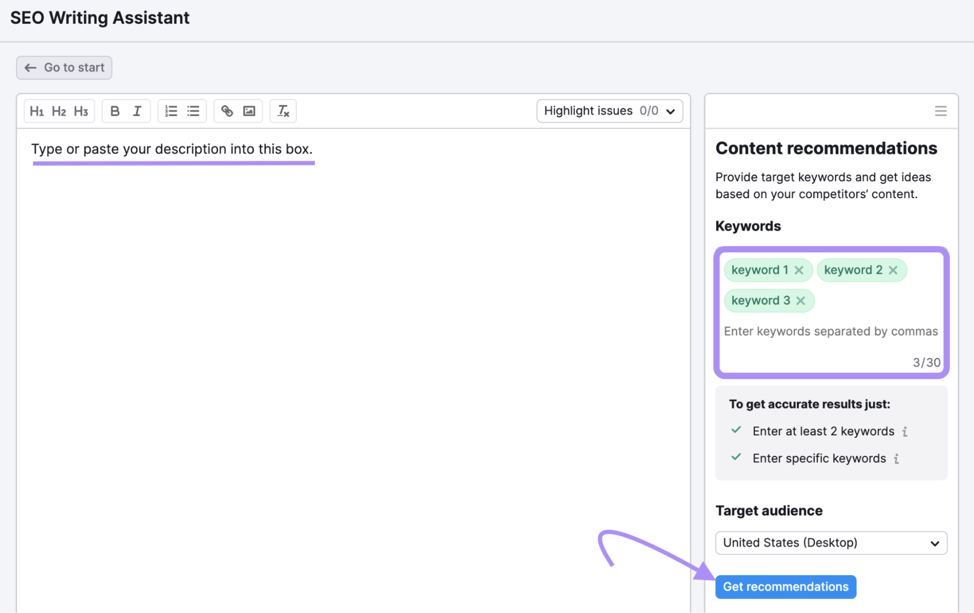
Use a tool like Semrush’s SEO Writing Assistant to create reader-friendly product descriptions that contribute to your keyword rankings.
Simply type or paste your description into the main text box. Then enter your keywords in the field on the right and click “Get recommendations.”
You’ll get a report with insights on readability, originality, SEO-friendliness, and tone of voice.
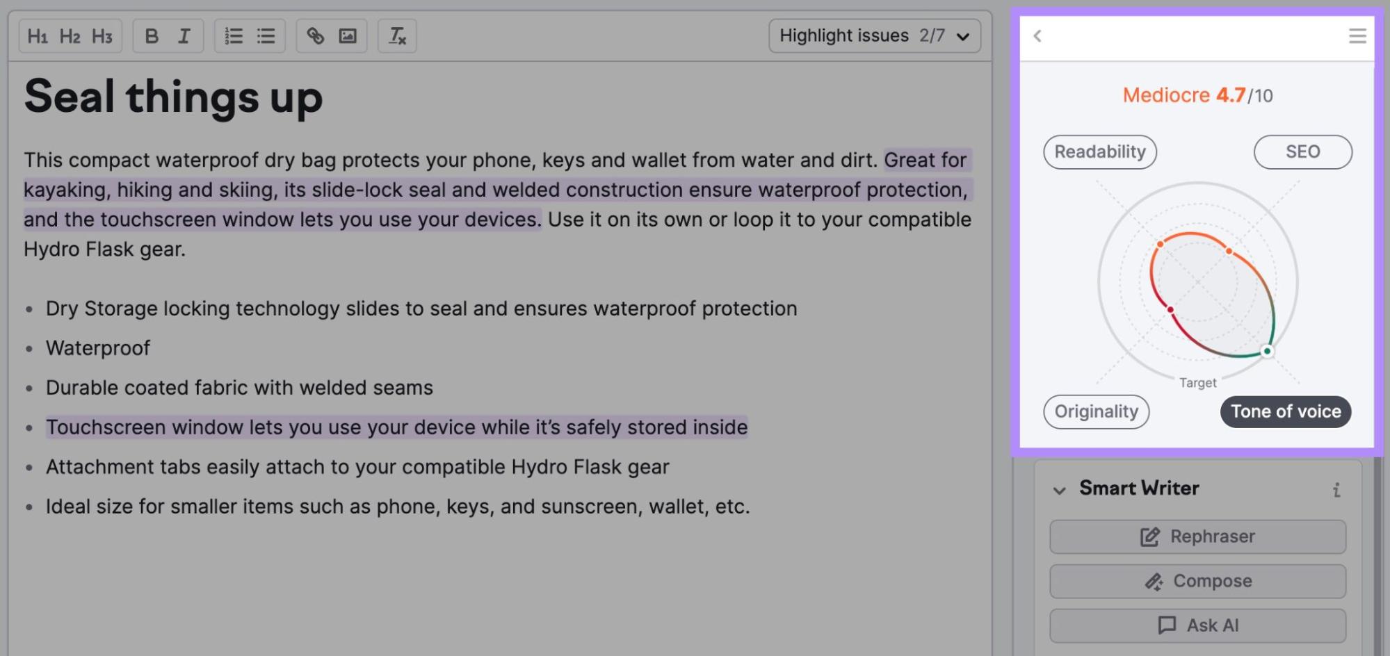
The full report provides simple guidance on how to improve each factor, plus additional keyword suggestions.
11. Offer Valuable Content
Build and deploy a content marketing strategy to boost your traffic and attract more potential customers.
Informational content like blog posts, how-tos, and guides can help you build trust and relationships with your target audience.
Educational content shows off your expertise. While brand stories make your company more relatable.
Content also opens up brand-new SEO opportunities for ecommerce sites. You stand a good chance of ranking for keywords outside your product descriptions.
First, you need to know what keywords to target.
Semrush’s Organic Research tool can be a big help in this process. You can analyze your top competitors’ websites and easily identify what informational keywords they rank for.
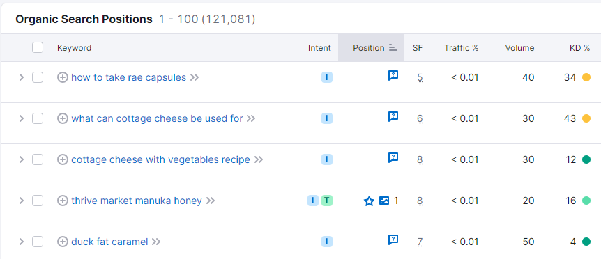
Once you have topics to write about, draft your content using content creation tools to make sure it’s well-optimized.
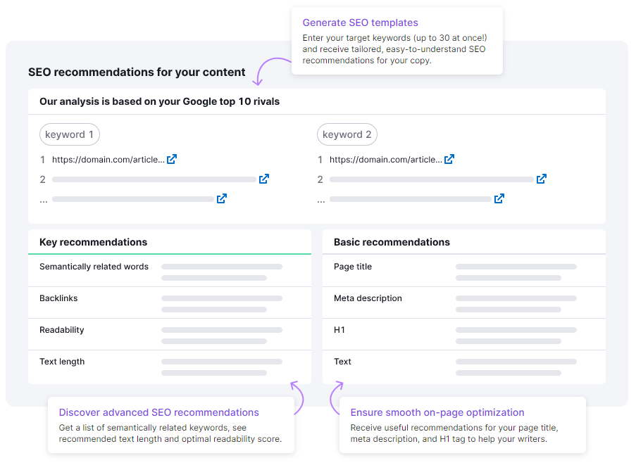
SEO Content Template is a great place to start. Enter a target keyword, and the tool will generate an ideal content outline to use as a basis for your writing.
12. Attract Users Throughout the Marketing Funnel
Figure out ways to target users throughout their buying journey to grow your traffic and make more sales.
Ideally, your website will attract users who are close to making a buying decision. But there’s plenty of opportunity to generate traffic from elsewhere in the marketing funnel.
The marketing funnel has four main stages:
- Awareness: Users have just become aware of a product need
- Consideration: Users are in the process of narrowing down their options
- Conversion: Users are ready to make a purchase and need a final push
- Loyalty: Users have already converted and now have brand affinity
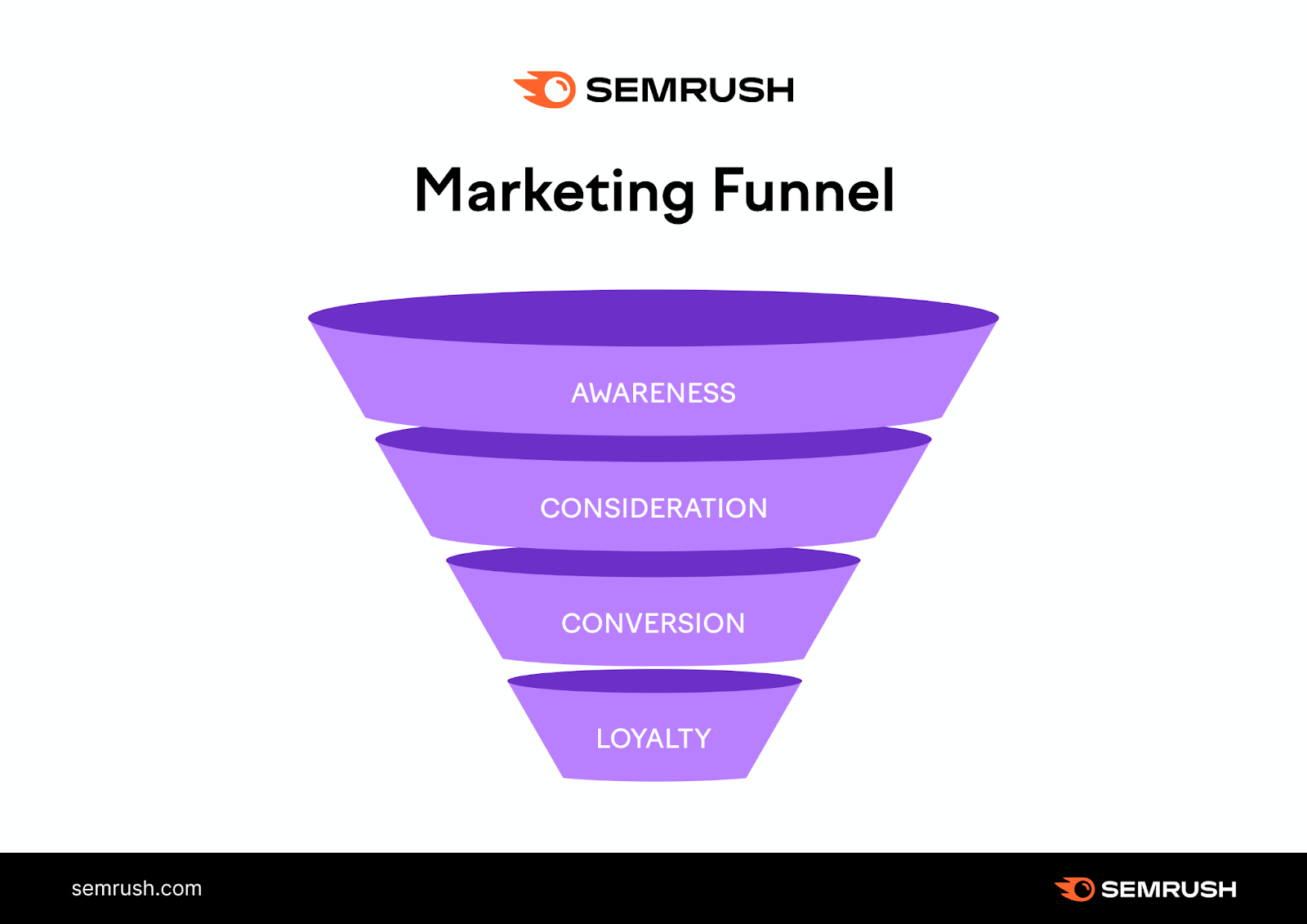
Each stage offers an opportunity to grow your online store’s traffic. You can capture all of them with a diverse range of page types.
Here’s how:
Users in the awareness stage need information. They’re typically in the process of researching a product.
Target them with informational content that answers their questions. In the process, you’ll make them aware of your brand. That way, they’re more likely to remember you when they reach the conversion stage.
Users in the consideration stage are comparing different products to make a purchase decision. Target them through content that puts your product head-to-head with competitors.
More users captured at the top of the marketing funnel = more potential customers.
13. Minimize Barriers to Conversion
Barriers to conversion stop a visitor from becoming a customer. Minimizing them can increase conversions.
A study by the Baymard Institute found that the average ecommerce shopping cart abandonment rate is 70%. The investigation revealed that the top barriers to conversion were:
- Extra costs (shipping, tax, fees, etc.) being too high
- Website requiring an account to check out
- Delivery times being too slow
- Low trust in the website’s credibility
- Checkout process that was too long or complicated
You can only avoid some of these factors with changes to your business model. But you can address the others through simple changes to your website.
Here are some tips:
Avoid forcing potential customers to create an account by adding guest checkout functionality. Like this “Continue as Guest” button:
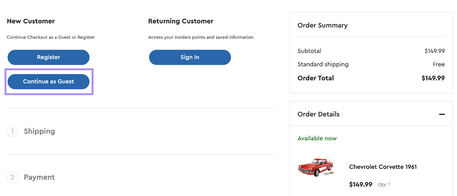
Reverse low trust by adding more evidence of your brand’s credibility during checkout. Include things like customer reviews or industry awards in prominent places on the checkout page.
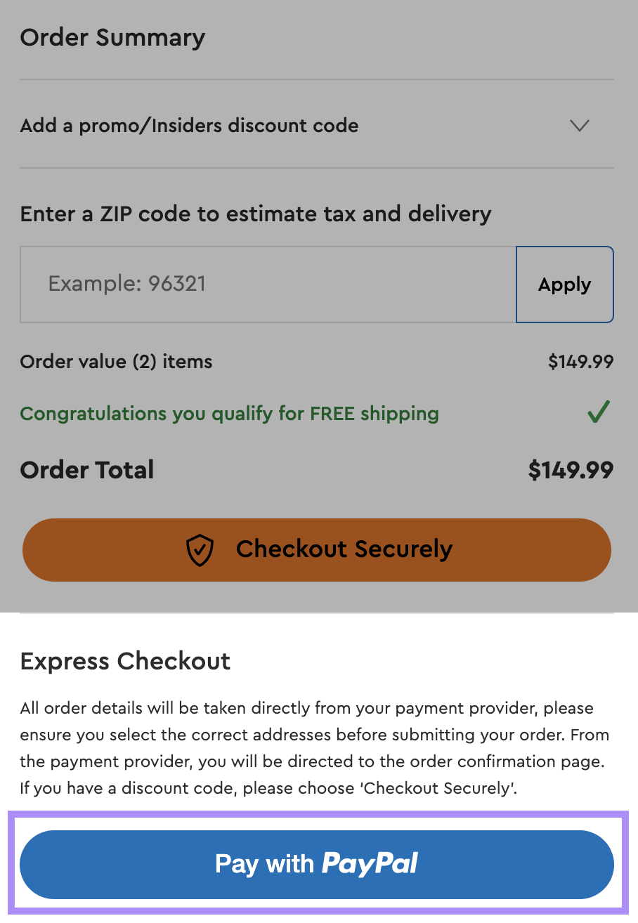
Add payment options like PayPal to convert users who are hesitant to enter their credit card details.
14. Create a Retargeting Plan
Track site visitor interactions. So you can continue to reach out to those who show interest but leave your site before making a purchase.
Even the best ecommerce sites don’t convert 100% of the time. Retargeting tactics help you find users who drop off during checkout and reach them again.
One of the most popular tactics involves tracking users on your website and targeting them with personalized ads.

The process works like this:
- A potential customer visits your site where tracking cookies or software pick them up. They leave without converting.
- You create a remarketing campaign on a paid ads platform like Google Ads. Using the tracking data to target lost users.
- Your retargeting ads reach the lost users on Google search engine results pages (SERPs) or other websites.
- Some of the retargeted users click on the ads and end up on your site. They have a second chance to convert.
Email is another popular channel for retargeting. In email retargeting, you contact lost users or previous customers directly through their inbox. But it first requires you to collect their email address legally.
The email below reaches out to previous customers. A discount code encourages them to return to the site for another purchase.
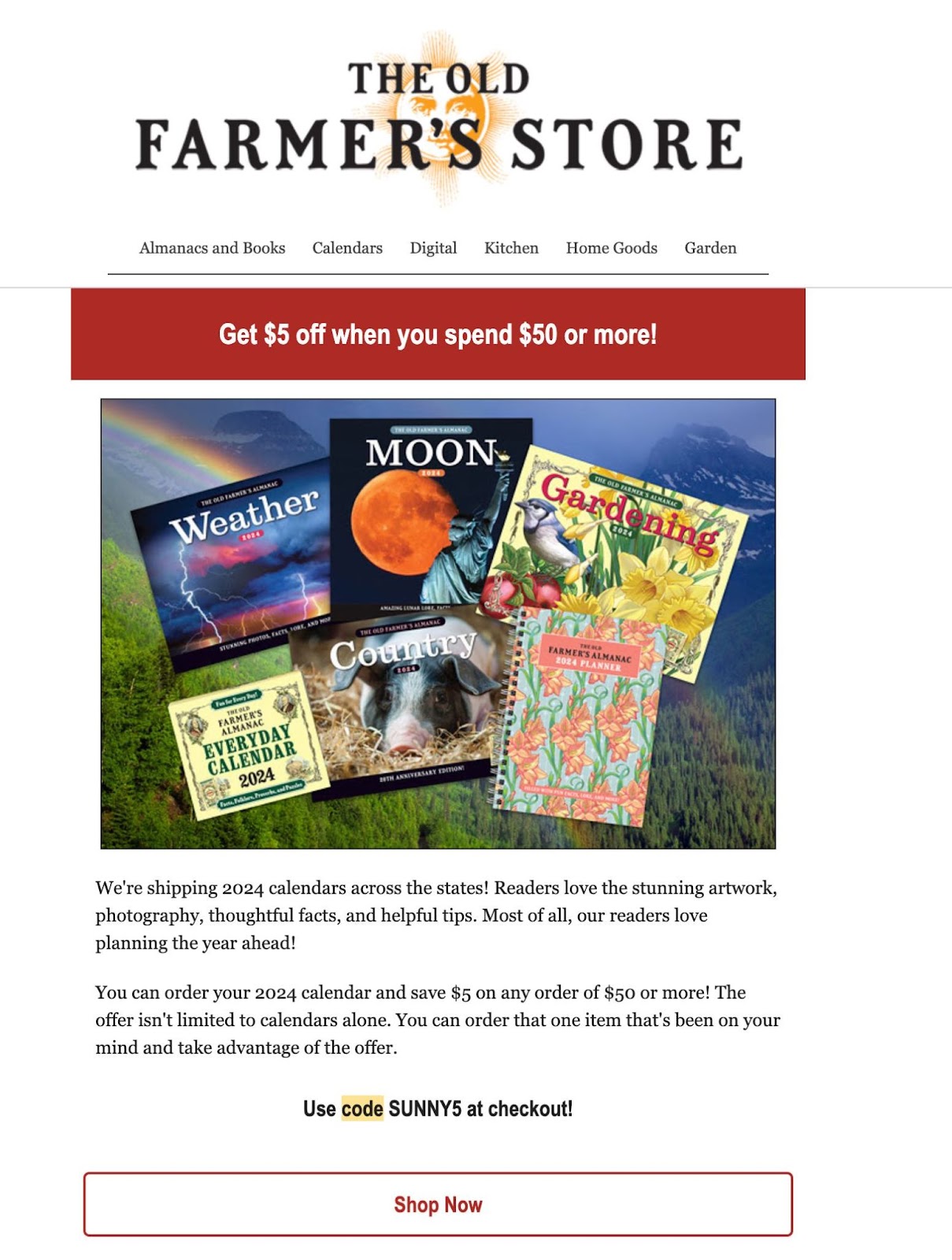
Both these retargeting tactics can be successful revenue drivers if you set them up effectively.
Retargeted users are already familiar with your brand. That means your website has less work to do here to persuade them to convert.
15. Keep Your Website in Good Health
Schedule regular site health checks so you continue to acquire and convert users.
Ecommerce websites are particularly prone to degradation. It’s not uncommon to delete discontinued product pages without redirecting them to another page, for example.
This can cause both UX and technical SEO issues.
Users following links to these deleted pages get a 404 status code. Which might lead them to exit the site altogether. Plus, the 404 pages will lose any keyword rankings they had.
The simple solution: Stay on top of your website’s health with an automatic technical auditing tool like Site Audit.
Run an audit as outlined in best practice No. 5. The main dashboard will update to reflect your site’s general technical health.
It will highlight errors, warnings, and notices you need to pay attention to.
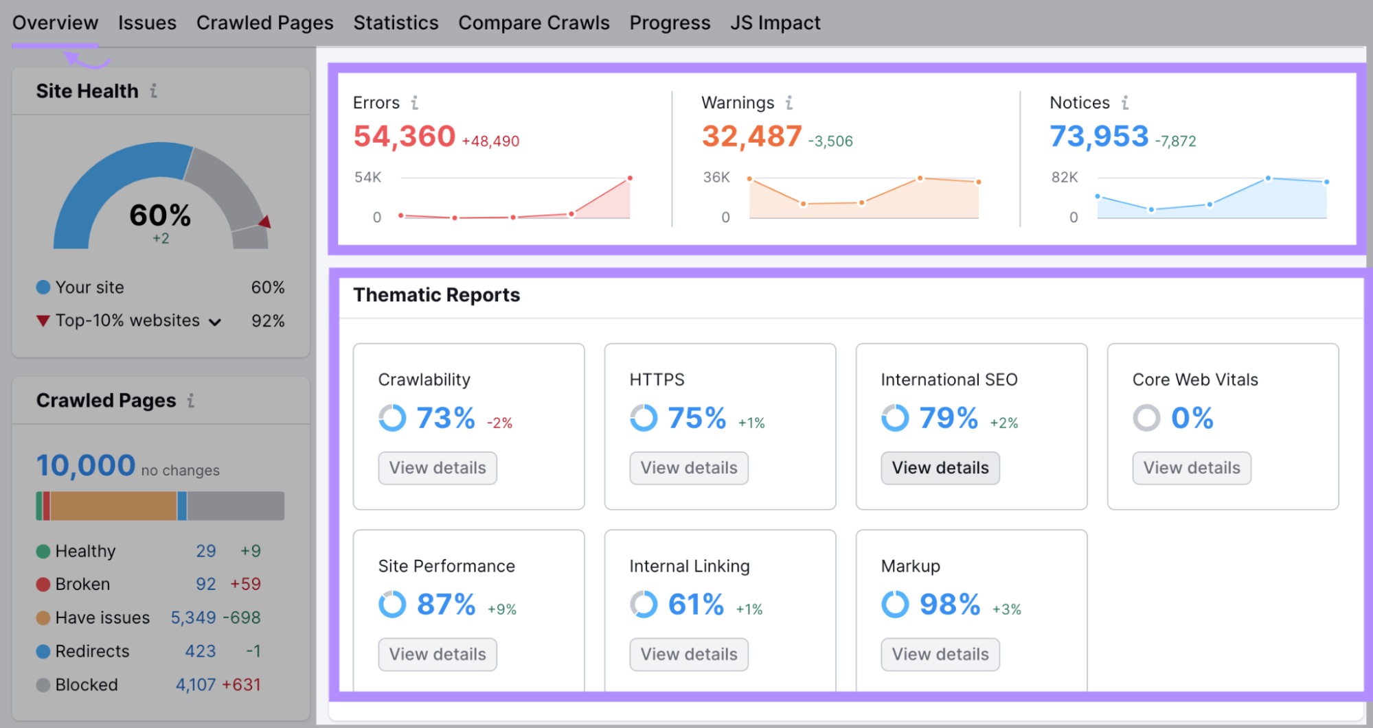
The “Thematic Reports” section links to more detailed reports with suggestions for fixing any issues.
The reports cover areas including:
- Pages that Google can’t reach
- Pages with slow load speeds
- Broken internal links leading to deleted pages
- Redirect chains that can cause loading issues
Set up Site Audit to run regular audits. It will help you respond to any concerns right away and keep your site in good working order.
Extend your ecommerce brand’s presence to the top social media platforms. You’ll reach new audiences and drive more traffic to your site.
Estimates put the total number of social media users worldwide close to 5 billion. That’s a huge potential audience.
Being active on platforms like Facebook and Instagram will get your marketing message in front of more people. When you want to announce new products or sales, for instance.
You can also boost audience engagement and views by hosting giveaways or contests.
Between the Covers Bookstore entered followers in this Easter giveaway for liking the post, following the brand, and tagging a friend:

Socials can double up as customer support channels. They give your customers the chance to get in touch directly. So you can respond and resolve their concerns quickly.
And they act as vehicles for social proof to make your brand more trustworthy. Satisfied customers can give you a shoutout on your page or highlight your brand in hashtags. Both actions will grow your visibility with their connections.
Ecommerce Best Practices Can Boost Your Online Sales
Each of the above best practices can impact your ecommerce website’s ability to attract and convert customers. The challenge lies in implementing them effectively.
To get the most out of your optimization efforts, test out one change at a time. Get started with Site Audit so you’ll know what you need to focus on first.
Source link : Semrush.com
