A/B testing can help you fine-tune your landing pages to boost clicks and conversions. By testing two different versions of a page, you can discover what connects best with visitors.
Our guide explores the benefits of A/B testing for landing pages and explains how to implement it using the Landing Page Builder app.
How Does A/B Testing Work?
A/B testing is when you change one key element on a webpage and compare the two variants to see which performs better. You can measure their performance to help you make data-driven decisions and optimize conversion rates.
As you only make one change in A/B testing, you can be sure of the cause and effect.
The majority of businesses conduct A/B testing with 60% of them using this method to improve their landing pages in particular.
Here’s a quick breakdown of how you run A/B tests for landing pages:
- Create a variant of your landing page and alter one key element, for example, the headline font or CTA button color.
- Split your website traffic between versions A and B of your landing page.
- Run the test until you’ve collected a substantial data set on each version’s user engagement.
- Ensure the data has statistical significance for reliable results.
- Analyze the results to see whether A or B performed better.
- Implement the changes for all your site visitors.
These steps just represent one cycle of A/B testing. It’s most effective when you repeat the process to continuously refine and optimize your website for changing user attitudes.
Benefits of Using A/B Testing to Optimize Landing Pages
Although A/B testing only requires a small effort, it can have a significant impact on the performance of your landing pages. Here are some of the main advantages you can expect:
- Increased sales from clicks and conversions
- Lower bounce rates as visitors are more likely to engage with your content
- Potentially higher return on investment as A/B testing requires few costs to setup
- Minimal risk as you only expose a portion of your visitors to the changes
- Applicable to almost any business size, type, and industry
Types of A/B and Split Tests for Landing Pages
There are several variations of tests for landing pages. You don’t need to limit yourself to one approach — mix and match depending on your specific business needs and goals.
Variant A/B Testing
Often seen as the simplest method, Variant A/B testing involves creating two versions of a landing page but changing one element. You might tweak the wording of the headline or reposition the CTA box.
Variant A/B testing can show you the impact of a single change to help you finalize a landing page before a full-scale rollout. It’s also one of the easiest strategies to implement as there’s relatively little data to track.
A/B/C Testing
A/B/C testing involves creating three variants of your landing page instead of two. You change the same key element in each. For example, you might check which of three images performs best. You can save time by testing three variants at once and ensure they have the same conditions.
Multivariate A/B Testing
As the name suggests, Multivariate A/B testing means you change several features on your landing page. The edits might be subtle but you could change everything from the color, size, and format to the order.
This approach is best for seeing how well a combination of elements performs on your website. For example, do visitors respond better to a minimalistic design or a feature-rich page?
Multi-Page Funnel A/B Testing
Instead of comparing two pages, this approach tracks changes the whole way through your conversion funnel. Suppose you change the tone of your landing page copy. You would then carry these changes over onto all the text on the pages you link to.
Multi-page funnel testing gives you a more comprehensive look at how users respond to changes. Use it to see whether elements perform well at all stages of the funnel or just at the initial engagement.
Split URL Testing
With Split URL testing, you go further by creating separate webpages and changing multiple elements, as opposed to testing one element at a time with an A/B test.
Using this method you can end up with distinct-looking variants. One set of visitors stays on your normal web page and the other set gets redirected to a completely different page that you’re testing.
As it’s more extensive than the other options, it’s best for major overhauls. You can test the changes without any risk of disrupting the user experience.
How to Decide What to Test
It’s possible to test any of the elements on your landing page. Here’s a list of the main choices:
- Headlines
- Copywriting
- Layout and page order
- Page length
- Images, audio, and video
- Sign-up forms
- CTA buttons
- Customer testimonials
- Countdown timers
- Pop-ups
- Banners
- Price points
To decide what to test, start by running site analytics. Tools like heat maps and click tracking can reveal how users interact with different elements on your landing page. You can see what people engage with and how long it takes them to scroll.
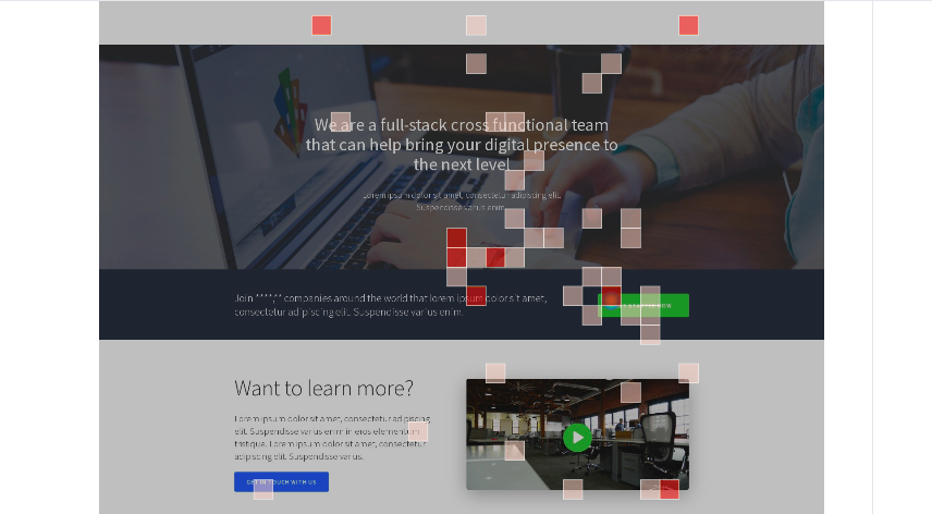
Surveys and focus groups can provide extra detail on what’s underperforming. They should be able to explain the data you collected in your analytics.
How to Set Up A/B Testing With Semrush
In our App Center, the Landing Page Builder lets you quickly create landing pages and conduct different types of A/B tests. Here are the steps to take:
Step 1. Set up Your Account
Visit the Semrush App Center to either sign up for a free trial or subscribe to the Landing Page Builder app.
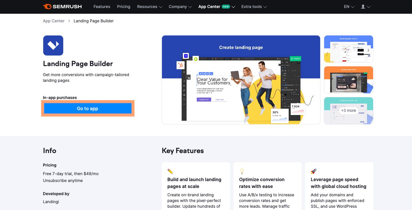
Once inside, click the create a landing page button.
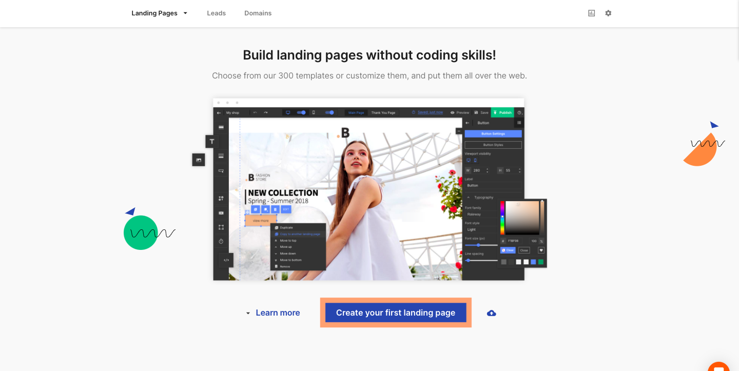
Next, choose to start from scratch or customize one of our 300 templates.
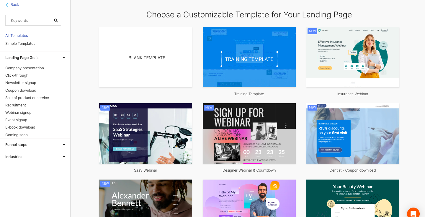
Step 2. Create a Landing Page
Let’s say you choose the template method. Edit the elements on the landing page using the tools in the left and right sidebar menus.
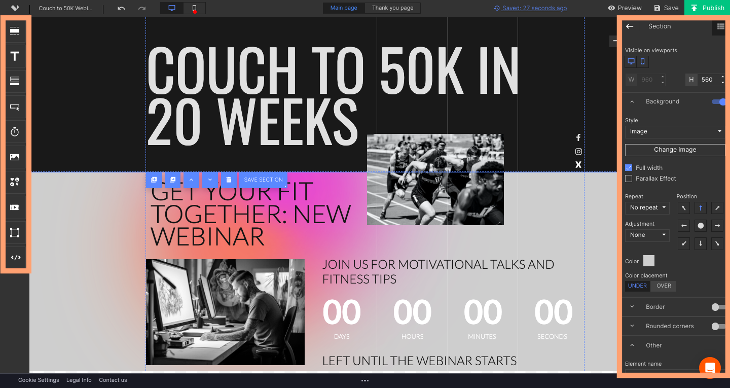
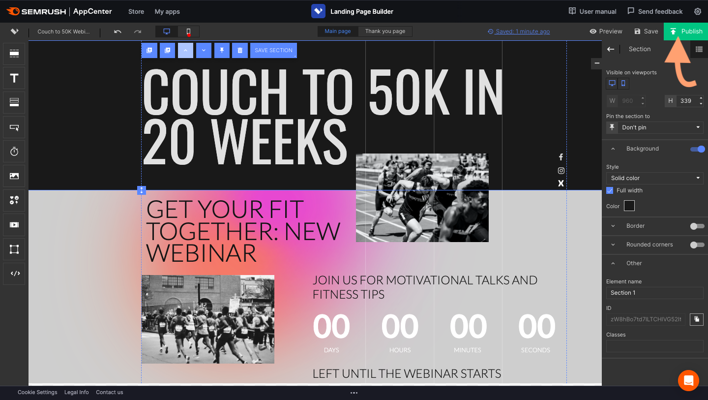
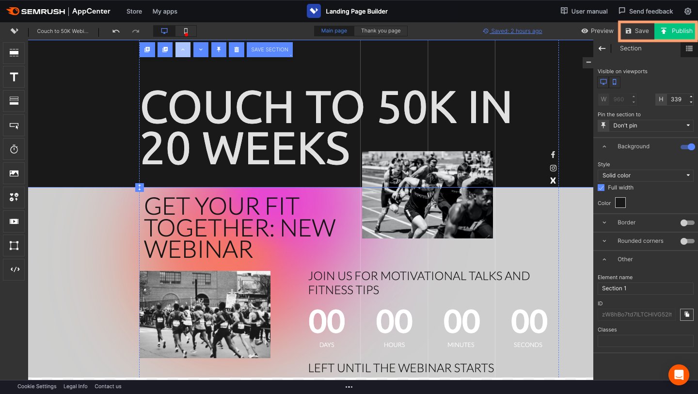
Once you’ve finished, click the green publish button in the top right corner.
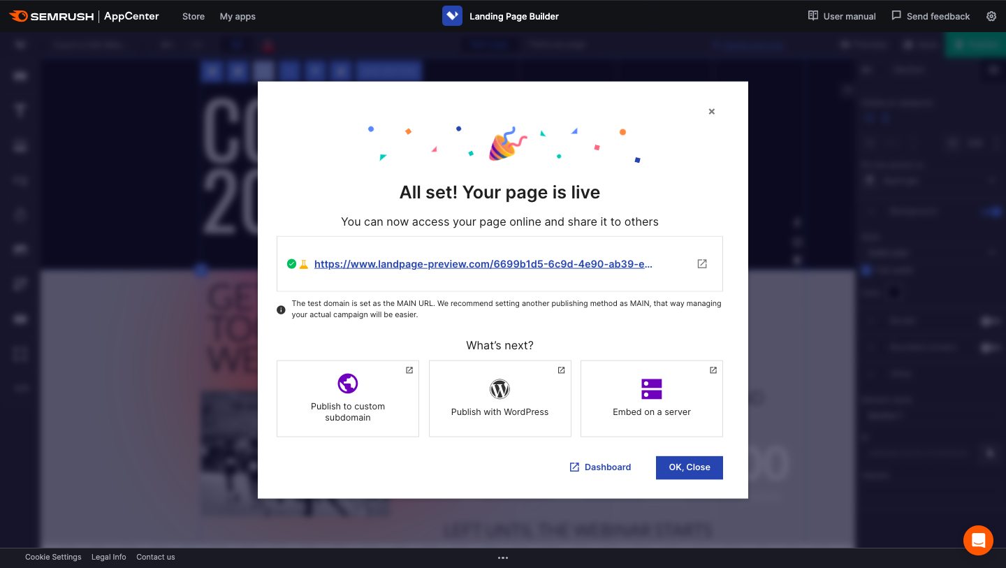
If you haven’t connected a domain, Semrush automatically saves it to a test one.
Step 3. Set up The Test
Navigate to the app’s main page. Hover over your new landing page on the menu to reveal options. Click on the dashboard button.
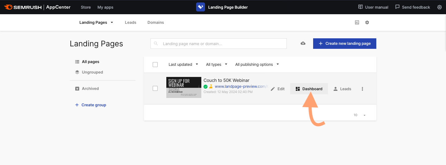
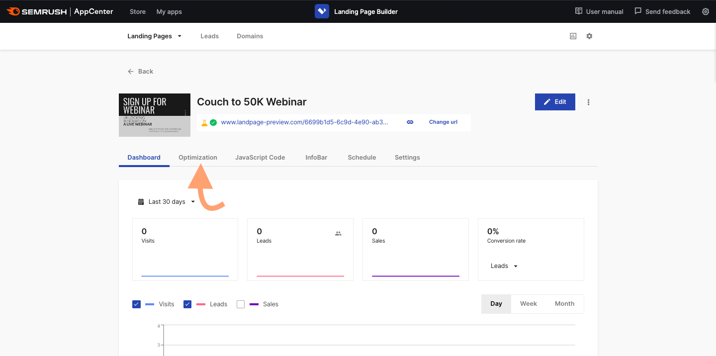
Click to open the dashboard and view the page’s visits, leads, and conversions. Click the optimization tab in the dashboard.
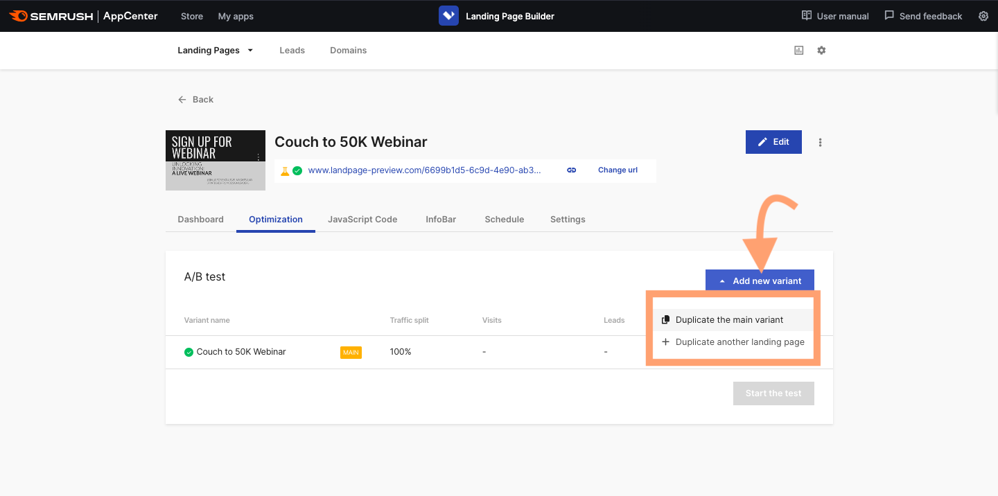
Click the blue add new variant button to open the dropdown menu. Choose to duplicate the main variant.
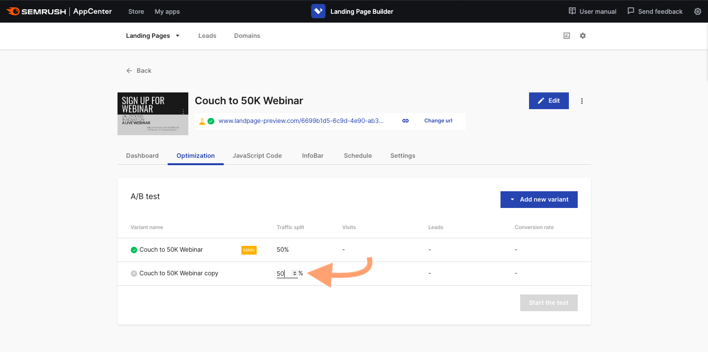
Step 4. Decide Your Traffic Split
Choose which percentage to direct to the variant by clicking the arrow icons.
To find the optimal percentage and timeframe, you can use the ABTasty calculator. The form asks for details like your number of visitors and current conversion rate.
Step 5. Make the Variant
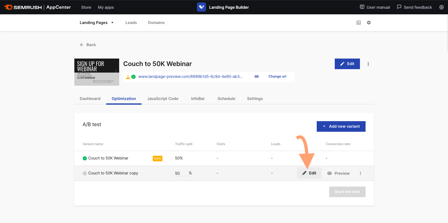
The variant will appear in the dashboard. Click the edit button to open the builder again and change key elements.
As before, either save or publish the landing page.
Return to the optimization tab for the landing page and click the start test button.
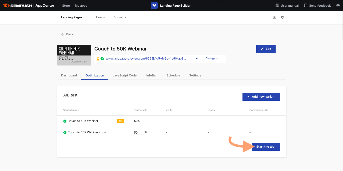
As you run the test, you can now compare the analytics for both variants in the dashboard.
Common Pitfalls of A/B Testing (And How to Avoid Them)
A/B testing isn’t foolproof. The success of your strategy depends on how well you implement the changes and measure the results.
Here’s what to watch out for:
Choosing the Wrong Metric
If you measure an irrelevant metric, your changes may seem successful but not have the desired effect.
Ultimately, you want to drive more payments. Tracking the click-through rate of a button during your A/B test may show which version of the button gets higher engagement. However, visitors might not be buying your product, meaning the changes aren’t effective.
Choose a metric that directly relates to your end goal. You might be better off measuring conversions in the case above.
Stopping the Test Too Soon
Short tests might not provide data of statistical significance to help you make informed decisions. You might get a false positive when A only performs minimally better than B over time. Then you’ll spend time rolling out unnecessary changes when you could move on to testing something more impactful.
Run each test long enough to ensure you generate meaningful results. The exact time depends on your average visitor count and the extent of the changes. If your landing page generally has low traffic, or you only make small tweaks, it may take months to collect meaningful data.
Testing Too Many Variables
If you change too many elements on your landing page, you may be unable to measure their impact. Then you won’t know which ones to continue using, making the test a waste of time and resources.
In a worst case scenario, you might implement the wrong changes and negatively affect user engagement on your website.
Stick to a manageable number of variables to keep your data clear and actionable. You should always be able to see cause and effect.
Changing the Variable Midtest
Once you start A/B testing, you must commit to the variations you’ve made. Changing elements midway through will invalidate your data. You won’t know whether you got your results from the first edits or the later ones.
Failing to Consider External Factors
Events like holidays and market shifts can temporarily influence how users behave. Time your test carefully so you record engagement under normal circumstances. Failing that, account for the external factors when you analyze your results.
Focusing on the Wrong Pages
Pages like bios and confirmations have a lower potential for improvement. They tend to get lower traffic and drive less engagement than other areas of websites. Testing them may not generate actionable insights or deliver worthwhile results.
Focus on landing pages with heavy traffic and the highest potential for clicks and conversions. You can return to low-priority pages when you have extra capacity.
Optimizations That Get You From A to B
When it comes to A/B testing for landing pages, the possibilities are endless. You can test a variety of ideas to see whether visitors respond. No need to stop at your landing pages either — you can run tests on your emails, social media ads, and more.
But the trick to successful A/B testing is starting small and building from that point. A restrained approach allows you to maintain your existing user base and gain more through experimentation.
Source link : Semrush.com
