Posted by
Shiri Berzack
The Rank Ranger Analyse section provides an array of reports featuring
data integrated directly with your Google Analytics and Webmaster Tools
accounts, presented in a simpler and more appealing format for you to
share with clients, management or anyone else who might need to see
them. These reports have recently received an upgrade that provides even more impressive visuals that we think will help those who are less SEO-savvy to better understand the results of your efforts.
Analytical graphs and charts have been updated with a smoother and more professional look and include a variety of functionality including compare-to-past period, Google algorithm changes, events & notes and more.
Overview
The Analytics Overview report provides a dashboard look at your campaign’s Google Analytics information. In addition to upgraded graphs, you’ll find these improvements:
- When you export the report the numbers of visits in the graph are included, making it easier to read.
- You can now include events & notes and Google algorithm updates in the graph to provide a better visual understanding of why visits have dipped or risen.
- The Top Channels pie chart has been expanded to show more channels that are directing traffic to your site, including direct, organic search, referral, paid search, email and social.
- An additional pie chart shows the percentage of returning visitors vs new visitors.
- The Device Overview pie chart is also a new addition showing what devices visitors are using to view your site.
Traffic Sources
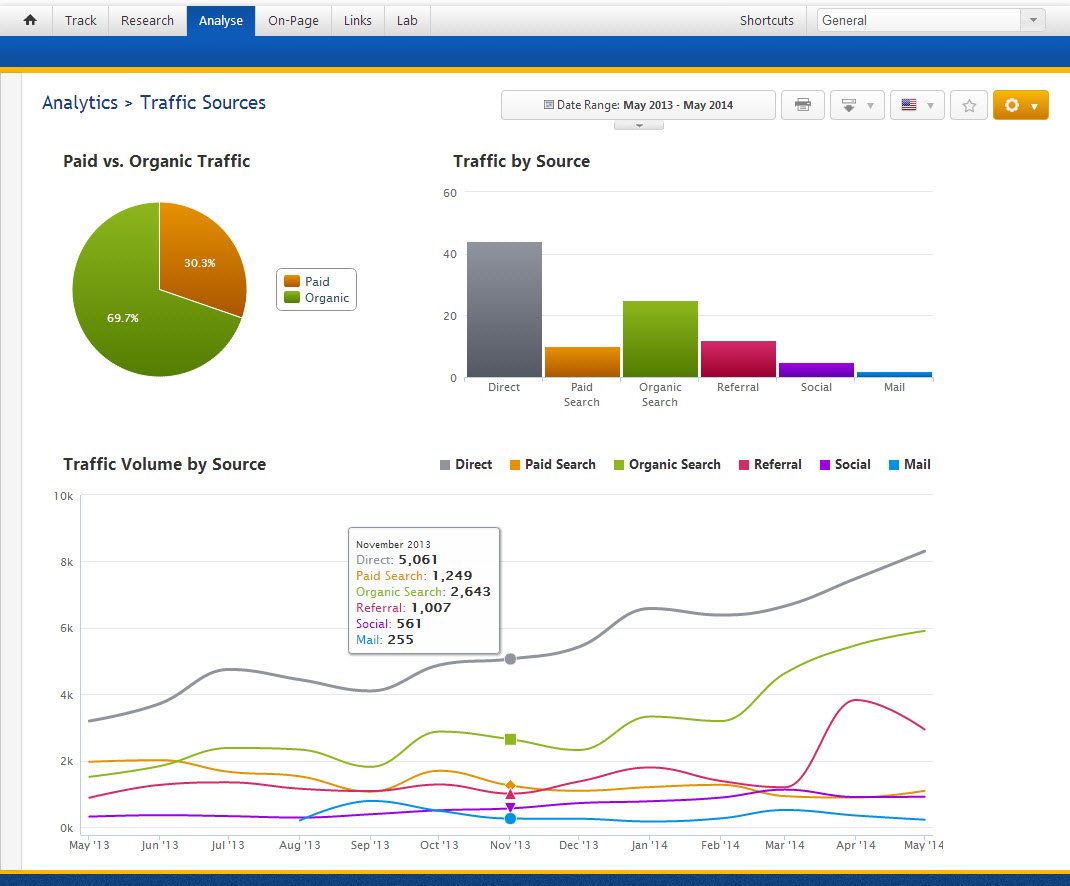
The Analytics Traffic Sources report visually explains where a site’s traffic is coming from and whether the source fluctuates from month-to-month. An upgraded Export to PDF function now displays the same colorful graphs that are seen in this screenshot.

Have you connected your Google Analytics and Webmasters Tools to your Rank Ranger account yet? Try it out and let us know what you think.

