Above-the-fold (ATF) content is important for web design because it’s where users form their first impressions. And where they expect to see certain website features.
Plus, ATF content can affect search engine optimization (SEO).
What Does ‘Above the Fold’ Mean?
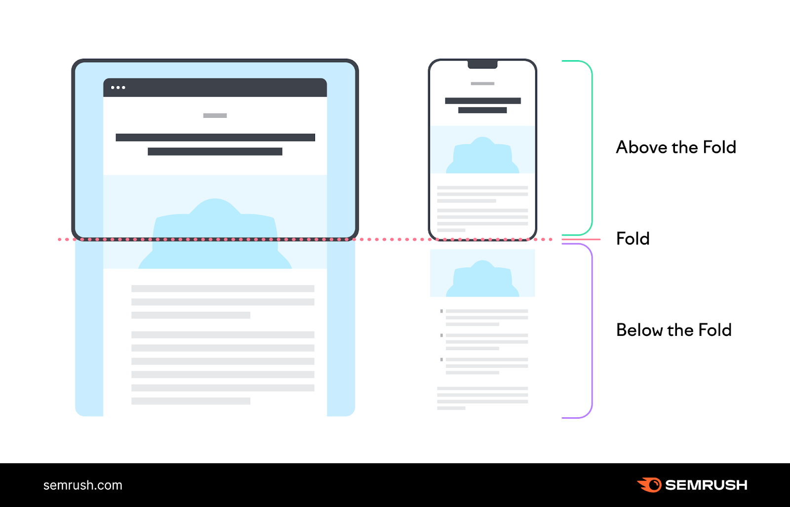
Above the fold refers to the visible part of a webpage before the user scrolls down
By extension, the fold is where the loaded page first cuts off at the bottom of the screen. Anything beneath this point is below the fold.
As the illustration below shows, the user’s device affects the precise point of the page fold. Other factors, such as browser settings, also affect the size and shape of the viewing window, known as the viewport.
When designing above the fold, focus on dimensions that work for the average user. Most screens and devices will display the top 600 pixels of a page.
Designers should implement responsive layout, which automatically adapts to different viewports.
Note: The above the fold meaning comes from newspaper publishing. Newspapers are typically displayed on newsstands folded in half, so editors place the most attention-grabbing elements above the fold—literally.
Above the Fold Best Practices
Above-fold content is crucial in capturing visitors’ attention. We’ve rounded up best practices that can help you deliver a great user experience (UX). And ultimately increase revenue.
Plus, we’ve included above-the-fold SEO strategies that can help your pages rank higher in Google.
Here are best practices for your ATF design:
The website header is the topmost part of a webpage, typically duplicated across every page of a site. It keeps key elements in the same easy-to-reach place. Which is great for UX.
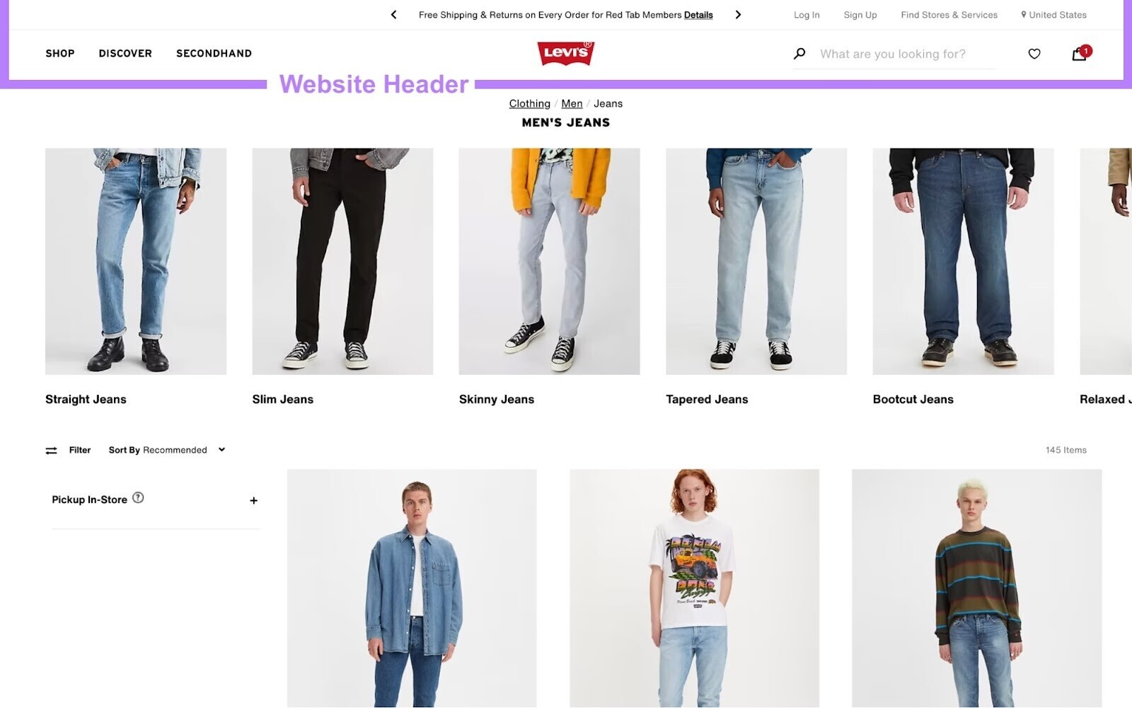
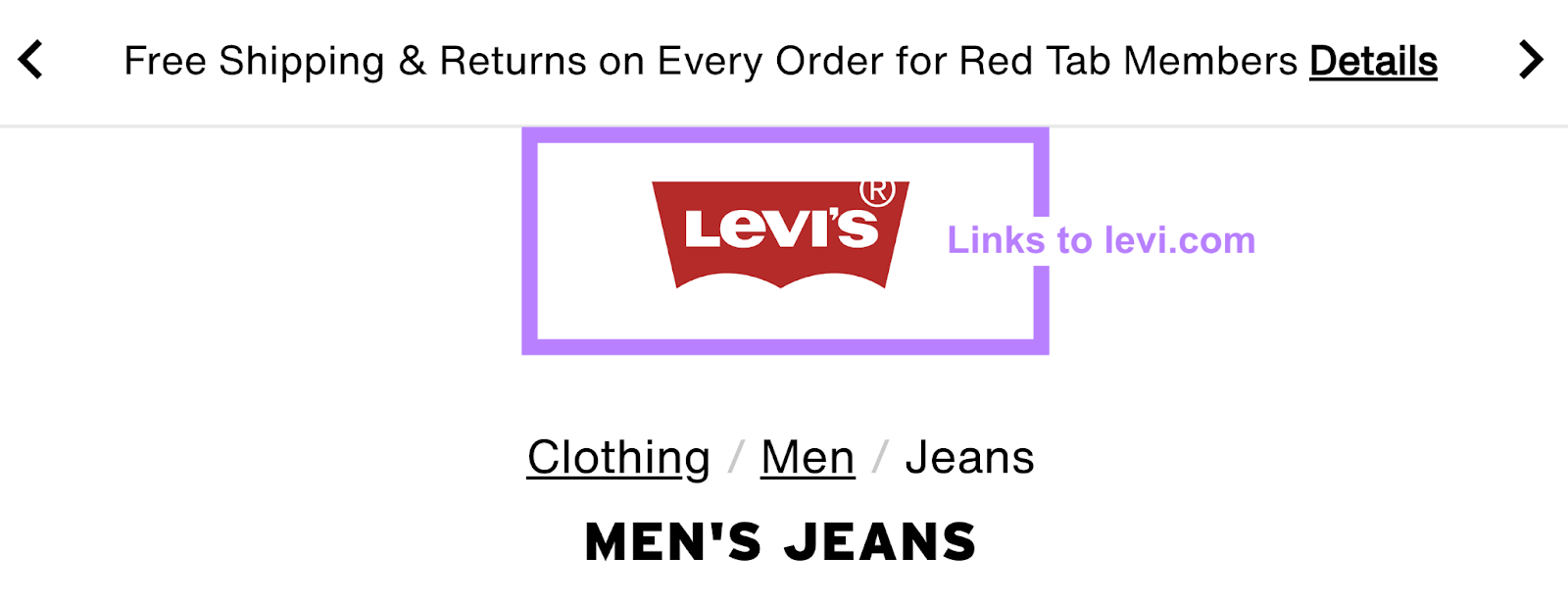
A website header typically includes the brand logo, which links to the homepage. So users can navigate to this key page quickly.
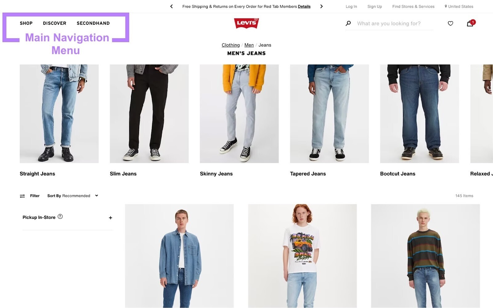
The header typically includes the main navigation menu, too—i.e., links to the main sections of your site.
Many web designers save space by placing the main navigation in a hamburger menu. Especially on mobile. But this means it takes users an extra click to access key pages.
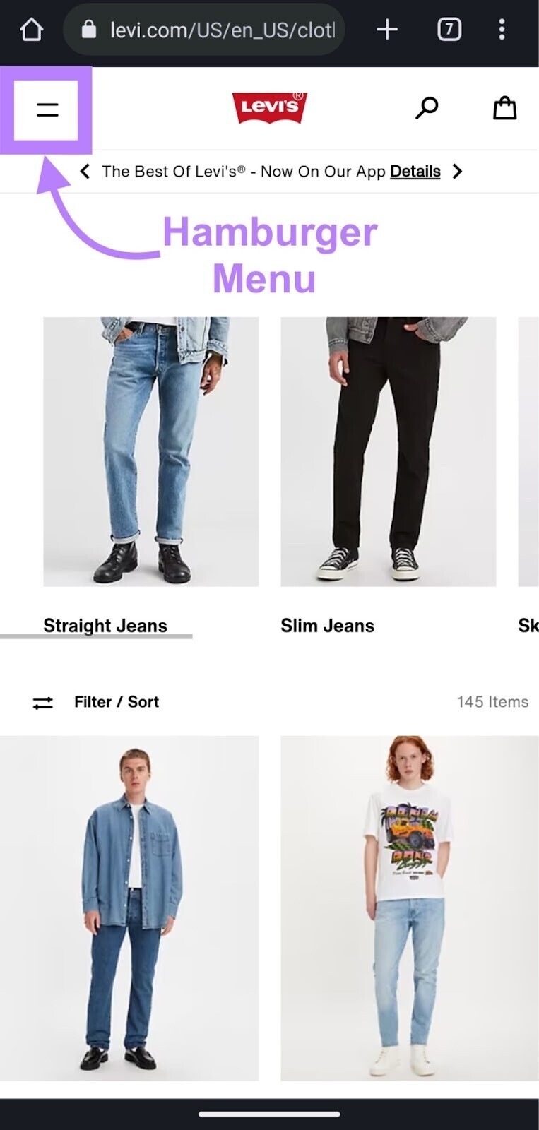
Below are some other elements to consider including in your website header:
- Banner: Use a website banner to advertise unique selling points like free shipping
- Sign-in/sign-uplinks: Encourage visitors to create an account or sign in, which makes it easier for you to track customer behavior and increase engagement
- Region/language flag: If you have a multi-regional or multilingual site, allow users to switch between options
- Search function: Include a search bar or icon so users can quickly find what they want
- Shopping cart icon: If you have an ecommerce site, make it as easy as possible for shoppers to start the checkout process

Adding extra elements to your website header can increase its functionality. But a cluttered design takes up valuable space above the fold and can be difficult for users to navigate. Designers must strike a balance here.
Include a Unique Heading
Every page should have a unique, descriptive heading displayed above the fold. This allows users to quickly understand the page’s purpose.
On the Mashable site, prominent headlines tell visitors exactly what to expect.
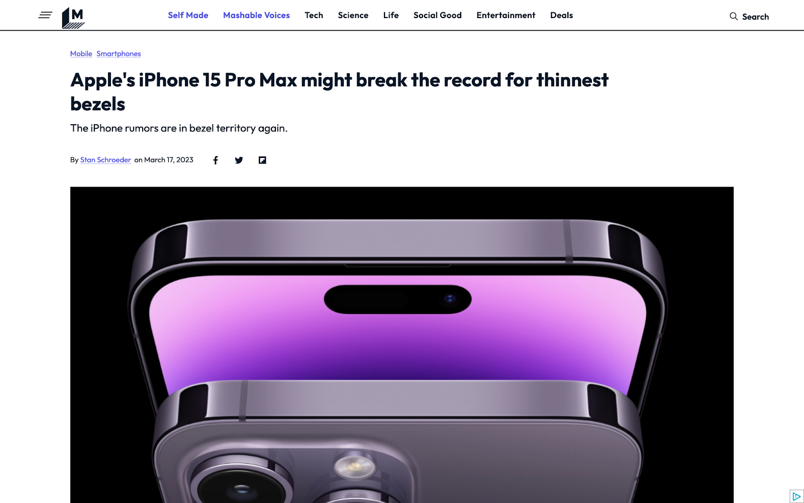
Including a unique heading can also assist with above-the-fold SEO.
When asked about ATF’s impact on rankings, Google’s John Mueller said: “The important part for us is really that there is some amount of unique content in the above-the-fold area.
“If you have a banner on top and you have a generic hero image on top, that’s totally fine. But some of the above-the-fold content should be unique for that page. And that could be something like a heading.”
To further improve your on-page SEO, wrap the headline in H1 tags (the topmost HTML heading).
Like this:
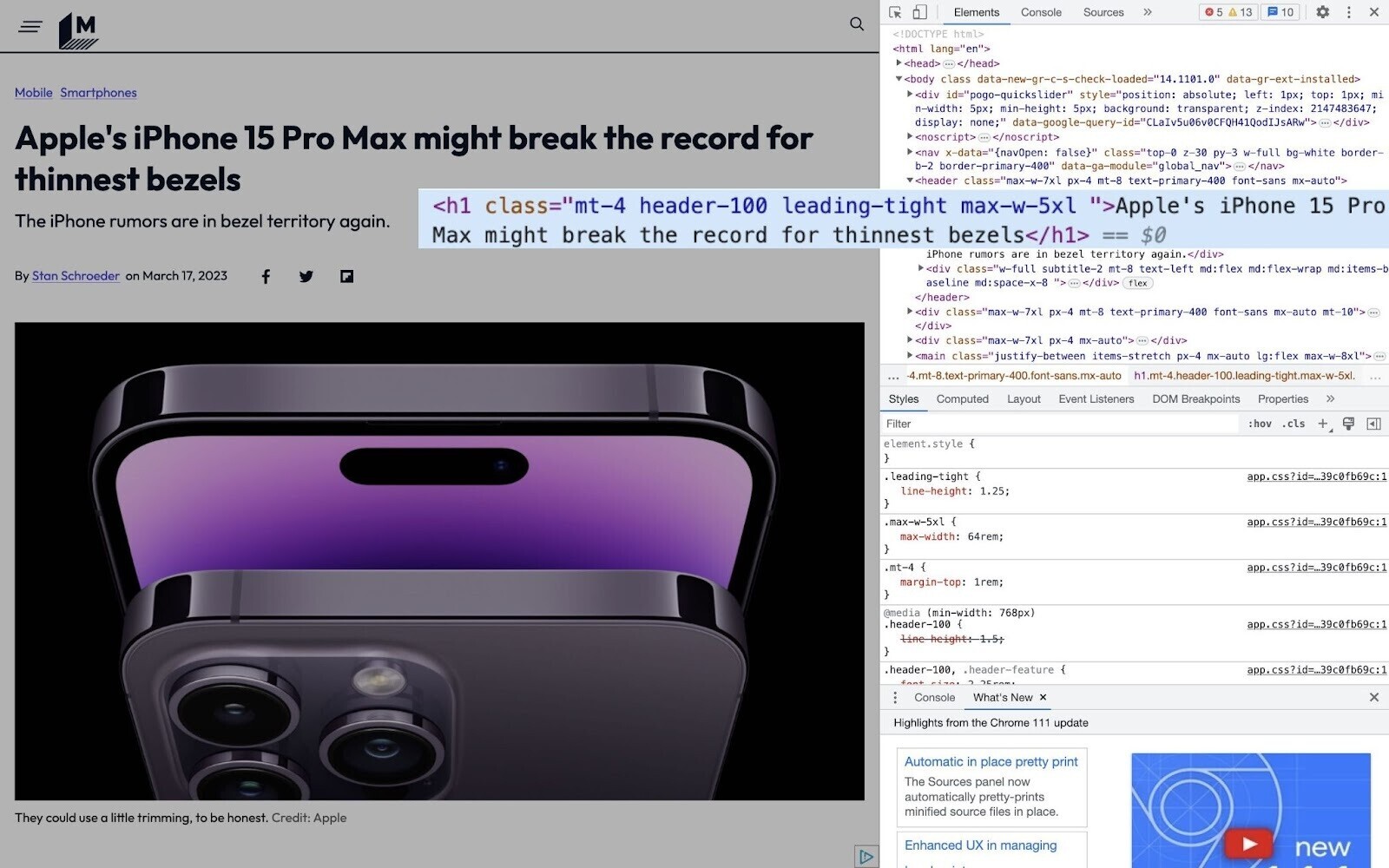
Ensure the heading includes your primary keyword (the main search query you want to rank for).
Tip: Use Semrush’s On Page SEO Checker to ensure your page includes an optimized H1 tag. And to get other SEO recommendations for your page.
Get to the Point
Users should be able to find what they’re looking for quickly and easily. So get to the point as soon as possible. Ideally above the fold.
When building a page, ask yourself the following questions:
- When someone lands on this page, what do they want to achieve?
- How can I help them achieve this goal quickly?
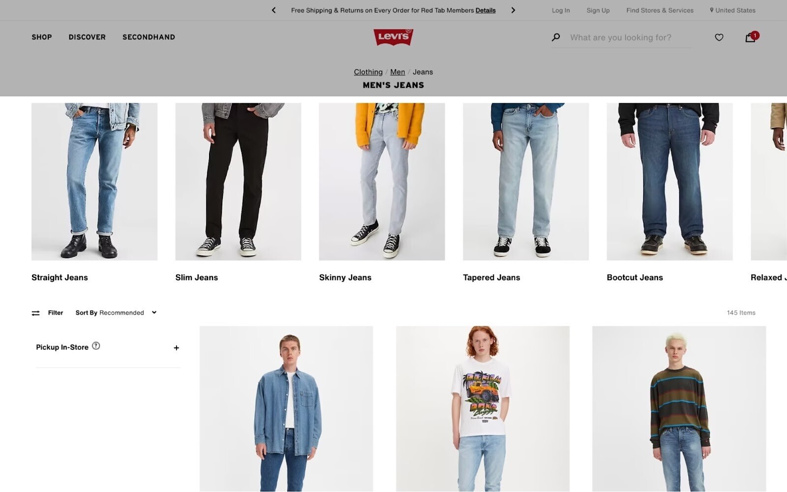
Take the men’s jeans category page on Levi’s site. Shoppers are immediately greeted by various product options and photos.
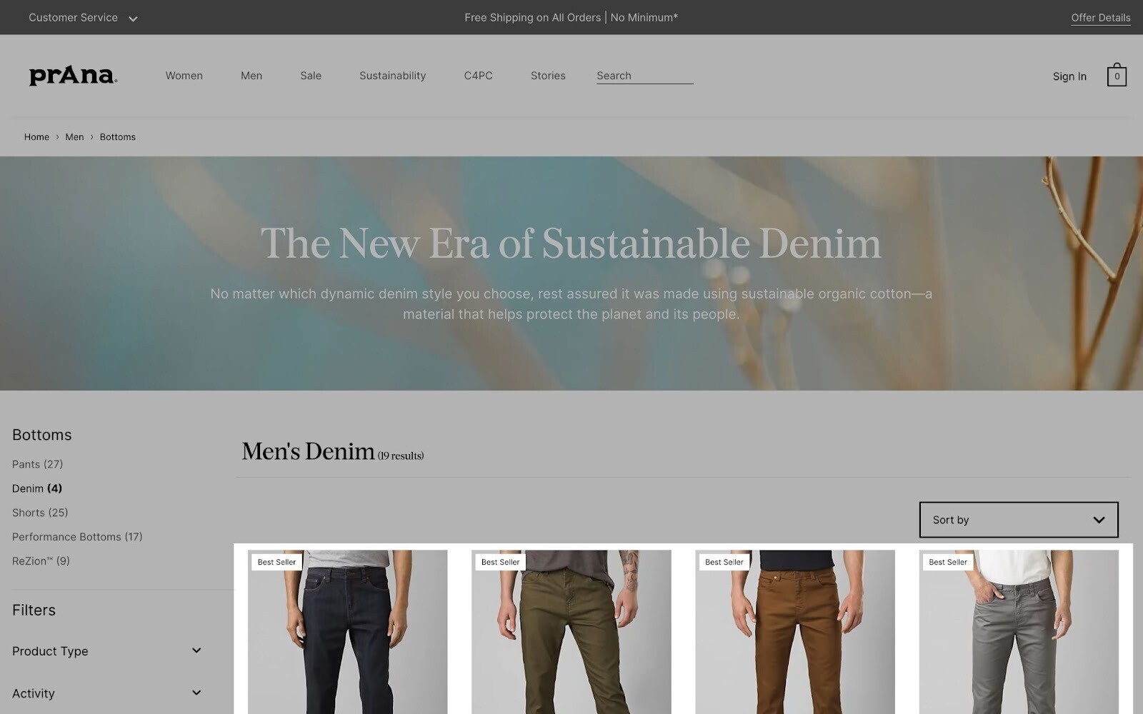
On the Prana website, most of the product images and information sit below the page fold. Users have to scroll to get to the good part. Meaning the page is less likely to grab their attention.
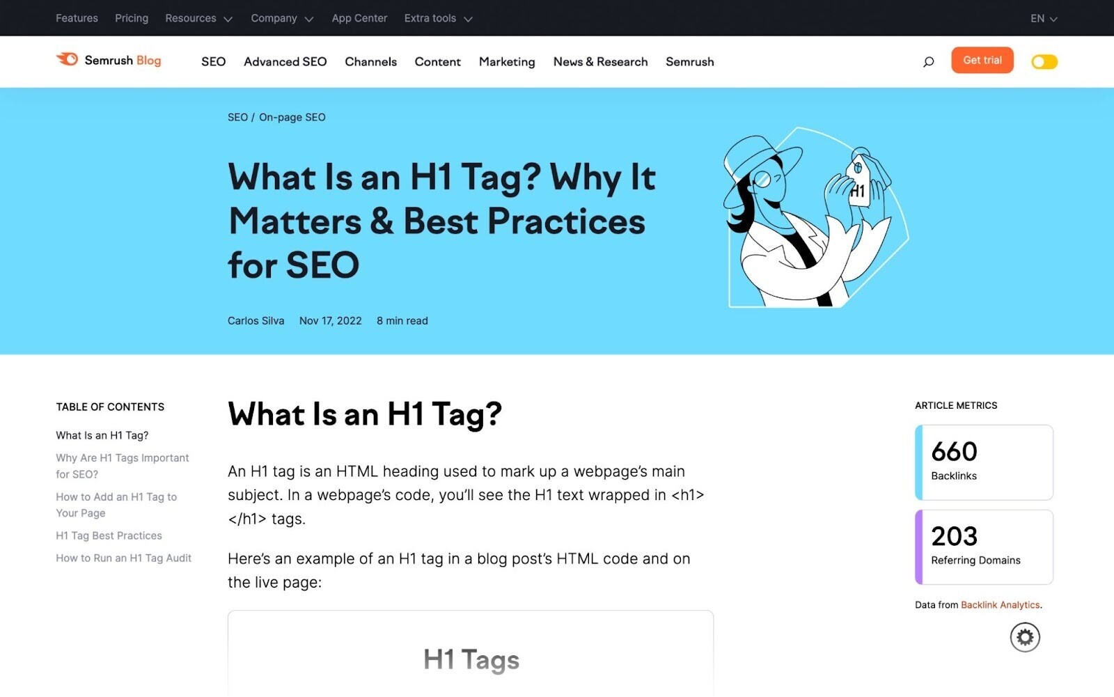
Also consider the Semrush blog template.
The estimated reading time and table of contents set readers’ expectations upfront. And visitors can start reading the article without scrolling past unnecessary visual elements.
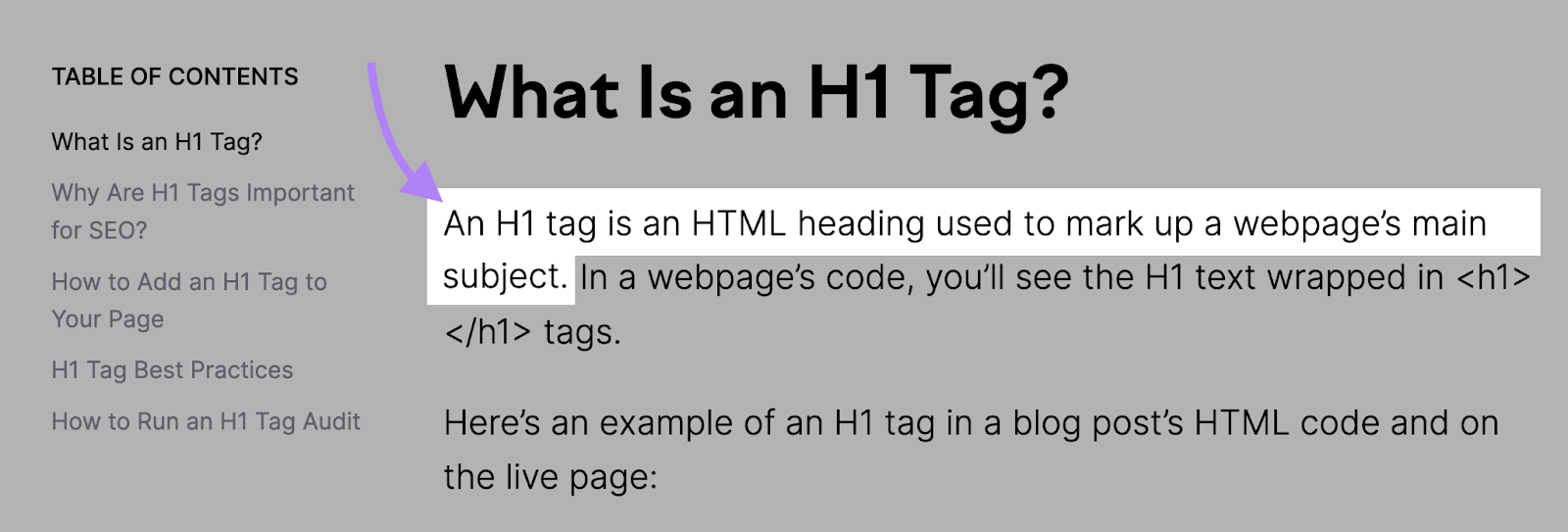
Notice how the writer gets straight to the point, too. This is an SEO copywriting technique known as BLUF (bottom line up front).
Don’t waste space on fluffy introductions. Focus on giving your visitors what they came for.
Tip: Need help writing copy that makes an impact from the start? Check out Semrush’s content writing services.
Balance Ads with Original Content
If you monetize your website with Google AdSense or another advertising program, you might want to display ads above the fold. Where more users can see and click on them.
That’s OK. But it’s important to balance advertising with your own content. If visitors are greeted by large blocks of ads—not what they came for—they might leave your site for a competitor.
Plus, unbalanced ads can harm your above-the-fold SEO. Especially on mobile, where they can take up a larger portion of the screen.
In 2012, Google released a page layout algorithm update that demoted sites using ATF ads “to an excessive degree.”
The announcement said: “If you click on a website and the part of the website you see first either doesn’t have a lot of visible content above-the-fold or dedicates a large fraction of the site’s initial screen real estate to ads, that’s not a very good user experience. Such sites may not rank as highly going forward.”
Google recommends following the Better Ads Standards, which advise against the following mobile web experiences (among others):
- Pop-up ads
- Large sticky ads
- Ad density above 30%
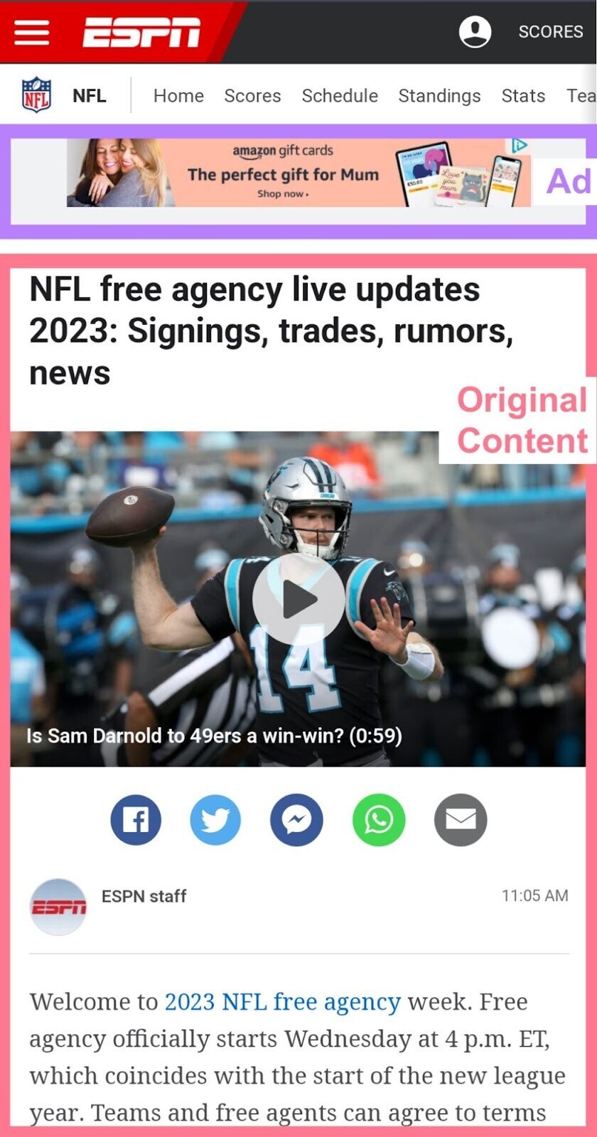
For example, ESPN places mobile advertising above the fold to maximize clicks. But the ad is balanced by a large amount of original content.
Increase Loading Speeds
Your above-the-fold content should load quickly. If users are left waiting too long, they’re more likely to exit your page. Plus, loading speeds impact SEO rankings.
The most important page speed metrics are known as Core Web Vitals:
|
Largest Contentful Paint (LCP) |
The time is takes for the largest image or text block to load |
|
First Input Delay (FID) |
The time it takes for the page to respond to a user’s interaction |
|
Cumulative Layout Shift (CLS) |
A measurement of unexpected movements that occur during loading |
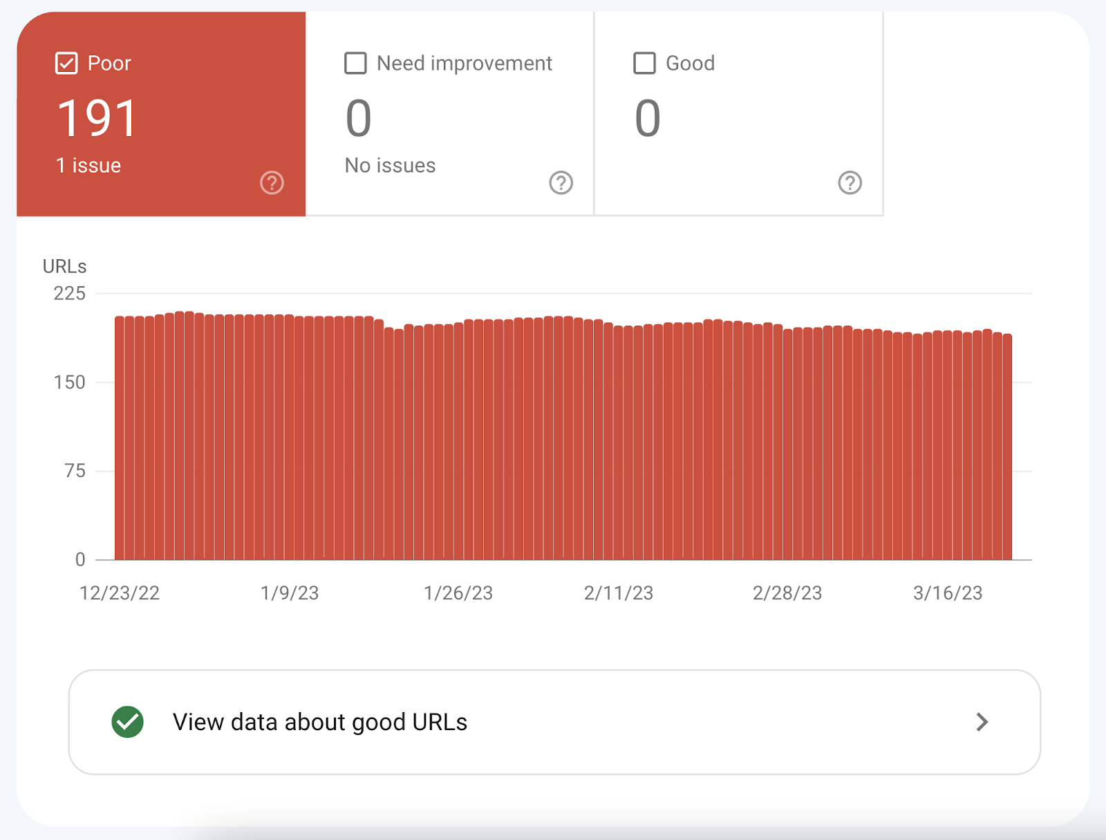
You can check your Core Web Vitals in Google Search Console.
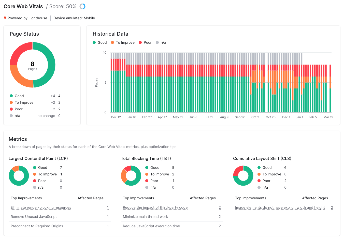
Or use Semrush’s Site Audit tool. The Core Web Vitals report shows key metrics at a glance. And provides detailed recommendations on how to improve.
Below are some best practices for improving ATF load time:
- Structure your HTML: Structure your HTML so ATF content loads first
- Minify HTML, CSS, and JavaScript: Streamline your code so it’s processed more quickly
- Inline critical CSS: Critical CSS is a technique that extracts the CSS for ATF content and places it in the <head> section of the HTML. This can help ATF content load more quickly.
- Optimize images: Resize, reformat, and compress image files to ensure they’re as small as possible—without sacrificing quality
- Preload resources: Use the rel=”preload” link attribute to load top fold elements early in the rendering process
Tip: Read our guide to learn more about page speed and how to improve it.
Make It Look Good
Your ATF content should function properly. But it needs to look good, too. If visitors don’t like what they see, they’re more likely to leave.
Web designs have just 0.05 seconds to make a good first impression, according to a Behaviour & Information Technology study.
Here are some top tips for above-the-fold design:
- Make sure text is easy to read and has a clear visual hierarchy
- Add unique visuals to break up text and aid understanding
- Insert relevant videos and animations to grab users’ attention
- Save space by using recognizable icons—explore options in Google’s Material Symbols
- Use empty space (also known as negative or white space) to prevent your layout from looking cluttered
- Ensure the design complements your brand identity
- Make sure your site meets accessibility guidelines
Tip: Need help from an expert? Check out Semrush’s trusted web design agencies.
Analyze Performance Metrics
Performance metrics tell you what’s working in your above-the-fold design. And what isn’t.
The most important metrics depend on your specific goals. But the ones below are worth considering. And they’re all accessible through Google Analytics.
|
Metric |
Description |
Why It Matters |
|
Bounce rate |
The percentage of visitors who leave the page without taking any action |
Stronger ATF content can decrease bounce rates |
|
Exit rate |
The percentage of visitors who leave your site from the current page |
Stronger ATF content can decrease exit rates |
|
Scroll depth |
The portion of the webpage your average visitor views |
Shows whether your ATF content encourages users to scroll down the page |
|
Goal conversion rate |
The percentage of visitors who take the desired action (e.g., make a purchase) |
Stronger ATF content can increase conversion rates |
|
Organic traffic |
The number of unpaid visits referred by search engines such as Google |
Good above-the-fold SEO can increase organic traffic |
Tip: Read our Google Analytics guide for help getting started.
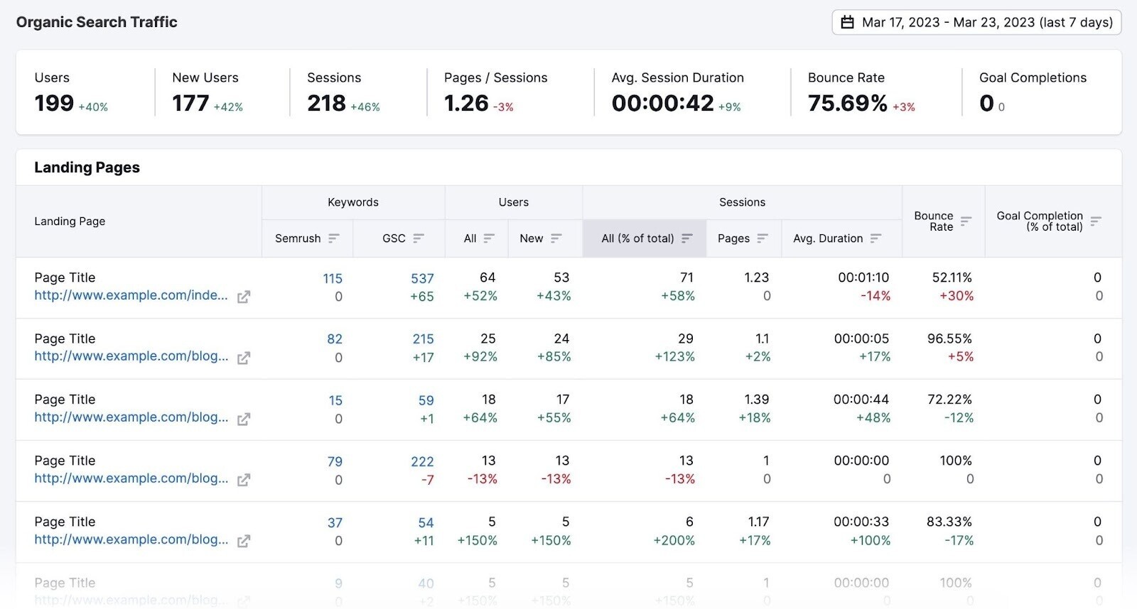
To view key data in one place, connect your Google Analytics and Google Search Console accounts to Semrush’s Organic Traffic Insights tool.
Compare the following metrics (and many more) across your landing pages:
- Number of keyword rankings
- Bounce rate
- Goal completion rate
Above the Fold Website Examples
These above-the-fold examples show best practices in action. Across various types of websites and pages.
Get inspiration for your ATF designs:
Lush
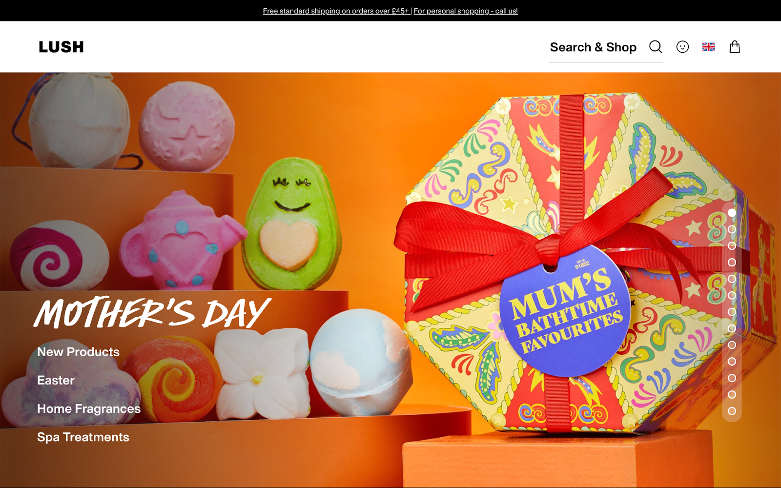
Above the fold on this Lush homepage, a striking product photo grabs users’ attention.
Fun, bold, and colorful, the image is on brand. And it works in tandem with the linked Mother’s Day heading to engage shoppers.
Lush overlays other useful links on the image, rather than using a navigation bar. This helps keep focus on the Mother’s Day campaign. And makes the website header clean and easy to use. Instead, the search bar (complete with suggestions) ensures shoppers can find what they need.
On the right side of the page, circular indicators show there’s more to be discovered below the fold.
Kombu
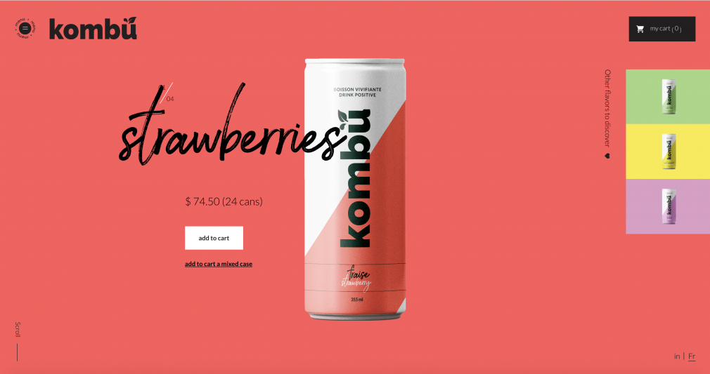
People landing on this Kombu product page have probably tried the drink before. And are ready to place an order. The ATF design is centered on that simple act.
The “add to cart” button appears prominently against a high-contrast background. And the minimalistic layout ensures no distractions.
That said, there is a “Scroll” prompt in the lower-left corner. Letting visitors know they can get more information if they want it.
Tip: See our dedicated guide for more product page examples and best practices.
ESPN
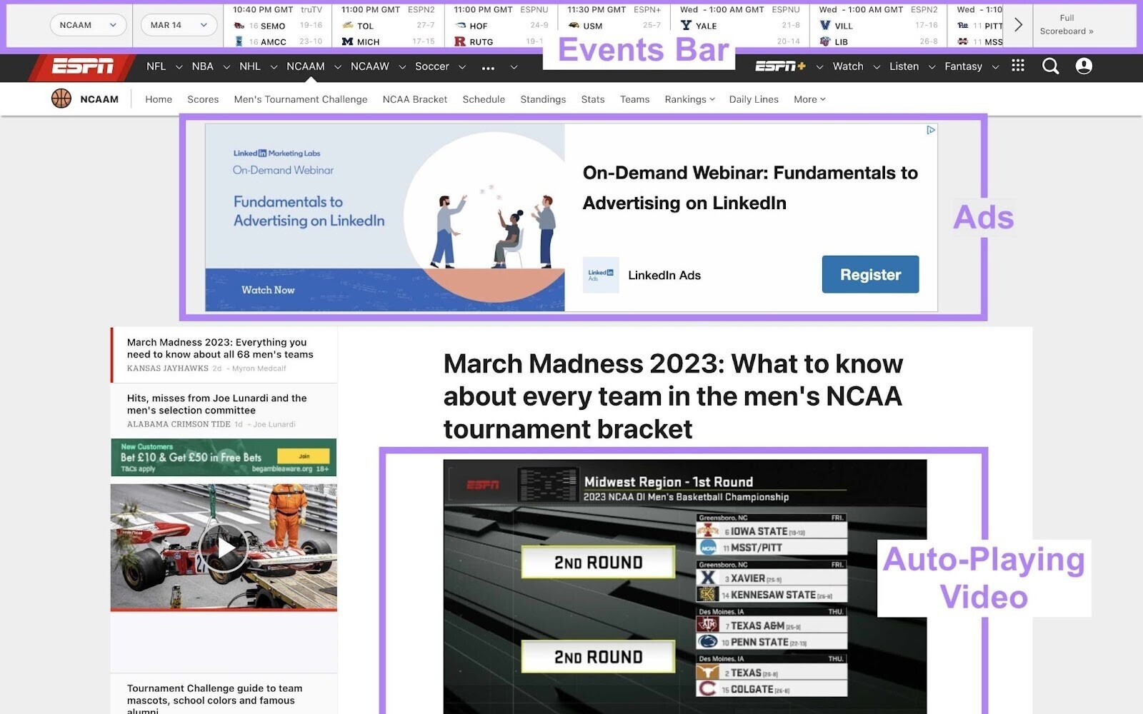
On ESPN’s desktop site, advertising takes up a relatively high proportion of the page. But it complies with the Better Ads Standards for desktop experiences by avoiding pop-up ads, auto-play video ads with sound, countdown ads, and large sticky ads.
One standout element of this ATF design is the “upcoming events” bar. It appears at the top of most pages and automatically updates to the current sport in view.
The events bar delivers valuable information upfront, helping ensure a positive user experience. It also brings together useful links that encourage visitors to remain on-site.
Also note the auto-playing video that starts above the fold. This helps attract users’ attention and encourage them to scroll down. (The sound is muted by default, to ensure compliance with Better Ads Standards.)
Smile Direct Club
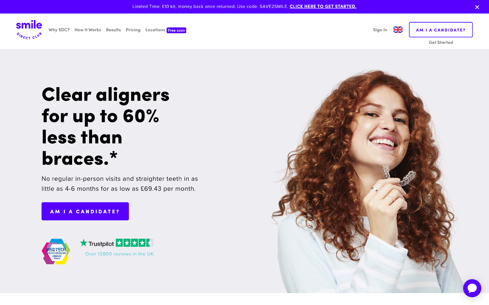
It’s clear that pricing is important to Smile Direct Club’s customers. The ATF banner, headline, and description tackle pricing objections upfront.
The accompanying image showcases the product (clear aligners) and its benefits (straight teeth). While the award logo and Trustpilot reviews build trust.
Notice how the CTA button “AM I A CANDIDATE?” appears twice above the fold. It’s clear to the user what they should do next. And they can start right away.
Visitors who want more information can find key links in the navigation bar. Or open the live chat in the lower-right corner.
Nordstrom
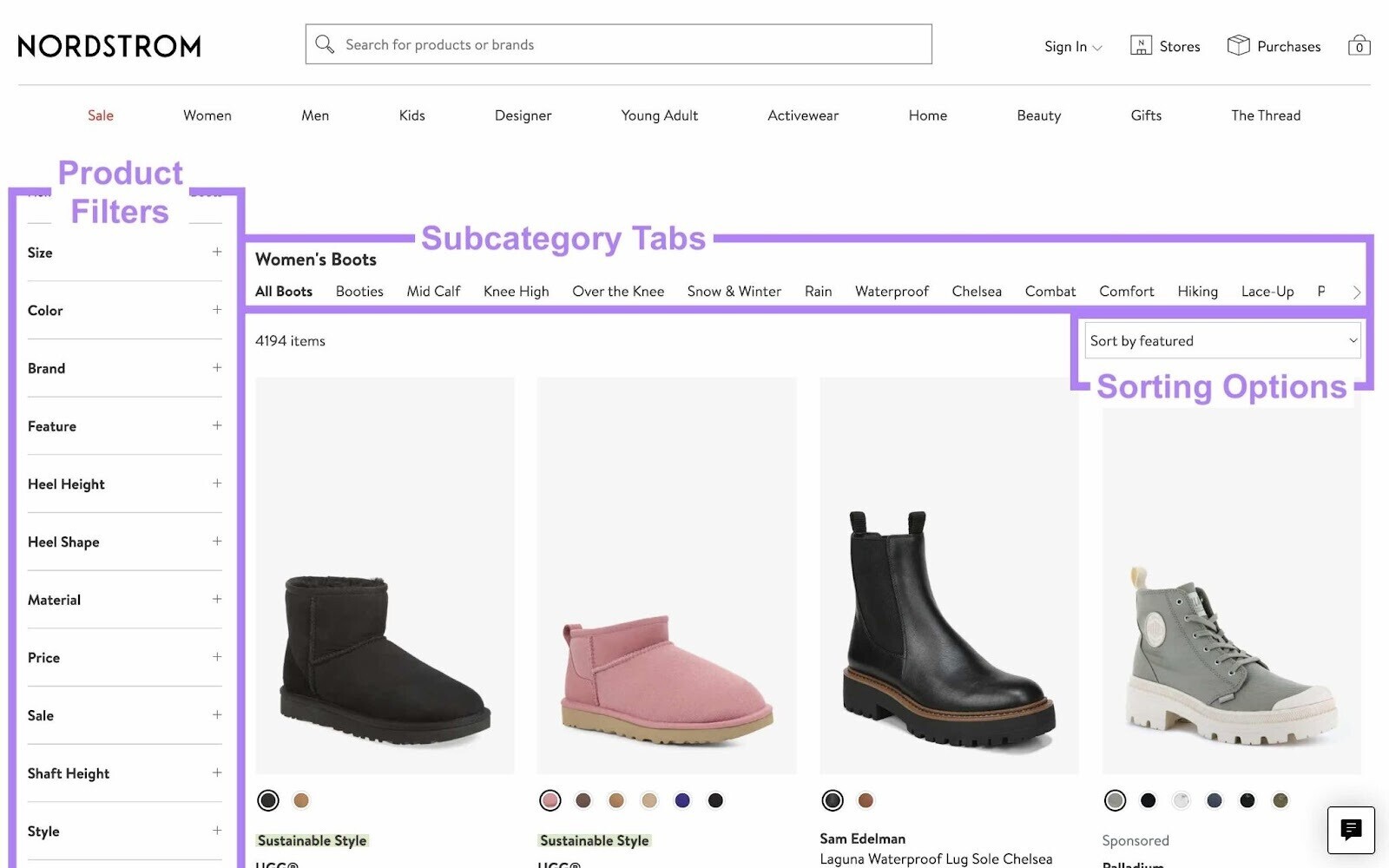
Nordstrom’s product category pages have multiple navigational features above the fold.
Subcategory tabs, such as “Over the Knee” and “Hiking,” give an immediate impression of a vast and diverse product range. Reassuring shoppers they’ll find what they’re looking for.
At the same time, product filtering and sorting options prevent shoppers from feeling overwhelmed. They know the product range won’t be too difficult or time-consuming to navigate.
So, they’re more likely to stick around. And find the perfect product.
Airbnb
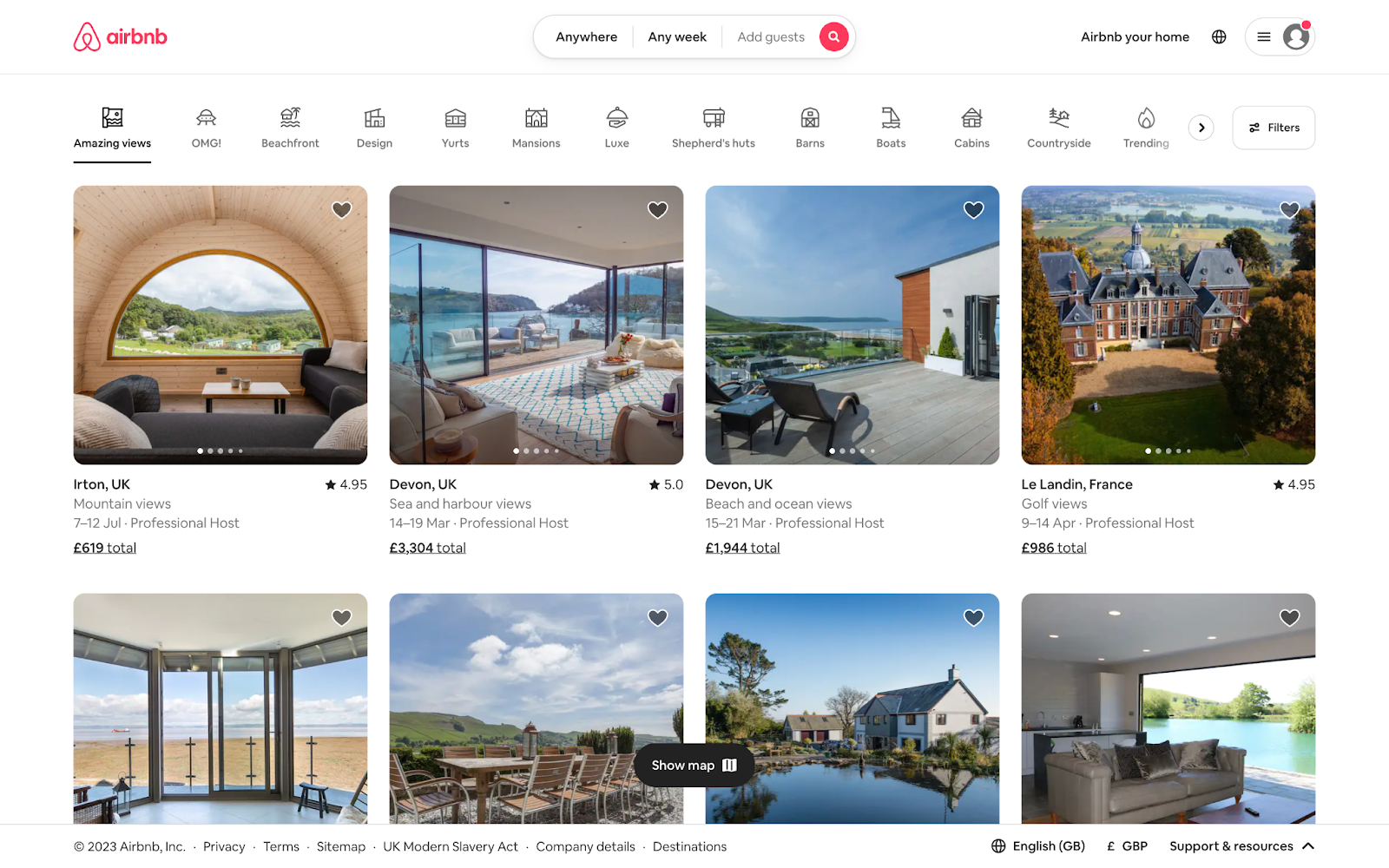
The Airbnb homepage fits essential navigation elements above the fold, encouraging travelers to start their search. Icons make it easy for users to find and visualize accommodation types.
Otherwise, the layout leaves as much space as possible for eye-catching listings from the “Amazing views” category.
Each accommodation preview contains details that matter most to travelers. And entice click-through.
- Photos
- Average star rating
- Location
- Dates
- Host type
- Price
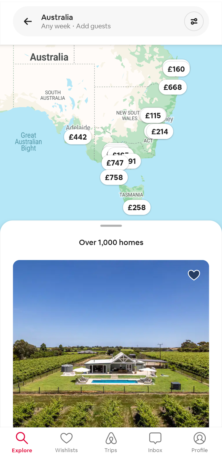
When you search a location, Airbnb ranks results based on quality, popularity, and price. Helping ensure that the most engaging listings appear above the fold.
And a map appears. Whether you’re on desktop, mobile, or the app. Because Airbnb knows locations are crucial to travel-planning users.
Make Improvements with Split Testing
If you update your ATF content, it’s important to compare key metrics before and after. So you can ensure your changes have a positive effect.
Better yet, use split testing (or A/B testing). This allows you to compare two above-the-fold designs and see which performs best, according to real user data.
Here’s how:
- Create a new version of your ATF content (known as the variant)
- Display the old version (known as the control) to half of users and the variant to the other half
- Analyze key metrics over a set time period
- Implement the version that performed best
The SplitSignal app makes it easy to run A/B tests and measure the impact on organic traffic. You don’t need web development or data science expertise.
Source link : Semrush.com
