As the new Web Content Accessibility Guidelines (WCAG) go live this month, a new light is being shined on website accessibility. But in honesty, this is something almost no SEOs think about!
Ensuring your website is accessible to everyone may not be a direct ranking factor. Still, if you’re driving traffic to a website and the users with disabilities can’t access and engage with the entire site, it’s going to impact your SEO efforts negatively.
Over 61 million people have disabilities in the U.S. alone. Therefore, a vast percentage of your target audience will likely benefit from improved website accessibility.
Plus, as more countries worldwide make website accessibility a legal requirement, not meeting government-issued accessibility guidelines could mean a lawsuit that might take down your online business.
As someone whose mother is registered as legally blind, I appreciate the difference website accessibility can make to the quality of someone’s day-to-day life.
In this article, we are going to look at the importance of website accessibility, how it can boost your SEO efforts, as well as what you can do to ensure your site meets the most up-to-**** accessibility regulations.
The Americans with Disabilities Act (ADA) is a civil rights law that came into existence in the 1990s. It aims to protect those with disabilities against any form of discrimination and ensure they have equal access to public life, services, and accommodations. These include:
- Employment
- Transportation
- Public accommodations
- Communications
- Government
In accordance with the ADA national network, a public accommodation is the:
- Retail sector.
- Restaurant industry.
- Hotel industry.
- Facilities dedicated to medical care.
- Library.
- Public park system.
- Area for public use outside the home, school, or work.
The law itself does not specifically mention website accessibility. However, in recent years, there have been a number of public lawsuits around website accessibility and confusion from businesses as to whether the law applies to both physical premises and websites.
In fact, the well-established restaurant Domino’s Pizza even petitioned the Supreme Court to confirm if it needed to “satisfy discrete accessibility requirements with respect to individuals with disabilities” after it was sued by a blind man who could not order a pizza on its website.
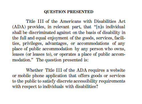
Since then, the U.S. government has issued specific ADA guidance for website accessibility. According to its website, any business open to the public (B2C) or government body (or those funded by the government) must meet ADA regulations as detailed in Title III of the law.
The ADA states:
A website with inaccessible features can limit the ability of people with disabilities to access a public accommodation’s goods, services, and privileges available through that website—for example, a veterans’ service organization event registration form.
For these reasons, the Department has consistently taken the position that the ADA’s requirements apply to all the goods, services, privileges, or activities offered by public accommodations, including those offered on the web.
In today’s world, ensuring a website is accessible to all should simply be good practice. Especially for large corporations with teams of developers and SEOs working together, there is no valid reason not to make website accessibility a priority.
We’re going to look at some of the top reasons to take action and ensure your website is accessible.
Allowing people to live without restrictions
If we think back to the time of COVID-19 when all of us were stuck in our homes for months on end, many of us lived our day-to-day lives online. Whether it be attending Zoom classrooms, ordering groceries, or paying bills.
Being able to easily access the things we need in a time of crisis is something many of us take for granted. However, for someone with a disability, having equal access to public services online can significantly impact their quality of life.
If you cannot leave your home or access websites that allow you to order food, pay a bill, or use a government service like voting, this can prevent you from living a normal life. Not to mention it can also cause a significant amount of stress.
Accessible websites are good for business
One benefit of improved website accessibility is that it is simply good for business. After all, more potential customers using your website can result in more leads and sales.
Web accessibility is a legal requirement in most countries
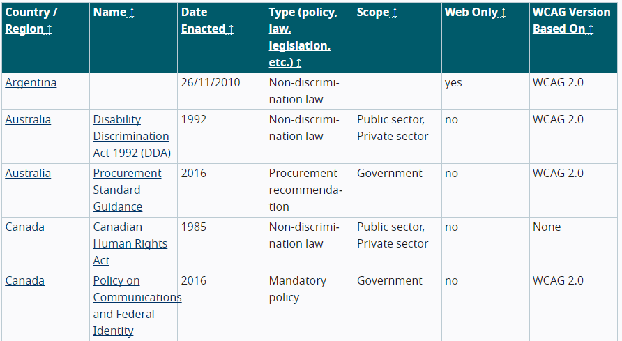
The Americans with Disabilities Act is just the accessibility law covering the U.S. Outside of the U.S., there are several international laws covering accessibility.
In 40 nations, it is necessary to ensure that your website is accessible—from Israel’s Equal Rights of Persons with Disabilities Act to Taiwan’s Web Accessibility Guidelines. There is even a proposed European Accessibility Act, currently drafted by the European Union.
Ensuring a website complies with local regulations can help you avoid facing legal action.
If a website violates the ADA, a person with a disability may file a lawsuit against the site’s owner, which is happening more frequently than ever before.
A little over 800 complaints involving inaccessible websites were filed in federal court in 2017, according to accessible technology company UsableNet. After the release of WCAG 2.1, that number rose significantly to 2,200 in 2018.
Big-name brands and even famous people are not immune to these legal repercussions.
According to reports, Beyoncé Knowles’ firm, Parkwood Entertainment, was served with a class-action complaint alleging that customers who were blind or visually impaired were denied access to beyonce.com’s services—making it in violation of Title III of the ADA.
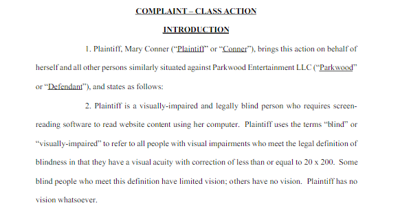
When site users with visual impairments attempted to buy concert tickets on Beyonce’s website, they found that images had no alt text, the website did not have keyboard access, and drop-down menus were not accessible.
Several other well-known brands, corporations, and institutes have been subject to high-profile ADA compliance lawsuits, including Nike, Burger King, Fox News, and even Harvard.
The number of accessibility lawsuits is increasing yearly. With the publication of WCAG 2.2 in April 2023, we’ll probably observe a sizable increase yet again.
Web Content Accessibility Guidelines (WCAG) are regulations that offer guidance to ensure all aspects of website features and web applications are accessible.
Currently, WCAG 2.1 guidelines released in June 2018 are in use and are intended for:
- Web content developers (page authors, site designers, etc.).
- Web authoring tool developers.
- Web accessibility evaluation tool developers.
- Others who want or need a standard for web accessibility, including mobile accessibility.
WCAG 2.2 standards are still in the development stage and won’t be complete until April 2023. However, despite this, WCAG 3.0 has already been drafted, albeit it won’t be made public for a while.
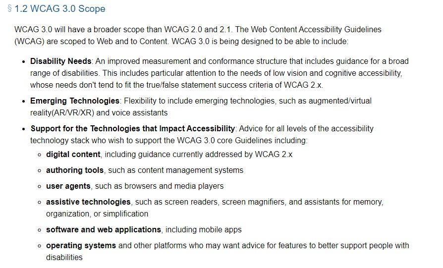
But keeping up with the most recent drafts of the WCAG rules and keeping track of any planned modifications or additions can assist you in ensuring your website continues to adhere to accessibility requirements.
The WCAG is divided into three levels of conformance. Each level is based on how they impact the design or appearance of the pages to meet the needs of different individuals and situations.
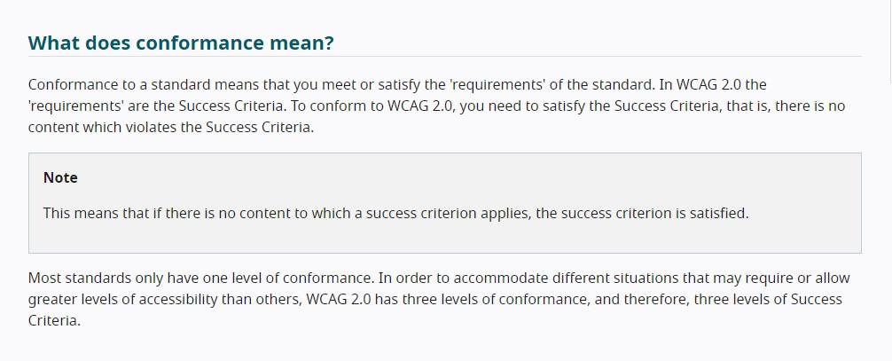
Let’s look at the basics of the three levels of compliance and what they include. We’ll look at the aspects that are important for SEOs in detail later.
Level A
This is the lowest and least complicated level of conformance to obtain. Level A does not provide a broad level of accessibility and sets an absolute minimum level of accessibility.
The following are some notable WCAG 2.0 Level A requirements:
Level AA
Regulations or legal settlements usually adopt or negotiate this level as a target conformance level. It sets a level of accessibility for all users, including those using assistive technology.
Level AA requirements of WCAG 2.0 include these:
- A minimum contrast of 4.5:1 (3.1 in the case of large text)
- For images that convey meaning, alt text must be used
- No or low background audio
- Site navigation consistent throughout
- Clearly labeled form fields
- Headings arranged logically
Level AAA
All three success criteria are met at this conformance level, which is the highest level achievable. If some content cannot satisfy all Level AAA Success Criteria, full AAA compliance is not achievable.
Below are a few noteworthy requirements for WCAG 2.0 AAA:
Although Level AA compliance criteria are thought to be reasonable, ensuring your website complies with level AAA will help you maintain accessibility standards going forward and make your website accessible to everyone.
WCAG compliance is the best way that digital marketers can ensure they are complying with local accessibility laws and avoid legal repercussions. Generally, WCAG-compliant websites should have a clear goal, speedy loading times, simple navigation, and user-friendly language.
These are all essential elements of UX design, which aids users of search engines in finding the information they want. You should improve the UX of your website to provide consumers with the greatest experience possible.
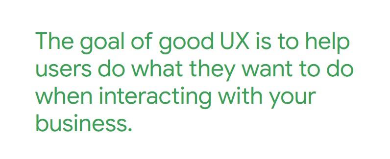
Every company, from large corporations to startups, ought to strive to be compliant with the law and have websites that are WCAG-compliant.
The United Nations states: “Access to information and communications technologies, including the Web, is defined as a basic human right in the United Nations Convention on the Rights of Persons with Disabilities.”
The negative impact of inaccessible websites means that many disabled people lose the ability to perform actions that many people may take for granted, such as handling their accounts, obtaining work, or accessing the internet in general.
As mentioned, website accessibility is not a direct ranking factor. However, accessibility issues affect user experience. From the Page Experience Update in March 2022, we know this is of the utmost importance to Google.
John Mueller also previously commented that poor web accessibility might negatively impact other signals, which could result in a site being less visible in search:
In general though, when sites are hard to use, people steer away from them anyway, so over time things like recommendations and other signals tend to drop away, resulting in the site being less visible in search too.
Plus, considering many of the elements that cause accessibility issues also happen to be aspects we look at to improve technical SEO health, there is a significant amount of crossover between the two.
Navigation
Effective navigation is beneficial for both accessibility and SEO. People with disabilities can utilize websites more easily when the navigation is simple and straightforward.
Well-organized navigation can also facilitate crawlers’ understanding of a website’s content and structure and, thus, may improve a website’s position on the SERPs.
Links and breadcrumbs are examples of navigational components that can be included, depending on the page’s content.
Consistent navigation is a level AA requirement for the WCAG. That means, using the same elements repeatedly throughout the site.
This can include a “skip to content” button at the beginning of each page (like a “skip to recipe” button on a food blog) and ensuring menus and submenus are in the same positions on each page.
A navigation element with the label “breadcrumb” defines the structure as a breadcrumb trail and designates it as a navigation landmark to make it simple to find.
It helps users to navigate where they are on a website, as well as how far away from the homepage. It looks something like this:
Home > Blog > Technical SEO > How to Do a Technical SEO Audit
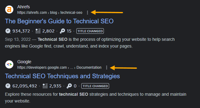
Breadcrumbs also help search engines navigate a website and categorize its pages. Google also displays breadcrumbs in search results.
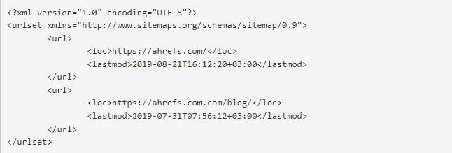
Sitemaps
Sitemaps help both users and search engines navigate your website. Especially for users with disabilities, sitemaps help them find the pages they need to access more easily.
The World Wide Web Consortium states:
The sitemap serves several purposes.
- It provides an overview of the entire site.
- It helps users understand what the site contains and how the content is organized.
- It offers an alternative to complex navigation bars that may be different at different parts of the site.
Titles and headings
Screen readers use title tags to offer users an overview of a page’s content when it first loads. Additionally, they provide page summaries and nudge visitors to click through tabs and search engine results.
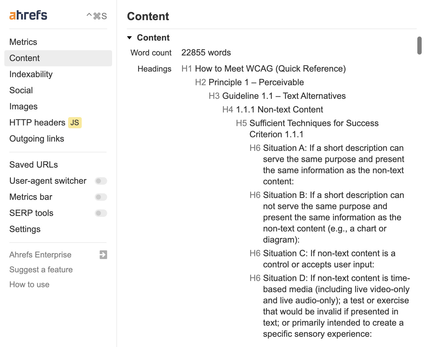
Make your information easier to read for users with screen readers by using headers appropriately. Make use of the right header tags (e.g., H2, not just bigger or bolder text).
A logical hierarchy should be observed while using cascading headers, with H1s coming before H2s, H3s after H2s, and so on. Both visitors and search engines can then easily comprehend the content’s structure.
A great tool to help with this is Ahrefs’ SEO Toolbar, which allows you to see the page title, content length, and headings (as well as the hierarchy) directly on any page.
Internal links
Anchor text is clickable text used to build links to other webpages. Users must understand what to anticipate when they click a link. For accessibility, a precise description is essential.

Search engines may evaluate the content of a linked website with the help of the anchor text. Anchor text aids in your understanding of the website’s structure, page layout, and keywords.
Alt text
Alt text allows screen readers to comprehend what a picture implies. Additionally, alt text helps search engines understand the content of photos, improving a page’s SEO and enabling images to appear in image results pages, which can increase traffic to your website.
To make your website accessible, you need to be able to run an accessibility audit.
Many of the key elements for SEOs that we have discussed can be assessed using Ahrefs’ Site Audit. The tool will show issues for:
- Sitemaps
- Robots.txt
- Internal linking
- Headings
- Titles
- Alt text
Of course, if you want to perform a detailed accessibility audit so you can forward accessibility-specific issues to a developer, there are several tools that identify which SEO elements can be improved to make your site more accessible.
Audit your accessibility with the Accessibility Checker
Start by heading over to the Accessibility Checker. Enter the website you want to audit and select the country you want to comply with.
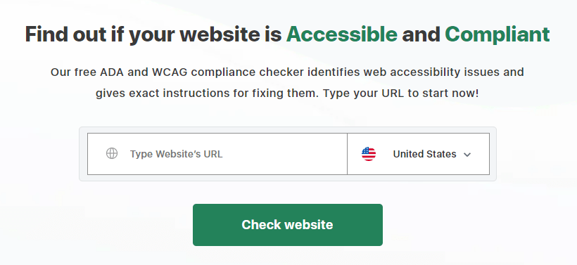
Once you’ve done that, it will take about 30 seconds to run the audit and bring up your results.

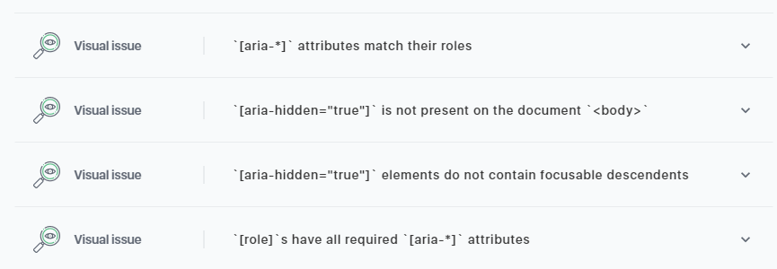
Below this, it will give you a breakdown of any critical issues and how to fix them. You can also download the report to work on later or forward to a developer.
Check accessibility with Google Lighthouse
Along with security and SEO, Google Lighthouse examines a site’s accessibility and Core Web Vitals.
Page titles and the color contrast between the background and the foreground are two accessibility criteria. The title tags, link names, and scalability of the viewport are also included.
Some Lighthouse Accessibility standards that aren’t accessible for automatic assessment can also be checked manually. Lighthouse may be used in various ways, including as a free Google Chrome plugin so that both technical and non-technical people can utilize it.
You can easily access a Google Lighthouse – accessibility audit directly in Google Chrome by either right-clicking the page and selecting “Inspect” or pressing F12 on your keyboard.

Then, in the developer tools window, navigate to the “Lighthouse” tab.
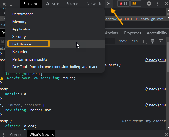
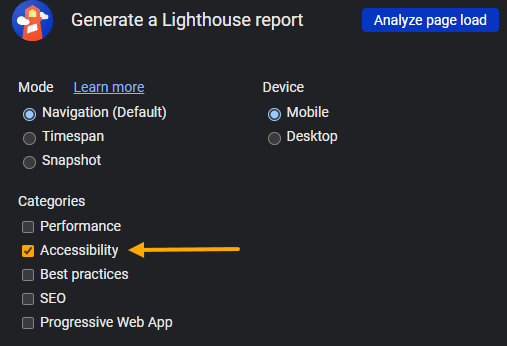
Adjust your Lighthouse settings and choose to audit only “Accessibility” and then “Analyze page load.”
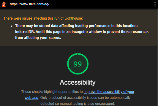
Lighthouse will then analyze the page and give you a score out of 100, as well as a list of issues.
Use WAVE’s accessibility evaluation tool
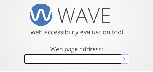
Wave’s accessibility evaluation tool gives you a detailed breakdown of the accessibility issues your website faces and is great to use in addition to the Accessibility Checker and Lighthouse.
Start by heading over to the WAVE website and entering the website address of the site you want to audit.
When the audit is complete, the audit overview will open in a docked window.
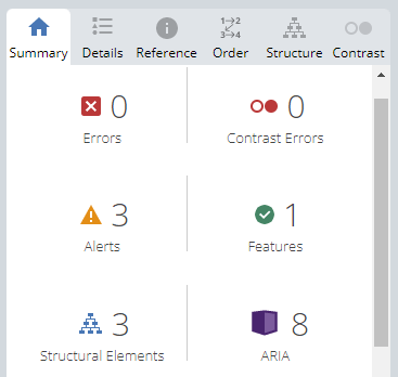
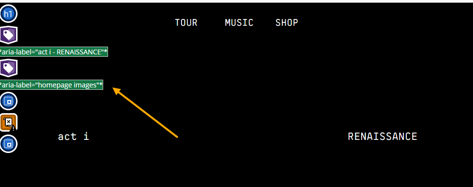
You can expand the different issues to give a detailed breakdown. The nice thing about Wave is if you click on an issue in the report, it will highlight it directly on the page. For example, highlighting exactly which images are missing alt text or links without descriptive text.
Plugins and widgets that test and improve accessibility
It may take considerable time and effort to make your website accessible. But you’re in luck if you use WordPress as your content management system.
At the very least, WordPress accessibility plugins can point you in the right direction when it comes to making your site accessible. Some can even help you make changes without the assistance of a developer.
I’ve listed three of my top choices below (you only need one).
WP Accessibility
Many common accessibility problems in WordPress themes can be resolved using the WP Accessibility plugin. The accessibility-enhancing features of the free plugin may be enabled or disabled by administrators without writing any code.
Color Contrast Tester allows you to compare the contrast between two colors. Using the plugin, you can also distinguish between photos without alt text.
One Click Accessibility
WordPress site administrators can set up and maintain accessibility settings with One Click Accessibility. The plugin brings up an accessibility menu at the side of the screen that website users can utilize for different accessibility functions.
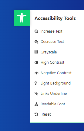
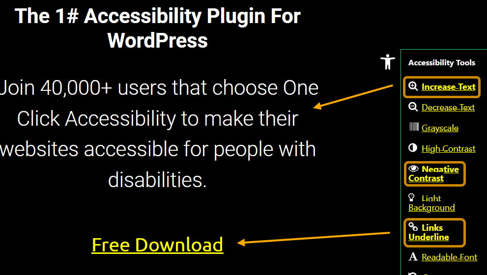
ARIA (Accessible, Rich, Internet Applications) landmarks, outline emphasis, target characteristics for links, and skip links are a few of its helpful features. It also enables you to create sitemaps, underline links, use negative contrast, and scale fonts.
WP Accessibility Helper
By addressing issues with font size, contrast, and alt text, the WP Accessibility Helper can help to make your website more accessible. You can simply use the toggle buttons to turn on the options you want.
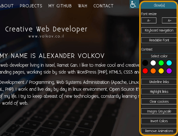
You can customize your front-end accessibility sidebar by using WP Accessibility Helper’s pro edition. It’s simple to adjust the font size, color, and other features.
ADA Okay!
ADA Okay is a premium tool that uses an onsite widget that site users can control to make your website accessible.
I’ve personally added ADA Okay to dozens of small business sites, and it has always worked perfectly simply by copying and pasting a short piece of code into the website’s footer.
By presenting an accessibility menu in a tiny pop-up (similar to a chat widget), ADA Okay works to increase accessibility and guarantee that your website complies with ADA standards.
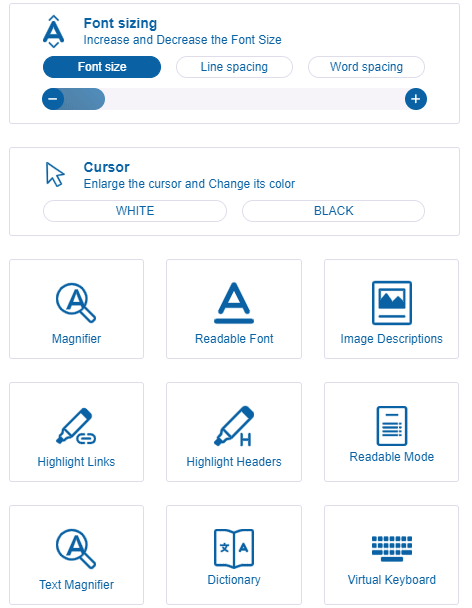
A website user can alter the text’s size and color, expand the cursor, and highlight links using the menu. You can also disable functions like autoplay and other animations that may trigger seizures.
Final thoughts
Website accessibility is not only a legal requirement, but it is also an extremely important aspect in ensuring people with disabilities can live a normal day-to-day life.
As SEOs, we can contribute to improved accessibility by ensuring the technical and on-page aspects that promote accessibility are properly implemented and maintained.
By doing so, you can improve the ROI for your clients by ensuring their website is accessible to every potential customer and prevent them from being subjected to an accessibility lawsuit.
Got questions? Ping me on Twitter.
Source link : Ahrefs.com
