What Is a Banner Ad?
A banner ad is a type of display ad (visual online advertisement) that’s placed in a prominent webpage location with the aim of drawing users’ attention. Often to generate clicks.
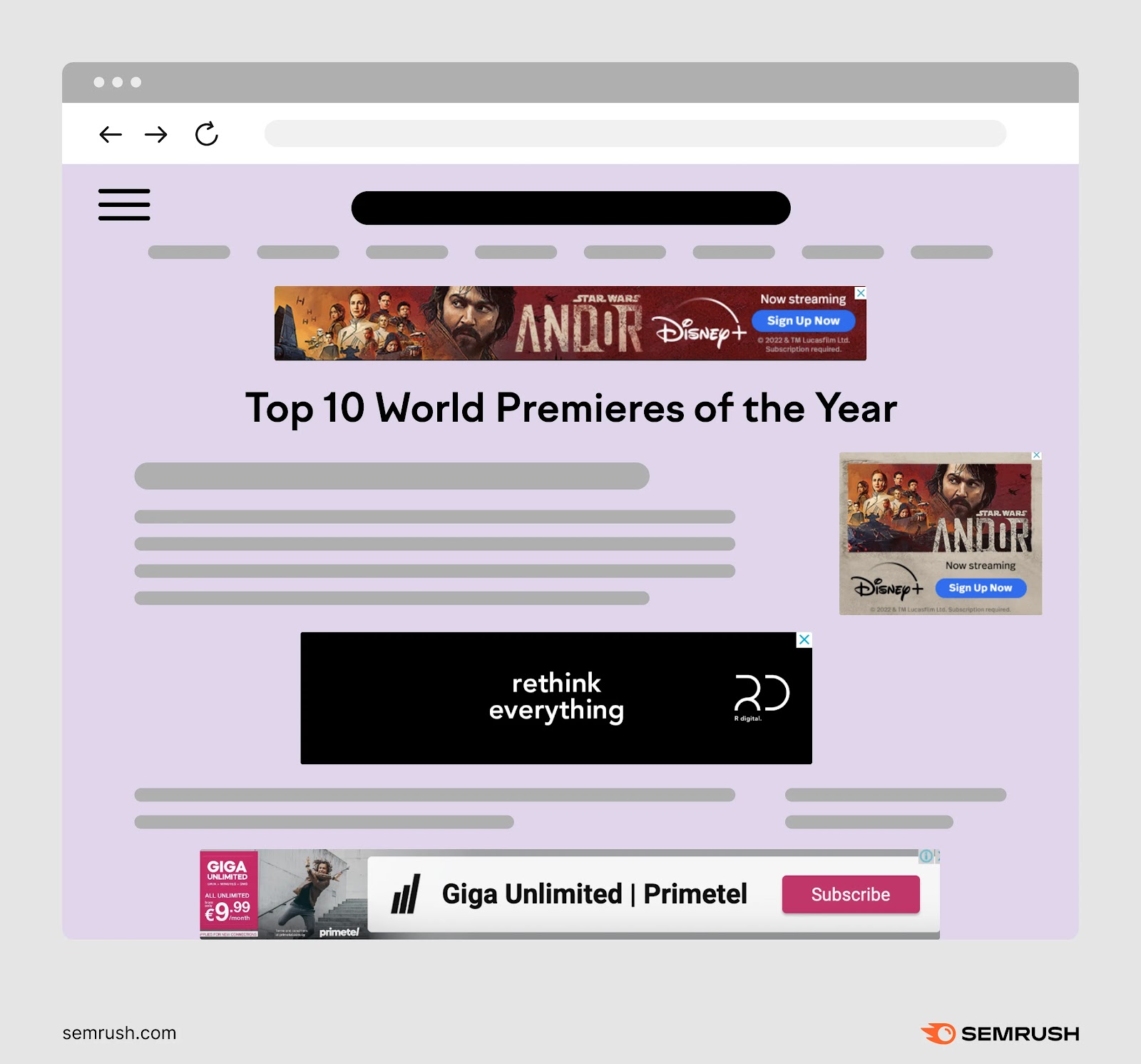
On ad-supported websites and apps, you may find banner ads:
- Near the top of the page but below the website header
- In the sidebar (particularly the right-hand sidebar)
- Interspersed within the main content
- Fixed to the bottom of your browser window
Like this:
Banner ads are designed to send traffic to landing pages or other important webpages (like product pages). And generate conversions (desirable actions). Such as purchases, form submissions, or app downloads.
But they’re also good for raising brand awareness.
How Does Banner Advertising Work?
Banner advertising works by matching publishers who want to monetize their websites with advertisers who want to reach the publishers’ audiences.
Many businesses use digital advertising platforms to distribute ads through groups of websites called display networks.
For example, Google Ads allows you to advertise on the Google Display Network. This includes 35 million digital properties, but using targeting tools lets you limit where you’ll appear to ensure relevancy.
You might recognize the icon that accompanies Google banner ads:

Some other digital ad platforms include:
- Meta Ads, which allows you to run banner ads on Facebook, Instagram, Messenger, and the Meta Audience Network
- Microsoft Ads, which allows you to run display ads on Microsoft properties (like MSN and Outlook) and the Microsoft Search Network
- Amazon Ads, which allows you to run display ads on Amazon and other sites
- Epom, which allows you to serve responsive ad banners, in-app banners, and other formats across various channels
The platform you choose determines where you can advertise, what types of ad formats you can use, your audience targeting options, and much more. So, it’s important to do your research.
Alternatively, you can purchase direct ad placements. By negotiating with publishers directly.
For example, ScreenRant has contact forms for ad inquiries:
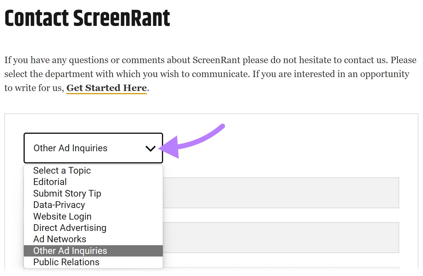
This is helpful if you want to reach a highly specific audience. But it’s difficult to scale your advertising with this method.
Further reading: What Is Google Ads & How Does It Work? A Comprehensive Guide
Banner Ad Pricing
These are the most common banner ad pricing ****** used by display networks and publishers:
|
Cost per mille (CPM) |
Pay for every 1,000 impressions (views) of your ad. This is a good option if your main goal is improving brand awareness. |
|
Cost per click (CPC) |
Pay based on the number of clicks your ad gets. This is a good option if your main goal is generating traffic. |
|
Cost per action (CPA) |
Pay based on the number of ad clicks that generate conversions. This is a good option if your main goal is generating sales, leads, app installations, etc. |
|
Flat rate |
Pay the same amount regardless of the ad’s performance. If the publisher wants a guaranteed income, they may offer a favorable deal. |
|
Hybrid |
Pay based on some combination of metrics. For example, you may pay a CPM rate as well as a bonus for each conversion. |
In many cases, you’ll buy website banner ads programmatically.
This means that you and other advertisers will engage in an automatic auction when ad space becomes available. It involves you setting a maximum bid on the ad space.
Should you win, the amount you pay will depend on your bid, the publisher, the type of ad space you’re buying, the level of competition, the campaign period, and various other factors.
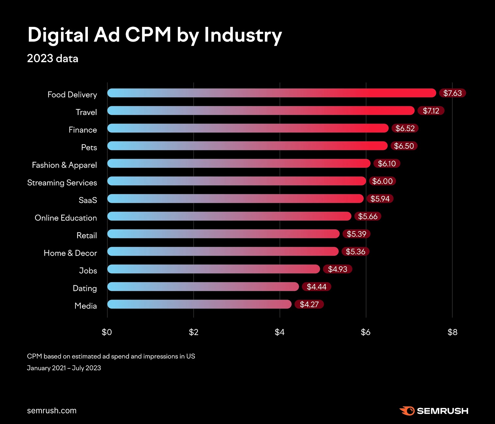
To get a general idea, take a look at these CPM benchmarks:
7 Banner Ad Examples
Below, we’ve rounded up some banner ad examples to inspire you.
If you’d rather spy on your competitors’ banner ads to start getting ideas, use the AdClarity app.
Add the advertiser you’d like to analyze and select the “Display” channel.
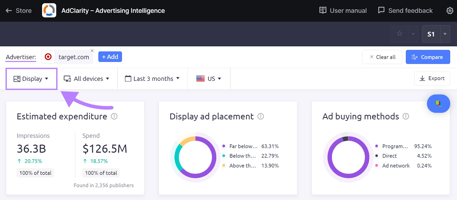
Scroll down to “Top Ads” to see which of their ads received the most impressions.
You’ll also see the following:
- Actual ad creative
- Ad type (static banner ad or animated banner ad)
- First seen ****
- Total spend
- Total impressions
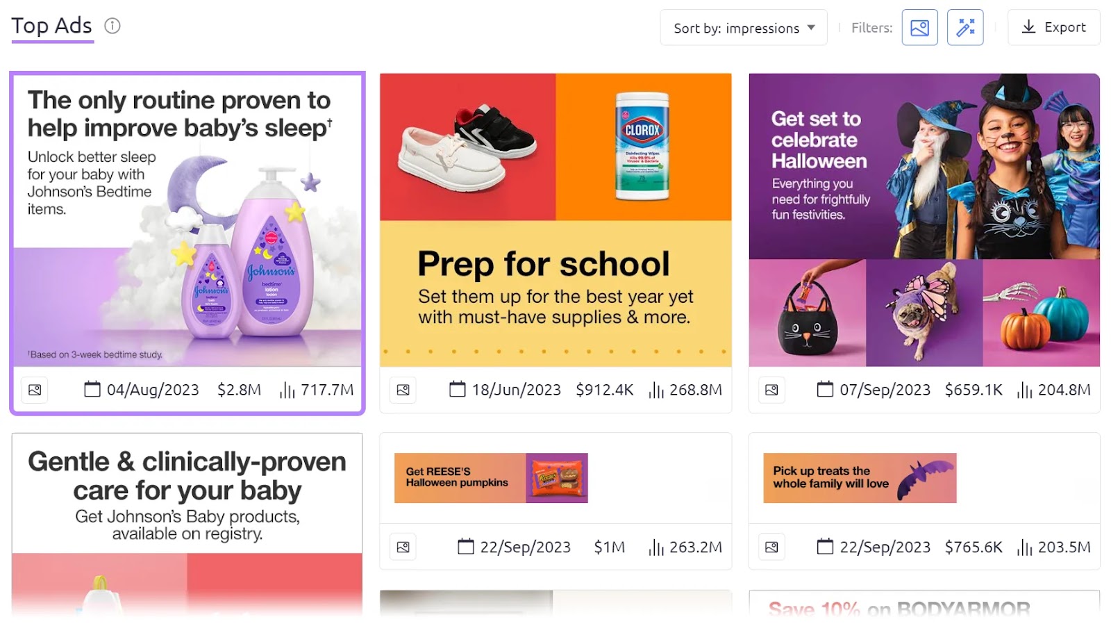
Click through any ad for more details.
For example, you can open up the campaign landing page. And see which publisher generated the most impressions.
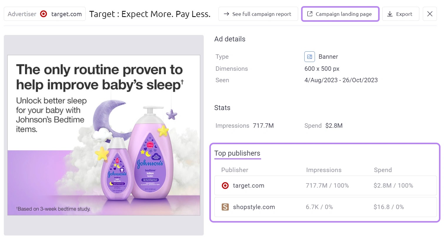
Now, on to the examples.
1. Amazon Music
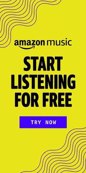
This vertical banner ad for Amazon Music received 2.4 billion impressions in the U.S. from August 2023 through October 2023, according to the AdClarity app.
Its bright yellow background captures users’ attention. While a complementary purple draws attention to a “Try Now” call to action (CTA).
Note that this CTA is made to look like a button. Providing a visual cue for users to click.
Amazon also features its logo prominently to capitalize on brand recognition. And immediately explain what’s being advertised.
Meanwhile, a bold slogan clearly communicates a key user benefit: “Start listening for free.”
2. Nike
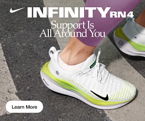
Although small (300 x 250 px), this Nike banner ad communicates key product benefits.
The photo clearly demonstrates that the sneaker is made for road running. And the slogan suggests an emphasis on comfort and safety.
Plus, the “Learn More” CTA implies that there are more features to discover. (And feels less pushy than a “Shop Now” button.)
3. Slack
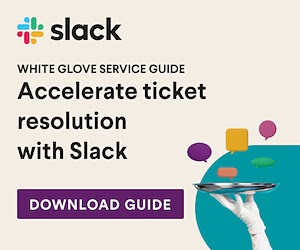
Slack’s static ad is designed to generate leads.
Rather than telling users to buy something, it encourages them to download a helpful guide.
Plus, the campaign landing page perfectly aligns with the banner ad design. And encourages users to submit their information.
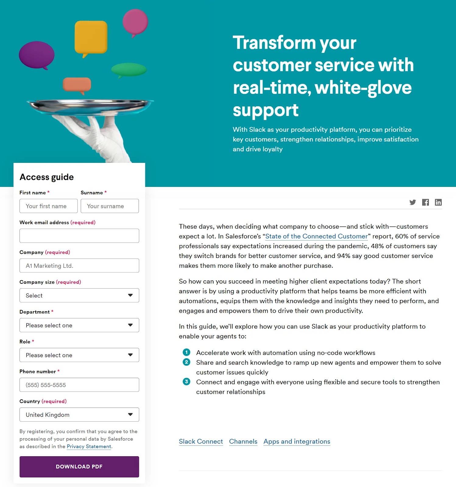
This is a great way to target users who are higher up in the marketing funnel.
4. Murray’s Cheese

Murray’s Cheese uses an animated ad banner to showcase a variety of products. Movement also helps to capture attention and encourage interaction.
The ad emphasizes the ability to buy online (“one click away,” “Shop Murrary’s online”), as many consumers are likely used to buying cheese in-store.
Murray’s also uses the opportunity to build brand awareness. With a prominent logo, a brand mention in the CTA, and an on-brand color scheme.
5. Google Chrome

This horizontal banner ad looks similar to a dialog box or warning message you’d get on a website.
Not only does this grab users’ attention, but it also creates a sense of urgency and importance. Which may prompt users to take action (i.e., download Google Chrome).
We also like how the ad copy anticipates a common objection: What if it doesn’t work on my device?
6. Yahoo Mail

Yahoo Mail first launched this ad in 2019, but still used it as of the time of this writing, according to AdClarity.
This suggests that well-designed ads can deliver long-term results.
What we like most about this banner ad is its slogan. It taps into a common pain point: difficulty searching for emails.
The ad also uses creative imagery to provide visual interest.
7. Capital One Shopping

Capital One Shopping advertises its coupon-finding extension on sites where coupons are available (like Kohls and Target).
By targeting shoppers who are most likely to benefit, the advertiser can maximize their click-through and conversion rates.
Plus, the capitalized text, red and white color scheme, and cut lines make the banner ad look like a traditional coupon. This clearly signals that there’s a deal available. And helps attract cost-conscious consumers.
How to Create Banner Ads that Convert
There are many steps involved in planning, creating, and launching a banner ad campaign.
Here, we’ll take you through the standard process. And share a number of best practices.
Step 1. Define Your Advertising Goals
Clearly defined goals provide direction for your banner ad campaign. And allow you to measure its success.
First, decide how much you’re willing to spend. It’s a good idea to spend conservatively at first, then increase your budget as you determine what works.
Next, decide your main goal.
- If your focus is conversions, set a cost per action (CPA) limit. This is the amount you’re willing to spend on getting a lead, user, or customer.
- If your focus is traffic, set a cost per click (CPC) limit. This is the amount you’re willing to spend for each click on your ad.
- If your focus is brand awareness, set a cost per mille (CPM) limit. This is the amount you’re willing to spend per 1,000 impressions (views) of your ad.
This method helps you stay on budget and achieve a positive return on ad spend (ROAS).
Step 2. Decide What to Advertise
At this point, you need to decide exactly what to advertise on your banner ad. And choose (or create) a suitable page to link to. This is often (but not always) a landing page.
The best choice depends on your main goal. But you should also take business metrics, industry trends, audience needs, and other factors into account.
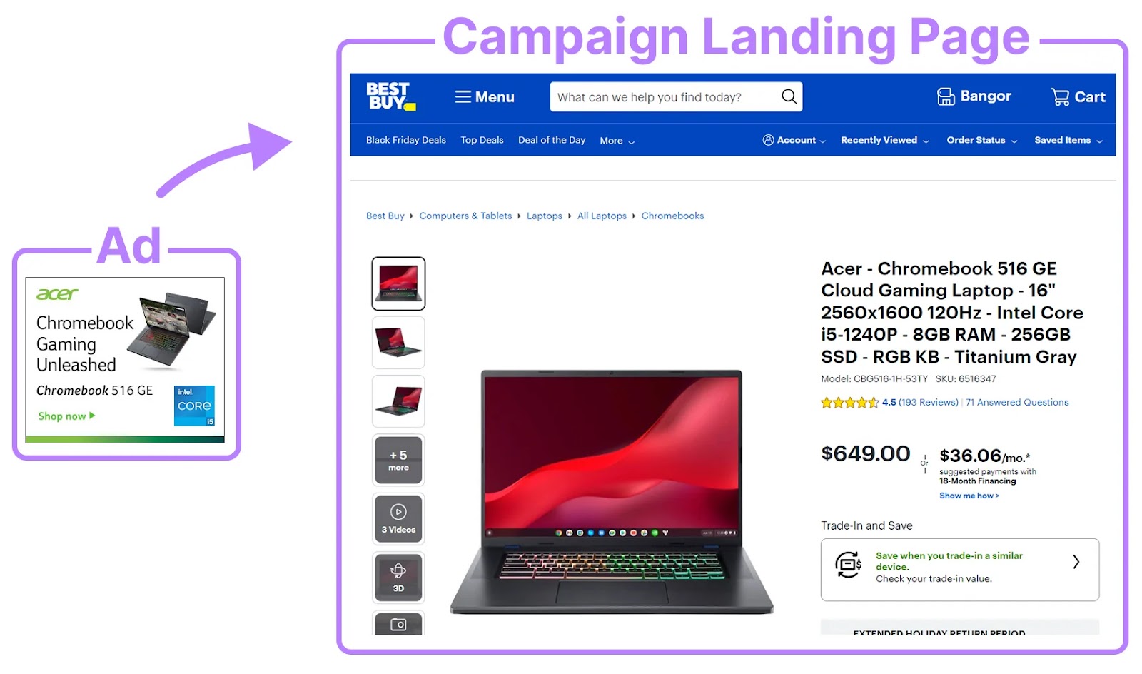
For example, you might advertise your best-selling products the majority of the time. And link directly to the corresponding product pages, with the aim of generating sales.
Like this:
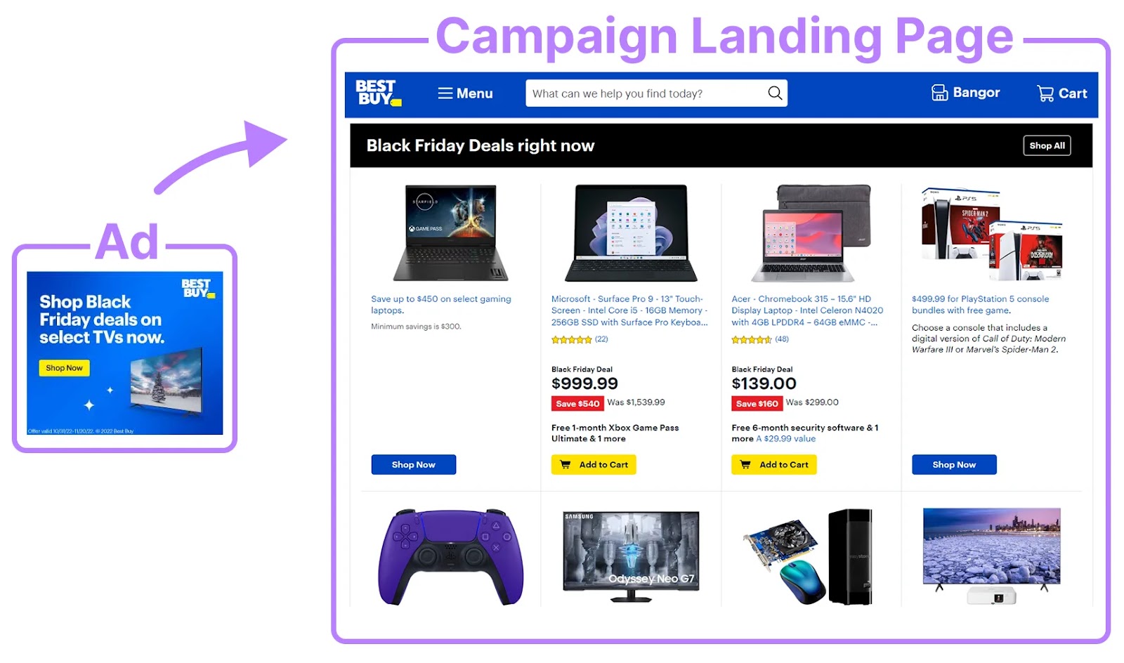
But during Black Friday, you could promote an entire product range. And create a dedicated campaign landing page.
Like this:
Step 3. Choose Ad Specifications
The size, positioning, and format of your banner ad will impact its success. And its cost.
Generally, things that earn your ad more attention (e.g., prominent placements) cost more money.
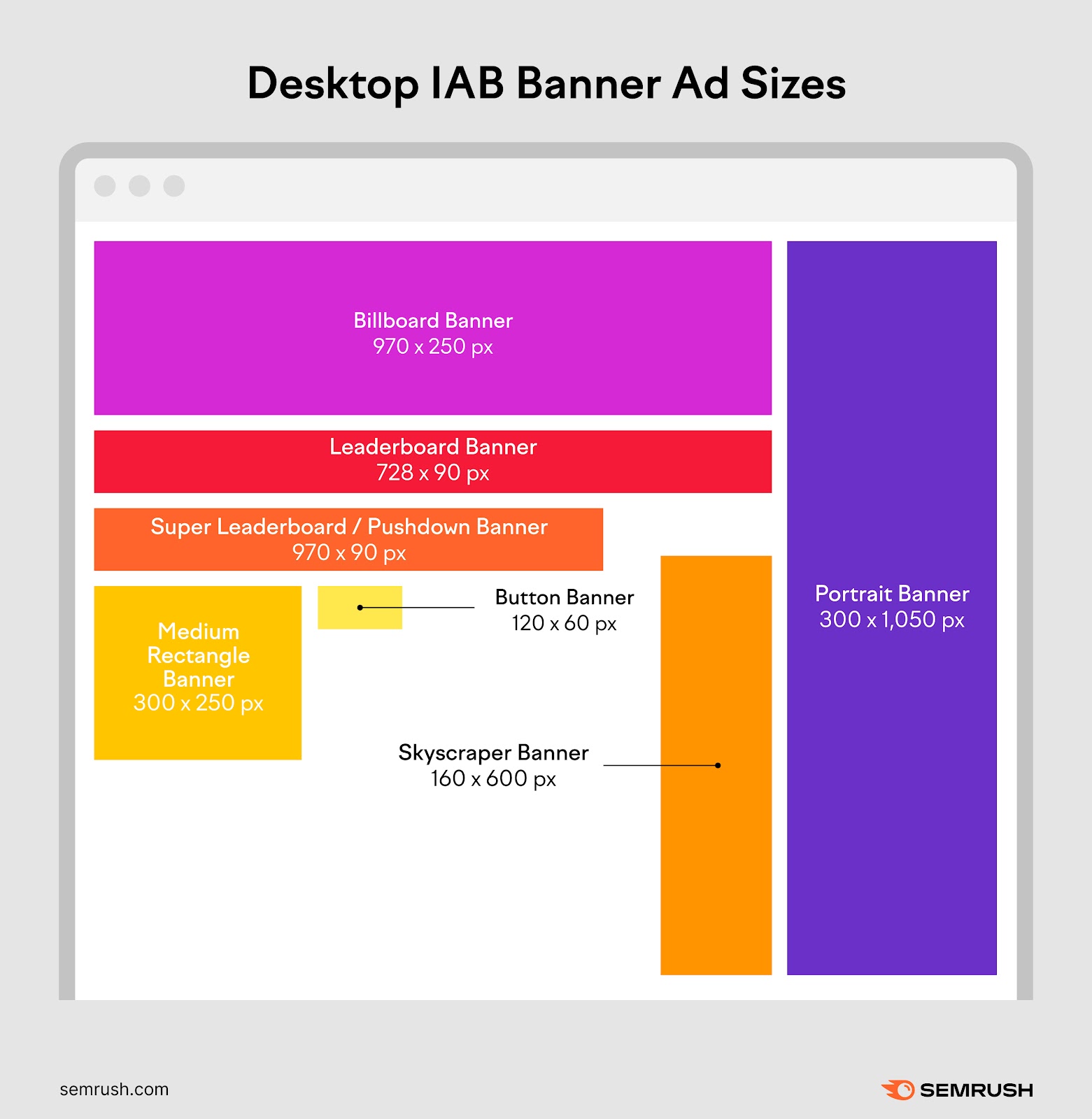
The Interactive Advertising Bureau (IAB) has defined the following banner ad sizes for desktop:
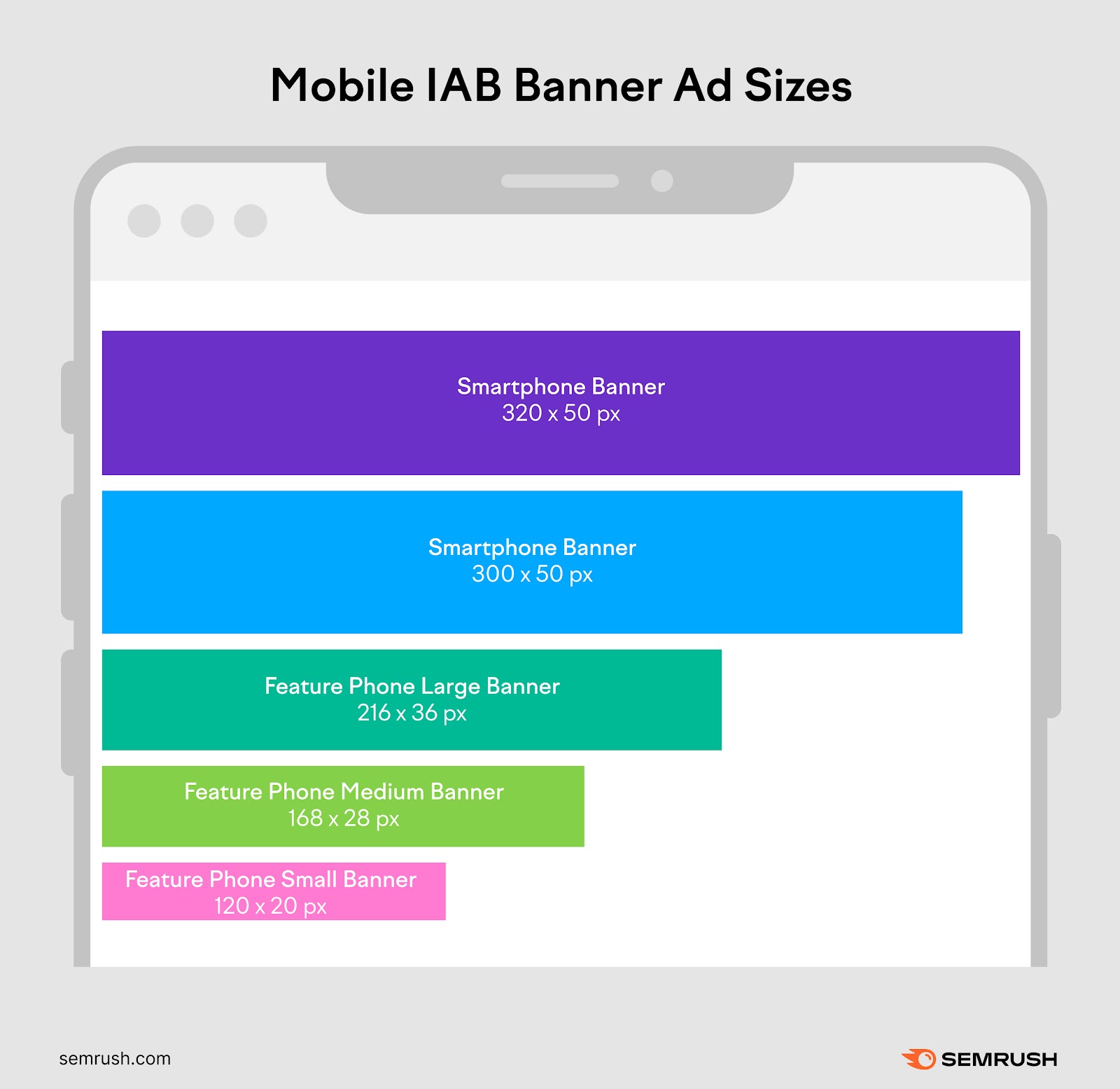
And here are the banner ad sizes for mobile:
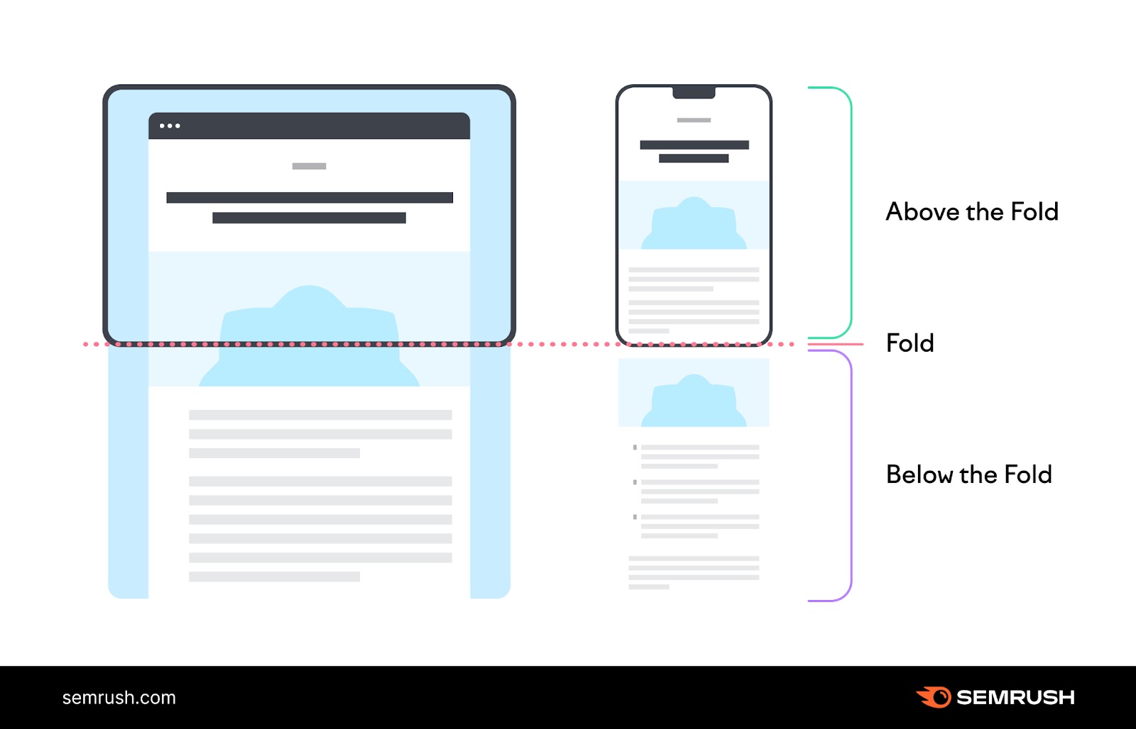
Ads placed above the fold (in the part of the page that’s visible before scrolling) get the most impressions. Along with sticky ads (ads that affix to the user’s window).
But below-the-fold banner ads are good for targeting highly engaged users. Particularly when they’re located within the main content.
Traditional banner ads are static. But you can often use animations, videos, or interactive elements to grab users’ attention. And communicate more complex messages.
You’ll need to explore the options available through your display network or publisher. And try to balance potential benefits against higher costs.
We recommend that you experiment and see which specifications deliver the best ROAS. (This is something we’ll talk about more later.)
Step 4. Design Your Banner Ad
Now, it’s time to design a banner ad that will capture attention and/or clicks.
The right approach depends on your ad specifications, target audience, and campaign objective. But we’ve rounded up some banner ad design tips to get you started.
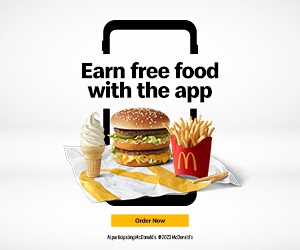
First, write a compelling headline. This should be the main message you want to communicate.
You need to combine short and snappy wording with a large and clear font. So users can absorb your headline at a glance.
Just like McDonald’s has here:
Write a CTA, too.
This is a short piece of text that prompts users to take the desired action (e.g., “Watch Trailer”). It’s often made to look like a button to encourage users to click.

Next, choose high-quality imagery.
If you’re advertising a product, lifestyle photography works well. It helps users understand the product and visualize owning it.
For other campaign types, consider using eye-catching illustrations. Or simple patterns and color schemes that keep the focus on your copy.

Once you have these key ingredients, work on your branding.
Using your brand logo, colors, and other elements will help users to recognize and remember your business.
It’s also important to uphold your brand identity. In other words, make sure your ad “fits” what you want people to think about your business.
For example, luxury brands like Dior keep their website banner ads chic and simple. And rarely (if ever) promote sales.

One of the easiest ways to design banner ads is with the Instant Banner Generator.
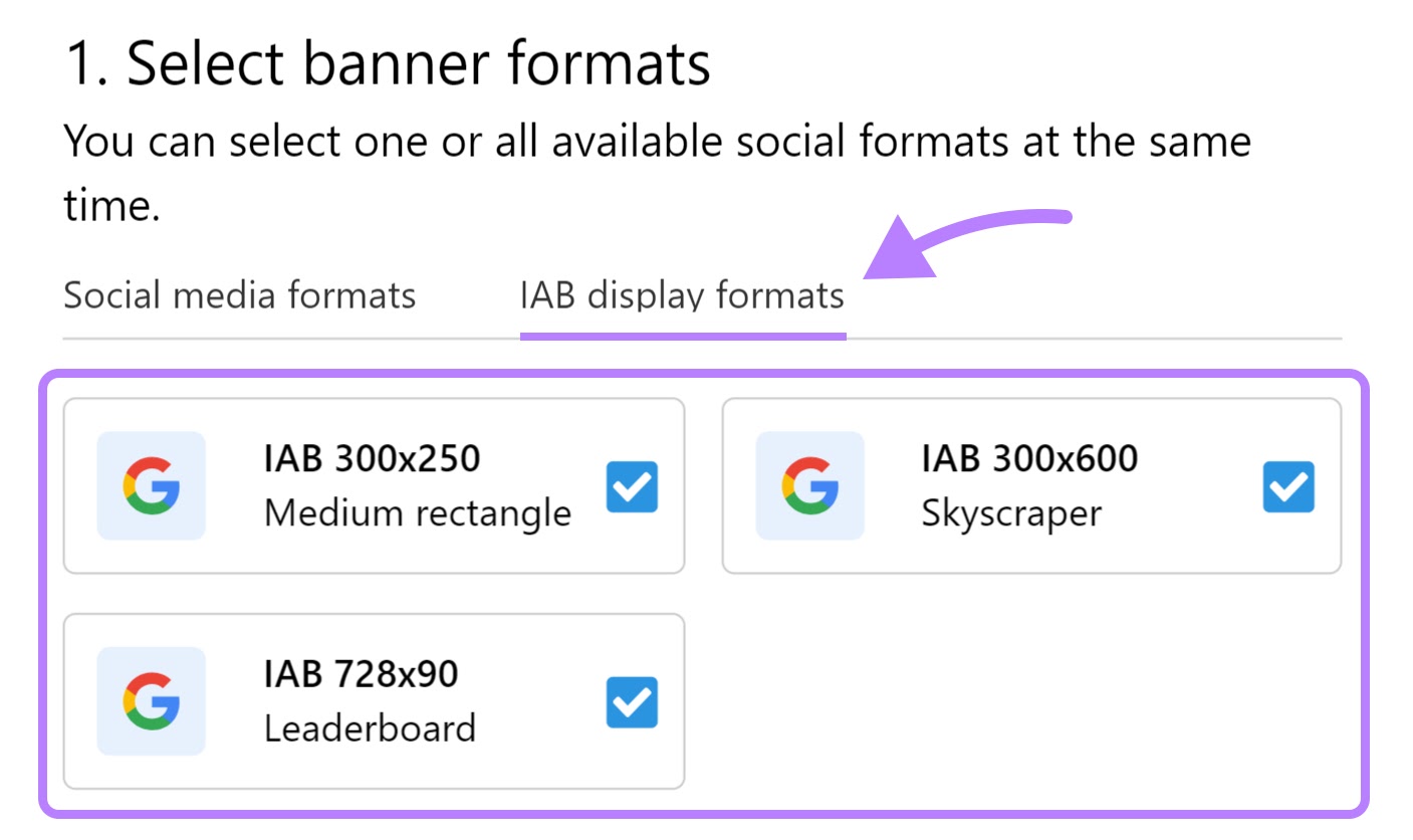
Select the “IAB display formats” tab.
Then, select your preferred banner ad size(s).
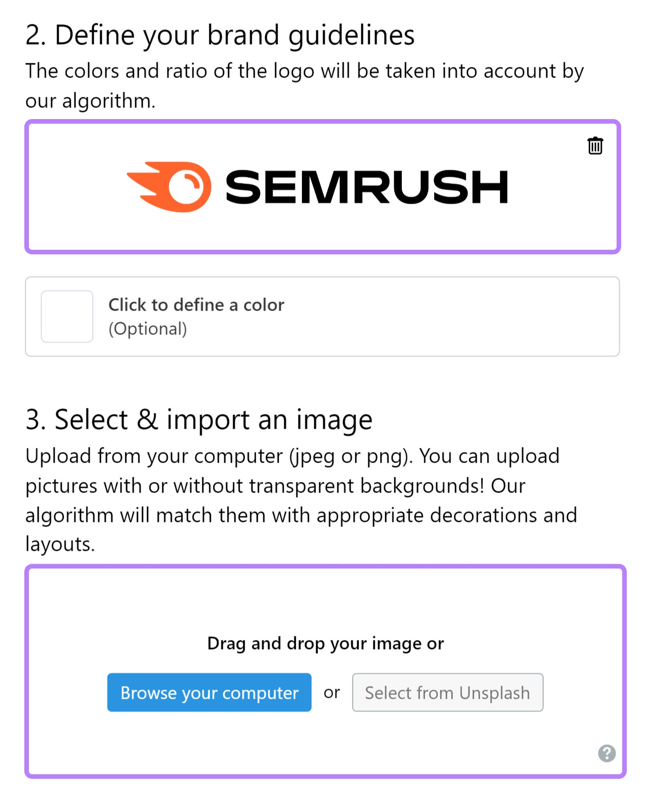
Scroll down to upload your company logo and any other banner imagery.
You can also import royalty-free photos from Unsplash.
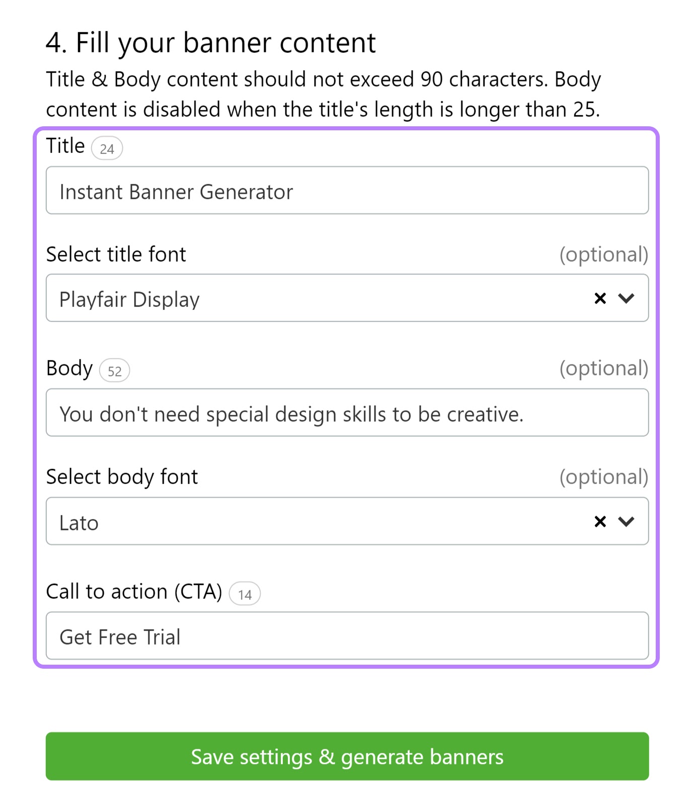
Next, enter the ad copy you’d like to display.
You’ll need a title and CTA, but you can also add extra body content.
Choose your favorite font(s) and click “Save settings & generate banners.”
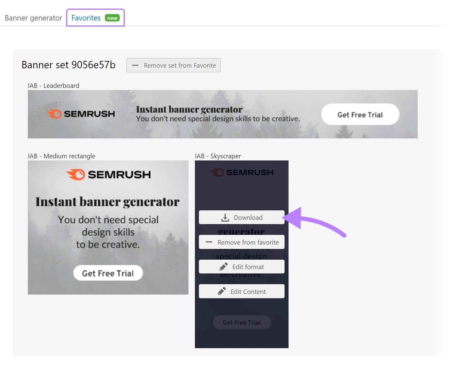
The tool will generate a variety of banner ad designs. Which you can save in your “Favorites” tab.
When you’re done creating ads, download your favorites. So you can upload them to your display network or send them to the publisher.
If you’d rather build ad banners yourself or create more complex designs, we recommend using Google Web Designer.
And make sure to use responsive layouts. These ensure that your ads adapt to the user’s device settings. To reduce the risk of your ad being distorted.
Step 5. Target the Right Audience
It’s crucial that you serve banner ads to relevant audiences. Otherwise, you’ll waste money showing them to people who will probably never convert.
The targeting options available depend on your digital advertising platform and publisher.
Here are some of the most common targeting types:
- Retargeting: Reach users who previously interacted with your business in some way (e.g., advertise a product to people who added it to their cart yesterday)
- Demographic: Reach users based on their age, gender, marital status, etc.
- Geographic: Reach users based on their location
- Behavioral: Reach users based on their browsing history, previous ad interactions, etc.
- Interest-based: Reach users based on their interests and hobbies
- Device: Reach users based on the device they’re using
- Contextual: Ensure ads are placed alongside thematically relevant content
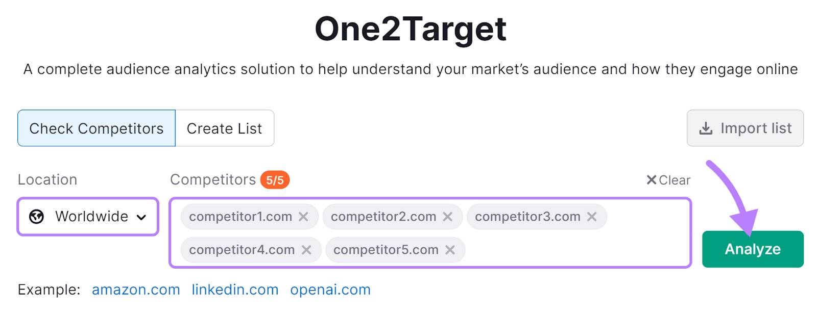
You can grab useful data from Semrush’s One2Target tool.
Choose your location and enter up to five competitors’ domains.
Then, click “Analyze.”
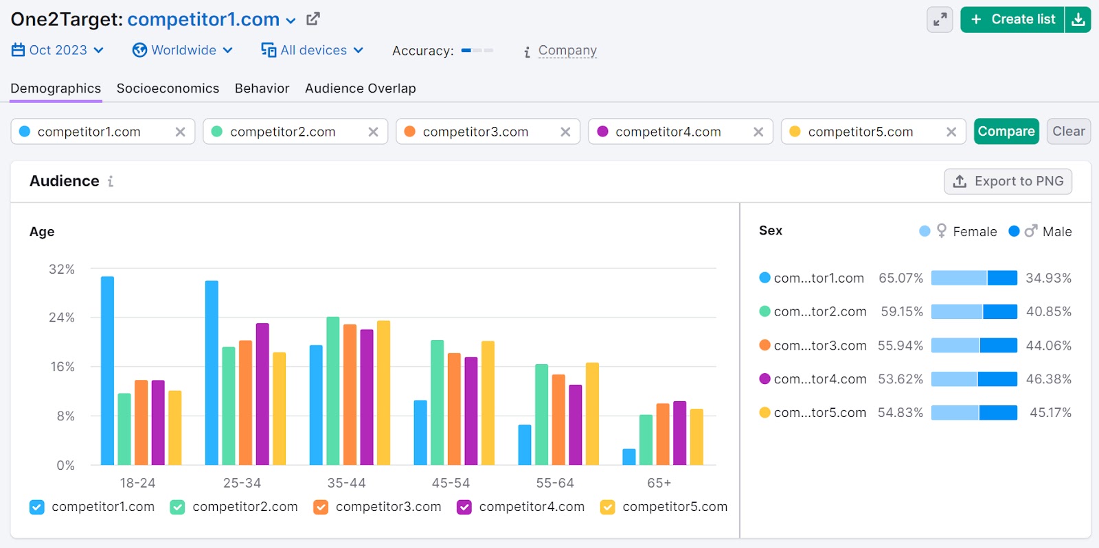
In the “Demographics” tab, you’ll see age, gender, and geographical data for your market audience.
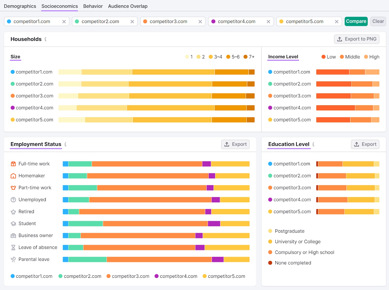
In the “Socioeconomics” tab, you can learn about the audience’s household size, household income, employment status, and education level.
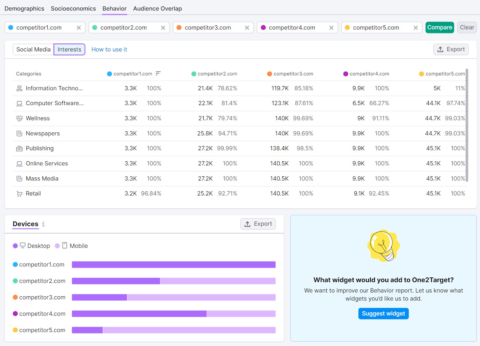
The “Behavior” tab details audience interests. And shows how desktop versus mobile usage compares.
Once you’ve gathered data, create buyer personas to represent different segments of your target audience.
Here’s an example created with the free Semrush Persona tool:
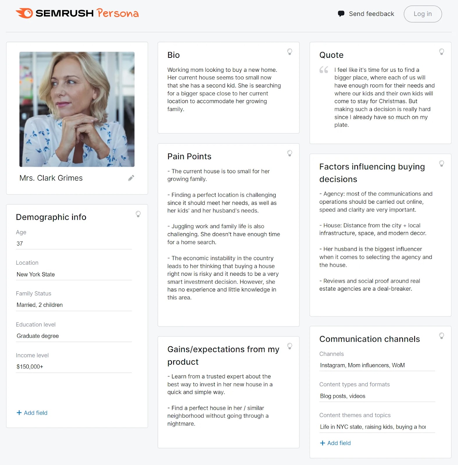
Then, use these profiles to target ads effectively.
Step 6. Launch and Monitor Your Banner Ads
You’re now ready to allocate your budget. And launch or schedule your banner ads for the desired campaign period.
When possible, take advantage of split testing (also called A/B testing).
This allows you to display one ad variant to half of users and another variant to the other half. And see which one generates the most clicks and conversions.
So, it’s a great way to minimize your risk. And learn what works best for your business.
During the campaign, we recommend that you monitor impressions, clicks, and conversions. So you can take action against any poor performance.
For example, if your conversion rate is low, you could try to improve your campaign landing page.
Just beware of making hasty decisions. It’s natural for ad performance to fluctuate over time.
At the end of the campaign, calculate your total cost. And see how performance varied over time.
This allows you to determine ROAS. And glean valuable insights for your next banner ad campaign.
For example, you might find that ads generated more clicks on Saturdays and Sundays. So, you could allocate more of your budget to weekend campaigns in the future.
Keep Growing Your Business with Ads
Banner ads aren’t the only digital ads that can generate fast results.
Check out our display ad guide and pay-per-click (PPC) advertising guide to learn more. And when you’re ready to start your advertising journey, get the tools you need with Semrush:
Source link : Semrush.com
