Online store visitors are expecting quick and seamless shopping experiences.
Pages need to load fast. Checkout processes must be efficient. And products are expected to arrive in a matter of days.
Delivering on these expectations can be challenging. But a strong technical foundation and optimized ecommerce architecture make it possible to satisfy shoppers and grow your business.
What Is Ecommerce Architecture?
Ecommerce architecture refers to the way brands structure various technical components of their ecommerce systems. And how these components interact with each other.
These components may include product pages, mobile apps, payment processing, databases, and other frontend and backend functions.
Types of Ecommerce Architecture
Ecommerce architecture components can be organized in various ways. There are simpler setups—like monolithic or two-tier—more suited to brands that have limited ecommerce needs. There is less code to maintain, so it’s cheaper and easier to work with.
But brands with more demanding ecommerce needs may opt for microservice, three-tier, and other complex ecommerce structure setups. These offer more functionality. But they can also be costly and more difficult to maintain.
Let’s cover some of the most important ecommerce architectures.
Monolithic Ecommerce Architecture
Monolithic ecommerce architecture refers to the setup in which the user interface, business logic, and data access layers are combined in a single codebase.
This approach has several advantages:
- Simplicity: Easier to develop, deploy, and manage due to its single-tier structure
- Reliability: Since all components are tightly integrated, issues can be more predictable and managed uniformly
But there are also several disadvantages:
- Scalability issues: It can be difficult to scale a specific part of the application without scaling the entire system
- Rigidity: Making changes can be risky and time-consuming, affecting the entire system
Smaller brands may particularly prefer a monolithic architecture. A small retailer, for instance, may choose this easy-to-maintain architecture if it has no plans to scale its limited product and customer base.
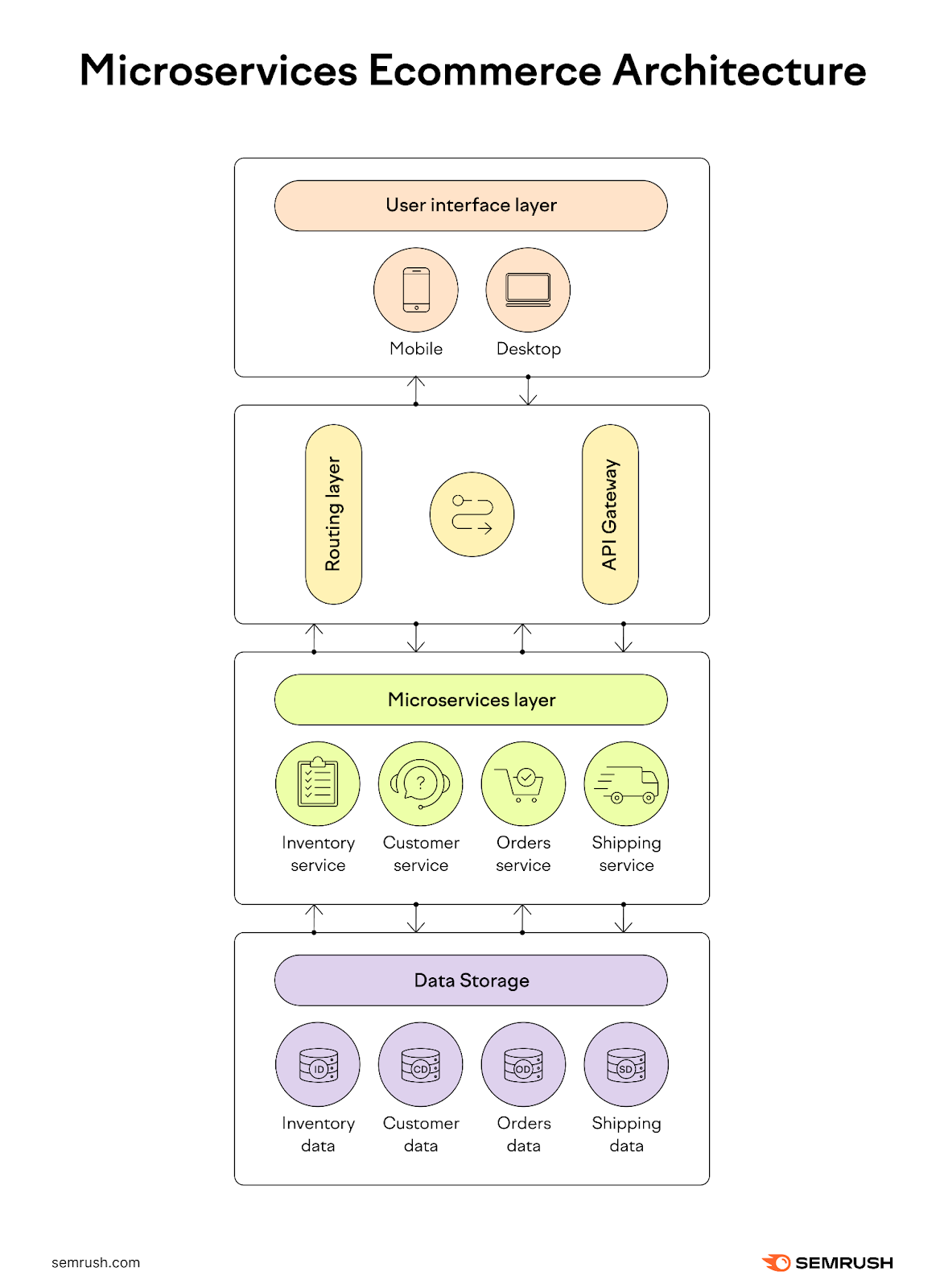
Microservice Ecommerce Architecture
Microservice architecture is a setup in which various ecommerce systems and business functions (i.e., inventory management) operate independently. They talk to each other through application programming interfaces (APIs).
Microservice structure offers a few advantages:
- Scalability: Services can be scaled independently based on demand for specific features
- Flexibility: Easier to update and maintain since changes to one service don’t directly impact others
But there are also some challenges:
- Complexity: Requires sophisticated coordination and management of various services
- Resource-intensive: Each microservice might need separate databases and other resources, which can increase overhead
Large electronic retailers, for instance, may use microservice architecture to manage diverse product categories. This setup enables them to scale particular categories, like mobile devices, without impacting other home appliances or personal computers categories.
Two-Tier Ecommerce Architecture
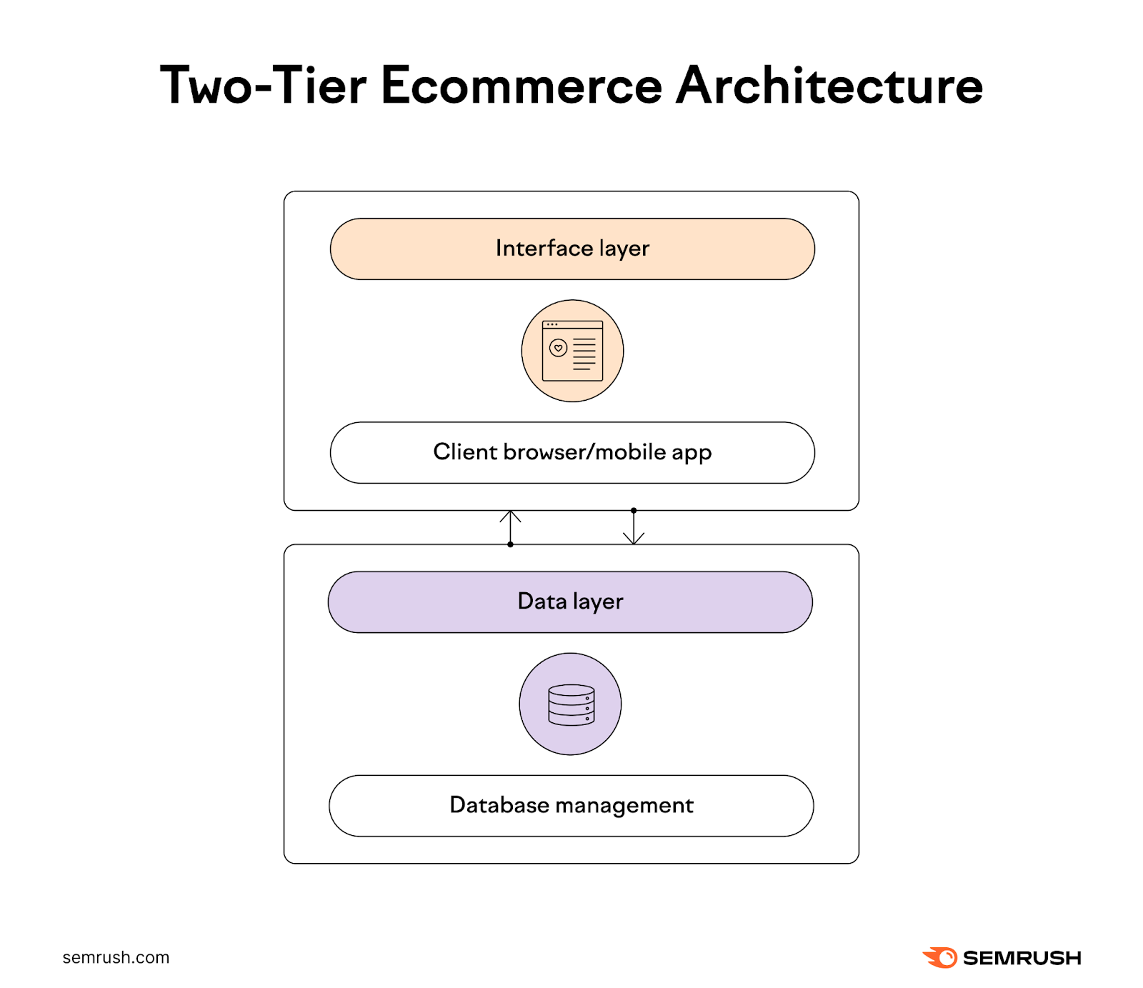
Two-tier architecture contains two main layers:
- The interface layer: The user interface that’s usually in the form of a website or mobile app
- The data layer: Servers where all the data storage, processing, and retrieval is performed
Shoppers communicate directly with the server to retrieve data (like product prices and images) and perform business operations (like adding items to a cart).
This approach has several benefits:
- Performance: Can enhance performance by distributing tasks between server and client
- Easily manageable: Simplifies server-side management by separating business logic from client interface
But there are also some drawbacks:
- Limited scalability: The client-server model can become a bottleneck if the user base grows significantly
- Security risks: More exposure points, as data has to travel between two distinct layers
Both smaller and larger brands may use two-tier ecommerce architecture. A boutique luxury shop, for example, may use this architecture to provide a rich client-side experience through an interactive website. And its robust backend server handles all business transactions and inventory management.
Three-Tier Ecommerce Architecture
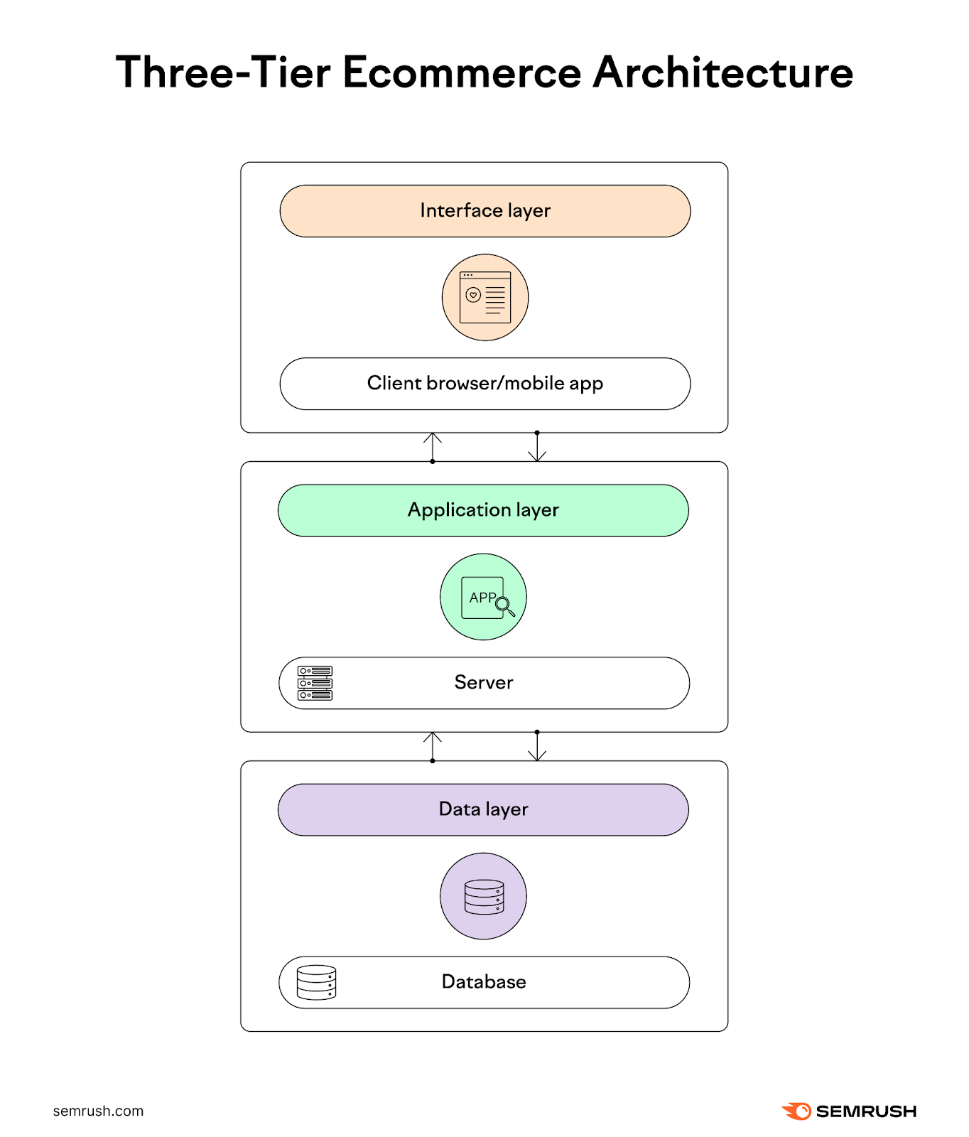
In three-tier architecture, an application layer is introduced between the interface and the data layers. This middle tier gathers and processes data, making changes to the data layer.
The application layer can perform more advanced functions. For example, it can track and save user payment, product, and shipping preferences. So that next time, users don’t have to enter payment or shipping methods and are served personalized product recommendations.
There are various benefits to the three-tier approach:
- Scalability: Each layer can be scaled independently, enhancing overall application performance
- Flexibility: Easier to modify or replace individual tiers without affecting others
And there are some drawbacks as well:
- Complexity: More complex to manage and maintain due to the increased number of components
- Cost: Potentially higher operational costs due to more sophisticated infrastructure needs
An online bookstore, for instance, can adopt a three-tier architecture to manage user interactions, business processing, and data storage separately. This allows them to offer book recommendations on the client side, process transactions in the middle tier, and manage an inventory database.
Headless Ecommerce Architecture
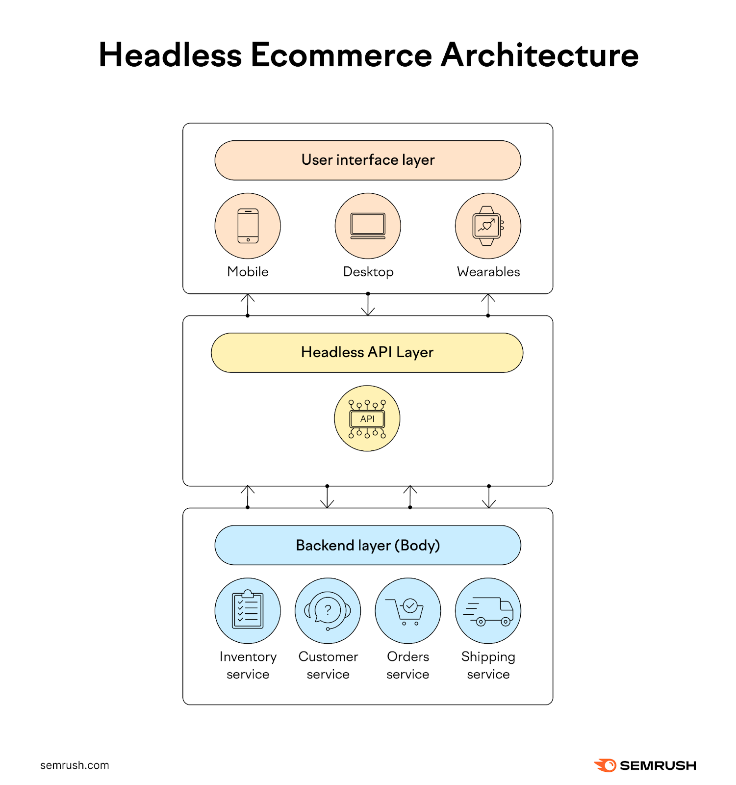
Headless ecommerce architecture decouples the frontend layer (website or a mobile app) from the backend. Developers can then use any technology to build the frontend experience. And the communication with a standard backend is achieved through a headless API layer.
This approach offers several benefits:
- Flexibility: Enables the use of various frontends for different devices or platforms without modifying the backend
- Enhanced user experience: Allows for faster deployments and updates to the user interface without backend interference
But there are also some disadvantages:
- Complexity: Requires advanced development skills to manage separate systems effectively
- Integration challenges: Integrating multiple frontends with a common backend can be complex
Headless approach may work well for some companies. For instance, a fashion retailer may opt for a headless architecture to provide a seamless shopping experience across mobile apps, desktop websites, and even wearable devices. And all of these experiences are managed through a single backend.
SaaS Ecommerce Architecture
Software as a Service (SaaS) ecommerce architecture is a web-based, out-of-the-box solution where ecommerce functionalities are managed by a third-party provider. The provider—Shopify, for example— is responsible for maintaining, hosting, and upgrading existing settings.
There are several benefits of this model:
- Cost-effective: Reduces the need for initial capital investment in hardware and software
- Maintenance-free: The SaaS provider manages updates, security, and infrastructure
There are some drawbacks, too:
- Less control: Businesses have limited control over the platform and depend heavily on the provider
- Customization limits: May offer limited customization options compared to other architectures
This architecture is especially attractive to startups. They can use a SaaS ecommerce platform to launch their online store quickly without the need for significant upfront investment in IT infrastructure. This allows them to focus on product development and marketing instead.
Benefits of a Clear Ecommerce Website Architecture
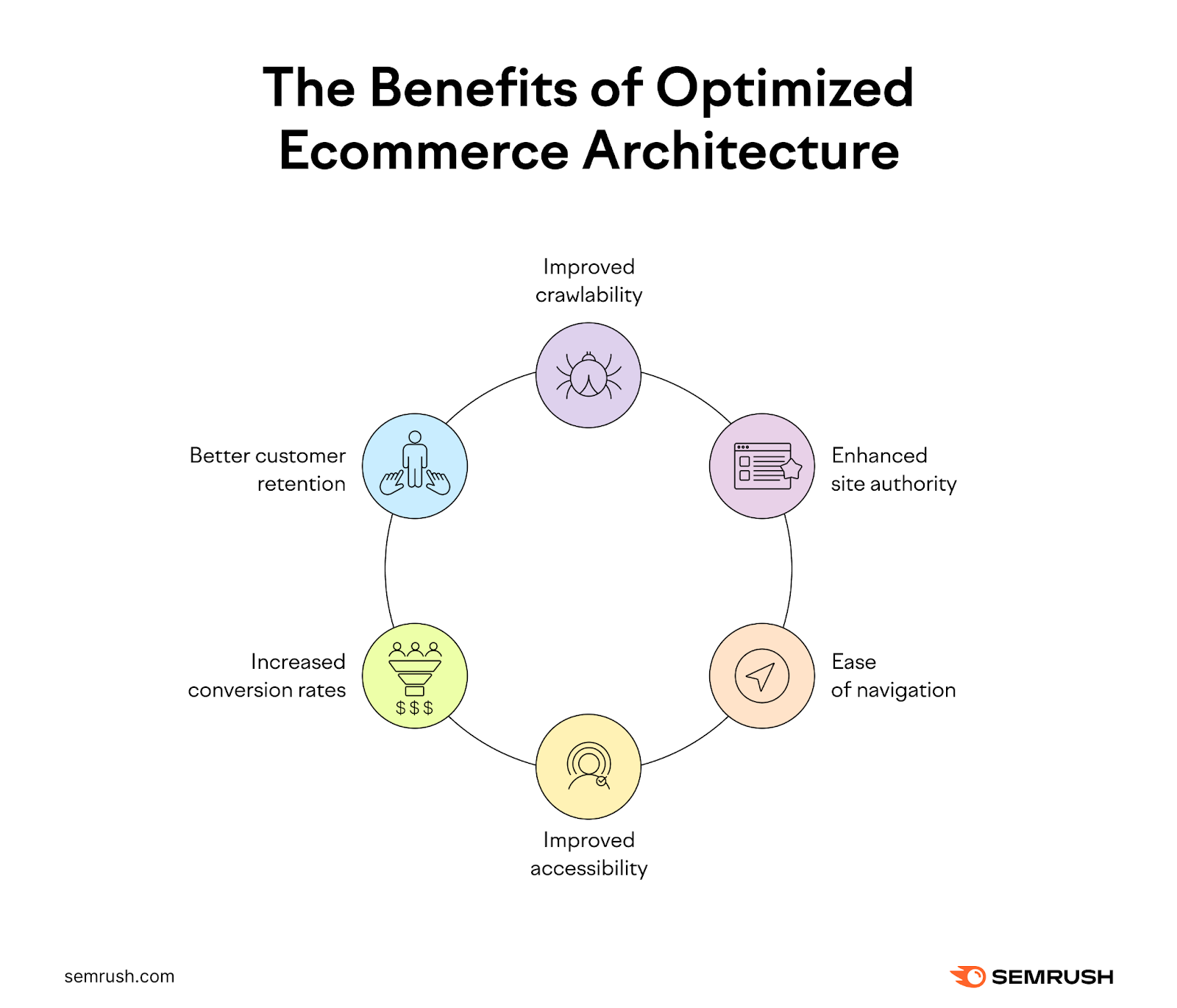
An optimized ecommerce architecture is important because it benefits businesses in various ways.
For example, it delivers SEO benefits, including:
- Improved crawlability: A well-structured site structure allows search engine bots to easily crawl and index the entire site. New product pages then appear in search results faster.
- Enhanced site authority: Effective architecture helps distribute page authority throughout the site. Backlinks to the homepage or main category pages pass authority to subpages, helping them rank for more keywords.
A clear ecommerce site architecture also provides user experience benefits. Such as:
- Ease of navigation: Users find what they are looking for with minimal effort and enjoy a satisfying browsing experience
- Improved accessibility: A clear structure is easier to navigate using assistive technologies and thus more friendly to users with disabilities
There are also various marketing and sales benefits a clear ecommerce structure delivers:
- Increased conversion rates: A clear path from landing pages to checkout reduces user frustration and abandonment rates, directly enhancing conversion rates and sales
- Better customer retention: A site that is easy to navigate encourages customers to return, boosting retention rates
All of these and other benefits make it important to create and maintain an optimized ecommerce architecture.
Ecommerce Architecture Components
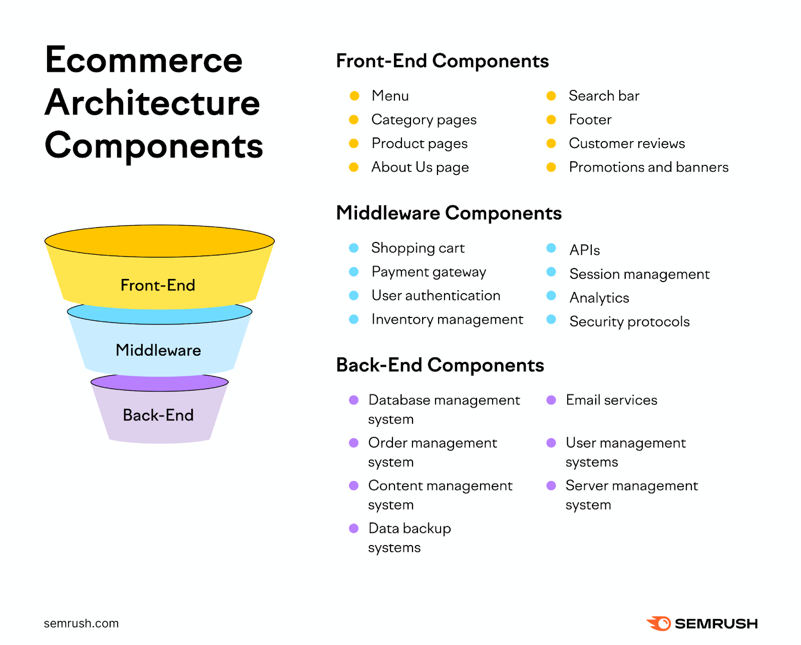
Ecommerce architecture can get fairly complex. Dozens, if not hundreds, of different ecommerce components interact with each other to deliver a seamless shopping experience.
Let’s go over some of the most important components used to create the best architecture for an ecommerce site.
Frontend Components
The frontend of an ecommerce site is what the customers interact with directly, such as a website or an app. It’s supposed to be user-friendly and visually appealing. This interface layer includes components like:
- Menu: A navigation tool that displays the various categories and services available on the website
- Category pages: Webpages that aggregate products under specific categories
- Product pages: Pages that provide details about each product, including descriptions, prices, and images
- About us page: A page that offers insights into the company’s history, mission, and values
- Search bar: A feature that allows users to type in keywords to find products or information on the site quickly
- Footer: A section at the bottom of each page that typically includes links to important information such as contact details, FAQs, and policies
- Customer reviews: Feedback from buyers about their product experiences
- Promotions and banners: Visual elements highlighting special offers, discounts, or new products to engage users
Middleware Components
This middleware layer serves as a bridge between the frontend and the backend. It may also be called the application layer, handling all the data flow and processing between the front and backends. It includes components like:
- Shopping cart: A virtual cart that allows users to collect and adjust their intended purchases before checkout
- Payment gateway: A system that processes and secures payment information and transactions
- User authentication: A security measure that verifies the identities of users logging into the platform
- Inventory management: Software that tracks product availability and updates stock levels in real time
- APIs: Tools that enable integration and communication between different software applications
- Session management: Technology that maintains a user’s interactions across webpages for the duration of their visit
- Analytics: Systems used to assess user behaviors and preferences to optimize the shopping experience
- Security protocols: Standards and technologies designed to protect the site and user data from cyber threats
Backend Components
The backend layer consists of the database and server-side components that store and manage data. This server layer supports the frontend through smooth data management and service functionality. Key components include:
- Database management system: This software stores and organizes all essential data. Such as user profiles, product information, and transactions.
- Order management system: Software that manages the processing and fulfillment of customer orders
- Content management system: Tools that allow non-technical administrators to update website content
- Data backup systems: Technologies that save copies of the site’s data to prevent loss in case of a failure
- Email services: Functions that automate sending emails related to marketing, confirmations, and support
- User management systems: Controls that manage access levels and permissions for different users of the platform
- Server management system: Infrastructure that ensures the website operates smoothly, managing server resources effectively
Ecommerce Architecture Best Practices
Various ecommerce brands may have different needs from their site structure.
For instance, the U.S. ecommerce giant Amazon may prioritize the speed and scalability of their ecommerce architecture. While one-person ecommerce brands may value the ease of inventory management and shipping.
But there are certain ecommerce architecture best practices that nearly any company would benefit from implementing.
Choose the Architecture Best Fit for Your Business Needs
Your ecommerce architecture should be able to follow your evolving business needs.
Here are several factors to consider to arrive at the right ecommerce structure:
- Traffic growth: Consider the size of your online store now and how big it might get. If you are going after a large audience and expect high traffic volume, then your ecommerce setup should be able to accommodate such growth. Scalable microservices architecture could be one option to consider.
- Product variety: You may have only a few products now but plan to add many more in the future. If so, your site structure should make it easy to scale your offering by adding new products, pages, and features. In this instance, going after features-friendly, three-tier architecture could be a viable option.
- Budget constraints: Your budget dictates the type of ecommerce architecture you can build and maintain. You may like certain architectures. But if they are out of your budget, it’s better to compromise with less sophisticated but reliable alternatives such as monolithic architecture.
- Technical resources: If you have an in-house IT team, you may feel confident deploying a more customizable and complex ecommerce structure (like a microservices structure). Otherwise, deploying a user-friendly but less flexible platform with the help of third-party developers might be a less risky option.
Map Out Your Ecommerce Structure
If you’re preparing to build or revamp your ecommerce structure, take some time to map out your desired architecture first. Don’t jump directly into building it.
Map your architecture either electronically or by hand. Include all the pages you plan to build, like product pages or the contact page. And visualize how they all link to each other. Add notes on which features and components different pages will have.
This exercise helps you understand what the typical shopper journey on your site will look like. And whether it’s too complicated.
Mapping out your ecommerce architecture in advance also helps you avoid costly redesigns. Because you already know the site structure. And which technologies, integrations, and frameworks you will deploy.
Develop an Intuitive Website Navigation
An ecommerce site navigation should be intuitive and logical. Category, subcategory, and product pages should be labeled with familiar terms, not industry jargon.
For instance, here’s how Etsy labels its product categories. All of these terms are easy to understand and you instantly know what to expect.
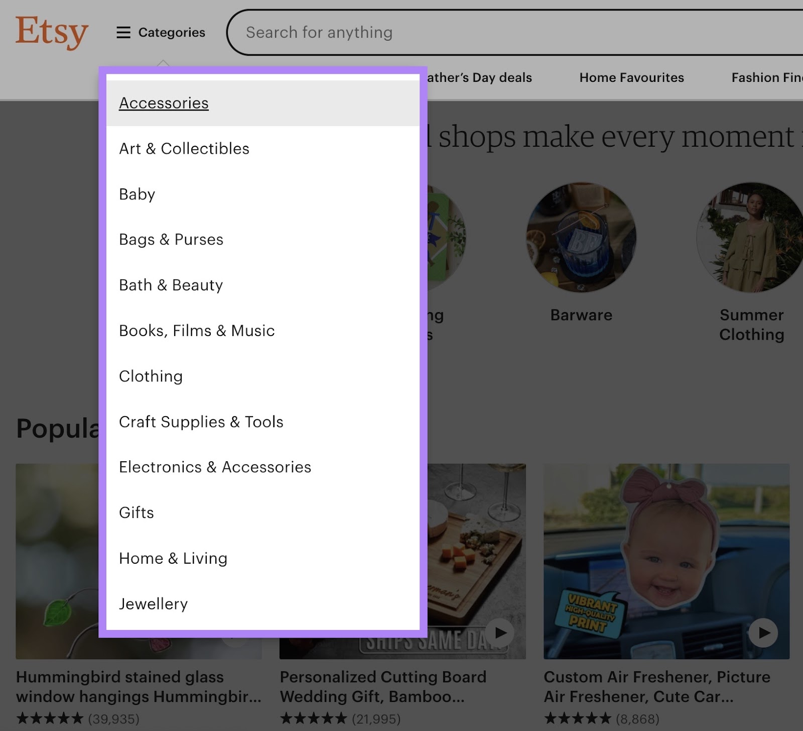
And when you open a subcategory, Etsy already displays all the information you may need to decide if you want to purchase a product. You can get from a homepage to a checkout page intuitively in just three clicks.

There are several other ways to create an intuitive website navigation:
- Keep essential links like “Home” or “Products” accessible from any page
- Use consistent design across different types of pages for a cohesive experience
- A search bar should be placed at the top of each page
- Use breadcrumb navigation to inform users of their location on the website
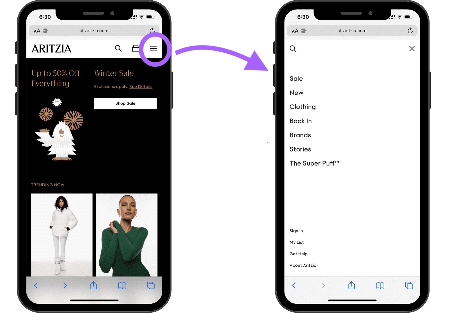
- Simplify the navigation for mobile shoppers using solutions like hamburger menus
Here’s what a hamburger menu looks like in practice:
Enable users to find what they want quickly, and they are more likely to make a purchase.
Make Your Ecommerce Structure Mobile-Friendly
Your ecommerce architecture’s components should be optimized for mobile users. Here are several tactics to achieve that goal:
- Use a responsive design that adjusts the layout based on the device’s screen size
- Keep the menu items limited to essential categories to avoid overcrowding
- Use optimized images with smaller file sizes that look good and load quickly
- Use larger button sizes, easy-to-select links, and adequate spacing to prevent accidental clicks
- Minimize the use of heavy scripts and animations to optimize site speed
- Streamline the checkout for mobile users by requiring fewer steps to make a purchase
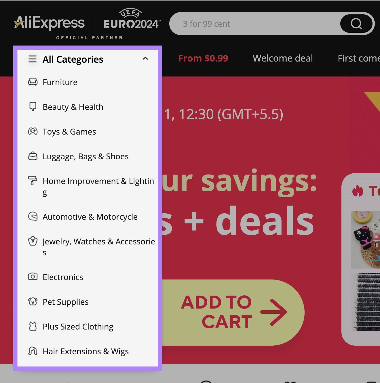
The Chinese ecommerce behemoth AliExpress is a great ecommerce architecture example. Its desktop and mobile versions are different.
Its desktop version, for instance, has 24 distinct product categories.
But on its mobile version, the company only lists the nine most popular categories on its homepage.
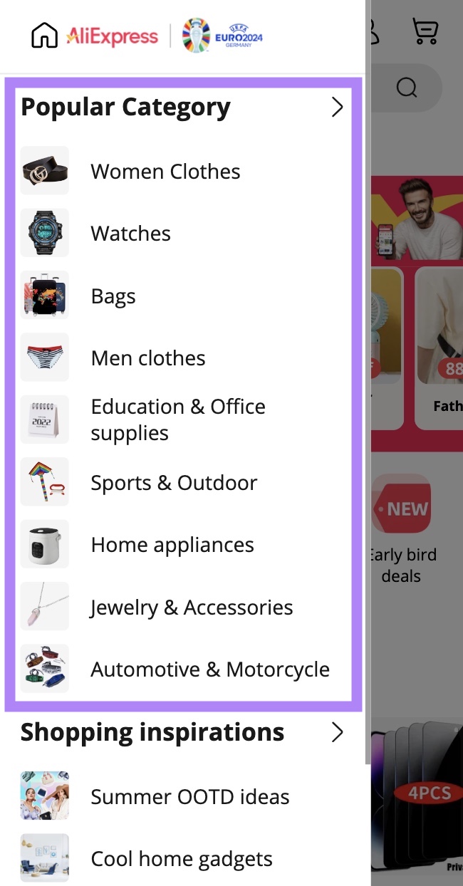
Less clutter on mobile versions helps visitors find their way to a desired product.
Making your ecommerce architecture design mobile-friendly can go a long way in helping visitors enjoy your site. And, eventually, convincing them to purchase one or more products.
Optimize Your Ecommerce Architecture for SEO
There are several ways to optimize your category and product pages to help drive organic traffic.
For starters, your homepage should link to category pages. Then, category pages should link to their respective individual product pages.
Like this:
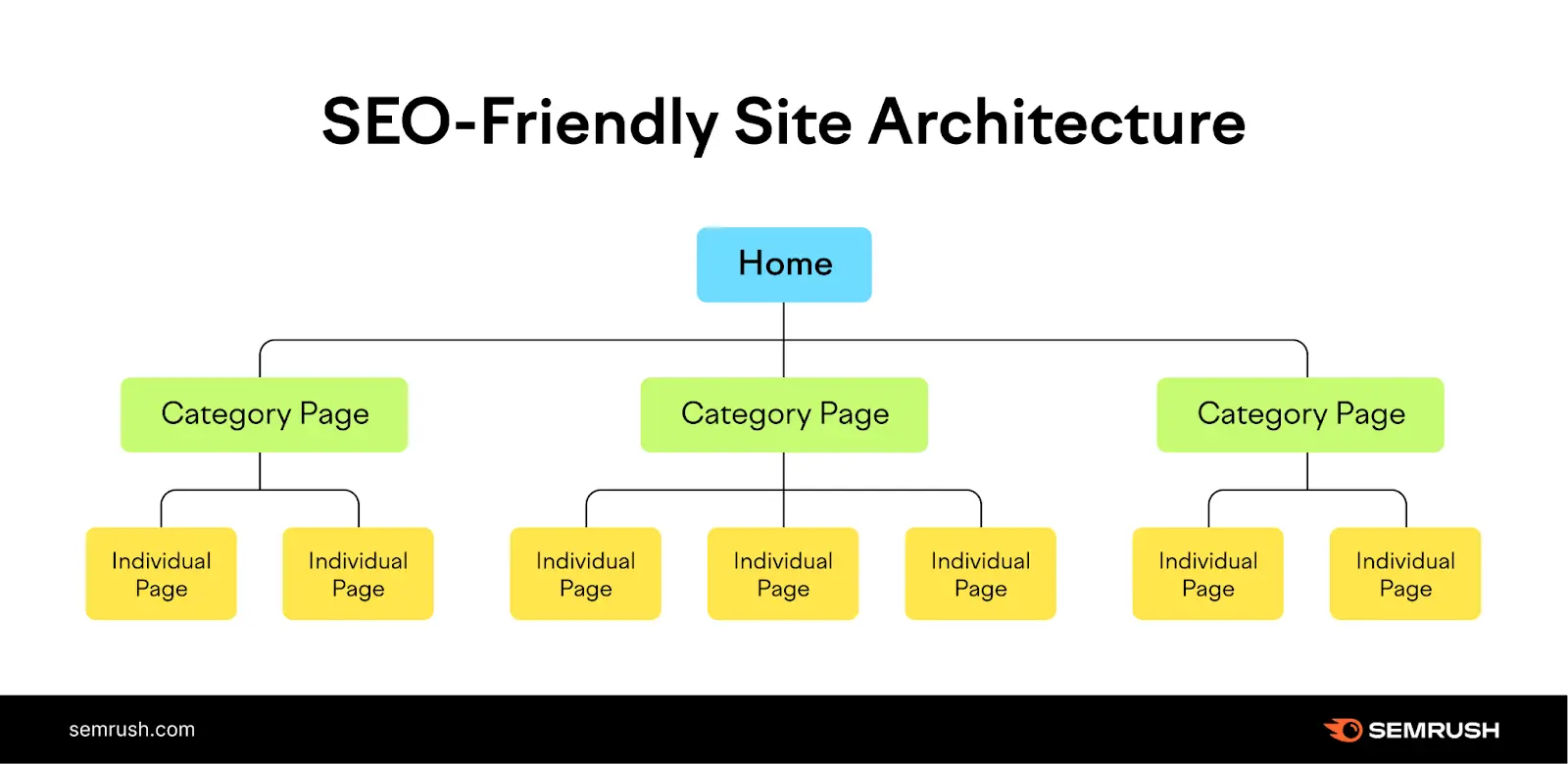
This helps pass page authority from the homepage to other pages. And in return, those pages may end up ranking higher for their target keywords.
You should also link to your product pages from your blog posts. This and other internal linking best practices helps your site become SEO-optimized and easier to navigate.
You should also identify various product-related keywords to name your category and product pages.
Use Semrush’s Keyword Magic Tool to find relevant keywords that can help optimize your page titles and content for better search engine visibility.
Here’s how:
Head to the tool, type in your category name, and click “Search.”
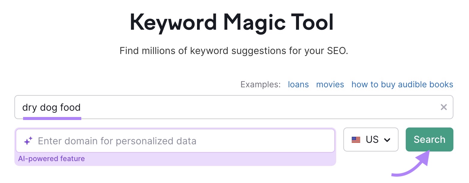
Next, you’ll get a list of various keywords that contain your category name.
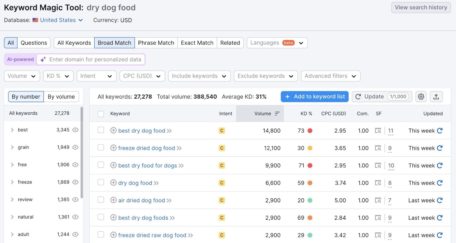
You’ll see various data points for each keyword, including monthly search volume, search intent, keyword difficulty (KD%), and more.
The tool allows you to sort the list by any of these and other data points.
This provides you with specific keywords that your audience types in search engines. Use these same phrases when naming your product pages to help your site show up in search results.
You should also optimize each page. For example, include target keywords in main titles, headings, content, and URLs.
Continuously Audit & Improve Your Ecommerce Website
Ecommerce websites continuously add and remove products and offerings. New pages are constantly being launched, and the site structure is ever-changing.
It’s important to monitor your site for any issues. For instance, checking that new pages are interlinked with other pages. So that Google crawlers can crawl and index every page on the site. Or that pages load fast with no security vulnerabilities.
Use Semrush’s Site Audit tool to monitor your ecommerce website for any technical issues.
Here’s how:
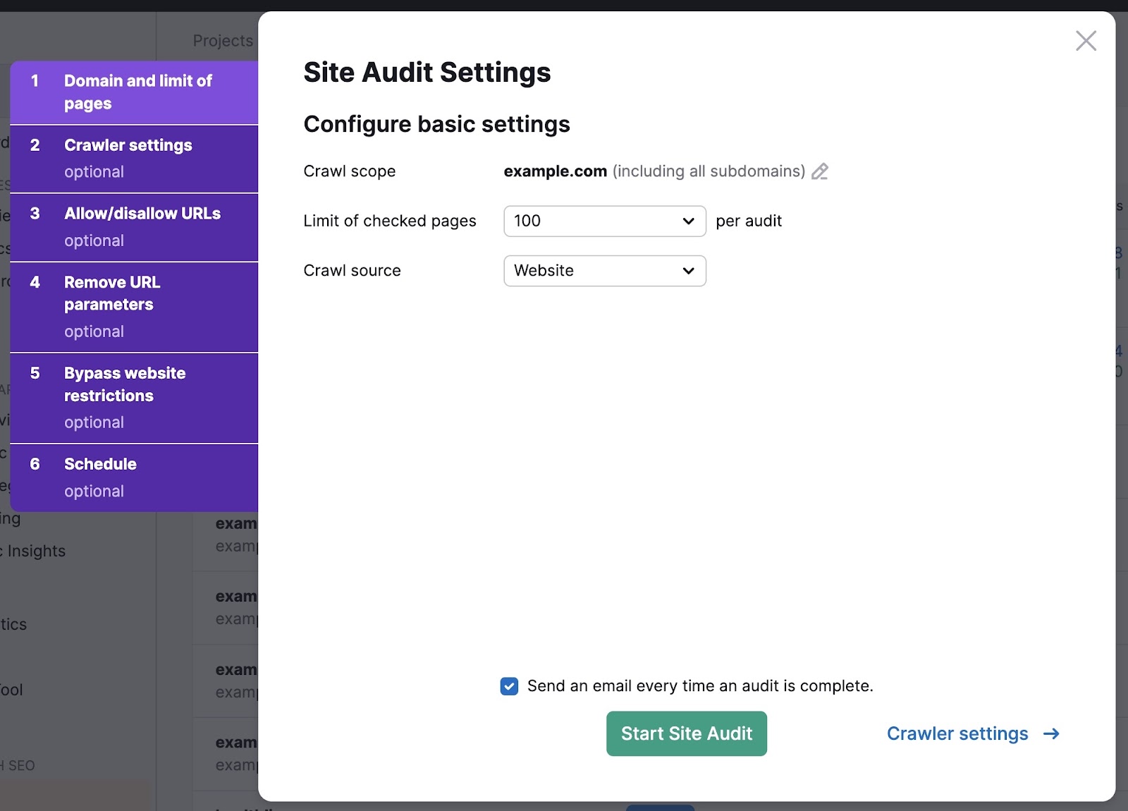
Open the tool, enter your domain, and click “Start Audit.”

Then, configure your basic settings by specifying whether you want subdomains to be audited as well. Set the limit of checked pages and the crawl source.
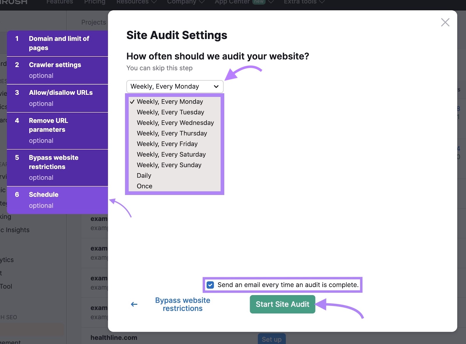
If your ecommerce site is massive, you may want to schedule weekly or even daily audits. Set this in the “Schedule” tab.
Check the box “Send an email every time an audit is complete” to receive an email following an audit. Next, click “Start Site Audit.”
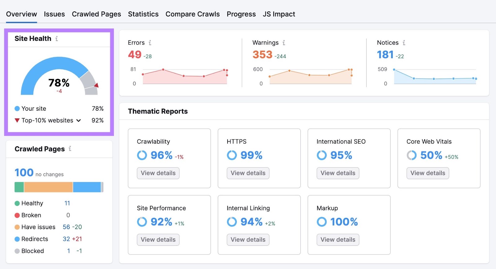
Once the audit is complete, navigate to the “Overview” report. This is a high-level view of your site’s overall health.
Find your “Site Health” score in the upper left corner. The score is calculated based on the scale of errors and issues found on your ecommerce site. The higher the score, the better.
Head to the “Issues” tab to find all the problems your site faces.
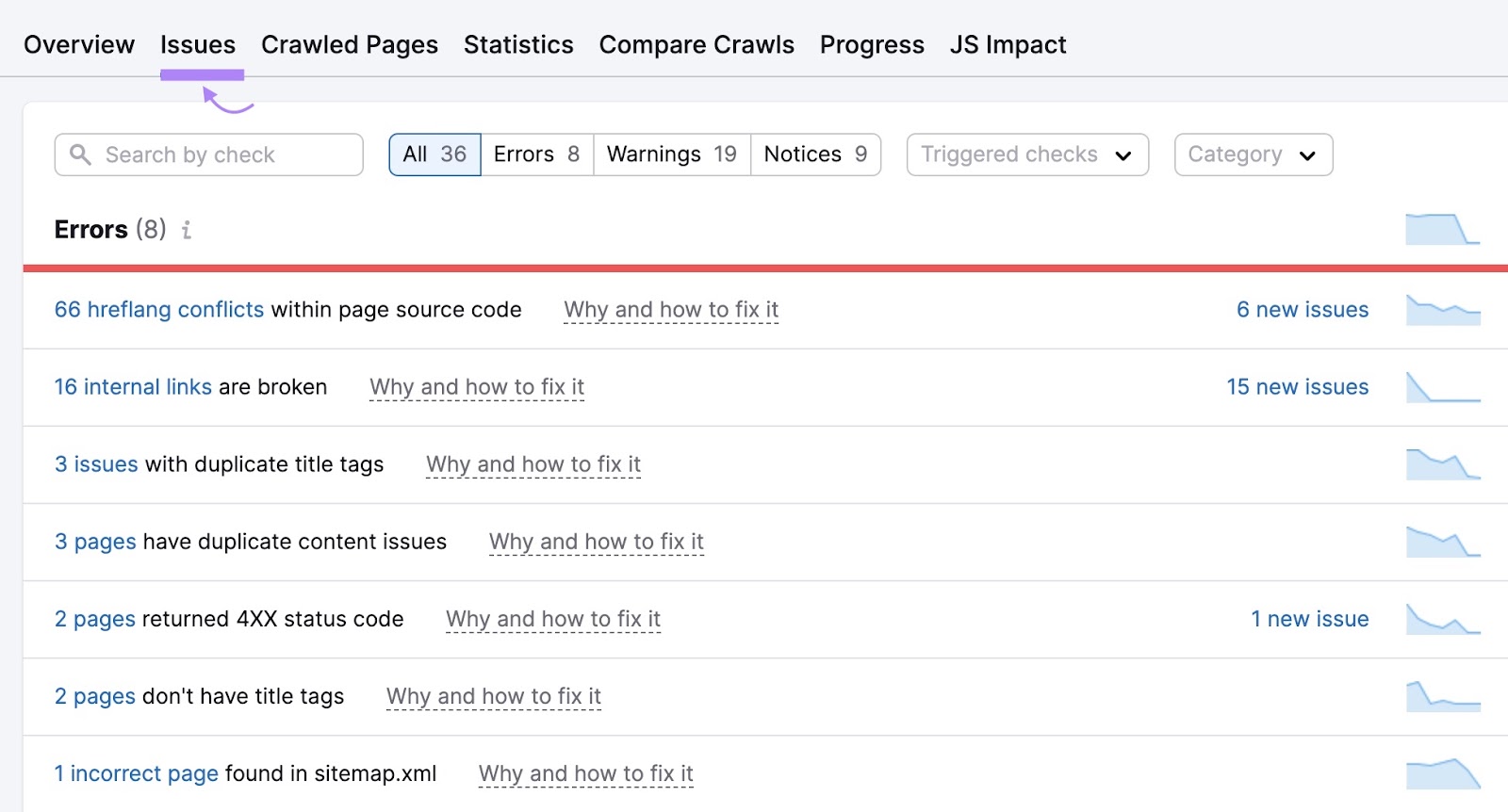
Start solving “Errors” first, which are the issues of the highest severity. Then, move on to “Warnings.” “Notices” don’t affect the health score.
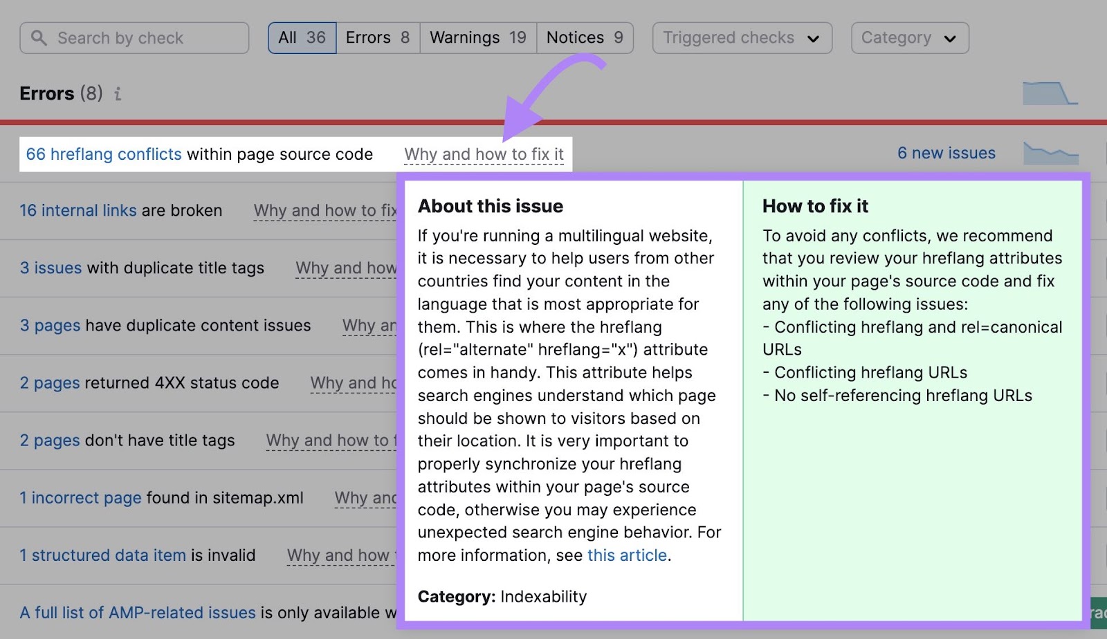
Click “Why and how to fix it” to get additional information on how to address given issues.
Fortify Your Ecommerce Architecture with Semrush
Ecommerce architecture continuously evolves as new technologies and features are rolled out.
Being mindful of the best practices in this field is important.
Otherwise, brands risk being left behind by competitors with more user-friendly site structures.
Use Semrush’s suite of tools to empower your ecommerce venture. The Keyword Magic Tool can help you identify relevant keywords, while Site Audit will help you monitor technical issues on your site.
Sign up for free today to get started.
Source link : Semrush.com
