Posted by
Shay Harel

Here we go, yet another month of all sorts of changes to the Google SERP and the features found on it! In the great month of October, we were privy to see Google start to roll-out its 20th-birthday updates, the coming of an all-new way to hunt down the best hotel, and some more Google algorithm action (yep, more updates… again). I’ve also got an exclusive look at the first set of data on the relatively new Explore Panels (you know, it’s not a Knowledge Panel but it’s also not a Featured Snippet)!
Another Significant Google Update in the Month of October
Google has been on a roll of sorts as it feels almost as if a week does not go by without another update hitting the SERP. In October we saw three “algorithmic events” as caught by the ever-helpful Rank Risk Index. On both October 9th and 13th, the index caught moderate increases in rank fluctuations. The most significant update came on October 16th were fluctuation levels on the index hit 83/100.
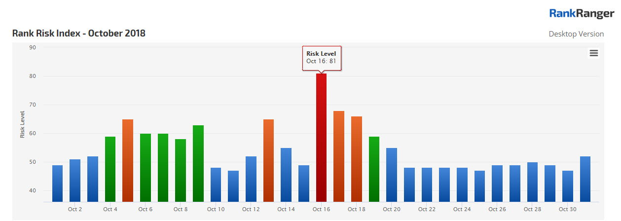
The Rank Risk Index showing three fluctuation events in October
The October 16th update lasted three days total before running its course. There has been some speculation that this update may have been related to the Medic Update of early August. I haven’t seen anything conclusive on the topic, nor have I researched this one in-depth myself.
Here Comes an All-New Local Search Hotel Listing Experience
Over the past year or so there has been a downright onslaught of changes made to hotel results on the SERP. Literally going all the way back to October 2017, we’ve seen Google go deep in offering hotel pricing insights. It seems that all of those updates have culminated in what constitutes an all-new Local Finder hotel listing interface.
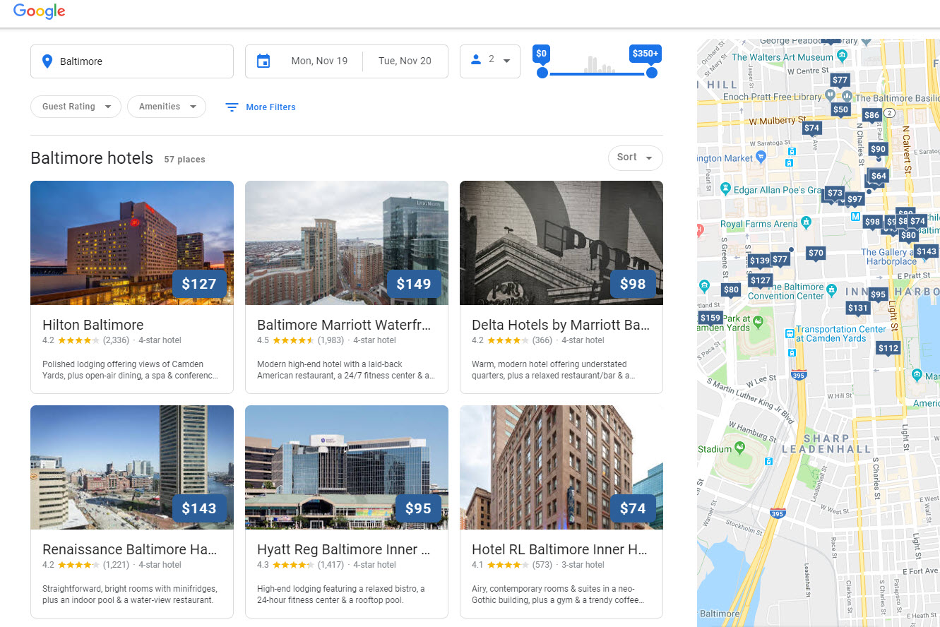
Google’s new hotel listing format on desktop utilizes larger and card-style images
For the record, many of the new elements have been tested on and off in the recent past. Also, as of the writing of this article, the new format is still being rolled-out (so not all of you may see it yet). With that out of the way, here’s what you get:
- A wider card style layout for a more visual hotel listing experience
- An entirely new page dedicated to a given hotel which opens in a separate tab when a listing is clicked on (desktop)
With this new page that appears when clicking on a listing (again, we’re talking about
- A carousel of images
- Specific tabs for pricing, reviews, etc. (much like is offered on mobile)
- The Location Summary showing a carousel of attractions, transportation options, etc. (which also existed on mobile previously)
- Listings of similar hotels
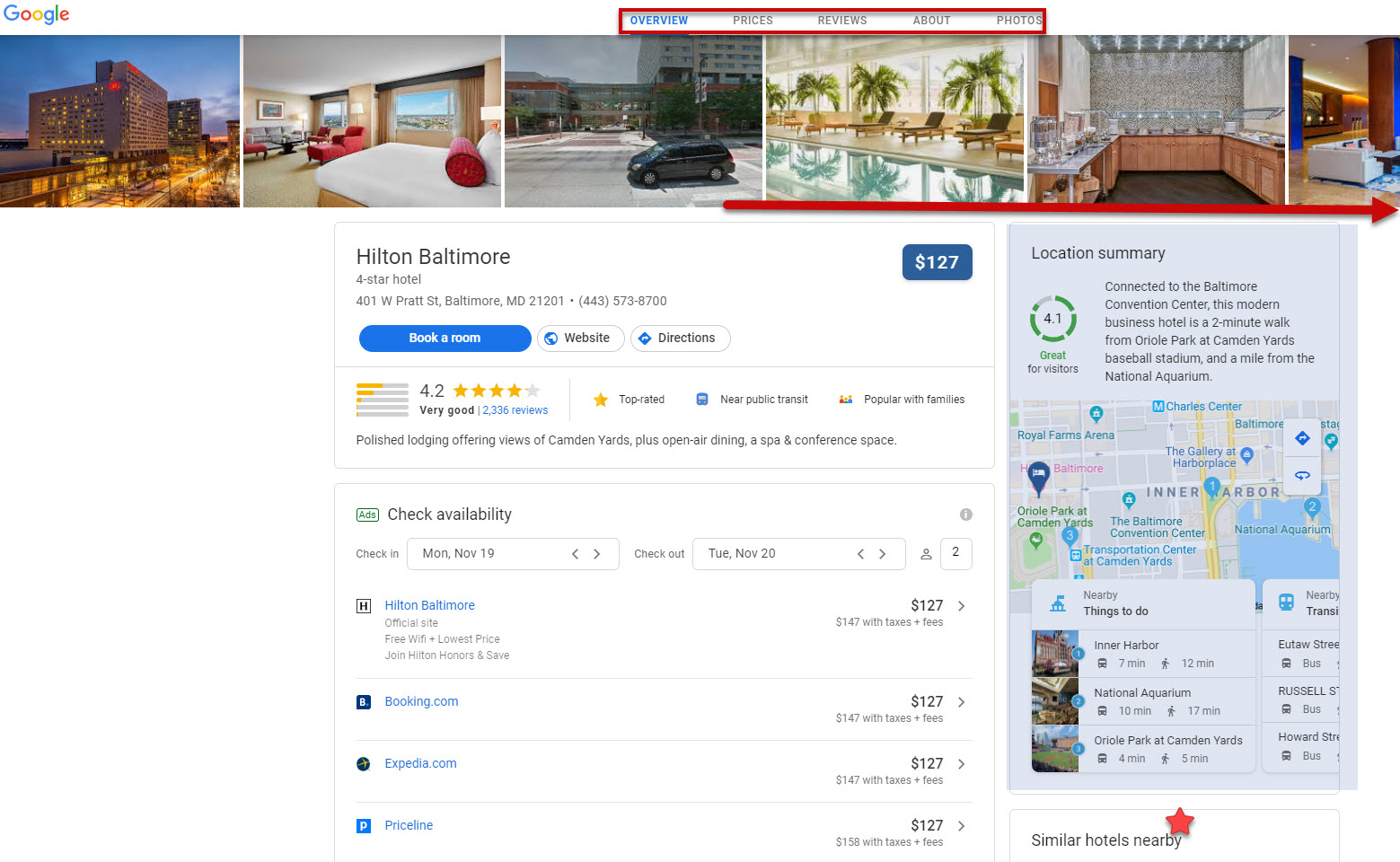
A new page dedicated entirely to offering hotel insights as part of Google’s revamped hotel listings
The update makes a great deal of sense to me. Booking a hotel can be a major financial transaction, where users often favor desktop’s more inclusive screen visibility. By presenting many of the advanced options offered on mobile to the desktop user, Google is offering travel sites some serious desktop competition. The advent of the new “extended page” also helps to engender the feeling that you are on a separate site meant specifically for booking a hotel room. That’s an important psychological shift that should make users more predisposed to using Google to make the actual transaction, not just research the best deal.
A First Look at Explore Panel Data
Very excited to share some data on the “new” Explore Panel. What is an Explore Panel you ask? In the recent past, Google has started showing a SERP Feature on
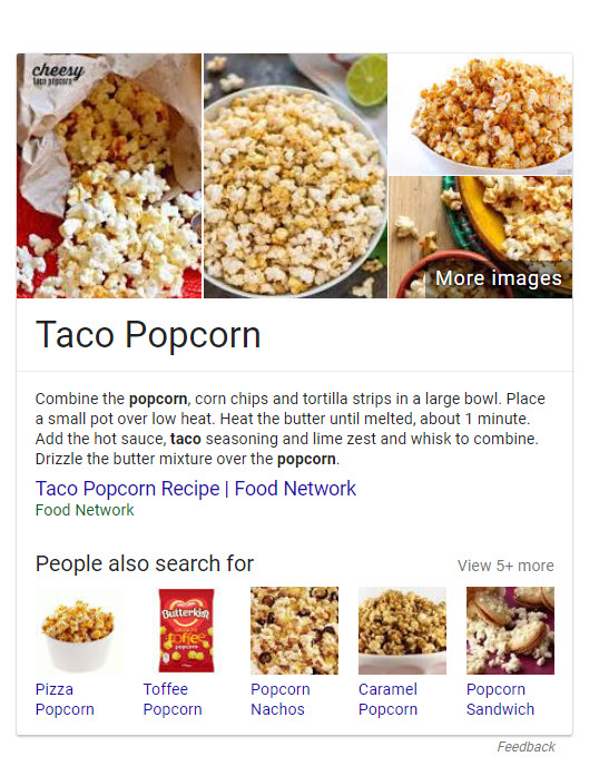
So what we have here is not a Knowledge Panel, nor is it a Featured Snippet. It’s an
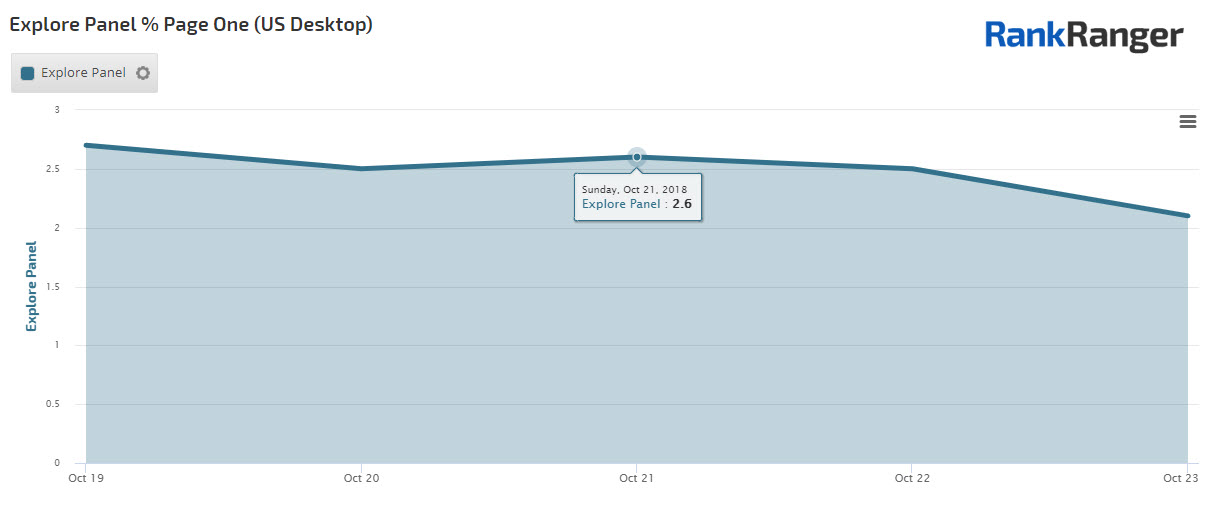
Initial data on the Explore Panel show it exists on between 2% and 2.5% of desktop SERPs
After looking at some of the keywords that bring the feature up, it seems like a good number of Explore Panels appear for product queries. What’s perhaps more interesting is that Google utilizes the Explore Panel when seeking to modify an entity according to a sub-topic of sorts. It’s almost a way of combining two entities when such entities are related or when one modifies the other. What do I mean?
Here’s what you get for JFK:

Now here’s what you get for space race:
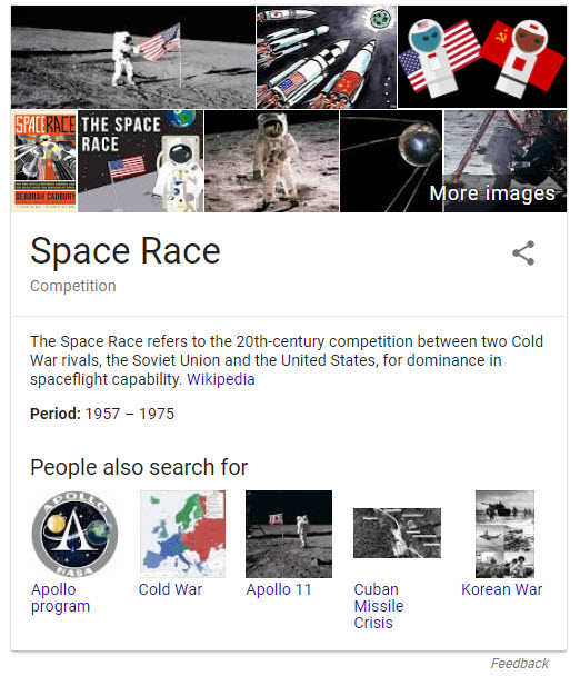
Finally, here’s an Explore Panel for JFK space race:

Other such keywords that brought up the Explore Panel (at the time of this writing)
That’s not to say other types of queries/entities do not appear in the
October’s Changes to the Google SERP
Any given month on the SERP includes what are usually numerous changes to features such as Local Packs and Knowledge Panels (Google’s go-to features for updates). This month, while we certainly have some of your more run-of-the-mill (yet no less important) SERP feature alterations, Google treated us to some pretty unique changes to the SERP.
Google Lens and Discover Make Their Way to the SERP
Let’s start off with some of the changes Google announced at its 20th-birthday bash. There, Google promised us that Google Lens would make its way to the mobile image SERP, and so it has.
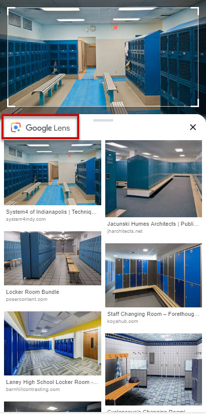
Google Lens as seen within mobile image search
Another promised change was the insertion of Google Discover onto the mobile SERP (formerly known as Google Feed, which existed as part of the Google app). Here too, Google has acted quickly. The newly named Discover now appears on the mobile homepage. As I’ve discussed at length previously, Discover on the mobile homepage is part of Google’s push towards guiding users rather than providing for users.
Search Console SERP Snapshot
Google has been testing a way to access your Search Console data right on the SERP. Meaning, if your site comes up in a search, Google has been offering many a brief look at some Search Console data amidst the search results themselves.
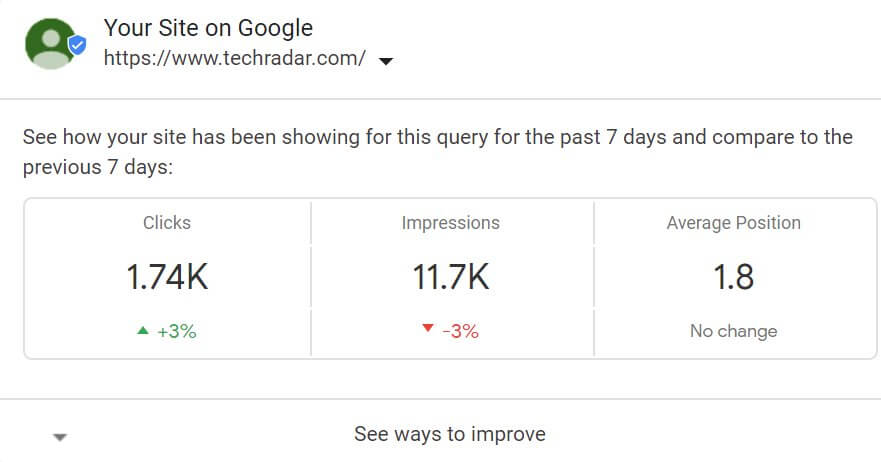
An example of SERP showing Search Console highlights (Image Source: SearchEngineLand.com)
This is definitely an interesting test/roll-out. I would imagine it would help site owners who might not be on top of their Search Console performance. Not sure how much it helps those checking in on their Search Console stats each and every day.
Mobile-First’s Cache Bug Fixed
Back in May, the industry discovered that sites that were moved over to the mobile-first index, when trying to access the Google cache version of the page, were served with a 404. Google, as of October 22nd, has fixed the bug, which means you can now see how your page looks
Rich Snippet Removal with Link Penalties
It would appear that Google penalties other than one specifically geared towards a rich snippet, can result in the site not showing with the ancillary information. That is, a site where a link penalty has been applied, may not show with its rich snippet. This makes total sense to me, since why would Google want to incentivize penalized sites with attractive rich snippets?
SiteLinks Expand to Featured Snippet Proportions
October brought us an entirely new version of SiteLinks. Early in the month, expandable SiteLinks were spotted within the organic results.
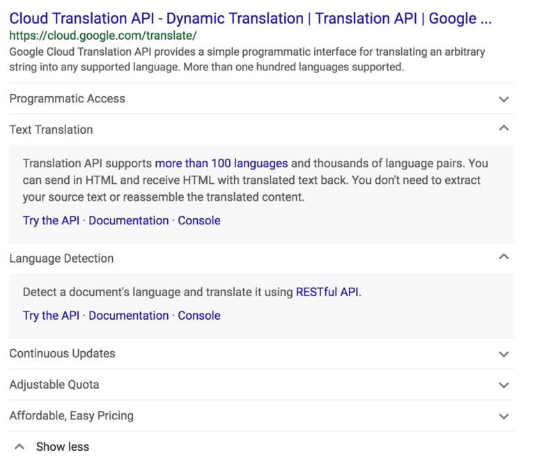
Expanded SiteLinks as seen on the SERP (Image Source: SERoundtable.com)
The new format functions much like expandable Featured Snippets and takes up about the same amount of space on the SERP! That is, clicking on a “SiteLink tab” expands it, showing you a snippet of page content (again, similar to a Featured Snippet).
Should this format take hold, it will almost certainly bring a new sense of importance to the SERP feature. Scoring an expandable SiteLink essentially brings with it a way to simply dominate the SERP.
Reserve with Google Now in the Local Pack
Google has expanded its Reserve with Google program. No, not with additional partners (at least not this time around), but by giving users “booking access” right from the Local Pack.
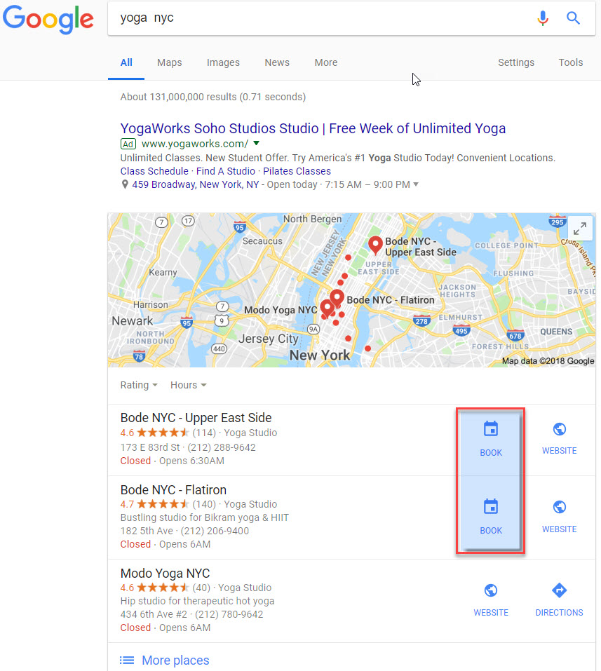
The Reserve with Google program now appears within the Local Pack
Previously, the “booking button” only appeared within the Local Panel. That is, a user had to first access the business entity to engage with the program. Now, a user can choose a business because it has access to the program. Meaning, now users can specifically choose one business over another due to the ability to easily book an appointment via the SERP itself.
The October SERP RoundUp
Rounding off the month was a series of changes/tests to the Local Pack and an important addition to the Local Panel. More, there was one really strange test that offered a new way to navigate the SERP.
Mobile Navigation Slider
This is an odd one. As October rolled in, Google tested a new way to navigate the SERP. Here, the search engine provided a slider that parsed the SERP as you scrolled down the page. As you engaged the slider, the SERP was all but hidden behind a slightly transparent “cover.” Instead of seeing results per se, users saw the “headings” of the SERPs various segments (i.e., Top results, People also ask, etc.).
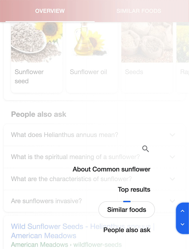
A test showing a slider that parses the SERP according to the section titles that appear on it (Image Source: SERoundtable.com)
People Also Search For in the Local Finder
People Also Search For now appears within the Local Finder. When moving from the Local Pack to the Local Finder, some of the listings on mobile now contain a People Also Search For carousel.
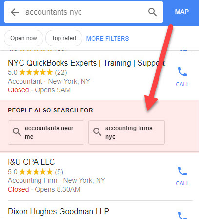
People Also Search For Carousel inside the Local Finder
When I spotted this mid-month, I could not bring the carousel up for local results related to eateries, though that may have changed over the past few weeks.
Product & Service Link in the Knowledge Panel
A new section that presents a link to a site’s products/services is now available inside the Local Panel.
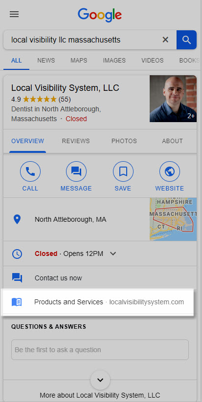
A new section within the Local Panel presenting a link to a site’s products/services
This is an obvious bonus that any business could benefit from. The new section appears to be pulled from your product and service listing within Google My Business. Have you seen the new link showing in your panel?
Local Pack Tests and Changes
There were a few interesting tests made to the Local Pack in October (other than what we’ve already discussed, because why would I mention the same thing twice? That just wouldn’t make sense).
Local Pack Trending Icon
This is a fascinating little test with potentially huge implications. On October 11th, a Local Pack with an icon indicating that the business was “trending” was spotted in Spain.
![]()
An icon showing a trending business within the Local Pack (Image Source: SERoundtable.com)
Big deal, right? Not necessarily. Sure, if you’re doing a query for a local accountant and you saw a “trending icon,” aside from wondering what exactly is a trending accountant, would it impact your behavior? Not likely.
Now imagine you’re planning a big ***** out. You’re researching restaurants, bars, and whatever attractions you fancy and you see the trending icon show for one establishment over another Local Pack listing, would that impact your decision process? Quite likely. Little test… big potential implications.
Both Highly Visual and Low-Key Local Packs Tested
Here’s a bit of a thesis/antithesis moment for you on the SERP
The graphically inclined mobile Local Pack sported large images on top of the traditional business information typically seen in a Local Pack (however, no buttons to call the business or visit the website were present).
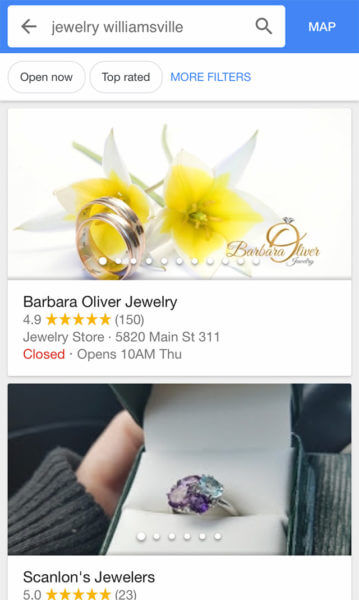
A Local Pack test showing a series of large images (Image Source: SearchEngineLand.com)
Conversely, the more minimal Local Pack contained no images nor did it contain any reviews. However, the Call and Directions buttons were available.
Your Top Sites on the SERP in October
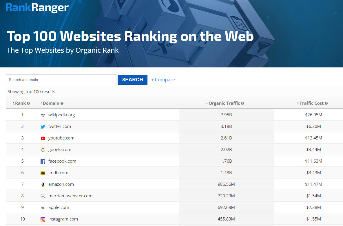
Just this past month we pushed a new free tool where you can view the top 100 sites on the web (as well as search your own web rankings and compare it to your competitors). I thought posting the top 10 sites for the month would be a nice little addition to the SERP News.
Here are the top 10 sites for the month of October:
In Search of SERP Insights

Between Google altering how desktop users interact with hotel listings to how users interact with search overall via Discover coming to Google’s mobile homepage, change is certainly in the air. I personally believe we’re at a “historic” crossroads, as Google is set to take
Good thing we’ve got a brand new podcast providing
With that plug, thank you for joining me for yet another edition of the SERP News. If you see anything strange out there on the SERP, as always, let me know, I’d **** to hear from you!

