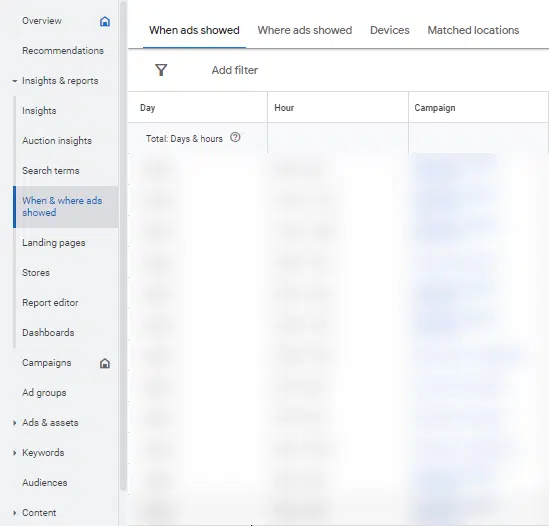
Google Ads has rolled out an updated UI to a small number of accounts.
While the affected accounts will experience a different layout, structure and design, it’s important to note that there have been no changes in functionality to any tools or features.
This specific UI change, which is currently in beta for Manager Accounts, was was designed to improve workflow organization and streamline accessibility, all while maintaining the availability of the same set of tools.
Why we care. If you can’t find your reports when you log into Google Ads, it’s because they’ve been moved to the “Insights and reports” section. All your performance reports can now be found there.
First spotted. The Google Ads UI update was first spotted by digital advertising team lead, Greg Kohler, who shared a preview of the platform’s new design on X:

Speaking to Search Engine Land, Kohler admitted he isn’t a keen on the new interface:
- “They moved around and it’s been confusing trying to figure out where to find things – for example, instinctually I would look under Keywords to see search terms.”
- “I’m not a fan but I think it’s mainly just because it’s change. I’m sure I’ll get used to it eventually but for now it’s a hassle.”
Why now? The new design is part of the same UI update that began rolling out in June. Google said it has continued to work on the new layout to make the platform easier to navigate.
What Google is saying. A Google spokesperson said:
- “User research indicates that advertisers use both the Insights page, and various reports pages when trying to understand campaign performance.”
- “By bringing these pages together into a consolidated section in the navigation, Google’s aim is to make it easier for you to get the performance data you need to optimize your ads.”
Get the daily newsletter search marketers rely on.
Deep dive. Read Google’s Navigate and Insights Reporting update in full for more information.
Source link : Searchengineland.com
