Posted by
Shay Harel
This was one of my favorite months on the Google SERP. Not because the changes Google made “broke the way of the SEO industry.” Rather, it’s because the changes Google made may seem slight or even negligible. But that would underestimate the search engine. Sometimes, the most innocuous changes to the Google SERP harbor the biggest impact. Such was the case on the June SERP.
Get ready, get set, here comes the July 2020 edition of the SERP News!
Google Unleashes Scroll-to-Text Featured Snippets that Highlight Page Text
Have you ever clicked on the URL of a mobile Featured Snippet only to be whisked half-way down the page to a section of text highlighted in yellow? If you have, that’s because in 2018 Google released scroll-to-text for mobile Featured Snippets where the URL directed the user to an AMP page. In early June 2020, Google moved scroll-to-text Featured Snippets beyond the AMP page. Now, a click on many Featured Snippet URLs speed you off to the section of the page that corresponds to the content shown in the Featured Snippet itself. This section of content is highlighted in yellow so as to clearly indicate its status as the content shown in the Featured Snippet.
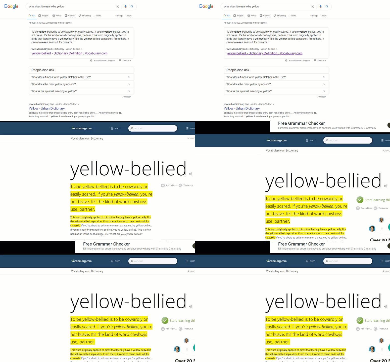
OK, so Google is taking users directly to the section of text on your page that is shown in the Featured Snippet and highlighting it in yellow on desktop and non-AMP pages on mobile, big deal! Google isn’t even running this feature for list Featured Snippets because often the list comes from a collection of headers, so what’s Google going to do, highlight the whole page?
But it is a big deal, for a few reasons. For starters, it means that you may need to start qualifying the traffic you get from a Featured Snippet and analyzing how users interact with your site. Google isn’t just shifting the user halfway down your page, Google is pushing the user past any ads you may have or even a really powerful CTA.
At the same time, the user no longer needing to skim your content in many cases when coming from a Featured Snippet means you lose the opportunity to “show your stuff.” A big part of a Featured Snippet win is the branding associated with it. That means that the user merely seeing your brand within the Featured Snippet speaks to your authority. However, there is another way the Featured Snippet can build your authority and that is by having the user scroll through your content to find the answer all while the user is (hopefully) impressed with the full-bodied work you put out on the given topic. That’s going to be happening less and less with proliferations of the scroll-to-text feature.
But if we really want to talk about the brand impact of scroll-to-text proliferation from the Featured Snippet, we should talk about your brand’s logo. Why would we talk about your brand’s logo? Because if the user is whisked to the middle of the page, they may never see it. This is why some are now advocating a site take a hard look at implementing a sticky-header.
Still, there’s one more aspect of the change to discuss and it might just be the most controversial aspect of the feature. This change represents one of the first incursions onto your site. In other words, Google isn’t highlighting the SERP, they’re highlighting your page. Now, I’m not advocating that this is some sort of nefarious attack on your site. I don’t think that to be the case at all. However, it is an interesting act that we should take note of.
I do wish Google would allow sites to opt-out of the highlight. There are many cases where the highlight just doesn’t work for the site, and can, in fact, make the site seem a bit unprofessional. That said, sites can opt-out of the scroll itself. Doing as such means the user will hit the top of the page from the Featured Snippet but the content reflected in the snippet will still be highlighted in yellow on the associated page.
Here’s my point on why this whole yellow Featured Snippet highlight thing needs a 100% opt-out…
I mean look at this…. Does this make sense to anyone?
If I was a user who had no idea about #SEO, I’d say this site is run by a total and complete moron… pic.twitter.com/q9mrvRR1Xn
— Mordy Oberstein (@MordyOberstein) June 10, 2020
For more analysis on scroll-to-text Featured Snippets have a listen to episode #74 of The In Search SEO Podcast
A New Top of the SERP Filter Bypasses Your Marketing Funnel
In mid-June, a nifty little filter started to show up at the very top of the desktop SERP. This innocuous little fella acted as a way to allow users to refine their search query. Here, have a look at it:
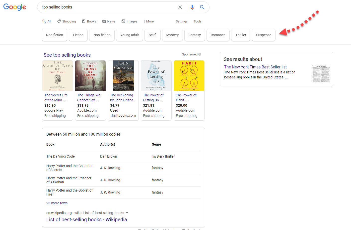
A new top of the SERP filter allows users to refine their search immediately
What’s the harm here, right? This is great for users, no?
Have you ever created some top-level content aimed at reaching a broad user demographic? Maybe you’ve made a list of the best movies to watch or the best restaurants in your town. Why did you make that list or write that content? Was it in the hope of casting a wide net, drawing in a wide variety of users, putting them within the “funnel” so as to move them towards more specific and more targeted content?
Well, this filter dampers this tactic.
Instead of a user running a broad query, seeing your site, and then refining their search process on your site per se, the user may never even see your site. Instead, with Google pushing funnel refinement right at the top of the SERP the user, all things being equal, will refine their process via the SERP itself, not on your site.
Of course, the user may have refined their query via the search box to begin with, but at least your site stood a chance. With a filter right at the top of the SERP, it’s hard to see users utilizing the sites on “broad intent” SERPs to refine their consumption process.
Personally, I don’t think this is Google “going after you.” This is just Google giving what it thinks users want. But it does mean you might need to get more specific in your content generation and so forth.
The point is, even what seems to be a small change to the SERP may have an enormous impact on your site and on your overall strategy.
The SERP Roundup Covering June 2020
From ads to images, June brought a series of updates to the SERP that impact how you can target consumers and how users interact with your images on the SERP. Here are this month’s collections of tests and updates to the Google SERP!
Changes to Google Ads Policy and Labeling
A few big changes to the world of Google Ads policy in June, both of which may greatly impact your ad strategy. On top of that, there is a new ad label for promoted products on desktop. Let’s get into it!
Google Introduces ‘Ad’ Labeling for Desktop PLAs
Late in June, Google removed the ‘Sponsored’ label from its product ads on desktop. In its place, Google has introduced the “Ad” label used on mobile to the desktop SERP.
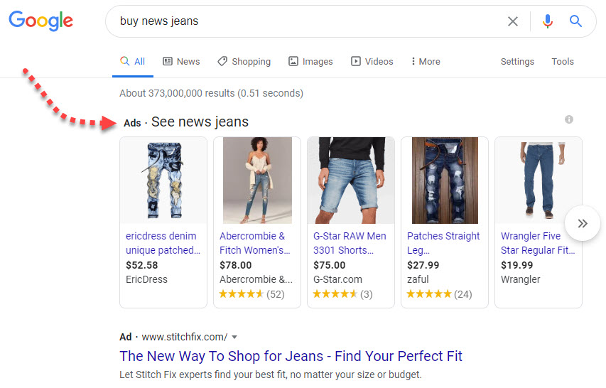
A PLA on desktop showing with the new ‘Ad’ labeling
Generally speaking, changes to Google’s ad labeling induce a reaction that accuses the search engine of trying to cover up its paid properties by presenting them under the guise of being organic. Personally, I think this does the opposite. For starters, the “Ad” label is simply more noticeable than the gray-scaled “Sponsored” indication that was shown previously. Also, I believe that the term “ad” is less ambiguous than the term “sponsored” and should bring greater clarity to the listings being a paid promotion.
Google Goes After Clickbait Ad Copy
As of July 2020 (which means, now), Google is going to be coming down hard on clickbait tactics used within Google Ads. According to Google, this basically means any use of sensationalism within an ad, whether it be via the written copy or an image, will not be shown on the SERP. Any time an ad intends to hide the true nature of a topic or goes about sensationalizing a topic, the ad will not be shown.
To this, Google has also indicated that ads that utilize “negative life events” to emotionally manipulate the user, will also not be shown. This means that an ad that, for example, induces the fear of arrest is officially against Google’s ad guidelines and will not appear on the SERP.
Google to Limit Ad Targeting for More Ad Types
Come 2021, Google plans on extensively limiting targeting for ads related to housing, employment, and credit. In specific, these advertisers will not be able to target consumers according to gender, age, parental and marital status, and zip code. This is in addition to previously enacted targeting restrictions around race, religion, ethnicity, etc.
The move comes in the wake of minority communities, many of which have been impacted to greater extents by COVID-19 than other communities, being perhaps nefariously targeted by advertisers seeking to capitalize on their vulnerable position.
For the record, the change may come sooner than 2021 in the US and Canada, though no specific timeline has been presented by Google.
Product Knowledge Panels to Feature Free Listings Exclusively
By the end of 2020 Google says it will only show organic listings within the Product Knowledge Panel. This makes a lot of sense as Google needs to integrate the free listings from its Shopping tab onto the main SERP to grab the user-attention it craves. I suspect that free Shopping listings will find their way to the SERP in a whole host of ways!
How-to Schema on Desktop Gets Image Thumbnail
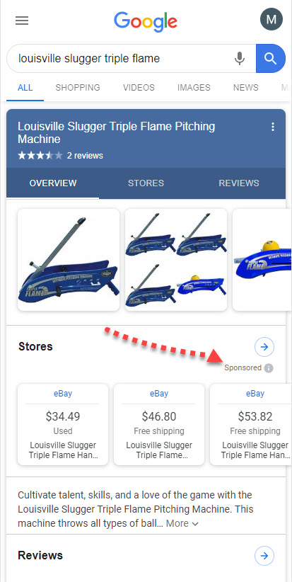
Google continues its flirtation with How-to markup on the desktop SERP. Towards the end of July, Google expanded its desktop “How-to test” to include… image thumbnails!
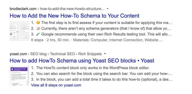
How-to Markup on desktop being tested with image thumbnails (Image Source: SERoundtabl.come via Brodie Clark)
For those of you familiar with the markup, the mobile version shows with a very visual set of cards that make up a carousel. The thumbnails tested here are Google’s attempt to incorporate that element on desktop. You can see in the image I presented above that it doesn’t really work, the thumbnails are too small to show much of anything. That said, the same issue does plague the mobile version as the visualizations shown in the image carousel cards are often too small to be helpful. I think some more guidelines are needed here.
Fact-Checking Comes to the Image SERP
Liars beware, Google has added the support for ClaimReview and Fact Check schema markup on the Image SERP. Sites can use the markup to debunk images that reflect utter trickery and downright lies (and to confirm truth as well). So if you are a giant liar, just know the image next to yours on the Image SERP may debunk that lie you wish to spread with this truth-telling markup.
Google Extends the User Journey with Content Attached to Images
Google’s tendency to present more accentual content opportunities continues with a test that placed content cards under Image Search previews. The test brought up a series of expandable cards attached to the image once the user brought up the preview from the image results. Once expanded the user was shown what is basically a Featured Snippet and the opportunity to explore other related images.
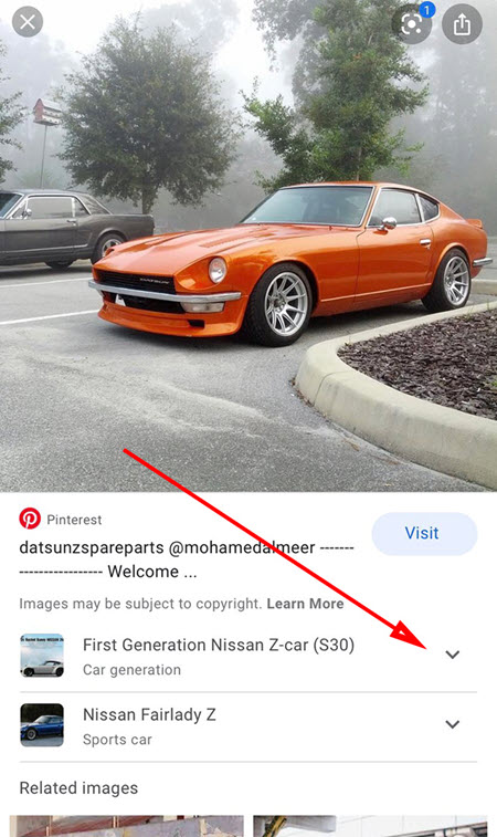
Google was seen testing content cards within an image preview (Image Source: SERoundtable.com via Brian Freiesleben)
The expandable cards appear to be a way for Google to extend the user’s journey by helping them explore the entity/topic associated with the image being previewed. I would bet that we’ll see more of this as this feature very much aligns with Google’s construct of and vision for the SERP.
Keyword Suggestions on the Scroll
Here’s a really interesting test for you…. Google was spotted trying out new search suggestions that appeared as you scroll down the page. In other words, as you moved down the SERP, Google would show new modifying keywords to your original term within the sticky search box.
Google SERP trial with Google suggesting search keywords by rotating them while you scroll @rustybrick pic.twitter.com/hXNBumu3te
— Yvo Schaap (@yvoschaap) June 17, 2020
What’s fascinating is that the keyword suggestions changed as you moved onto different parts of the SERP. This would seem to imply that Google is very much aware of the intent embodied by specific results. Not that we didn’t know that, but it’s interesting to see that in action on the micro-level.
Online Care Label to Local Pack
Google has been indicating when a medical facility offers online care so as to accommodate for the COVID-19 virus. In June, Google began running the label within the Local Pack itself. That makes a great deal of sense as the information is entirely pertinent and may very much influence the click to the business listing.
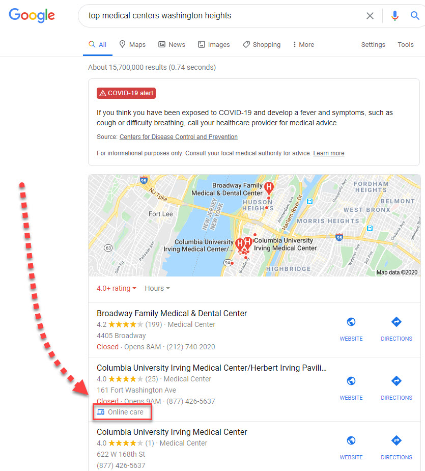
The Local Panel showing a label for ‘online care’ that previously showed only in the Local Panel
Qualify the Hours for GMB Listings
Due to the way COVID-19 has altered the way businesses operate, Google is letting listings qualify their hours. The change lets a listing indicate specialized hours for a particular service. For example, should your business offer curbside pickup but only during certain hours, you can now add hours for that specific service to your general hours of operation.
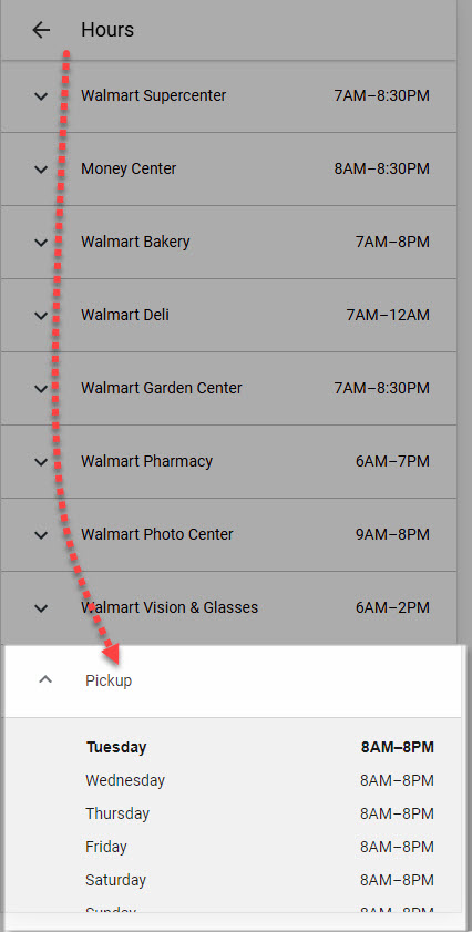
Specialized hours within the Local Panel tell consumers when they can pick up their orders among other things
I **** this change and hope that Google implements it beyond COVID-19. For example, it would be nice to allow a bar to indicate when their happy hour time slot is (you see where my mind is).
Google’s Direct Answers Show Special Store Hours
Google has been showing store hours in Direct Answers for some time. Now, however, Google is showing the specialized hours you can add via GMB within this Direct Answer. More than that, each department listed in the Direct Answer gets its own link to a new SERP!
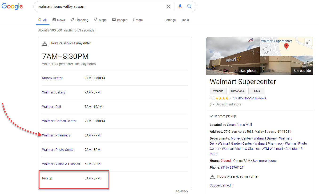
A Direct Answer showing links to departments as well as the specialized hours GMB now allows businesses to list
Local Panel Messaging Becomes More Relevant
Google has given more options when it comes to the messaging feature found in the Local Panel. The most prominent change is that you can now connect the messaging feature to your own customer support system. Previously, communication was relegated to SMS messages, so this is a big upgrade that should make the feature more relevant to businesses.
Google Maps Moves to Support Local Businesses
Searchers using Google Maps may now see an option that allows them to explore local businesses. Utilizing the options directs the user to the Local Pack where Google presents the usual three listings, but with a button to buy a gift card or make a donation. Meaning, you are not getting the three most relevant listings in the Local Pack, you’re getting the three most relevant listings that have set up the ability to buy a gift card or make a donation within GMB.
AMP Ups Its Relevancy with Core Vitals Clarification & Google Assistant Implementation
Google’s AMP may have taken a hit when the search engine said the format will no longer be needed to rank in the Top Stories carousel. However, those who wish to throw AMP overboard like tea in the Boston harbor may want to walk that back (or not). Google said that when an AMP version of a page is available it will be the page considered by 2021’s Page Experience Update. That is not to say you cannot have a page that does well with Google’s “core vitals” if it is not AMP.
The search engine is similarly pushing for retaining AMP’s relevancy with Google Assistant. Accordingly, Google has recently said that Google Assistant Smart Displays will be capable of pulling content from AMP pages. Google will use the speed of the pages to show articles in their entirety on the device in an expeditious manner.
The point is, Google had to drop AMP from the News Box but it continues to look for ways to bolster AMP’s relevancy.
COVID-19 SERP Functionality Moves to Other Verticals
The left-menu sticky tab functionality found on the “COVID-19” SERP has been spotted for other topical matters. Now, Google has used the format for the COVID-19 SERP as a Knowledge Panel of sorts in the past with tabs for “People Also Search For'” etc. I don’t count these instances as the functionality expanding to other verticals. The way Google implements the functionality on the COVID-19 SERP is totally different from the way Google uses it to replace the Knowledge Panel. In the former, Google uses it to break a vast topic down into its various segments whereas in the latter Google is throwing generic Knowledge Panel categories onto the left-hand side of the SERP.
In the example here, Google, as it does with COVID-19, is taking a topic and truly segmenting it and extending it.
Not seen this SERP feature before. Anyone seen anything like this? Giving you the option of what kind of result you’d like to see… pic.twitter.com/p4ijcfAj2O
— Dan Brooks 🤓🔍 (@seodanbrooks) June 16, 2020
The above, truly gets into a topic and reflects a truer proliferation of COVID-19 SERP functionality than the Knowledge Panel format seen previously.
What to Watch Carousel Gets Stretchy Cards
Here’s a really interesting little update to the relatively new “What to Watch” carousel…. Now, when you hover over a carousel card the card stretches to reveal more information. I don’t think I’ve ever seen that functionality on the SERP before… but I do expect to see more of it!
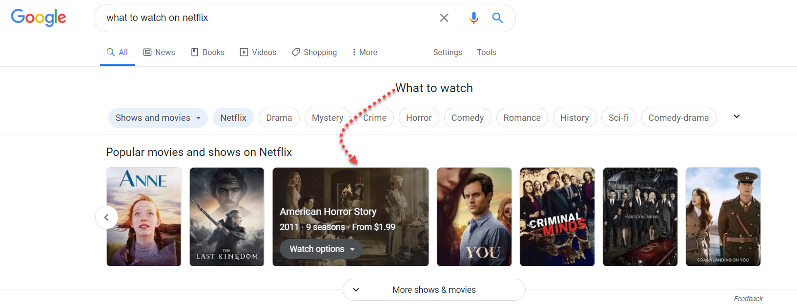
Hovering over a card in the ‘What to watch’ carousel expands the card to reveal additional information (Image Source: SERoundtable.com via Satyajeet Salgar)
Blue Headers and SiteLinks with Borders
Here are two items for SERP voyeurism….
1) Google has been seen testing blue headers on mobile. The test had a very faint blue tinge appear at the very top of the result cards on mobile.
2) Google has been testing sitelinks with a border around them. In other words, each sitelink looks like an independent card
So there was that.
Pay Close Attention

Remember Google’s mobile interstitial penalty? It was supposed to be the biggest update to mobile ever, but it wasn’t. Sometimes Google may announce something that we all think will be the biggest thing to hit SEO since the advent of the search engine, yet it falls flat. At the same time, Google plots a plain ol’ very boring looking filter at the top of the SERP and oh snap there goes top of the funnel content being as powerful of a SERP strategy than it was the day before the filter rolled-out! My point? It pays to keep very close tabs on the SERP. I’m not saying that to promote this post. In fact, I very much recommend you keep up with sites like seroundtable.com and TLDR Marketing throughout the month so as to keep close tabs. Because, hey, you never know when Google is going to drop the next small thing!

