Posted by
Mordy Oberstein
After extensive testing, Google’s ‘More results’ button officially does away with mobile pagination. With the new mobile format users can quickly load the equivalent of another page of search results with just one click and without
Onwards.
What are the Implications of the Absence of Mobile SERP Pagination?
Is this really a big deal? Is the insertion of one little button on the mobile SERP really going to change anything? It’s not like we’re talking about infinite scrolling (yet). The answer is yes, the ‘More results’ button has some pretty interesting and substantial implications, specifically on how users scroll and see organic results.

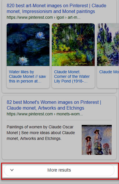
The new ‘More results’ button as seen on Google’s mobile SERP
Data on the Load More Button
There is actually a bit of data on the impact of ‘load more’ buttons and infinite scrolling vs. pagination. In 2016, the Baynard Institute ran a prolifically long and
Here are some of the more notable findings:
- Pagination, as it is “slow,” discourages users from further browsing. As a result, more time is spent on ‘page one’ when pagination is used.
- Conversely, load more buttons result in increased browsing.
- Load more buttons result in less focus on each item shown when compared to pagination, though not nearly to the extent that infinite scrolling does.
What the Data Means for Search
Let’s interpret this information and explore what it means vis a vis search.
So, it’s pretty self-evident that pagination is an obstacle towards browsing. As almost silly as it sounds in the grand scheme of things, that extra click combined with “longer” load time, makes jumping to the next page less likely, especially on mobile. Meaning, the chances of a user moving on to page two of the SERP is made less likely as a result of the functionality that is pagination.
Load more functionality (and to a greater extent infinite scrolling…. and please understand, what Google released is not infinite scrolling, despite some in the industry calling it as such), has the opposite effect. Load more buttons utilize Ajax, which of course results in faster functionality. When you click on a load more button, the new content shows pretty much instantaneously. Thus, the sluggish experience of pagination is no longer a factor, thereby removing a serious impediment towards further browsing.
What the study then says, is that with increased access to “browsing items,” whether they be products on a web page or search results, comes less focus on any given item on the page. Meaning, as users are more easily able to scroll more results faster, they pay less attention to each of the results shown. This is a relative equation. The faster users scroll, the less attention they pay to each individual result. It just makes sense. Load more buttons fall into the middle in that they don’t allow users to scroll as quickly as infinite scrolling, but the format does allow the user to peruse through the results faster and more seamlessly than pagination.
Think about it like this, scrolling equals skimming. When there isn’t much to scroll, such as with pagination, there is more reading and less skimming. When users can flick a finger and scroll forever, there’s more skimming than there is reading. When the format is somewhere in the middle, there’s a bit of reading and a bit of skimming. (I’ll prove this below.)
Bottom line, the study shows that Google’s new ‘More results’ button on mobile will most likely lead to users accessing more results, but with a bit less attention shown to each specific blue link.
A World Free of Page Two Stigma

Still, there’s something else to consider when analyzing the impact of the new ‘More results’ button, and that’s the lack of page two stigma that the button brings. We all suffer from it, the embarrassment of being found on page two of the SERP. Page two is like disco ***** at the community center, you wouldn’t be found dead there. If you suffer from page two stigma, but secretly want to see what exists across the threshold, the ‘More results’ button is just for you.
In all seriousness, the ‘More results’ button is rather benign. All you’re doing is having a look at some more results, nothing wrong with that. There’s no association of irrelevancy with seeing ‘More results’ the way there is in heading over to “page 2.” There is a very real and very pronounced psychological difference in the way we relate to “page 2” versus the new button Google offers. The mere fact that pagination uses numbers already creates a
This is just another reason why users are far more likely to view more organic results with the ‘More results’ format than they would have when pagination is present (or was present) on the SERP.
Google’s ‘More Results’ Button – Who Wins and Who Loses?
With Google implementing the ‘load more’ format, who stands to gain the most? Who stands to benefit from more results being seen by users? Who loses when users skim results, paying less attention to each title and description?
The ‘More Results’ Button Winners
Interestingly enough, there are a few winners here. The evolution of user interaction with the mobile SERP, as brought about by the ‘More results’ button paves the way for both some expected as well as some unexpected ‘winners’.

Page Two Results: The most obvious winners are those sites that would have ranked on page two, should mobile SERP pagination still exist. I would say it’s almost a given that users will load more results upon reaching the button. The ‘More results’ button almost begs them to do so. And why not? The results load super-fast and there’s no longer any “page two stigma.” Users are now going to see those results that would have otherwise been on the ever-irrelevant page two.
More than that, they will be able to easily compare the results that show after the first ‘More results” button to those results that initially appeared on what is the equivalent of page one of the SERP. Whereas previously users had to return to the previous page to compare results across multiple pages, now all they have to do is scroll back up. In fact, once you load more results, it becomes very difficult to distinguish between the original set of results and the ones that just loaded. Actually, the only way to do so is by remembering which result was the last of the initial set or which was the first of the new set. That means a lot more competition between the results on what was “page one” and the results on what was before “page 2” (see below).

Sites Capitalizing on Structured Data Markup: As noted, with the ‘More results’ button comes more scrolling and in turn, more skimming. In such an environment, those results that are in some way visually enhanced, stand a better chance to be “seen” or remembered by fast-fingered users. This is particularly true when it’s immeasurably easy to not only scroll down the SERP but back up to earlier results as well.
Those sites that take advantage of structured data markup always have had a “SERP advantage,” however, that advantage is far more pronounced with the insertion of the ‘More results’ button. Sites that show on the SERP with features such as Image and Video Thumbnails, SiteLinks, Structured Snippets, and so on, stand to be noticed in a scroll heavy, or rather, scroll quickly environment.
Google: Following the above logic, the only thing more noticeable than the SERP features that are part of an organic result are those that are not. Dwarfing everything in their path, features such as Local Packs, Knowledge Panels, and Direct Answer Boxes are set to only become more dominant in the era of load button SERPs.
If users are now even more likely to notice mobile organic results that contain an Image Thumbnail, how much more so a Knowledge Panel that can take a few
Load Button Losers
Not all the news is good news (Is it ever?). There are going to be sites that yearn for the days of yesteryear where pagination was the only thing stopping users from moving onto to pages unknown.

Non-structured Results on the Page Formerly Known as Page One: Keeping in mind that which was just mentioned, and the most likely loser here would be top ranking sites that don’t employ any markup.
The ‘More results’ button dilutes the power of each ranking position by making those results that would have otherwise gone unseen accessible and in a sense desirable (given our tendency towards curiosity and clicking buttons for the sake of clicking buttons). Whereas page one results used to be unchallenged, the ‘More results’ button throws lower ranking sites into the fray. Couple this with the notion that “visibly distinct” sites are set to thrive in this new mobile SERP environment and your most likely loser are those sites higher up on the SERP that do not show with any sort of “visual enhancement.”
Obviously, I’m not calling “plainer” top ranking sites “losers.” Rather, I’m pointing out that they stand to lose the most with the new loading button paradigm.
What’s next for the Mobile SERP? Are We Heading towards Infinite Scroll?
If Google had gone within infinite scrolling, as opposed to a load more button, the implications would be far more drastic. Imagine users flying down the SERP at breakneck speed without as much as a second thought? The whole framework for tracking rank on mobile would change. The power of ranking positions would be largely determined by where, on average, users stop scrolling. An analysis of how much of each title users assimilate would have to be done in order to have insight as to the expected impact on rank. SERP features would play an even more important part of everyone’s SEO strategy. So, is this where we’re heading? Is the ‘More results’ button just a stop on the train to dynamically loading results on the mobile SERP?
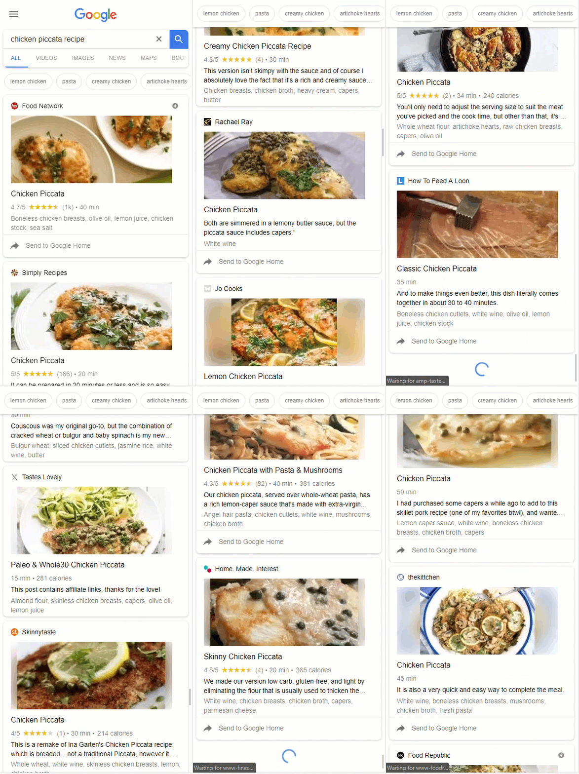
No way, right? I mean even the Baynard study, which was all for search engines utilizing load more buttons, was very much against their implementing infinite scroll functionality. There’s no way Google would ever do that! It would be terrible for organic results, Google wouldn’t go that route… except… it… already… has:

For a long while now, recipe queries on mobile, more often than not, display a series of rich cards that load dynamically. Notice above, that Google is quite aware of the fact that scrolling = skimming. These are not “standard” organic results, these are Rich Cards. Google knows that users are not “reading” much when infinite scroll is implemented, so the search engine adjusted accordingly. Should the search giant eventually move towards infinite scroll as the rule for the mobile SERP do you really think all results will be in the form of Rich Cards? Let me answer that for you. No.
Make Way for Visual
Ads

I don’t think infinite scrolling is coming to a mobile SERP near you in the immediate future. What I think is far more likely is that you are going to see ads that contain images pop up on the mobile SERP.
What a crazy notion! Except that Google has already tested doing so. Back in December of 2017, an AdWords text ad that contained an image was spotted on the SERP. Considering that the ‘More results’ button greatly increases the significance of visual content on the SERP, it’s not a fantastical leap to image enhanced AdWords ads. Afterall, Google has already tested the ad format.
It just makes sense that the evolution of AdWords would include images. With the insertion of the ‘More results’ button, that notion seems to become more of a necessity for the health of the mobile AdWords program.
You can already get a glimpse of Google’s own awareness that the load more format demands a new approach to ads on the mobile SERP. Along with announcing that they had moved to the ‘More results’ button, Google also said that ads will appear at the bottom of the newly loaded results (should a user tap the ‘More results’ button).
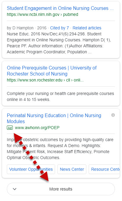
Let’s translate that. Google knows that the load more format means users are more likely to skim search results and ads as well. Rather than have you miss out on an ad (and it on ad revenue), Google is making sure you see an ad. How so? By placing an ad in an optimal location, right on top of the ‘More results’ button (more specifically the second or third appearance of the ‘More results’ button).

An ad appearing above the third appearance of the ‘More results’ button
Load on Google, Load on

It doesn’t seem like much at first glance, but this is a big change. The ‘More results’ button is going to change the way users interact with the mobile SERP. Anytime you have a new user interaction scheme, you’re going to have
How do you think the ‘More results’ button will change the way users interact with the results found on the mobile SERP? Are you seeing any interesting changes now that mobile SERP pagination is a thing of the past? As always, I would absolutely **** to hear from you.

