Posted by
Shay Harel
There was no major Google algorithm update this past month that shook up the entire SEO community. Instead, we got a few shorter “bursts” of rank volatility that had their own story to tell. On top of that, mobile indexing multiplied by immense proportions, Chrome’s update brought us more direct answers, and a good dozen or so SERP feature tests and changes popped up.
Oh, and Google announced a slew of some pretty big changes that could change the entire way we think about search and go about optimization vis a

Big Changes to Search Coming Your Way as Google Goes for Guiding Users on their Search Journeys
We’re coming up on 20 years of Google search and to mark the occasion Google held an event. At this celebration of search, Google just so happened to announce a series of changes that I for one think will change search as users know it (which means it will change “optimization” as we know it as well).
Let’s dive in.
New Activity Cards SERP Feature to Show Pages from Your Previous Searches
In early September an astute searcher caught a test that had Google showing a tab on the SERP called “Relevant history.” The tab, when activated, showed your pages from your past searches. As part of these “20th-anniversary” announcements, Google said it is going with the new tab. Activity Cards, as they will be known, will show pages you visited as the result of previous searches that Google thinks is relevant to your current query.
According to
Google Collection Cards – Bookmarks of the Future
Coming this fall, Google will be adding Collection Cards to the mobile SERP that are synced with the Activity Cards I mentioned above. Meaning, you will be able to directly add a page from the Activity Cards to a collection. The cards will also offer users some search suggestions.
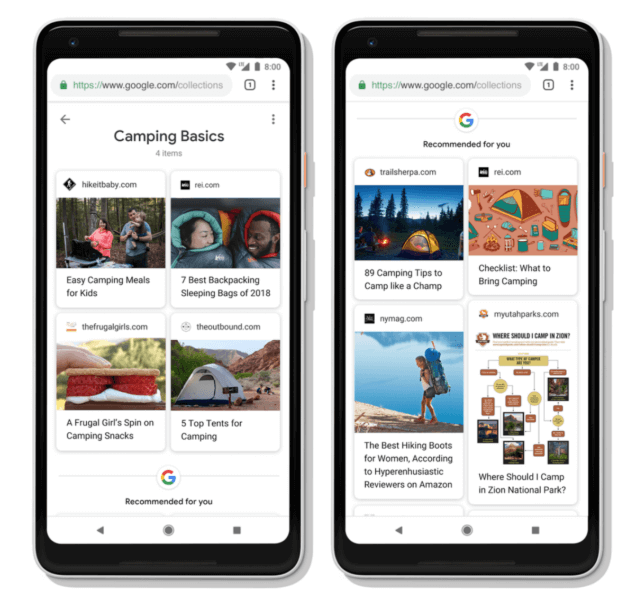
New Google Collections Cards were announced at an event celebrating Google’s 20th birthday (Image Source: Searchengineland.com)
Google Feed Becomes Discover & Finds a New Home on the Mobile SERP
Believe it or not, but according to Google, its “Feed” has 800 million active users. Google Feed, as found in the Google app, is a set of content that Google thinks you might be interested in. Google Feed, per the Google’s 20th birthday bash, will now be known as Discover… and it will show up on the mobile SERP as well!
How will Google Discover work? If you’re logged into your Google account and head over to the Google homepage on mobile, you’ll see a slew of content that Google thinks you might be interested in. So instead of heading off to whatever search you meant to execute, you’ll spend more time than you wanted to
Topic Surveys Come to the SERP with Knowledge Panel Functionality
This is the one that I think will have the most impact on users and how they search. Google is using mobile Knowledge Panel functionality (where you have sub-topics represented as tabs within the panel) to bring up new SERPs related to the “entity” a user has searched for. What am I talking about?
Let’s take Google’s example and my favorite species of , Pugs:
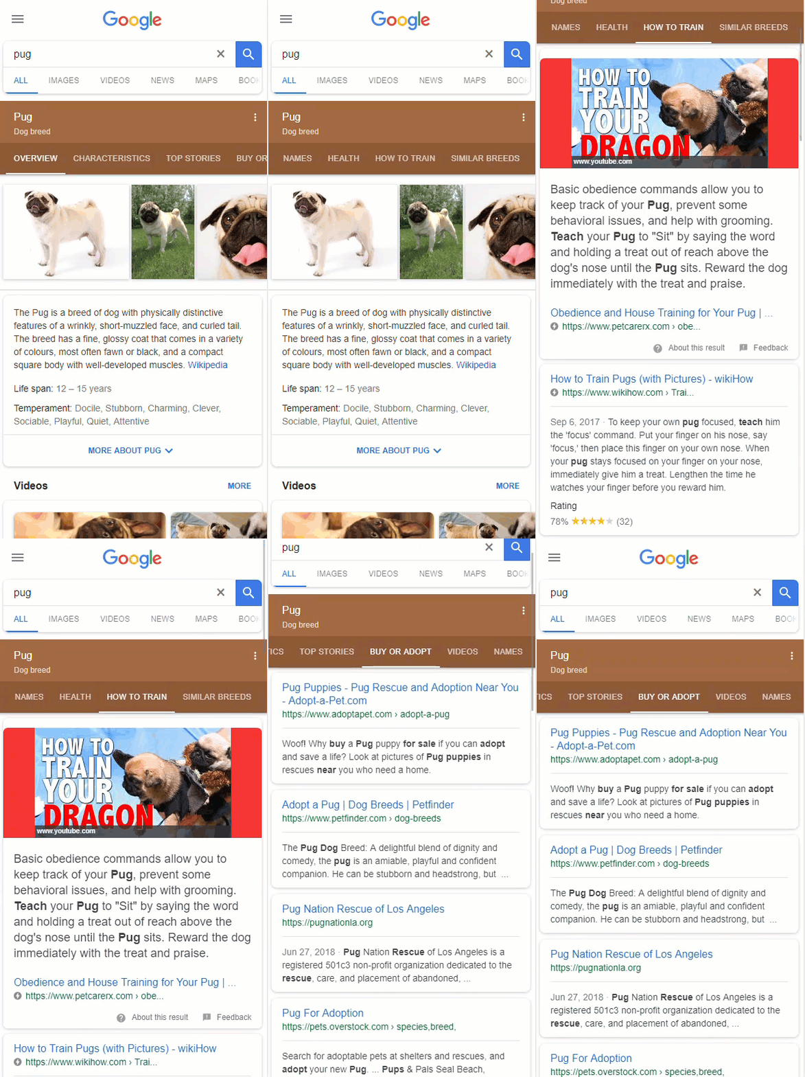
What you see here looks like your everyday Knowledge Panel, but it’s not. For starters, Google has added a host of new tabs, i.e., the Buy or Adopt tab. Clicking on a tab takes you to a brand new SERP! Like any SERP, Google utilizes elements such as Featured Snippets within a given tab/SERP. As such, if Google creates a tab that is relevant to your content, ranking well or scoring a Featured Snippet could be a real boost to a site’s traffic as in this instance a user would not need to execute a new search to access it. Whereas a user may not have done such a search on its own, they very well might click on the next tab if it’s there already.
What’s more is that the new layered topic format is custom fit. Queries that produce the panel will now often show a set of topic tabs that align to that specific entity. For example, when I did a search for big
Seeing more tabs within Movie Panels. Tabs also seem to vary per movie.
Big Lebowski panel even gives a showtime at a lone theatre for a movie that came out 20 yrs ago! #SEO #Movies pic.twitter.com/BZgKHCrRgQ
— Mordy Oberstein (@MordyOberstein) September 26, 2018
Simply, instead of a user executing multiple searches to gather the answers they are looking for, Google is guiding the user as they navigate their search journey.
Visual Stories Come to the SERP & Other Changes to Image Search
Remember AMP Stories? Well, Google has taken the “story” format to a whole new level. Per their celebratory announcements, Google themselves are creating stories for celebrities, athletes, and the like. Functioning exactly like an AMP Story, the format is built off content contained on a variety of sites. Meaning, Google is creating visual stories by grabbing content from actual sites (like it does with Featured Snippets). And as with Featured Snippets, you can click on the source of the content within any frame of a Story.
Here’s a “Google Story” on Joe Montana in action:
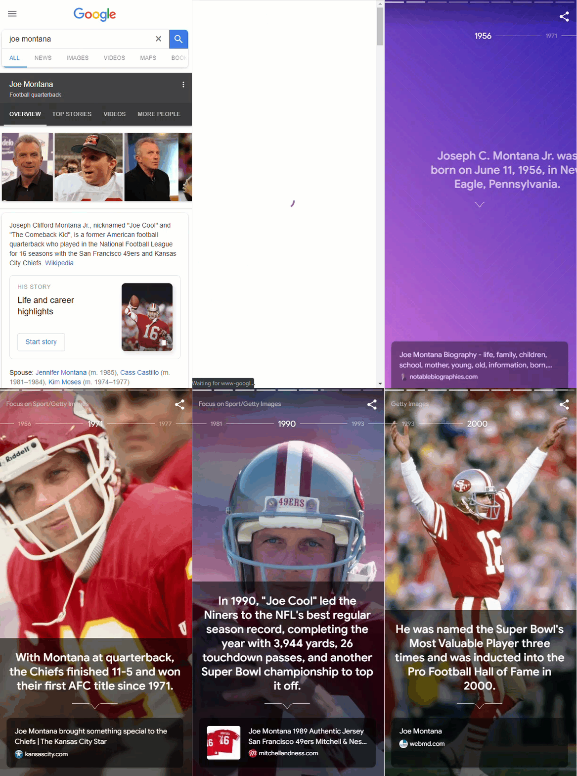
Image Search Undergoing Changes
Along with the visually striking “Stories,” Google also announced that image search itself has undergone an overhaul. Specifically, Image Search on
The desktop changes, in some way mirroring the mobile UI, mean that captions, as well as a new top showing filter that contains images within each option now appear on the Image Search SERP.

Google’s new Image Search UI includes a top of the page bubble filter that now contains image thumbnails
Also, Google Lens, which recognizes images you take and provides information on it via search, is coming to mobile image search. The result should be the ability to find images similar to the one you took so as to be able to find more information about it.
What Google’s New Changes Mean
The announcements and changes that came out of Google’s 20th birthday bash have endless implications and numerous themes. This being a digest post of sorts, I can’t get into all that here. However, I will say that many of the changes seem to have a commonality in that they alter the natural course of a user’s search path.
Be it a new “Google Story” format, the Discovery feed on the mobile SERP, or the tabbed search results, Google is placing content in front of the user that they may never have searched for directly. In other words, Google is in a way guiding the user’s search journey. In doing so Google is creating the more than likely potential that that journey will be different than what it would have been had Google left the user’s path alone. Users will now see all new forms of content as well as content they may not have been interested in at the outset placed before them. This has the ability to send users to all new and unexpected sites.
I hope to write up something on the topic that is a bit more comprehensive in the near future.
Short (Yet Spunky) Google Algorithm Updates in September
No, there was no monster update like that seen in early August (you know, the Medic Update, or whatever you want to call it). Rather, there were two curious little updates that hit the SEO world in early September (followed by an even smaller end of month update that Google surprisingly confirmed).
The first update hit the pavement on September 6th and lasted through the 7th. During that time the Rank Risk Index caught rank fluctuation levels as high as 74 (out of 100). Interestingly, fluctuation levels were slightly lower on mobile.
Then, just a few short days later, the index caught another wave of rank fluctuations. On September 11th the index showed fluctuation levels that hit 75 on desktop and 71 on mobile.

Multiple spikes in rank fluctuations spread across the entire month of September
But that’s not what’s interesting, or that’s not what’s entirely intriguing. As you may know, Google has a propensity to tack on a host of “changes” to its algorithm updates. Often, these changes include shifts in SERP feature data patterns… as was the case here.
To get the full story, we have to jump back to August 22nd, when Google also rolled-out an algorithm update. With this one, we saw a host of SERP features change their trajectories. Have a look at
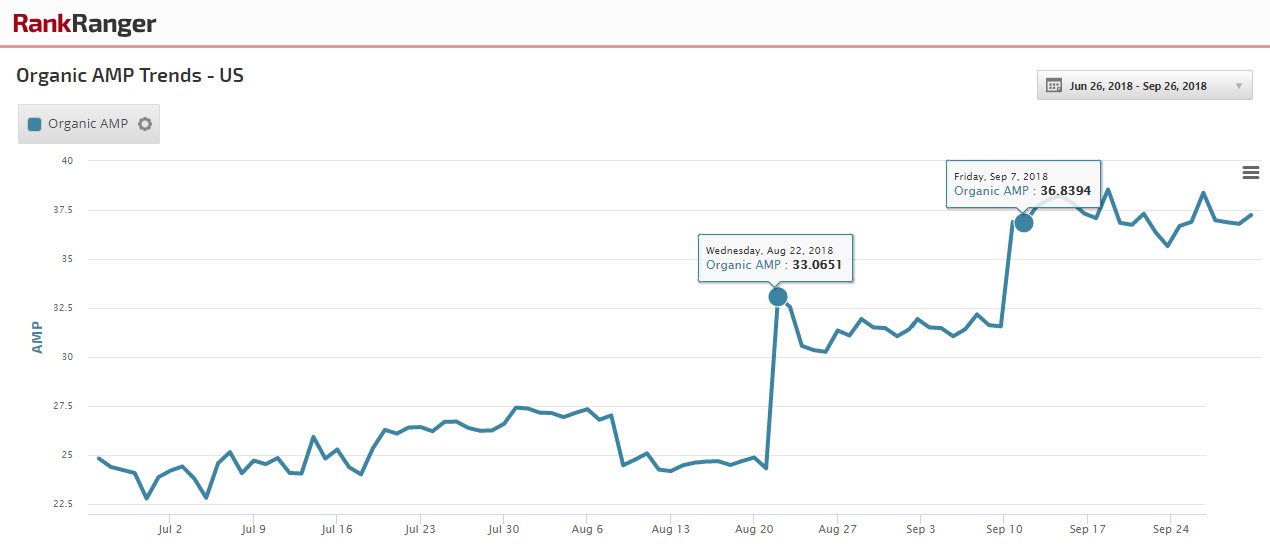
Organic AMP underwent two significant and highly unusual increases with the latter taking place on September 6th
That’s right, there was a second spike that coincided with the September 6th update. In other words, with these updates came some serious shifts in SERP feature data patterns.
Now, that is entirely interesting.
Mobile-First Indexing Spreads Its Wings

Did you get a notification in September letting you know “you’ve been indexed?” Circa the 20th of the month, Google sent out a barrage of notifications that sites had been placed within the mobile-first index. This latest wave of indexation seems to have placed mobile-friendly sites within the new construct (reportedly, most sites indexed prior to now were those lacking in their mobile-friendliness).
So I guess that’s it. The bulk of the sites out there have been placed within the mobile-first index. Wrong. Google noted that there is still “a lot” left to do before mobile indexation is complete.
Google Gives the World a New Data Search Engine
Released in early September, Google gave us the gift of data in an all-new way… a dedicated search engine. Called Google Dataset Search, the new search engine is dedicated to helping you find datasets (hence the name). Dataset search actually makes use of dataset schema, so theoretically you can get your data added to the search engine by implementing the markup on your site.
The search engine’s format seems very much similar to that of Google for Jobs and is predisposed to data from government agencies and data organizations. I’m not sure if that will change or not, but it’s a bit peculiar in a way in that the results I’ve seen a lack in diversity to an extent. Here’s what you get for the search Johns Hopkins Medical Data:
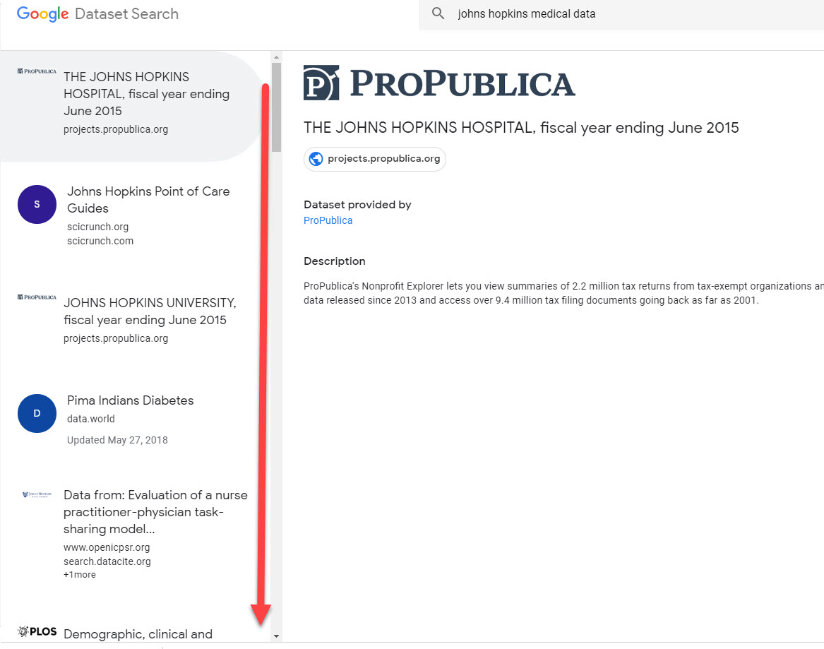
Notice, nothing from the actual university appears within the top results. Nor did it appear as I scrolled down either. It would appear that the number of sources Google is pulling from is quite limited. This is a broad query that did not produce an endless number of results (as one might expect). Seems that the search engine is really in its infancy, but should grow accordingly as time goes on.
September’s Changes to the Google SERP
Another month, another huge round of tests and changes to the SERP. By the way, Google just revealed that it made over 2,400 changes, whether it be to its algorithm, SERP features, or the SERP itself, in 2017. So it makes good sense that each and every month we have
With that, here’s how the SERP was altered in the month of September in the year 2018!
New SERP Design Officially Tested
As the month rolled in Google confirmed it was testing the very appearance of the desktop SERP itself. The limited test showed a sticky search box that followed you down the page as you scrolled through results.
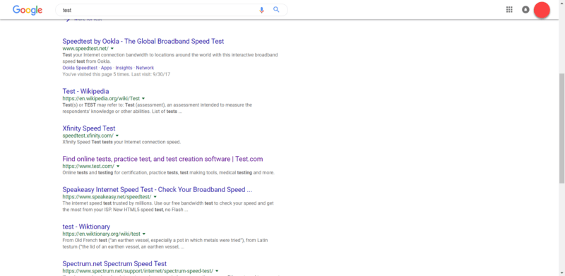
Google tests a SERP with a sticky header that follows users down the page (Image Source: Searchengineland.com)
Some people really liked the test, others not. I guess I can see how it would be helpful being that you wouldn’t have to scroll back up a SERP to do a new search. Although, if Google is your default search engine you wouldn’t need to utilize the search box anyway.
Shopping Carousels Go Deeper Into Products
In another early September test, Google showed a “See More” button within its shopping carousel. Tapping the button brought you deeper into Google Shopping where one could peruse through even more products.
RT @ppchubbub: Not sure I’ve ever seen the ‘See More’ button for Google Shopping. Video below @GoogleAds @rustybrick #ppcchat pic.twitter.com/pM9B8hpzOr
— #ppcchat (@ppcchatbot) September 2, 2018
If I were a ******* man, I would say there is a good chance we’ll see more of the “See More” button as the functionality is consistent with Google’s strategy of getting and keeping users within its ecosystem.
No Descriptions in Ads
This is an interesting one. Google was showing mobile ads at the bottom of the SERP that did not contain descriptions. All a user saw was the headline and URL.
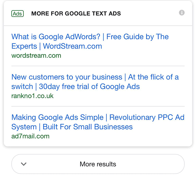
A test produces ads that do not contain any description (Image Source: SERoundtable.com)
At first thought, you have to wonder why Google would do that?! But if you think about it a bit more, it kind of makes sense in a weird way (perhaps). I have to wonder, do users really want ad descriptions? Do they really read them? Is the headline enough to grab them regardless? Quite possibly. Perhaps more so than with descriptions (which I personally never read).
SiteLinks Get Image Thumbnails
I’ve always said it, Google very much adheres to its desire for a visual mobile SERP. As such, it makes a good deal of sense for the search engine to show images within the SiteLinks carousel. Meaning, each and every element within the SiteLinks carousel is image potential (which makes your result that much more visible).
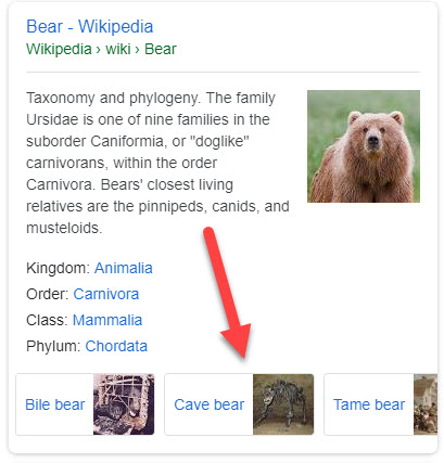
The Sitelinks carousel showing with Image Thumbnails
For the record, this is not the first instance of Google using small image thumbnails within a mobile carousel. Among other instances, Google uses the format when searching for an actor/ actresses’ other movies via the Knowledge Panel:
Omnibox Answers the Norm in Updated Chrome
September gave us Chrome 69, which gave us an
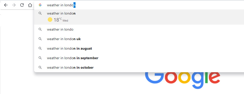
The Omnibox within Chrome 69 showing the weather in London
Let’s be fair
The September SERP Roundup
OK then, here’s the rest of the changes to the SERP I’ve deemed as being newsworthy per my very scientific and exact method of defining what is and what is not fit to be print.
Knowledge Panel Changes in September
There were an interesting few updates to the Knowledge Panel in September (par for the course at this point).
Business Panels Get Tabbed: You may be accustomed to seeing tabs used within mobile Knowledge Panels for entities such as books, movies, famous folk, and so forth. September, however, saw Google try the format for brands.
This branded tabbed test saw sub-topics that included a brand’s various physical locations, related news stories, etc. Using tabs allows Google to better guide a user’s search path (as discussed above), so it makes a good deal of sense to think that the tabbed format will become increasingly pervasive.
Edit Reviews in the Local Panel: In what I think is a step in the right direction, Google has made it possible to edit reviews right in the Local Panel. Why do I say it’s a step in the right direction? Because allowing people to edit their reviews with ease encourages not only more, but better and more accurate reviews.
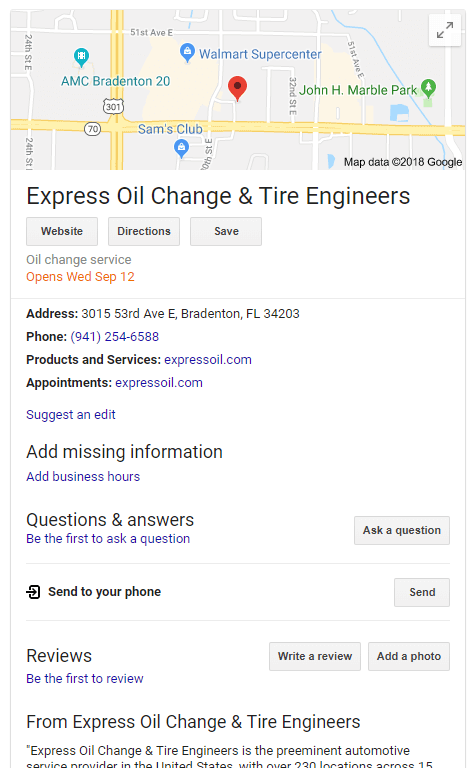
Expected Openings in the Knowledge Panel: Have a business that is set to open soon? Now you can share the **** of your grand opening in the Knowledge Panel:
Family Led Panel Attribution: In the
Expanded Top Stories List
When showing news results within the News Box, aka Top Stories, users expect to scroll through a nice set of articles via the carousel. However, Google does employ another format when displaying such news articles via a list. Within this “mode” what you see is what you get. However, in early September Google tested the idea of showing expandable news story lists.
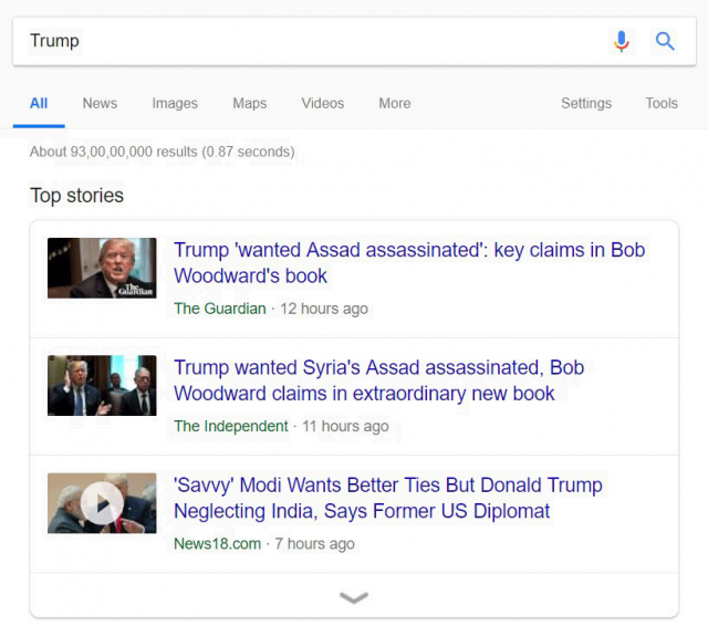
Google tested showing News Box list results that expand to show more news articles
New Video Carousel Format Caught on Mobile
A new format for the mobile video carousel popped up in mid-September. The tested format prominently featured one large video above the other results.
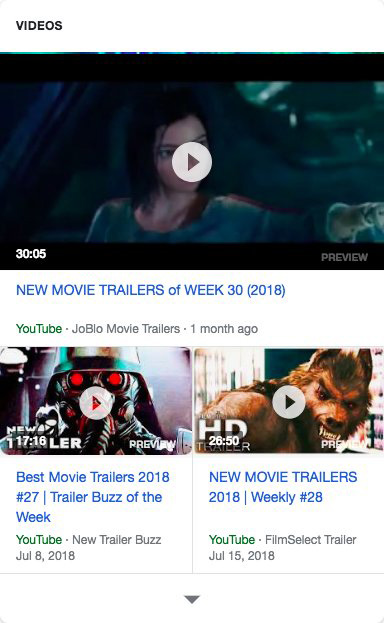
A tested mobile video carousel format showing one large video above the other carousel cards
In a way, it seems the test took the format used for video Featured Snippets (with its large top showing placement) and applied it within the video carousel
Google Posts Get a Serious Content Boost
If it seems that each and every month I’m discussing another breakthrough for Google Posts, it’s because I am. Towards the end of September, Google gave creators using the feature a bit more breathing room. As in an extra 1,200 or so characters. Previously, Google Posts had between a 100-300 word limit. Now Google is gracing us with a whopping 1,500 characters per post. I’ll say it again, keep on top of the feature, and use it as much as you can… it’s going places!
Where Will the Rubber Meet the Road?

Often, I feel as if we over-emphasize certain changes that Google makes. There are certain ***-button issues that if Google gets a hold of we all sort of go to the extreme with. Mobile indexation would be a good case. Certainly significant, certainly impactful… but to an extent. At the same time, we gloss over what I think are some of the most telling changes. The new topic layered “Knowledge Panels” – if you can even call them that – is such an instance. The new format represents a new willingness to use machine learning to energetically target the user’s very search path. That’s a game-changer – if not now then in the relatively near future as this sort of “use” progresses.
If you look at some of the other changes Google announced, specifically the Activity Cards, the new Discover feed coming to the mobile SERP, and Google’s “Stories” the same pattern holds true. Google is engineering the SERP to work as a vehicle to help guide users. The SERP is no longer the end of the road. It is now a vehicle to propel your search journey in all new directions. This will impact user behavior and it will impact SEO. It will force us to think more strategically and more broadly about how a user goes about search and where a user may be directed.
I’d **** to hear your thoughts on how you think Google’s recent announcements will change search…. reach out to me!
Thanks for joining me on this SERP journey. See you next time for more SERP news!

