What Is Website Architecture?
Website architecture refers to the hierarchy of the pages on your site and how each page is connected.
Here’s a visual example of website structure:
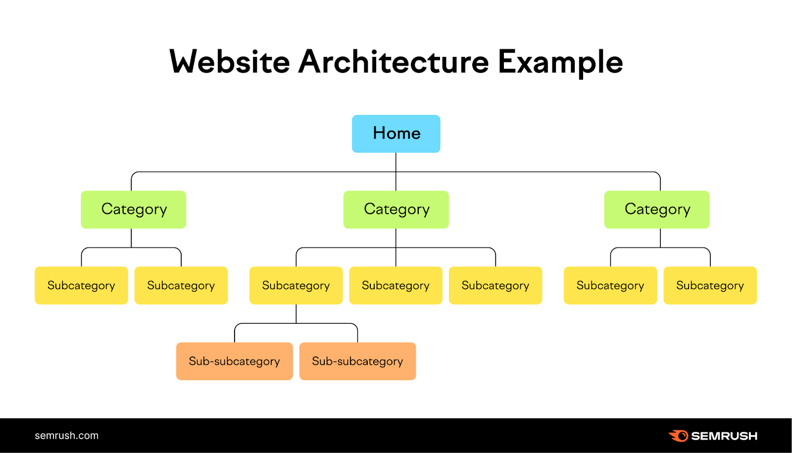
Website architecture is important for SEO for a few key reasons:
- It helps search engines find and index all your site’s pages
- It spreads authority throughout your webpages via internal links
- It helps visitors find the content they’re looking for
Internal links create website structure. Meaning that linking from one page to another gives Google (and readers) more context about that page. And the ability to reach the linked page.
Below, we’ll discuss the importance of website structure and how to design one that’s good for both users and search engines.
Why Is Website Architecture Important?
Website architecture is important because it affects both search engine rankings and user experience.
Good site architecture can help your pages rank on Google. Because it can impact Google’s ability to find and index all of your important pages. And understand what your website is about. That’s the first step to appearing in search results.
Imagine entering someone’s home for the first time. You won’t immediately know where each room is. But you’ll know from context that there should be a bed in the bedroom, a toilet in the bathroom, and so on.
Now imagine you walk into the bathroom and see a bed next to the sink. That might leave you wondering whether the room you’re in is a bathroom or a bedroom.
This is similar to Google encountering a disorganized website. If the structure doesn’t make sense, Google may not understand the purpose of each of your webpages. And then might struggle to understand when and where your pages should appear in search results.
Here’s a visual example of a disorganized website’s architecture:
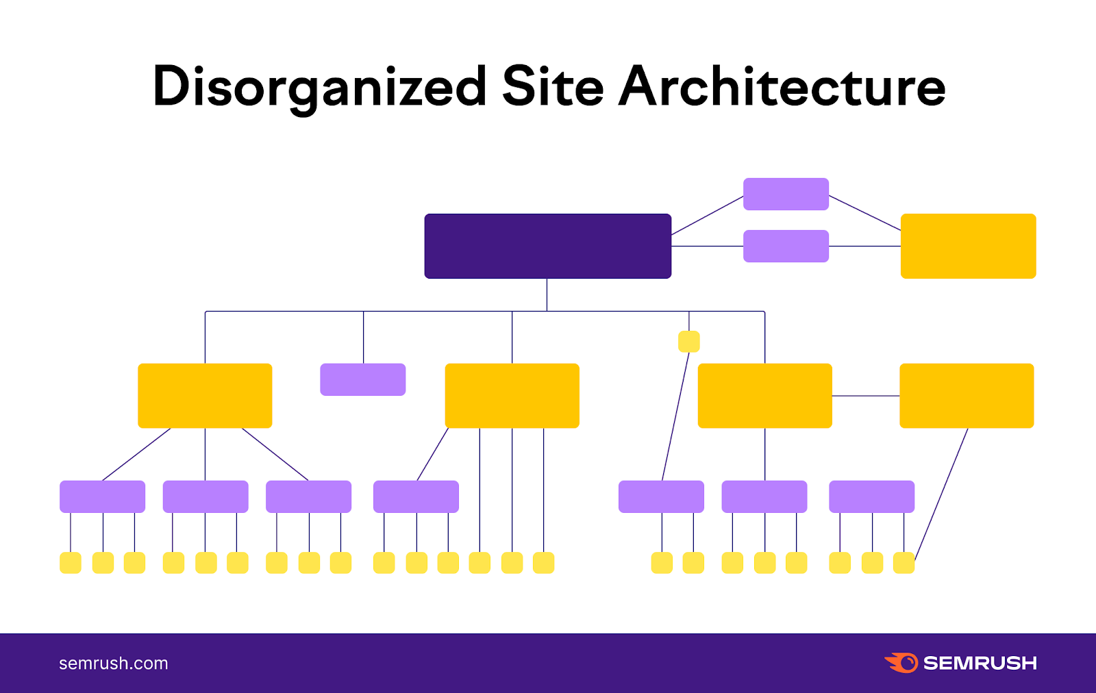
Google uses internal links to discover and rank pages. And website architecture is created by internal links between pages.
So the more disorganized your website architecture is, the less context Google has about your webpages and their relation to one another.
This means it’s important to keep your overall internal linking strategy in mind when structuring your website.
By linking from one page to another, you communicate to Google which pages are related. And if you link to a particular page many times, Google will see that you think it’s important.
Now on to our second point: how website architecture affects user experience.
You should carefully plan your website’s structure to make it easier for users to navigate to products, services, and important information.
The easier it is for someone to find what they landed on your site for, the higher the chance that they’ll become a client or customer. Or stay engaged with your website content
In fact, 94% of surveyed users said they consider easy navigation to be the most important website feature.
One of the key functions of content on a website is to push prospects further through the sales funnel.
Sephora, for example, does this well.
The makeup website’s user-friendly navigation menu groups all their products into well-known categories (e.g., Makeup, Skincare, Makeup for Eyes, etc.). That way, shoppers can find the products they want with only a few clicks.
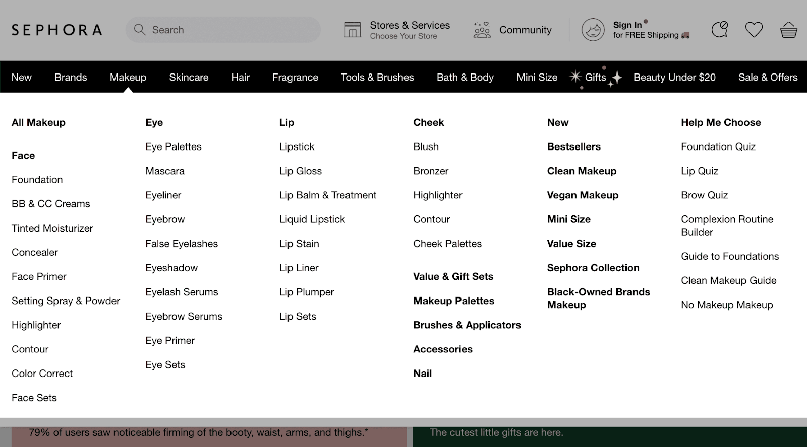
Keep this in mind when you decide how to display products and content for your website’s users. The structure you choose will affect how users interact with your site. And whether they do what you want them to do while they’re on it.
For example, you can paginate results (i.e., display products or search results on separate pages). Or use infinite scroll (i.e., load more content as the user scrolls).
Infinite scroll can decrease the number of clicks it takes for users to reach a product. Which helps users find what they want faster.
But pagination gives users greater control and allows them to easily remember where products are located. And navigate back to them.
So pagination often works best for most sites for navigation purposes. But infinite scroll may work well for a blog or content that’s not product-based.
Now that we’ve covered some basic best practices, let’s take a look at what good website architecture looks like.
What Does a Good Website Architecture Look Like?
A good website architecture should do the following:
- Group topically related content together
- Organize groups in a logical hierarchy
- Highlight your most important pages
The best way to do this is to use flat website architecture instead of deep website architecture.
These terms describe how deep the structure of your website goes. Or how many clicks it takes to work your way down the subcategories of your site—which is also called crawl depth or click depth.
Users should be able to access your content in as few clicks as possible. The ideal click depth to reach any page on your site is fewer than four clicks.
This way, users don’t need to work too hard to find the content they want.
Here’s an example of flat website architecture:

It only takes three clicks to get to the bottom of the architecture.
And this is an example of deep website architecture, which takes several more clicks to reach the pages toward the bottom of the structure:
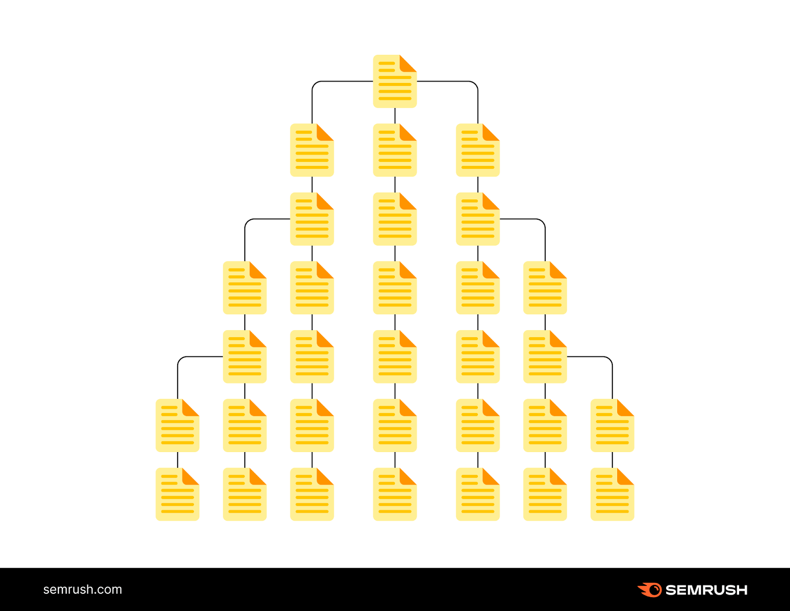
Because it takes more effort to access certain pages, this isn’t the best user experience.
It’s also important to ensure that each important page is a part of the website architecture—meaning that each webpage has at least one incoming link from another page on the site.
Pages that don’t have any internal links pointing at them are called orphan pages.
Like this:
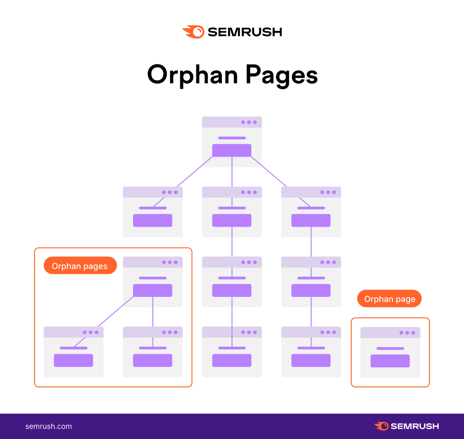
Search engines travel the web through links. So they likely will struggle to access and rank pages with no links pointing to them. And users can only access a page that doesn’t appear in the search results by typing in the link directly.
Pro tip: Create a clean site architecture and avoid orphan pages by creating topic clusters—or groups of content that revolve around the same topic and link to one another. This allows you to group related webpages under relevant categories.
How to Design a Good Website Architecture
Ready to plan your own website’s structure? Follow these guidelines to create a website architecture that will satisfy both users and search engines.
Use Internal Linking Strategically
Internal links are hyperlinks that point to other pages on the same website.
When you link from one page to another, you convey to search engines that the two pages are related. Which helps search engines determine your site’s structure.
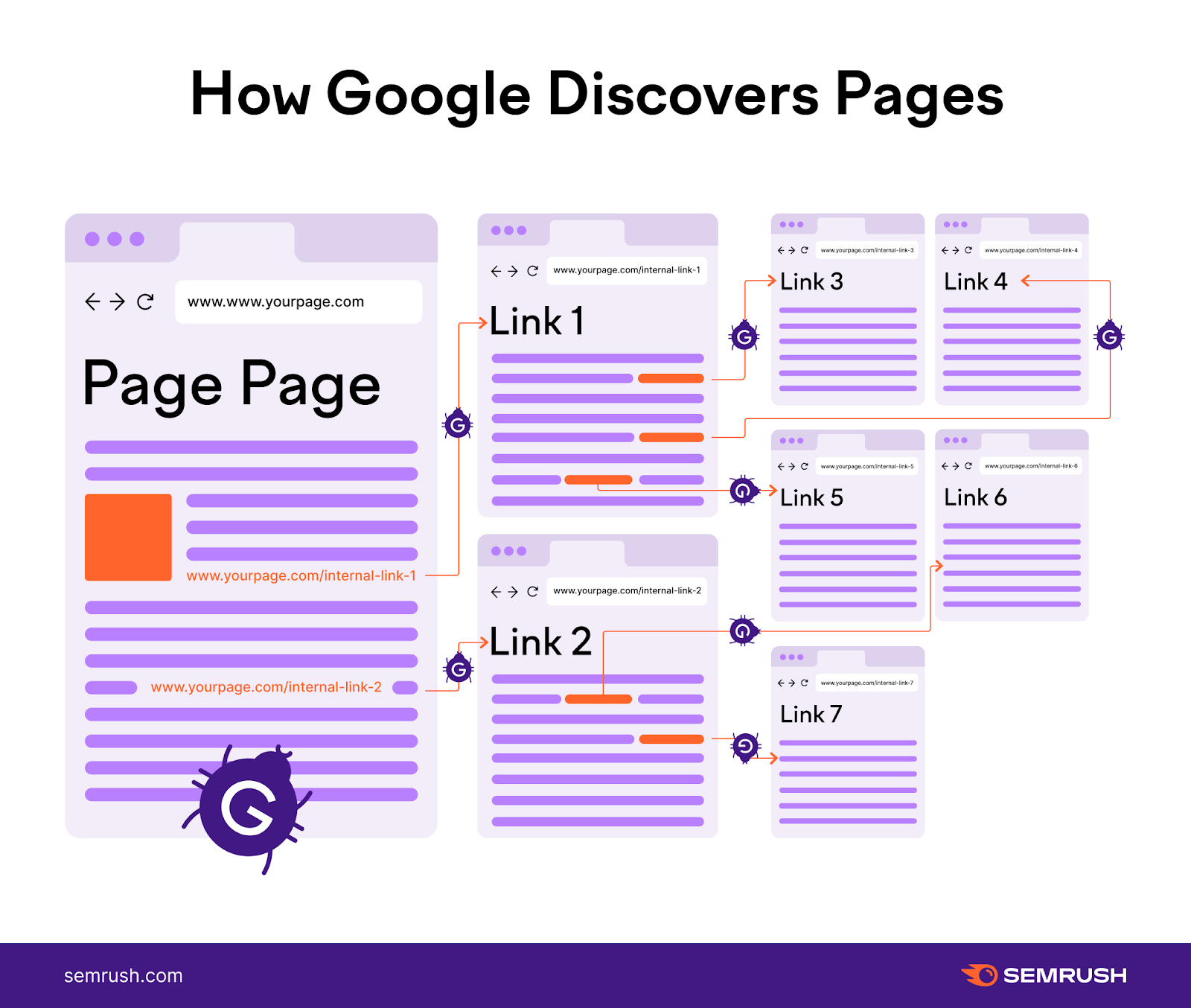
Links also pass authority, or votes of confidence in the eyes of search engines. So it’s good practice to link to relevant, important pages on your website.
A strong internal link strategy also helps users navigate to pages that are relevant to them.
A good way to interlink is to use content pillars and topic clusters.
Content pillars are your main, broader categories of content. And clusters are your subcategories that support the pillars.
Like this:
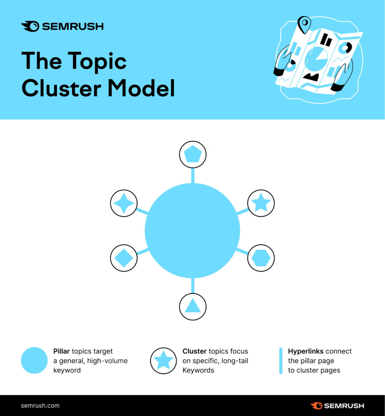
Say you wanted to create a content cluster about the content pillar topic of “Copywriting.”
Open a keyword research tool like the Keyword Magic Tool. And look up your target keyword—in this case, “copywriting.”
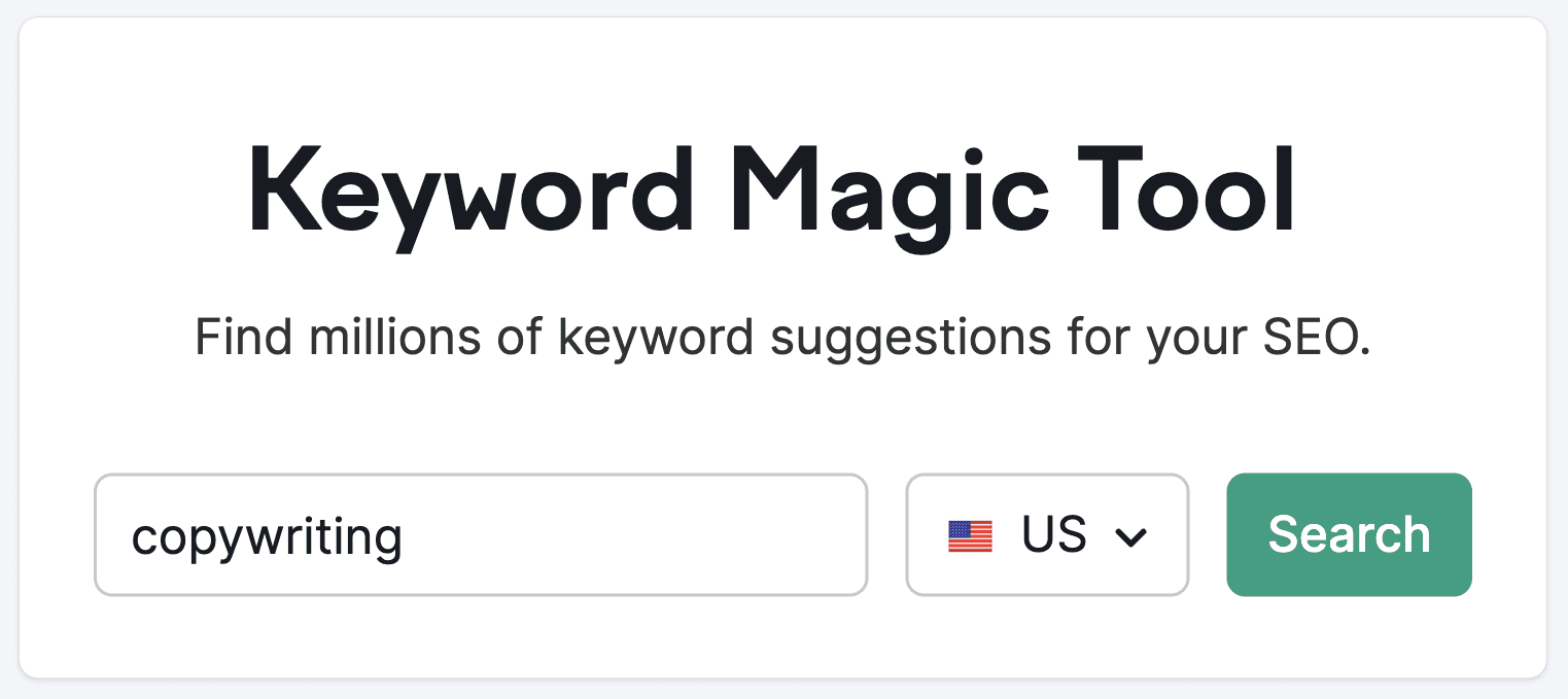
The tool will generate a list of related keywords, arranged by the number of searches each keyword gets per month (aka monthly search volume).
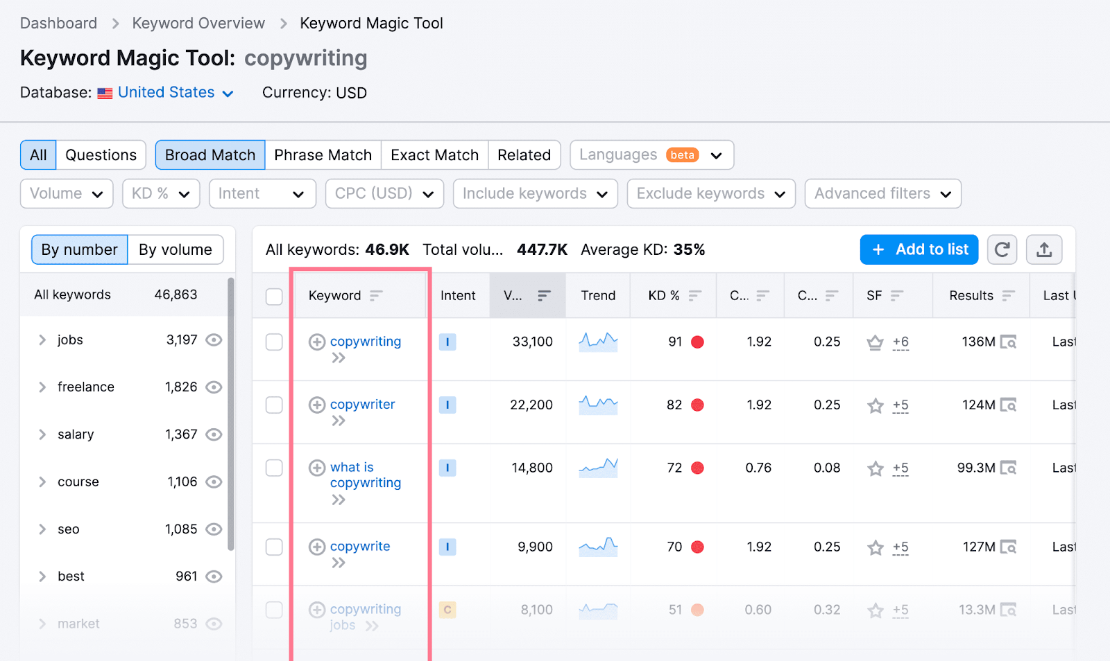
Scroll through the keyword list and start writing down keywords related to copywriting that might fit well into pieces of content within your “copywriting” cluster.
You might, for example, identify the following keywords related to “copywriting”:
- What is copywriting
- Email copywriting
- Examples of copywriting
- Copywriting tools
- Copywriting courses
- How to find the best copywriters
Your finished result may look something like this:
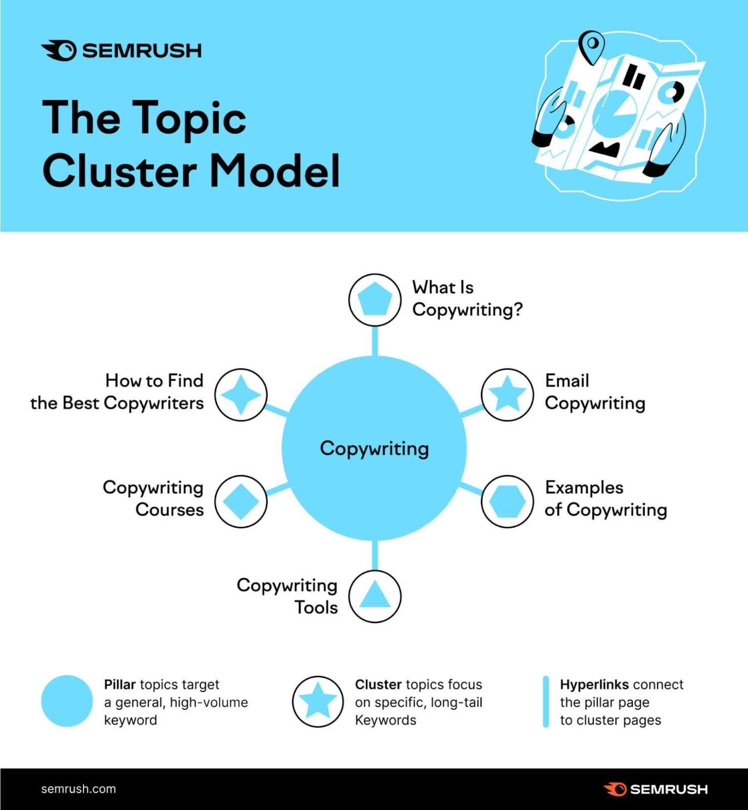
Follow this process for each of the main topics you’ll create content for. You’ll end up with a map of all the topic clusters you want to include in your site structure.
Then, create content for each pillar topic and subtopic you’ve identified. Be sure to link the related topics together in accordance with the linking architecture you’ve outlined already—homepage links to pillars, pillars link to subtopics, etc.
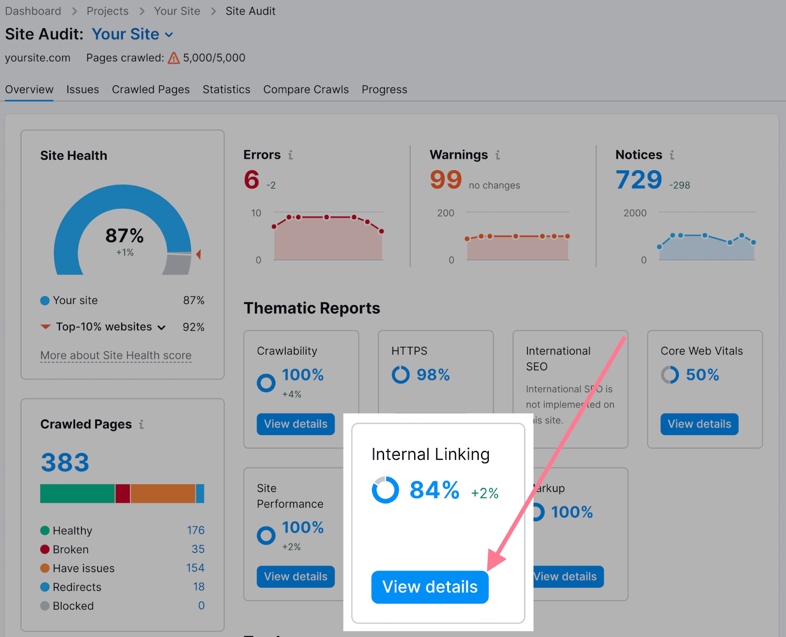
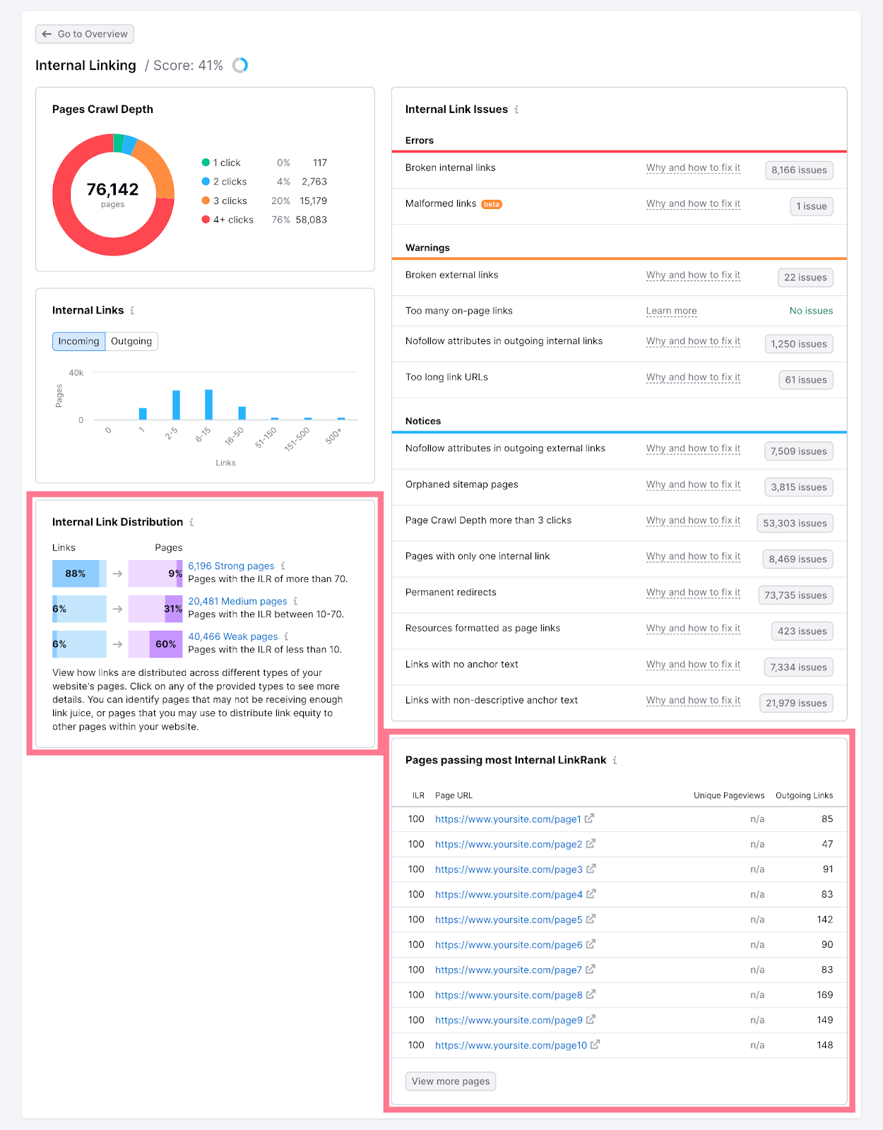
Once you’ve published the content, you should check for general internal linking issues. Open Site Audit and click on the “View details” button under “Internal Linking.”
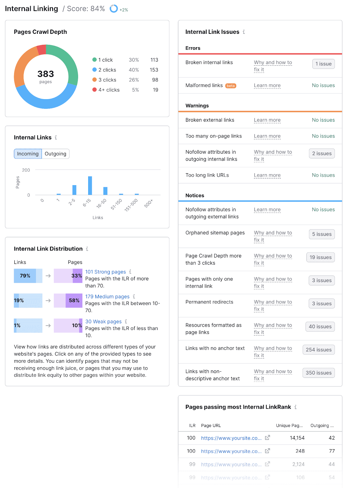
You’ll get a report with the following information:
- Crawl depth for each of your pages
- Internal linking errors that you need to fix
- Ways to improve your internal linking strategy
- Internal link distribution throughout your site
- A list of top pages that pass authority
And while you’re in Site Audit, check your site for orphan pages.
From the “Internal Linking” report, click on “# issues” button beside the “Orphaned sitemap pages” error under “Notices.”
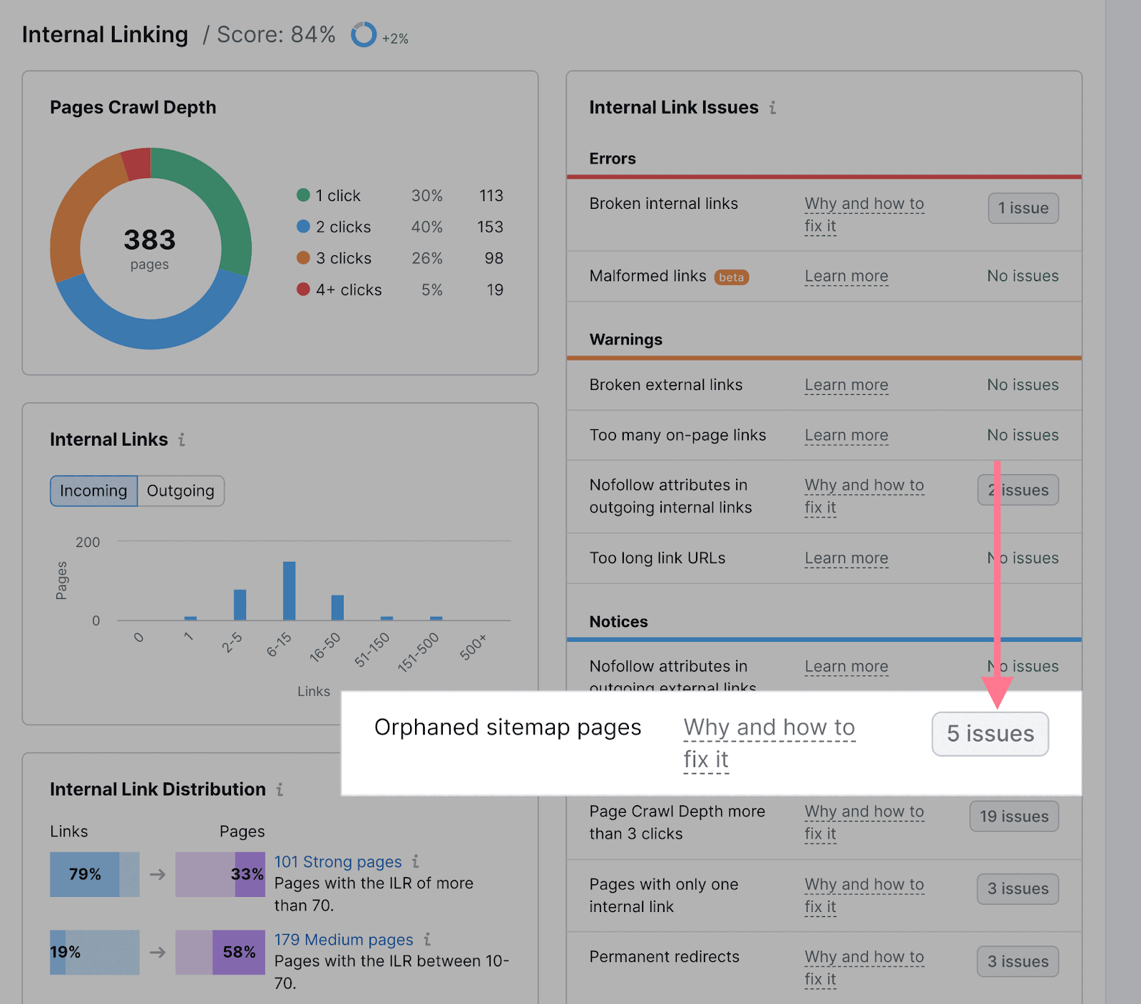
You’ll get a list of orphan pages.
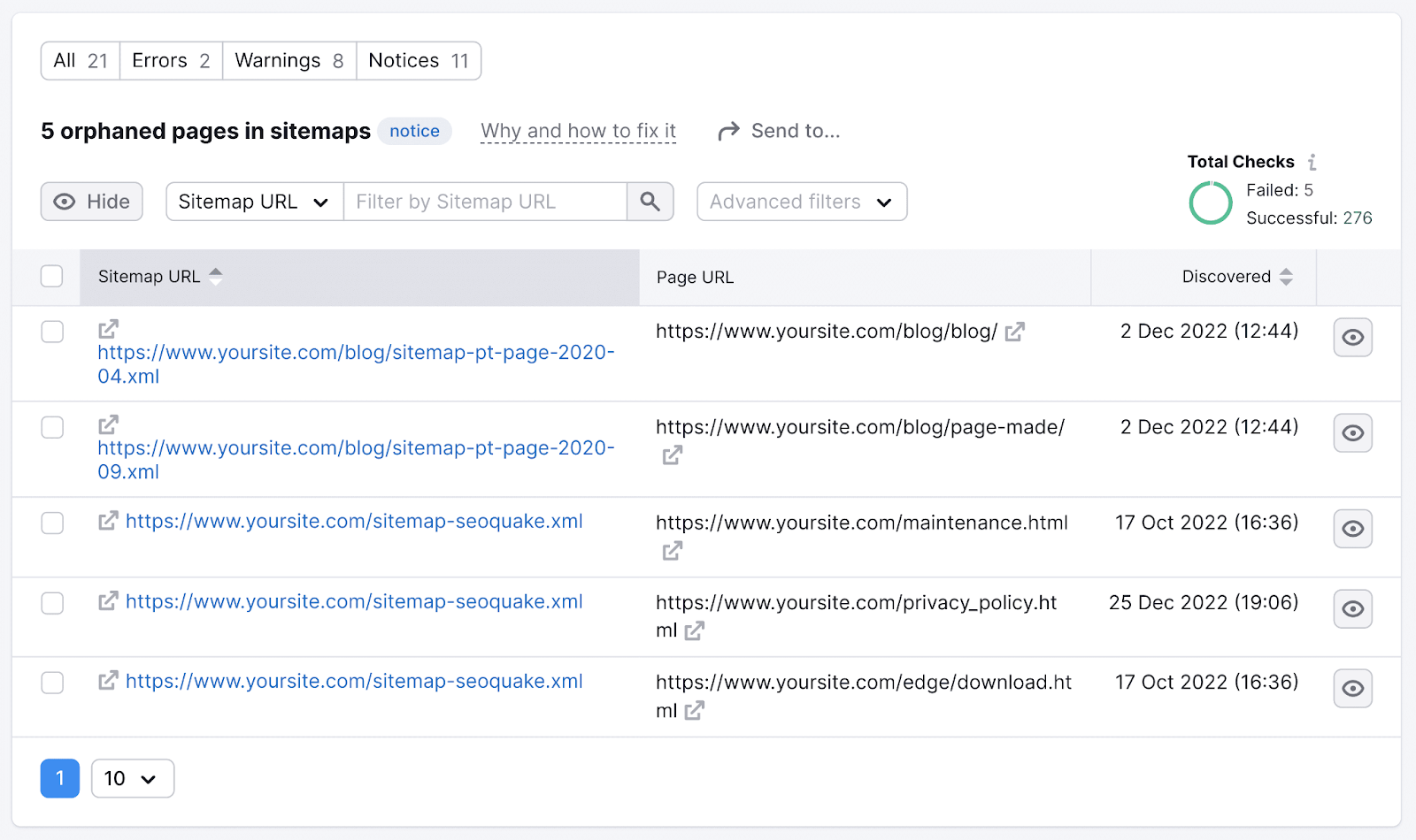
If you find any of these pages, link to them at least once from a related page. This will ensure that both users and search engines can access the (previously) orphaned page.
For more information on how to create a proper linking structure, read our guide to internal linking.
Create a Flat Site Architecture
Users should be able to access content on your website in as few clicks as possible (ideally, fewer than four). Even if you run a large ecommerce site with a million pages.
The depth of your architecture also affects how search engines crawl your site. Search engines navigate websites through links. So the lower the crawl depth, the quicker and more likely search engines can navigate to a webpage.
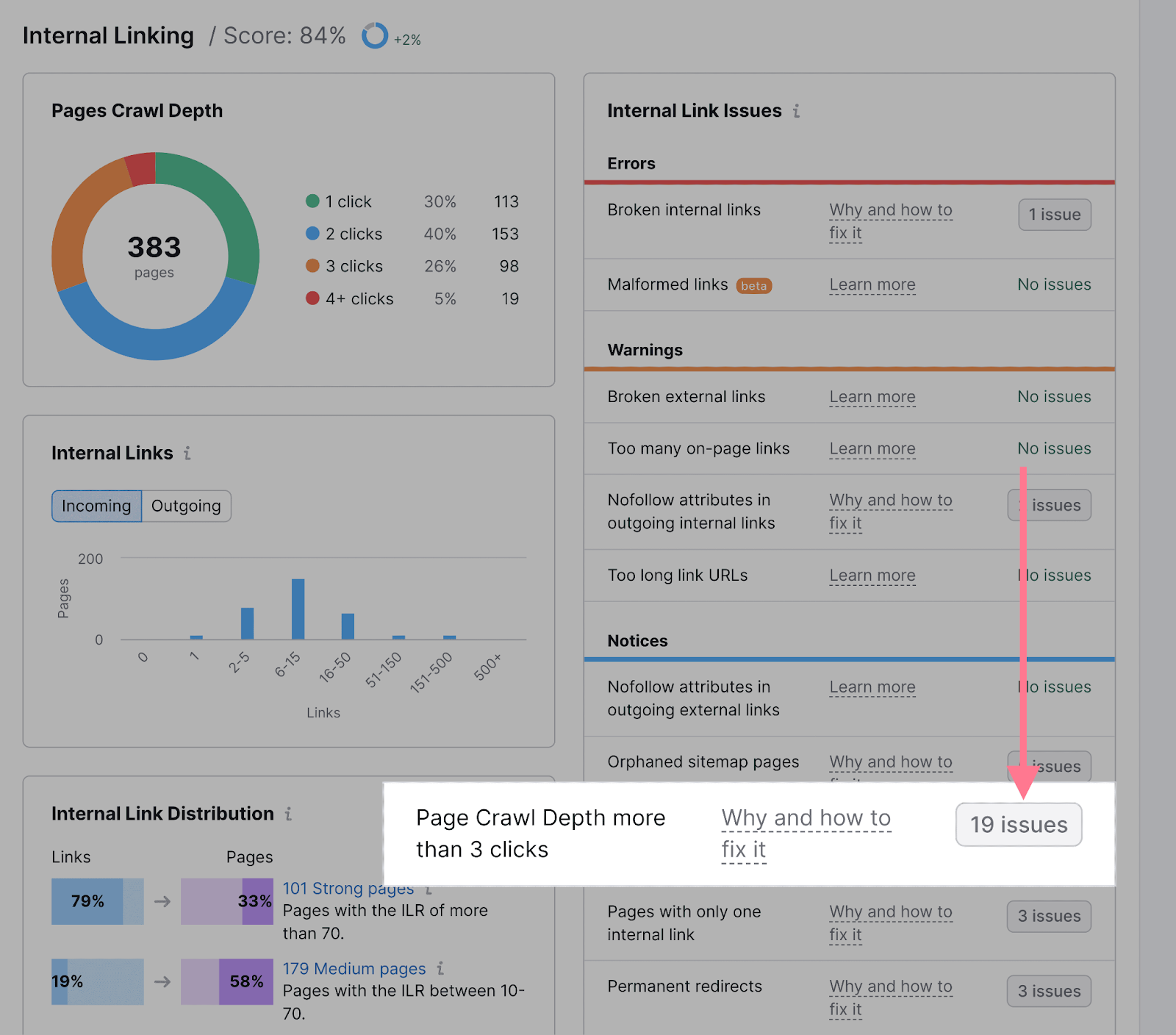
You can use Site Audit to find out which pages on your site require more than three clicks to access.
Hit the button beside the “Page Crawl Depth more than 3 clicks,” in the “Notices” section of the “Internal Linking” report.
And you’ll get a list of links that are “too deep.”
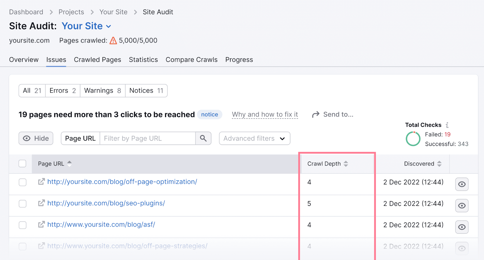
If you find any pages that take more clicks than necessary to visit, consider simplifying your site structure.
Tip: Use authoritative pages on your site to link to pages with a high crawl depth. You can find authoritative pages by reviewing the “Pages passing the most Internal LinkRank” widget in Site Audit’s Internal Linking report. Pages with a high Internal LinkRank will pass more authority.
Using a navigational menu is an easy way to connect pages and reinforce your site structure. Because menus are simply collections of related links.
There are many different types of navigation menus to choose from. There’s no single right way to structure your menu, but it’s best to keep your site easy to navigate. So customers can find important pages and (hopefully) do what you want them to do.
The most common type of navigation is a horizontal navigation bar. This straightforward option will work well for most sites.
It looks like this:
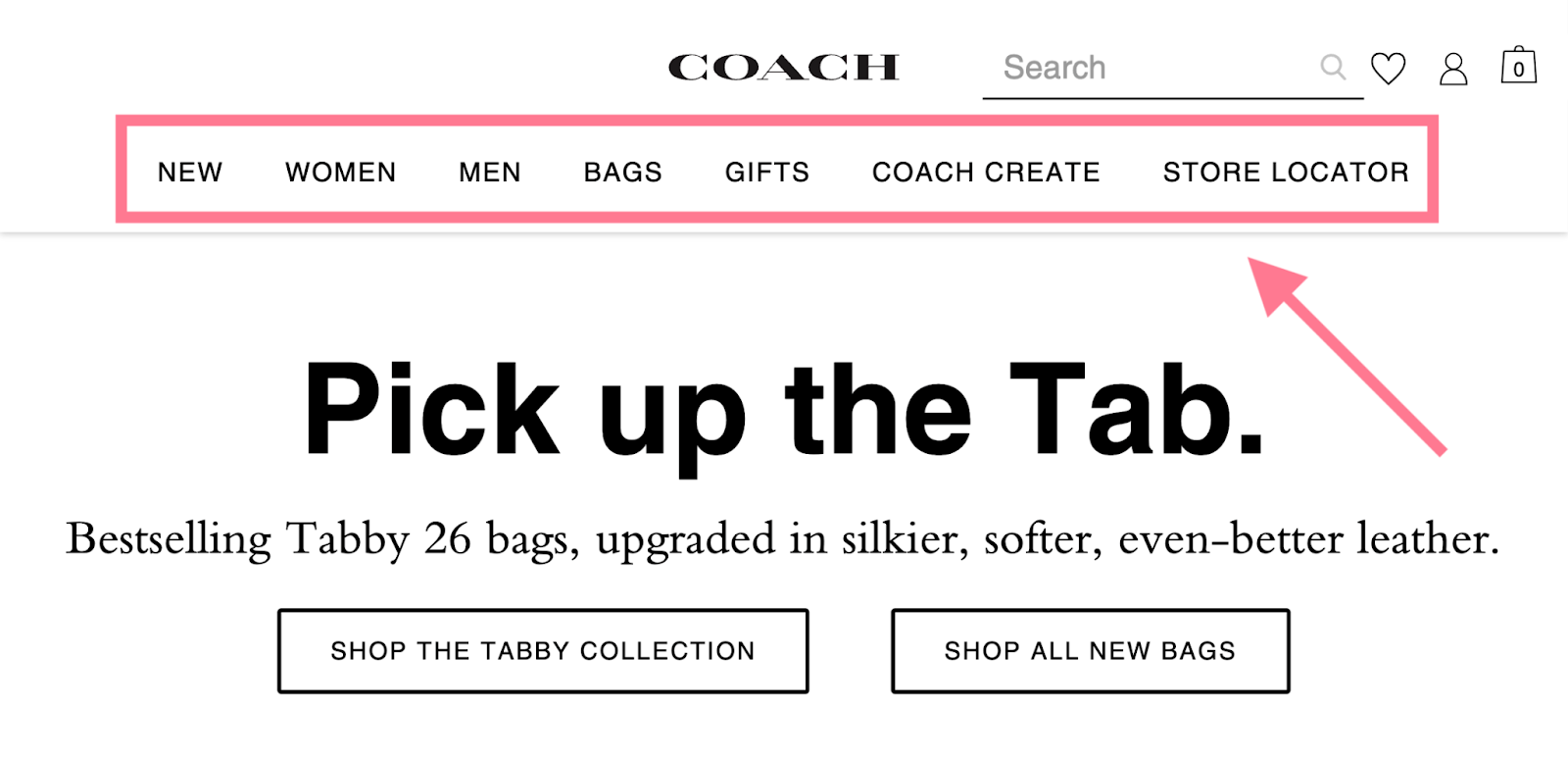
This top-level navigation bar should provide categories users expect (like “Shop,” “Contact,” “About Us,” etc.).
But don’t be afraid to customize your top-level navigation. Think about your audience—what are they looking for? What are they trying to achieve by navigating your website? This should dictate what you include in your navigation.
Say you own a local car dealership. You’ll definitely want a link on your main navigation menu that takes customers to your new car inventory.
But many people buy used cars—so you’ll likely add a link to your pre-owned inventory, as well. And links to your other departments (like finance and service) for good measure.
This way, whether someone wants to buy a car, get finance information, or schedule service, they can find what they need right from the main navigation. You’ll cover every important area of your business.
But you don’t want to overwhelm users with too many options right from the start.
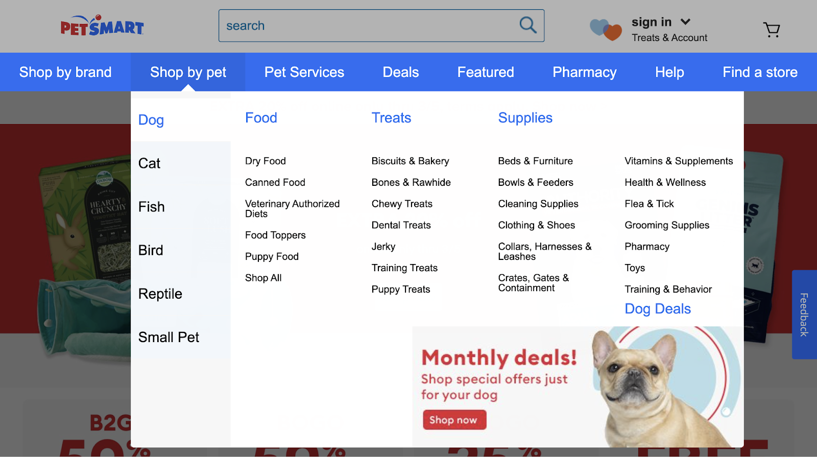
If you find yourself including too many options in a horizontal navigation bar, opt for a drop-down navigation structure.
Drop-down navigation menus work well for sites with lots of content and a more complex website architecture. You can declutter your important pages while still providing a clear path for the user.
For example, drop-down navigation works well for ecommerce sites with lots of different products. Users can view a simple horizontal navigation. Then select the category they’re interested in to see more links.
Here’s a good example from PetSmart:
You can also opt for a vertical sidebar navigation menu:

This option is similar to a horizontal navigation menu. But can provide more real estate for more top-level navigation links.
Maybe you have a small site and want to include all of your pages in the navigation. A vertical menu allows you to do that easily.
Using this type of navigation also gives you the freedom to include other information at the top of the page, like social links or contact information.
Optimizing your navigation for a mobile site?
Hamburger navigation menus are a popular option. While this type of navigation appears horizontally on larger screens, it appears vertically on mobile.
Like this:
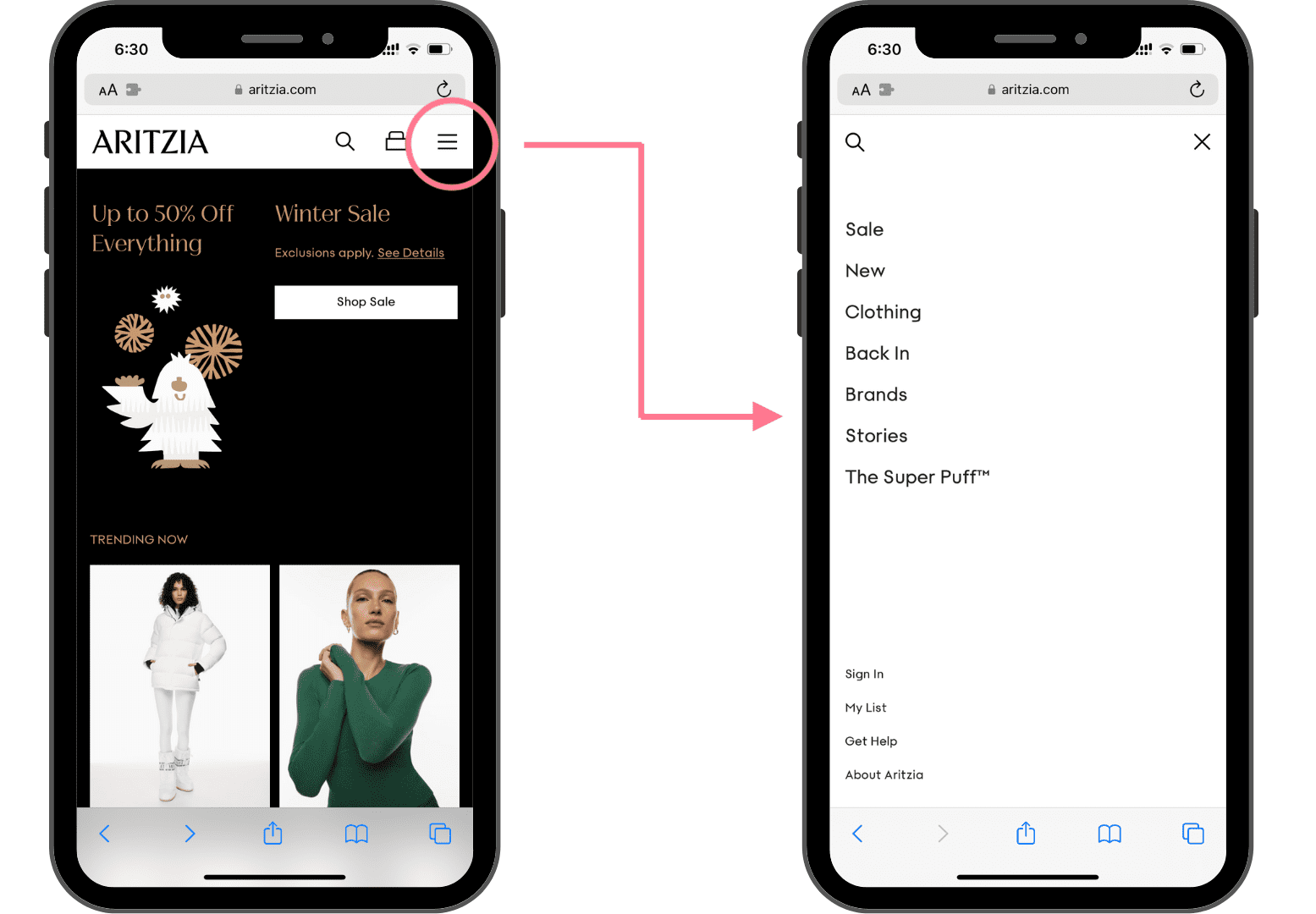
Users click the navigation button (the three-line icon) to see navigation links. Which saves lots of valuable space on the screen.
A hamburger navigation is a great pick if you don’t want your navigation to take up too much space.
Lastly, you’ve also probably seen footer navigation menus at the bottom of websites before:
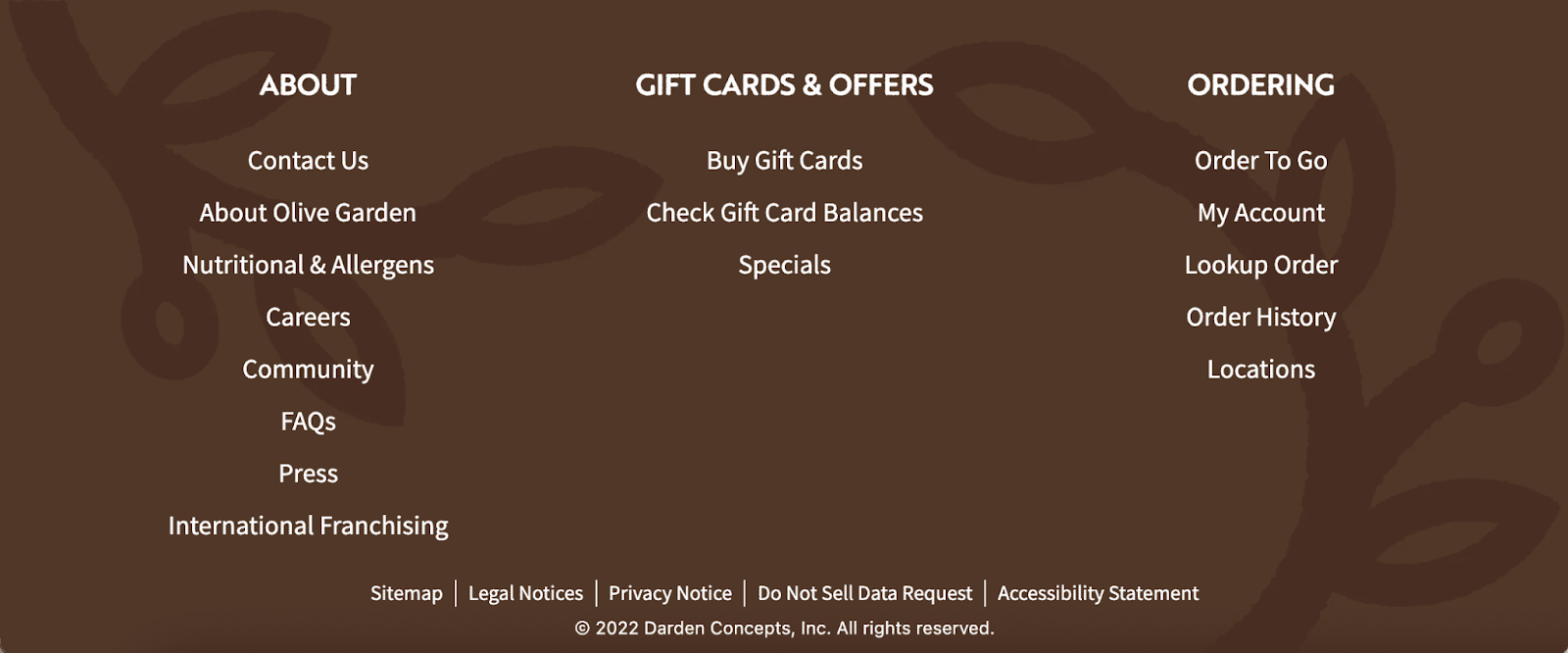
This type of menu is usually paired with horizontal navigation bars. You can add additional links that won’t fit in the main navigation. And it won’t clutter the design of your page since it appears at the very bottom of the screen.
Ready to update your navigation? It’s easy to do on the average CMS (content management system):
Optimize Your Site’s URLs
Keep URLs short. And always use words that relate to the content on the page. (Usually, your target keyword works well.)
It’s important to keep URLs clear and consistent because Google uses them to understand the hierarchy and structure of your website.
Google recommends using simple URLs that don’t look “intimidating.”
Here’s an example of a poorly optimized URL:

And here’s an example of a well-optimized URL that clearly communicates the topic of the page:

Most CMSs automatically generate URLs based on your page’s H1 and any category of parent page you’ve chosen.
Which isn’t always ideal. However, your CMS usually allows you to alter the URL before publishing.
Here’s what that looks like in WordPress:
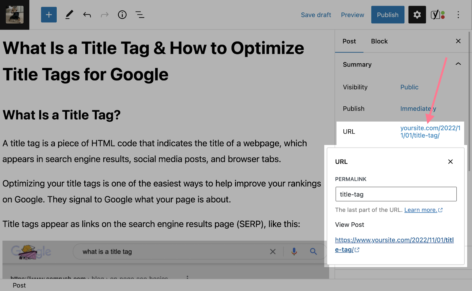
Before you publish your page, ensure the URL is concise and clearly explains what your page is about.
Note: Be very careful about changing URLs of live pages. If you believe it’s necessary to change a live page’s URL, you’ll need to set up the proper redirects. Read our guide to redirects to learn how.
It’s easy to keep a consistent URL structure when you use your content pillars and clusters for reference.
For example, pillar page URLs could follow the format yourdomain.com/pillar-topic/
And your cluster page URLs could be yourdomain.com/pillar-topic-/cluster-topic/
So if we use the “copywriting” example from above, here’s what that would look like:
- Pillar page: yourdomain.com/copywriting
- Cluster subtopic page: yourdomain.com/copywriting/email-copywriting/
These URLs are optimized for user experience and SEO purposes. And the cluster page’s URL shows the relationship between the pillar topic and subtopic.
Use Breadcrumbs
Breadcrumb navigation is a text-based navigation path made up of links. It shows users where they are in your site structure.
Breadcrumbs also communicate to search engines how your site is structured.
They look like this:
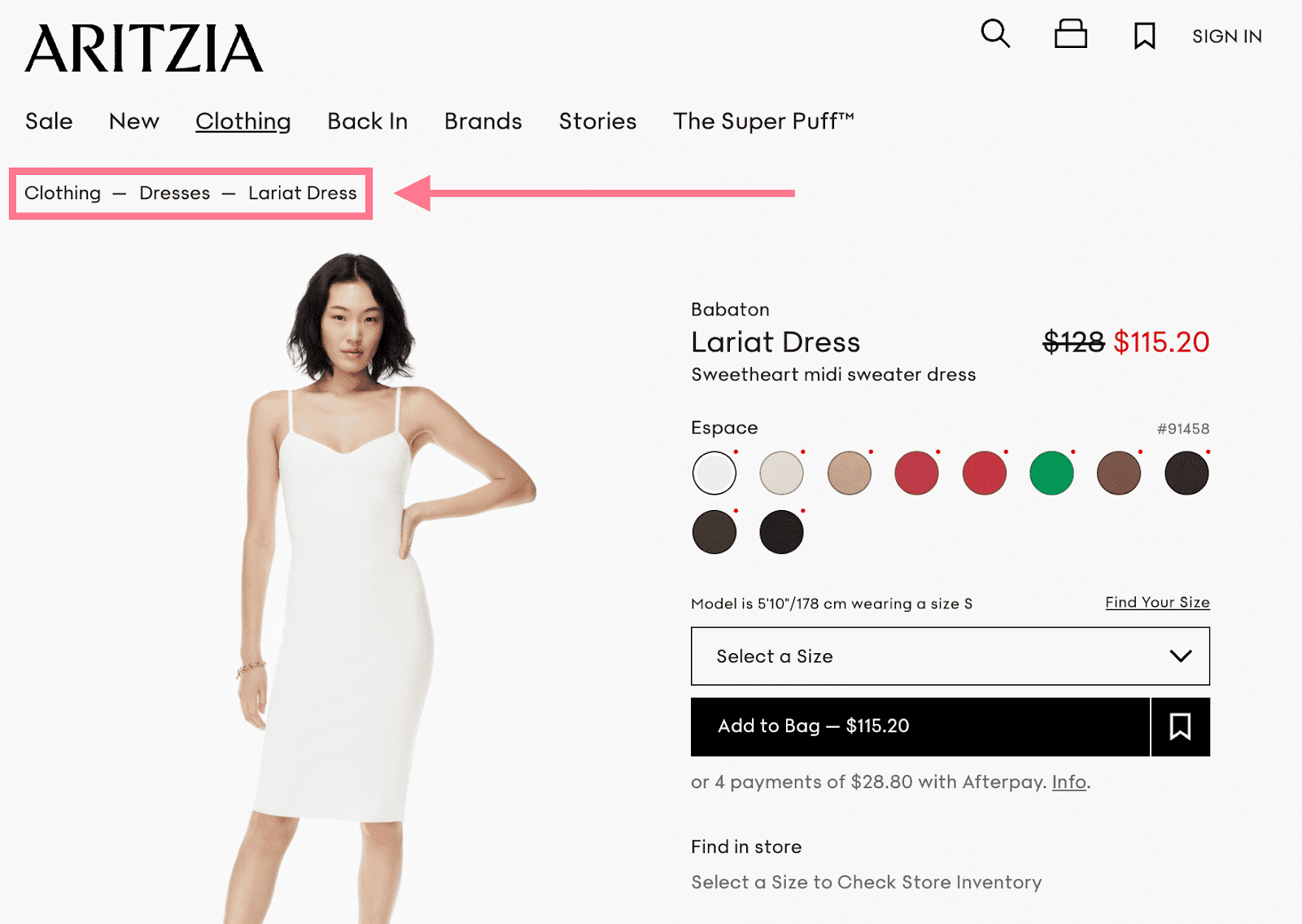
We can see links from the homepage to the individual product page.
When users click through your site, they don’t always navigate directly to the product they eventually buy or the content they eventually read. So it’s helpful to show their navigation path, in case they need to backtrack.
Advanced tip: You can also add breadcrumb structured data markup to pages so the breadcrumb path shows up in the SERP. Like this:

To learn more, read our guide to breadcrumb navigation.
Use HTML and XML Sitemaps
A sitemap is a file that shows all the pages, images, videos, and files on your website.
It shows how different parts of your site are related to each other in a crawlable format for search engines.
An HTML sitemap is designed for users. So if they can’t find a certain page, they can view a full list of every page on your site.
Like this:
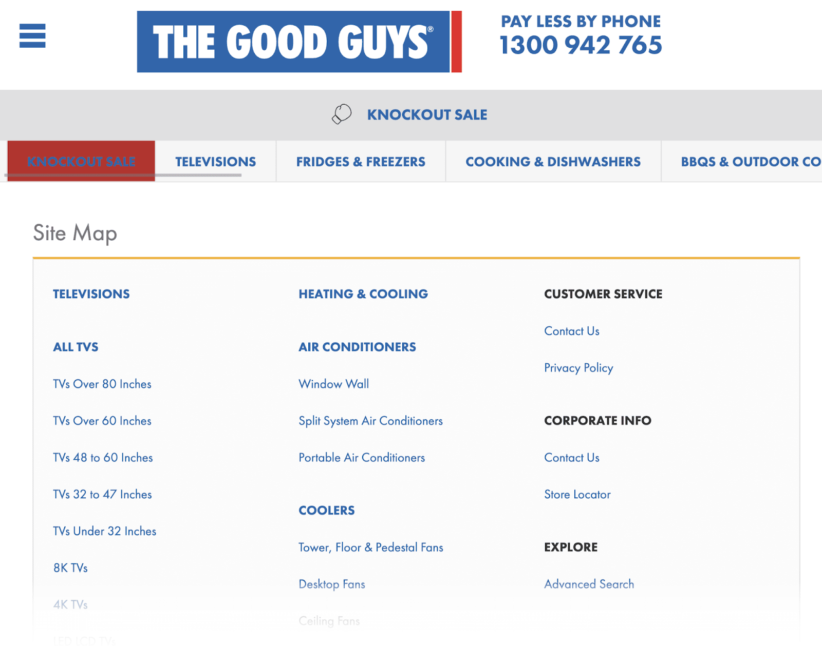
XML sitemaps, on the other hand, are created with search engines in mind. They show a full list of URLs in plain text so crawlers can easily access them.
Here’s an example of an XML sitemap:
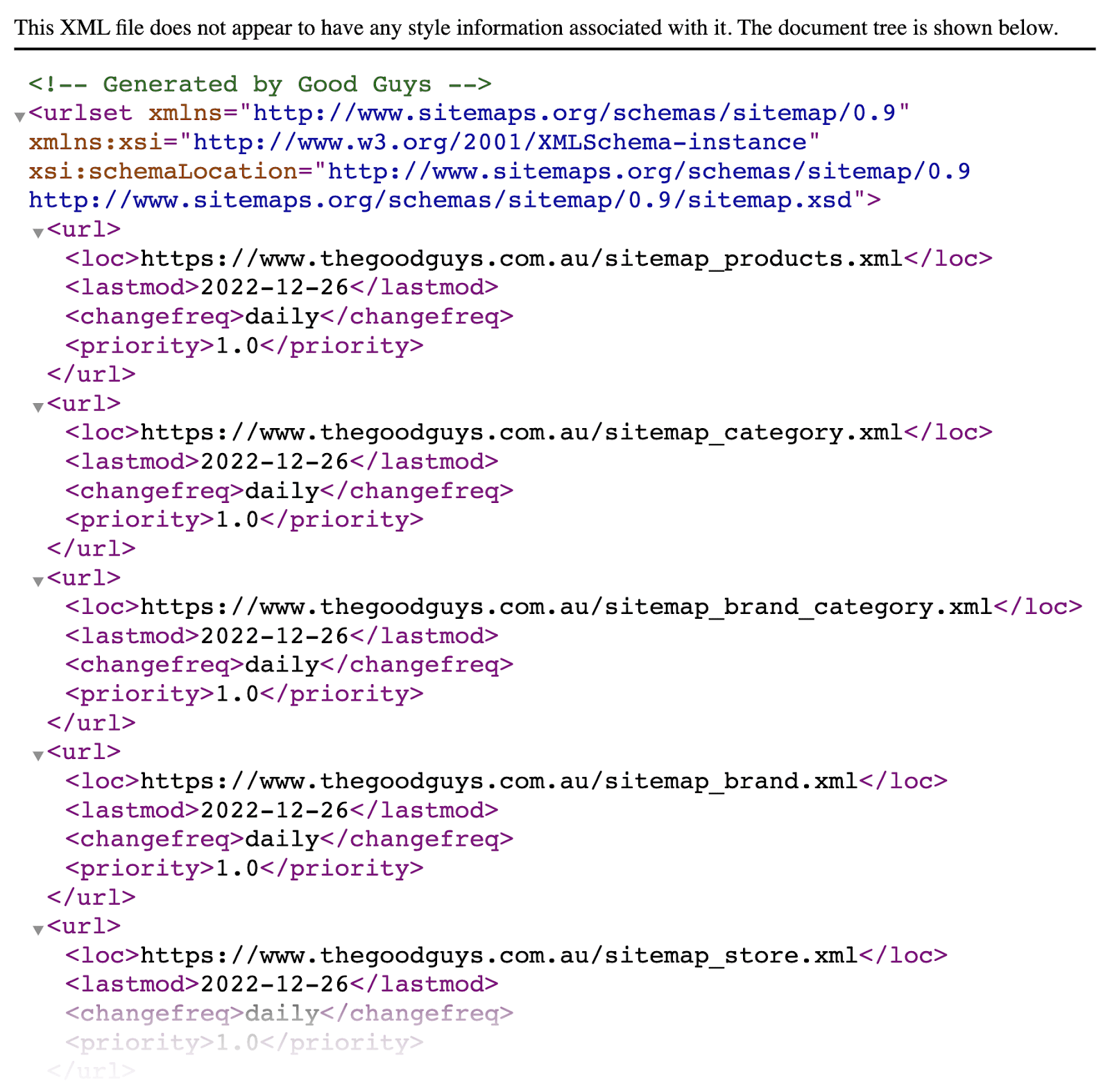
If your sitemap has errors, it may mean search engines are unable to find or process certain webpages. And search engines may choose to ignore pages they can’t process. Which could lead to issues with ranking.
To find XML sitemap issues, go to the “Issues” tab within the Site Audit tool. Then search for “sitemap” in the search bar.
That should pull up a list of potential XML sitemap errors, like formatting errors and incorrect pages.
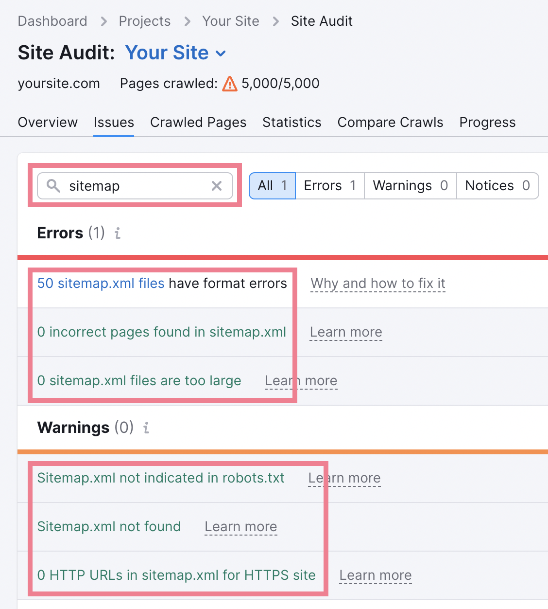
Click on any errors you may find to get more details about how you can improve your site. For example, here is a list of sitemap pages with formatting errors, as identified by the tool.
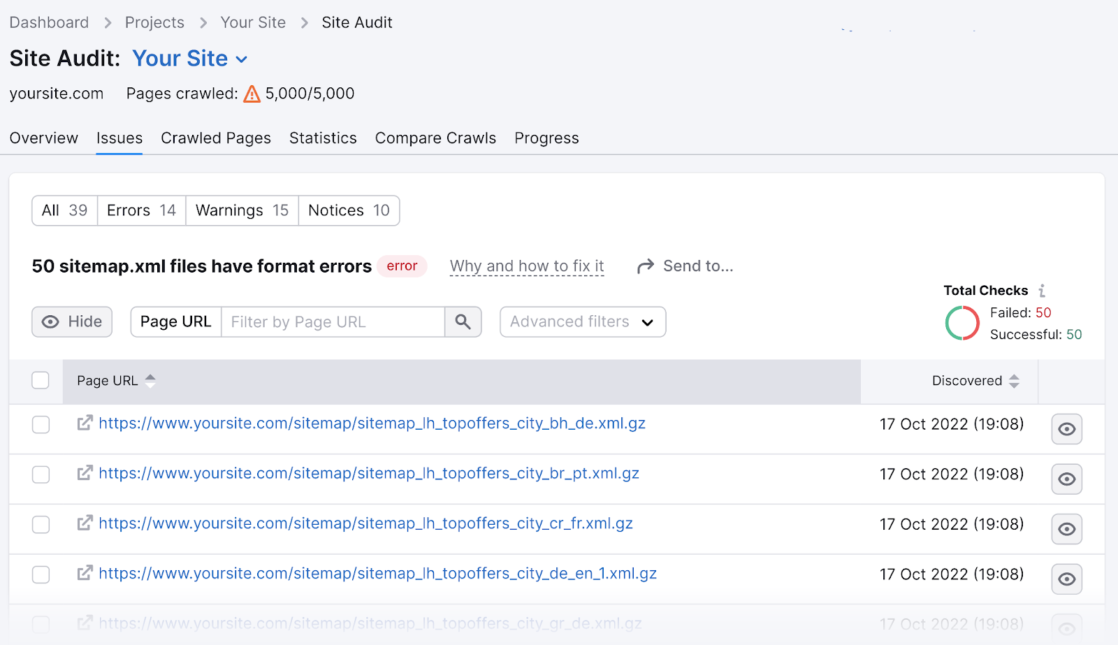
You can submit your XML sitemap directly to Google through Google Search Console. We recommend doing this to quickly inform Google of your website architecture in just a few clicks.
Looking to generate a sitemap? Here are a few resources:
Source link : Semrush.com
