Posted by
Shay Harel
It’s 2020 and what better way to kick off the new year than by looking back at the December 2019 SERP! Don’t think for a second that Google took it easy as 2019 wound down…. The last month of the year saw Google take BERT international and use the natural language processing (NLP) technique to take the Top Stories feature to places no news carousel has gone before. Couple that with an onslaught of local changes to the SERP and you have yourself a mighty month of SERP madness!
And away we go!
BERT Goes International & Impacts the Google News Carousel

On December 10th, it was announced that BERT, Google’s latest tool to help it understand language naturally, has expanded to reach 70 languages. Meaning, Google is now using BERT to better help understand elements of language such as prepositions, multiple-meaning words, and is going beyond English to other languages from Latvian to Nepali to Kazakh, etc. The obvious impact is the better interpretation of queries in markets around the world for the allowance of more relevant results.
Just one day later on December 11th, Google announced that it has begun using BERT to advance the depth of the results within the Top Stories carousel. The upgrade to the news carousel means that Google has begun segmenting a news story according to multiple topical strains. That is, Google is now showing multiple carousels under a heading that reflects unique storylines. Additionally, the search engine is often showing a carousel of related stories under a heading entitled “Also in the news.”
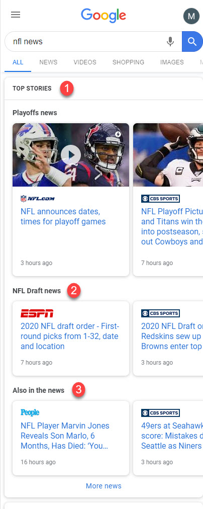
The News Box showing three topically unique carousels on the mobile SERP
Google attributes the ability to structure the carousel as such to new “story understanding technology,” part of which includes BERT. In specific, Google says that it uses BERT to “examine the related articles and determine where one story ends and another begins.”
To be honest, it took me a minute to wrap my head around how BERT fills such a role. After much thought and a shot of scotch or two here’s how I think BERT impacts the upgraded news carousel…. BERT, beyond helping clarify the meaning of language via context also serves as a Question and Answer model. To this, BERT uses its context clarification magic to determine where within a series of content the answer to a question starts and ends. (This, of course, lets Google offer more accurate answers.)
What I believe is happening here with the Top Stories carousel is that Google is using this ability of BERT, or a similar such ability, to determine where a news topic begins and ends. That is, does the “answer” or topic being discussed in one article match to what is being discussed in another article? Alternatively, BERT is also used as a means of named entity recognition (NER), so it could be Google is analyzing each article from an entity perspective to see what does and does not align. If I had to place a bet, I would say Google is using it more like the Q&A construct I outlined above. Again, Google has not discussed the way it is using BERT here in any detail whatsoever, these are just my own thoughts.
The Month in Rank Fluctuations
While there was no confirmed or core update in December, the month still sported a few moments of considerably elevated rank fluctuations. The first algorithmic change that shook rank up occurred on December the 6th when our Rank Risk Index caught fluctuation levels reach 82/100 on desktop.
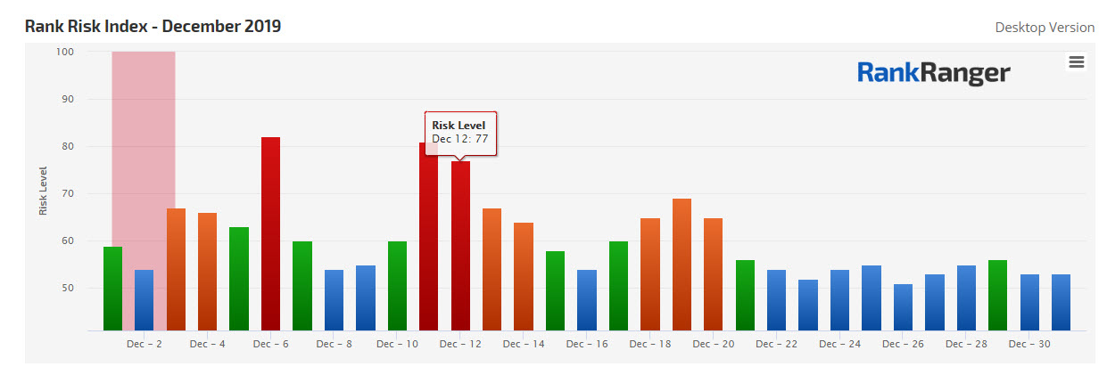
By the 10th, rank fluctuation levels had returned to normal but just five days later the index caught a four-day update that had fluctuation levels hit 81/100. Four days after that there was a more moderate event that had fluctuation levels hit a high of 69/100.
There were some rumors that Google had rolled an update out on Christmas itself, but as you can see in the image above, the index shows that rank volatility was significantly low at the time.
Google Updates the Quality Raters Guidelines in December
In early December, we were privy to yet another update to the Quality Raters Guidelines (QRG), though the changes this time were like a generic bottle of salsa… relatively mild (I like my food to reflect my life… spicy). The most notable update was the insertion of a new introduction.
The new section outlines that different users search for different reasons and that as such the type of results Google offers for different verticals should reflect that. The example Google uses is that “medical results should be high quality, authoritative…. Search results for “cute baby animal pictures” should be adorable.”
The change speaks to Google’s ability to profile content according to vertical (which Google has actually discussed in the past). Seeing it here in the QRG only adds emphasis to the notion that how you think about your content should be vertical-specific.
The SERP Roundup Covering December 2019
As I mentioned in this post’s introduction Google did not take it easy just because the year was quickly coming to a close. In fact, as far as changes to the “local SERP” were concerned, December was the pinnacle of Google’s emphasis on feature experimentation.
Local SERP Feature Changes: From Colorless Local Pack Ads Labels to Review Carousels
Google is always tinkering with its local SERP features, but I haven’t seen Google this focused on the world of local elements in quite some time. Moreover, some of the tests and changes are downright fascinating (though some might be downright disturbing depending on your perspective.)
The Colorless Ad Label Comes to the Desktop Local Pack
The minute Google tests something that makes its ads more organic looking the SEO world is going to “freak.” This time, Google’s colorless & very organic looking ad label reared its inconspicuous head inside the desktop Local Pack.
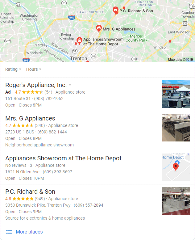
The Colorless ad label appearing within a desktop Local Pack (Image Source: SERoundtable.com via Glenn Gabe)
Spotted on December 9th by Glenn Gabe, the colorless ad label is hard to notice at a glance when it resides within the desktop Local Pack. Note, mobile Local Packs have sported the colorless ad label since their general introduction to the mobile SERP a few months ago.
Google Implements Review Carousels
In a buzz-generating move, Google has taken to show reviews in the carousel form within the Local Finder’s business panels. The carousel both brings reviews into the user’s immediate focus and increases the chances that users will peruse through more reviews. That is, the carousel of reviews shows higher up the panel than the traditional review format. At the same time, the carousel presents functionality that allows the user to more efficiently go through a business’s reviews.
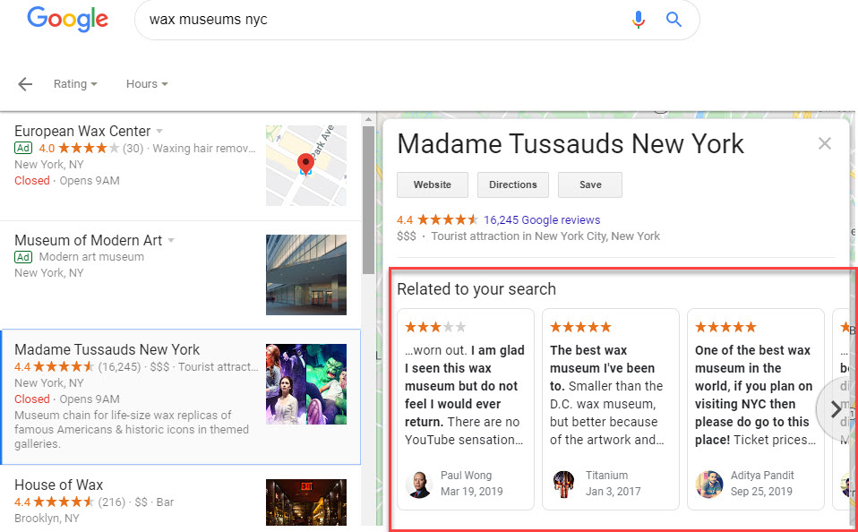
A carousel of reviews as seen within the Local Finder’s business panel
Request Quotes Via the Local Pack
Google was seen showing a “Request Quotes” button at the top of the Local Pack. What’s “interesting” is that the quotes do not come from the listings shown within the Local Pack. Rather, executing the option brings up a new screen that allows you to secure quotes from multiple vendors that are ‘Google guaranteed’. Meaning, the vendors offering the quotes are part of the Local Service Ads program. As such, the insertion of this button is a Local Service Ad in everything but name.
‘Request Quotes’ button above 3-pack. Lets users request quotes from multiple businesses using messaging. The Google Guaranteed badge shows for businesses participating in Local Services ads pic.twitter.com/PiYo07I6d1
— Tom Waddington (@tomwaddington8) December 17, 2019
URL Cards Appear in the Local Pack
Here’s another doozy for you that should bring a smile to your face. In mid-December, Google was found testing what I’ll call “URL cards” within each Local Pack listing. That is, the test put a card that included the listing’s favicon (the test was mobile-specific) within a card that presents a URL to the listing’s site. I would imagine that full implementation of this format would be quite welcome as many Local Packs do not contain any direct access to the business’s website.
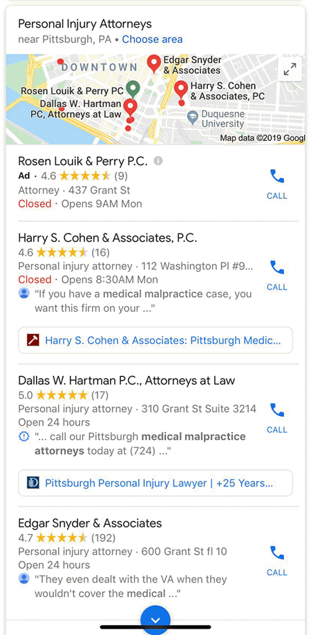
URL cards appearing within the mobile Local Pack (Image Source: SERoundtable.com via Jason Parks)
Business Service Area Icon
Local Search guru, Joy Hawkins, caught a nifty little icon inside the Local Panel that actually offers a great deal of information. The new icon depicts a delivery truck that when clicked on brings up a new screen which tells you the areas the business serves that fall outside the boundary of its primary location! Small icon… big information!
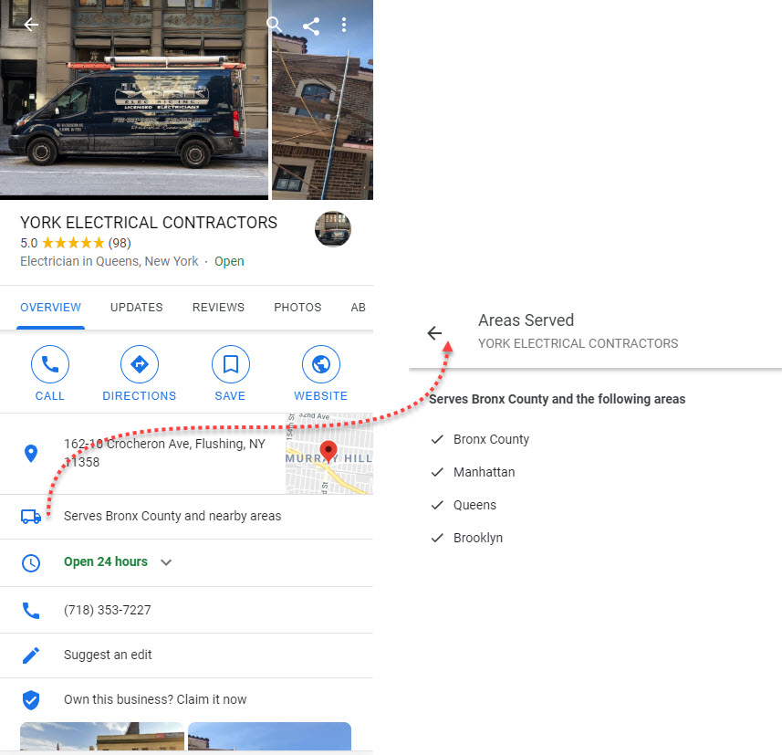
The Service Area Icon within the Local Panel indicating the areas served beyond the primary location
Local Packs with ‘Top-Rated’ Icons
Speaking of icons, Sergey Alakov found Google showing an icon that indicates that the listing is top-rated. Oddly enough, the icon seems to appear when the description also mentions that the location is top-rated. Thus, the icon isn’t really offering the user new information (as the description already says the listing is top-rated) but rather makes that information more noticeable.
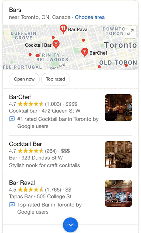
Local Pack listing showing with a ‘top-rated’ icon (Image Source: SERoundtable.com via Sergey Alakov)
Local Guide Lists Added to the SERP
Google is testing a carousel on the mobile SERP that presents lists created by Local Guides (and other users as well). The carousel, applicable to local queries only, shows a series of cards that represent lists related to the initial query’s business type. Clicking on a card brings up the full list and all of the establishments on it.
Has anyone ever seen Google show a carousel of Google Maps lists on the SERP for local queries before?
Pretty interesting.
cc: @rustybrick @sergey_alakov pic.twitter.com/ebSbHVVC0l
— Mordy Oberstein (@MordyOberstein) December 30, 2019
Tiles Bring Details to the Local Pack
Nope, still not done with local changes and tests. In this aberration, Google was testing a ’tile’ format for the Local Pack. That is, buttons traditionally found in a Local Pack were shown in tile form. Among the tiles was a button marked ‘details’. It’s not exactly clear what details Google was showing, but it is interesting to see Google try to stick more info into the Local Pack per se (as opposed to having the user utilize the Local Panel and Local Finder for deeper information).
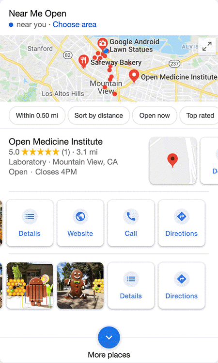
A Local Pack test showing the buttons in tile form (Image Souce: SERoundtable.com via Valentin Pletzer)
And that concludes our spotlight on local in this edition of the SERP News. If that was not enough for you… there were actually other tests that I didn’t include. Meaning, yeah, Google kind of went nuts with ‘local’ in December!
Google Expands Its Cameo Program
Google Cameos is a feature within the Knowledge Panel where celebrity-type folks could ask and answer questions about themselves via short video snippets that appeared in carousel form. Now, Google has not only expanded the program to include folks who may not be national celebrities (no insult to Barry Schwartz who is the industry’s closest thing to a celebrity and who was clearly having a good time with this feature):
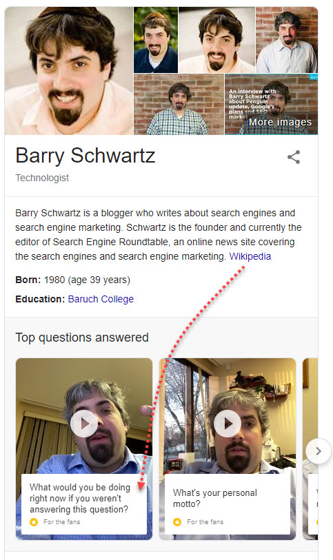
Besides opening the program up to include more people, Google is also showing cameo snippets within its Discover Feed. If you get invited into the program this could be a great way to get yourself out there as you no longer need to rely on users engaging with the Knowledge Panel per se for this feature to appear. Though, I would imagine that the user would have to be searching for you directly or very close to your direct name prior to your cameos appearing within a given Discover feed.
Multi-Perspective Featured Snippets
Bing has long offered multiple opinions or “takes” within its version of Featured Snippets. Google has long “borrowed” some of Bing’s SERP feature novelties (yep, that’s a fact). This past month, Google has been spotted testing a Featured Snippet that offers multiple looks at an answer to a question.
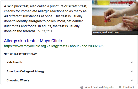
A Featured Snippet offering multiple opinions via expandable tabs (Image Source: SERoundtable.com via Emily Perry)
The test had Google showing a Featured Snippet as it always does, however, below the answer per se was a series of extendable tabs under the heading “What others say.” To me, this is a no-brainer… Google showing multiple perspectives is only a good thing. That said, Google showing the “one true answer” does create an air of authority that it may not wish to forgo in favor of answer diversity.
Google Pushing for On the SERP Package Tracking
Google is working towards making the SERP your destination for package tracking. In December, the search engine was seen testing an opt-in program that would show all delivery status details right on the SERP. The program would require shipping companies (i.e., FedEx) to integrate their systems with Google. The result would be the user being able to enter a tracking number and seeing the shipping details right on the SERP without having to head to a website. Before you freak out about Google stealing traffic… I’m pretty sure UPS does not care if folks use Google itself for tracking a package (though, I could be wrong).
Mobile-Like Movie Carousel Lands on Desktop
Google’s desktop carousel that appears whenever you Google anything from best movies 2019 to the roster for your favorite sport’s team has looked pretty much like the below for a very long time:

Now, for queries related to watching your favorite movie or your binge-worthy series Google is showing a carousel that offers a horizontal scroll as well as a button to expand the carousel into that which devours all other space on the SERP.
I think @Kevin_Indig spotted these last week, but now I’m seeing this new carousel format more often and in new markets.
h/t @RankRanger
cc: @rustybrick pic.twitter.com/nIKHItE9Gt
— Mordy Oberstein (@MordyOberstein) December 16, 2019
By hitting the button below the carousel, what was once left-to-right experience now results in a vertical scrolling experience filled with all sorts of media options to help you escape the misery that is your life. From an SEO perspective, this ever-loading vertical carousel makes it quite difficult to reach the organic results.
Google Translate Box Shows Images
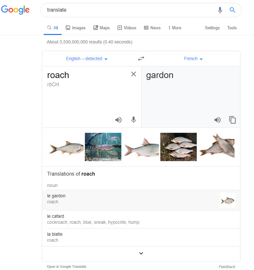
In the last edition of the SERP News, I mentioned how Google had begun showing images in some of its Dictionary Boxes for some very simple nouns, etc. The only added benefit I saw of this was for those learning English or maybe for kids. (I mean, do you really need to see an image of a horse when looking up what a horse is? Do you really need to look up the definition of a horse all together?) Now Google is taking its reasoning behind its Dictionary Box images to the next logical place…. the Translation Box.
When you run a translation for some simple nouns you may see a series of images below the translation. The only upshot of this is that perhaps when translating you’re unsure if the result you receive is what you meant. By seeing a picture I guess you would be able to tell that the translation matches what you meant in your native language. For the perfect example of this, just see below:
Movie Watchlists from the Knowledge Panel
Reports have surfaced that Google has added a Watchlist button to the mobile Knowledge Panel for movies and TV shows. I personally would **** this if I used Knowledge Panels to find movies and shows. Meaning, I think this is a very helpful feature, it’s just that I tend to find movies on lists (as in What’s New to Netflix in January). That would mean looking at a list of movies/shows and specifically Googling each movie, bringing up the panel, and then adding the flick to my watchlist.
By the way, at the time of this writing, I do see the button to buy tickets to a movie or indicate that I already watched it, but I do not see the Watchlist button.
Looking Ahead to the SERP in 2020

I guess at this point I’m supposed to talk about what I think the SERP will look like in 2020. I could tell you that I think we’ll see all sorts of new elements and upgrades and whatnot but calling such a prediction obvious would be an understatement. I could tell you what new features Google will introduce and what will be important in the SERP feature world, but how can I possibly know that?
Instead, I’ll share where I think things are headed and that’s ‘options’. More and more options for the user. I don’t mean a small filter here or a tab there, Google has been offering those sort of options to its user since forever ago. Rather, I mean options, whether they be a bubble filter or tabs or whatever, that change the entire SERP. At a certain point, Google is going to have to offer the user options to filter the SERP to their specific needs in order to match the level of personalization users will come to expect.
Imagine a user searches to buy a product. Google very often shows a slew of product review sites for such queries. Let’s assume that in our case reviews are exactly what the user meant to see. Why not have a filter that lets you ONLY see review sites for the query? Good idea, right? Now imagine what that would mean for “ranking.” I’m getting a little ahead of myself here, but this sort of directional move is what I see for 2020 on the SERP.
Right or wrong, it’s a pretty interesting prediction (if I do say so myself) and a subsequent predicament for the SEO industry.
Do you agree? Let me know!

