Posted by
Shay Harel
Now that we’ve entered the new year, I guess taking a look back at December’s SERP is a bit nostalgic. For those of you who eagerly let go of 2016 and quickly embraced 2017, I promise this post will not retroactively kill another beloved celebrity, nor will it make any mention of politics (for those of you who couldn’t get enough of 2016, take a look back at the full year in SEO). This post will however fondly review some interesting changes to Google’s SERP as December 2016 presented us with some important happenings.
Google Gets a New UI
Google gave itself a face-lift in preparation for the new year by rolling out a new UI for all of us users to enjoy. Truth be told, many of you may not have even noticed the early December update since Google had been testing the new UI format extensively for a while. The new UI presents a lot of small changes that include a new font and a new placement of some of the buttons under the search box, etc.
The thematic difference between the old and the new UI is that the latest version is an attempt to move closer to how the mobile SERP is presented. As such, the new UI incorporates more cards that deeply impact how the SERP’s carousels appear.
For instance, here you can see how a Black Carousel used to appear on the previous UI’s SERP:

Here’s how it appears now:

You’ll notice that the newer version has a more mobile-like feel and presentation, which speaks to the overall direction of Google’s new UI.
In the News (all but) Removed from the SERP
Google’s new UI did present one other major change, it saw what was essentially the removal of the “In the news” feature. Our SERP Features Tool caught the decline of this News Box format, showing that it ran parallel to the release of Google’s new UI.
Instead of “In the news,” the desktop News Box has a heading that reads “Top stories”… which is how the News Box appears on mobile. The new format presents cards that contain the title, publisher, and time of release of each article displayed in the News Box.
Local Pack and Rich Cards Get New Filters
December 2016 saw Google work to refine the functionality of some of it SERP features by adding in some new filters. Specifically, we saw both Local Packs and Rich Cards get presented with new filtering abilities.
Local Pack Filters
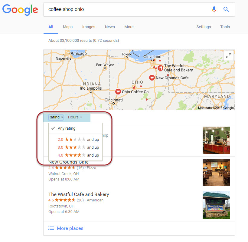
First reported on December 19th, the Local Pack SERP feature now displays with relevant filters. These filters allow you to sort the three results shown within the feature by hours (i.e. hours of operation), distance, and rating.

A Local Pack displays with a new set of filters
The “hours” and “distance” filters makes a lot of sense to me for obvious reasons. However, the rating filter in my opinion is a bit odd. It’s not even as if you can sort the results by rating in ascending or descending order. Rather, users are only able to sort by range of rating (i.e. three stars and up, etc.). Now, the filters are also shown within the Local Finder as well. Here, the rating filter makes a lot more sense, since there are so many results. However, within the Local Pack per se and to put it a bit bluntly, do we really need a filter to sort by rating when we’re only looking at a whopping three results?! Overall though, the filters are a helpful little addition.
Rich Cards Filters
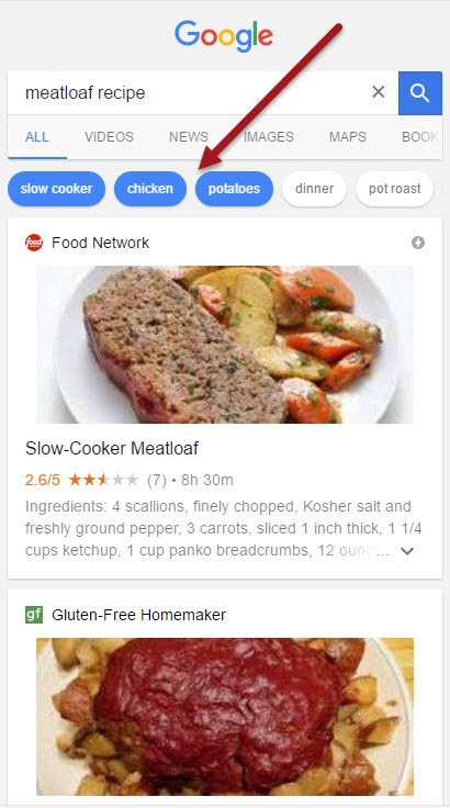
Rich Cards recently expanded to new categories, but now those cards under the Recipes heading have received new filters to help you track down the ultimate dish. The filters appear above the carousel of cards and present filter categories related to ingredients, preparation method, etc. Further, you can select multiple categories to better narrow down the recipe you are looking for. Say you want meatloaf made from chicken, cooked with potatoes in a slow cooker…. you could do that… if that’s your thing.

New Rich Card filters for recipes narrow down results to meet the selected criteria
Organic AMP Spreads to Images, Featured Snippets Spike, & the SERP Gets a Color Picker
Rounding out the last month of 2016 were multiple changes to the SERP, each with its own glimpse into where Google is and may be heading. Two of the major facets of SEO are represented, AMP and voice search, while at the same time Google added another good ‘ol feature to the SERP.
AMP in Image Results
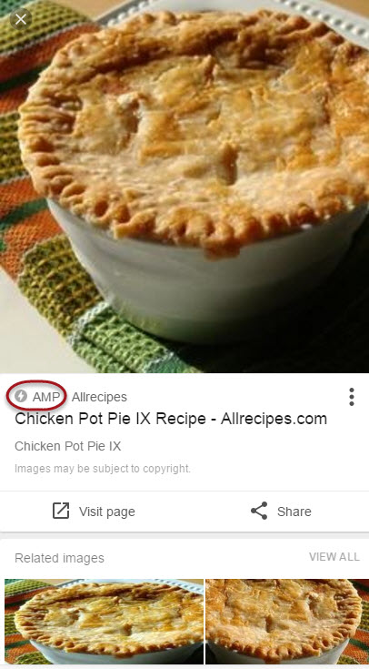
To start, organic AMP spread its wings last month by entering Google’s image results on mobile. Should an image be hosted on an AMP optimized page, Google will indicate as much. Upon tapping and hence enlarging an image result, Google now displays the AMP icon should the corresponding page be optimized for the format.

An expanded result from Google’s image search displays the icon and status
Featured Snippets Spike to New Heights
While Featured Snippets started 2016 showing on 2.7% of Page One desktop SERPs in the US, by December 31st the number was at 10%. That’s quite a jump. December alone saw an approximate 1.5 percentage point jump to break the 10% mark. The uptick in the SERP feature is most likely due to Google’s voice search, as the search engine utilizes Featured Snippets to provide voice query results. As such, the SERP Feature’s popularity has greatly increased.
Featured Snippets now show in over 10% of Page One #desktop SERPs (USA)- Surge related to voice search optimization? https://t.co/dzoQcQx09o pic.twitter.com/KsEykNAW3a
— Rank Ranger (@RankRanger) December 21, 2016
Google SERP Color Picker
Last up, December saw Google add a “color picker” to the SERP. For queries along the lines of pick color or color selector, Google may now show a nifty little feature that allows you to see the numerical representations of any color you have displayed within the tool. Certainly not as significant as Featured Snippets spiking on the SERP, but certainly a helpful addition.
Google’s new color picker SERP Feature allows users to see the numerical representations of any given color right on the SERP
At the End of the SERP Rainbow
With a splash of bright color vibrations we close the month of December on the Google SERP. Certainly the month presented a colorful array of new improvements to multiple SERP features. It’s always interesting to get a sort of glimpse into how Google bunches SERP feature changes together. In this case we saw two different SERP features get filtering abilities (i.e. Local Packs and Rich Cards for recipes). However in my mind, the larger theme here is Google’s focus on images within the mobile SERP. It’s interesting to note that Google chose to hone in on improving/updating (either with a new filter or AMP status) a user’s interaction with elements related to images. I wonder if going forward we are going to see an increased focus over at Google on enhancing and increasing those elements of the SERP and SERP features that have to do with images. We shall see… we shall see!

