There are tons of different website types, ranging from media to entertainment, ecommerce, to business, and the list goes on. Each type has its own structure, its own approach to design and its own ideal SEO structure. Sometimes, having just one page on a website is fine, especially if your aim is to showcase your business or portfolio. While single-page websites provide opportunities to be creative design-wise, their SEO potential leaves much to be desired.
In this article, we will explore all the different ways to create a single-page website. We’ll also look at the specificities of a one-page website SEO.
What is a single-page website?
The concept is fairly simple: a single-page website contains only one page. It usually has a long-scrolling layout and is designed for a specific CTA.
You may also come across its alternative term, one-page website, which slightly differs in functionality and UX. One-page websites are typically static and self-contained within a single HTML page. They don’t incorporate navigational links leading to different page sections. All the information, visuals, and functions are condensed into a single, continuous layout. This design creates a seamless scrolling experience, giving users the impression that the page’s content is unified and integrated.
On the other hand, single-page websites leverage dynamic content loading and use anchor links. They dynamically fetch and display content from the server, responding to user interactions without requiring a full page reload.
While some people highlight the distinctions between the two, others, including us in this article, treat single-page and one-page websites as similar because their SEO approaches are typically alike.
What purposes can a single-page website serve?
- Selling one particular product or service. Usually, one-page websites look like landing pages concentrated on one offering. If you don’t need several pages and you don’t plan on having a blog, a single-page site is the perfect option.
- Gaining brand awareness. Some companies create websites purely for web exposure.
- Having a creative portfolio. Portfolios are another popular example of single-page sites. It’s useful to include all your contact information and key projects on a single page, facilitating distribution across other channels.
- Hiring a team. Companies can create websites to attract potential employees. You only need one effective page to fulfill this purpose.
Though there are plenty of other potential purposes for creating a single-page website, we will focus on how to build a site that converts users and brings you profit.
Let’s explore the typical components of a single-page website. Its structure includes:
- A catchy headline. A headline is the first thing a person sees on the website, so make sure it is visually appealing. Studies have shown that top-performing headlines use emotional language, include an action verb, strike a positive tone, and convey clear benefits to the reader. You can also use value propositions, how-to phrases, and interesting testimonials make impactful headlines.
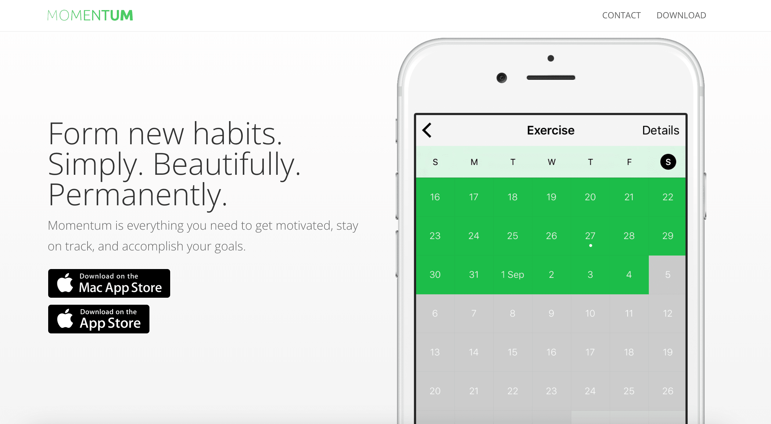
- Navigational buttons linking to different sections of the page. The fact that it’s a single page doesn’t mean you can’t provide links to each distinct section. An ever-present navigation bar at the top of the page, visible while scrolling, can guide users to different sections of the website.
- A basic description of a product, service, brand, etc. Your sole page should describe your offering clearly and in detail. It’s also a good idea to include reviews to enhance your product’s authority and relatability.
- A distinct CTA. This is the pivotal element of your single-page website, encouraging users to take action. Ensure your CTA is concise, attractive and speaks to your target audience.
Below is an example of a website that builds a logical narrative, guiding users through different service features while presenting several CTA buttons aimed at converting users into leads and loyal customers.

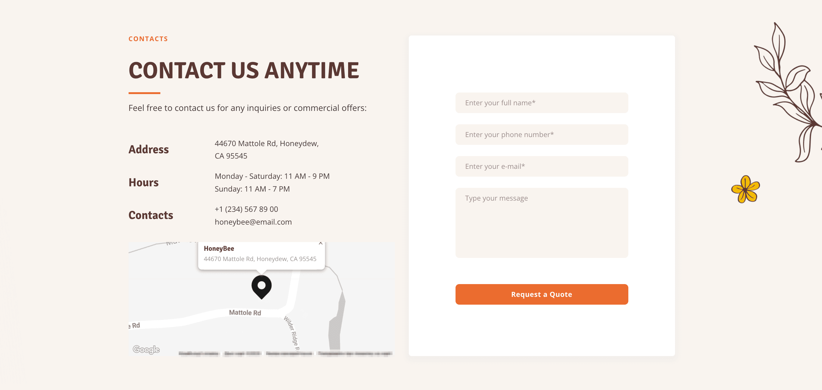
- Contacts. You can either display your contact information or integrate an entire contact form directly onto the page. If you have social media accounts, provide links to them along with your contacts.
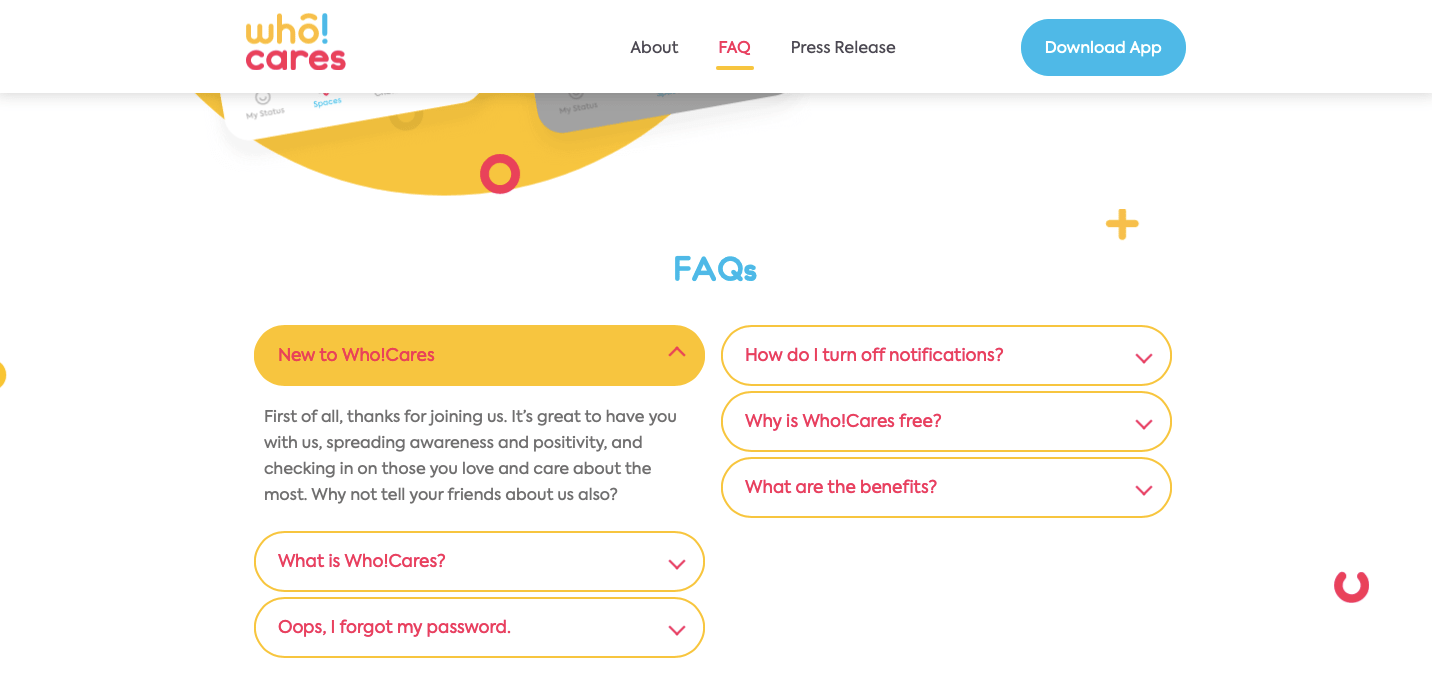
- FAQ. Include as much information as possible in your FAQ section to persuade visitors to try out your product or service. Adding an FAQ helps users make informed decisions.
Learn more about trust factors, what makes them essential for websites, and how they help increase website authoritativeness and boost conversion rates.
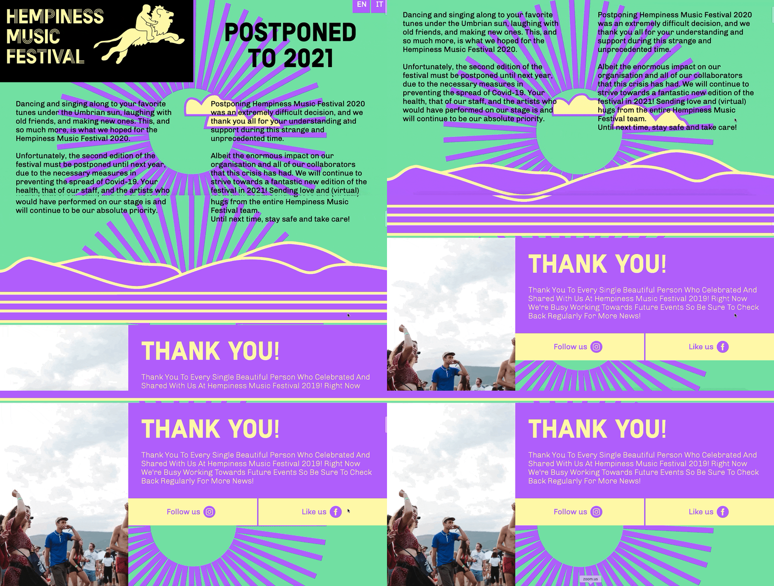
Apart from typical elements, one-page sites often have a very distinctive design-centric feature called parallax scrolling. This technique is used to create an illusion of depth and make the page more interactive. As you navigate through these websites, you’ll notice how the background content moves as you scroll up or down.
One-page vs. Multi-page website: Which one to choose?
When building a website, a fundamental choice you’ll make is whether to create a one-page or multi-page site. Each approach comes with its own strengths and considerations, and choosing the right option depends on your goals, content structure, and target audience.
One-page websites are an excellent choice for projects that require a streamlined and focused UX. They are an appropriate format for:
- Landing pages: One-page websites are often used to create effective landing pages focused on promoting a specific product, service, or event. They are great at capturing visitors’ attention and encouraging them to take desired actions, presenting all critical information in a cohesive and visually engaging manner.
- Businesses with a single product or service: If you have a singular product or service that you want to highlight, a one-page website can be an excellent choice. You can utilize sections or scrollable elements to provide comprehensive details, testimonials, and captivating visuals, all on a single page.
- Storytelling or personal portfolios: One-page websites are ideal for telling a compelling story or showcasing your personal portfolio. They let you share your narrative or creative projects in a linear and immersive format, catching visitors’ attention as they scroll through your content.
Multi-page websites are more suitable for projects needing a comprehensive and hierarchical structure, along with extensive content. They are a better fit for:
- Informational websites: When you have lots of content or different categories of information to showcase, a multi-page website provides clearer organization and simpler navigation. Divide your content into logical sections or pages, ensuring users will find it more accessible and digestible.
- Ecommerce websites: For online stores, multi-page websites are often the go-to choice. They let you categorize products, create separate product pages, and follow a more traditional navigation structure. This makes it easier for visitors to browse and search for specific products.
- Scalable projects: If you expect your website to expand over time and plan on incorporating new sections, features, or functionalities, having a multi-page structure provides the flexibility to accommodate future growth. As your website evolves, having multiple pages makes maintenance, updates, and scalability smoother.
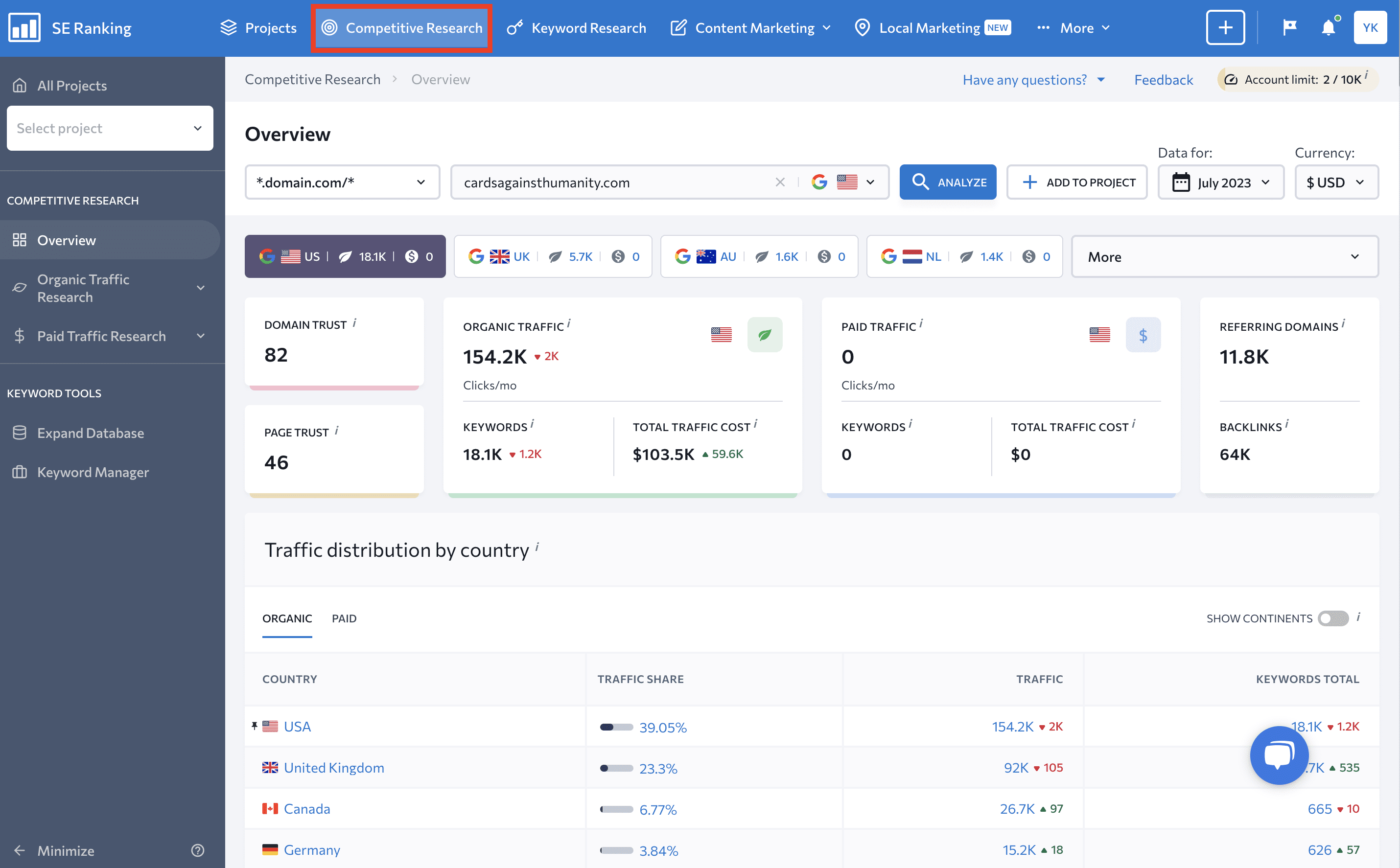
Consider using SE Ranking’s Competitive Research tool to figure out which format would suit you best. This instrument allows you to analyze your competitors’ websites and gain insights into their online strategies. By examining successful websites in your niche, you can identify trends, determine which approach aligns better with your goals, and make informed decisions about the structure of your website.
Simply enter a website, choose the region, and click the Analyze button. In just a few seconds, you’ll get a comprehensive report on the site’s SEO and PPC campaigns.
Differences between single-page websites and landing pages
Sometimes, landing pages tend to have the same long-scrolling designs as most single-page websites, but make no mistake about it, they are not the same. A landing page focuses on a specific feature or offer and is designed to drive users to a product or service. It is also part of a larger website with many other pages.
On the contrary, a single-page website has no hierarchy and is limited to one URL. Any navigational click on a single-page website will lead to a section on the main (and only) page, while elements on an ordinary website will redirect you to other URLs.
Key aspects of a single-page website
So what else differentiates single-page websites, apart from the obvious? And more importantly, how can you determine if this website style is the right fit for your business? Let’s explore some key attributes of single-page sites.
- Emphasis on one core offer. By skillfully designing your single-page website and crafting content that revolves around the main offer, users won’t get lost or distracted. Don’t just mindlessly cram in as much information as possible.
- Opportunities to be creative in design. Focusing all your efforts on just one page opens up avenues for creativity. You have the freedom to experiment with layouts, color schemes, and interactive elements. This not only ensures functionality but also reflects your brand’s uniqueness.
Some websites are designed purely for the joy of creative expression. One company even crafted a page as a visual metaphor for the emotions they trigger through their work. While this may seem pointless in terms of generating new leads, it effectively conveys the company’s values and devotion to what they do.


Check out this portfolio website and its fun, interactive elements:

But make sure to approach it consciously. Pulling an all outdesign extravaganza might lead to lower loading speeds and a less satisfying user experience.
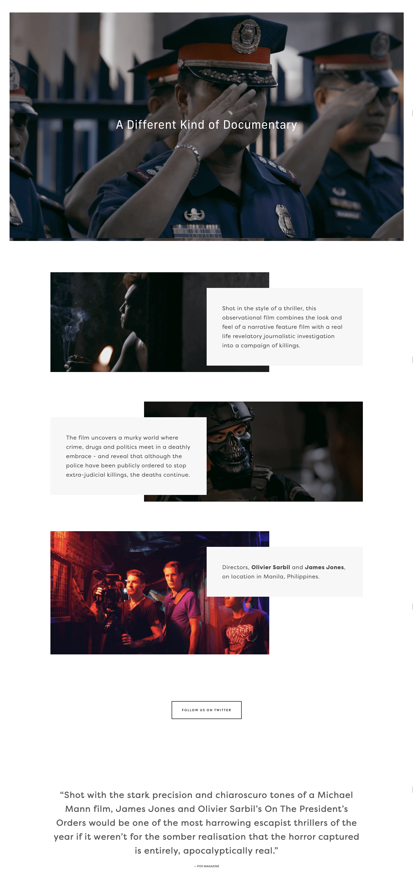
- Benefits of the long-form approach. Long-scrolling web pages allows you to fully utilize a linear structure and the art of storytelling. Check out this story involving the transformation of a product page into a comprehensive narrative. This site incorporated different sections that were initially spread on separate URLs into a single page. This consolidation allowed users to see all the features, testimonials, and instructions in one place. As a result, their product got 37.5% more signups.
Long scrolling gives you the opportunity to build a solid narrative, working wonders for both commercial offers and creative projects. Storytelling, a powerful tool of persuasion that thrives on long-form content, is proven to be effective in marketing.
- Chance to evaluate your niche. A single-page website can serve as an initial platform for your business for gaining awareness and attracting customers. Starting from a single page is a quicker and more cost-efficient approach, and can always be scaled when needed.
- Easier A/B testing. Condensing all info onto one page makes it easier to test several versions of your website. It can be more effective than running tests on multiple pages with different CTA buttons, headings, and interactive elements.
- Fewer technical issues. When you just have one page, identifying and fixing technical problems is simpler and takes less time.
Is a single-page website good for SEO?
Single-page websites serve as powerful tools for engaging visitors and delivering a seamless browsing experience. When implemented correctly, they allow for intuitive design and streamlined functionality. But it is also important to consider some limitations that can hinder search engine optimization.
Here are some potential drawbacks:
- Less conversions. Though it’s easier to target a specific audience with a single-page design, nothing is quite as effective at getting traffic and conversions as having multiple landing pages. HubSpot’s research revealed that having over 30 to 40 landing pages helps in generating 7 to 12 times more leads, indicating that designing multiple pages could simply be too good of an opportunity to miss.
- Lack of trust. Unlike regular websites that can dedicate entire pages to features like blog posts, product listings, and detailed descriptions, a single-page website offers just one page for all its content. Failing to provide all relevant information can dampen client trust. Enhancing the trustworthiness of your single page is possible with the help of clear product/service descriptions, testimonials, FAQs, and links to social media profiles for users to learn more about what you offer.
- Challenges with the mobile experience. Although single-page websites allow creative design, they can lead to a heavier and potentially slower page. Optimizing these kinds of websites (especially for mobile devices) demands extra effort to ensure smooth navigation comparable to desktop use.
- The semantic core is limited. You can’t pack one page with as many terms as you’d like. This means that you’ll need to spend extra time segmenting and prioritizing your keywords.
- You can’t produce as much content as you’d like. Having only one page means you can’t supply your SEO with multiple pages, blog posts, and other pieces of content.
- There’s no room for siloing and other powerful structuring techniques. Siloing, which is when you group related content within the site’s hierarchy, is used for enhancing internal linking. With only one page available for optimization, you don’t have enough content to group and structure.
- You can only use one Title and one Description for the whole site. Having one page means you only have one opportunity to optimize your Title and Description tags, which greatly influence how your site appears on the SERPs.
- Fewer sources have links leading to single-page sites. The less information you have, the fewer sources are interested in linking to your site. This greatly dampens your link-building potential.
- Indexing problems. Search engines like Google don’t index page sections separately. Even with anchors linking out to different content sections, search engines treat the entire page as a unified entity, making it more challenging for search engines to discern the distinct intent of the page.
Given the limitations of certain techniques and approaches, many SEO experts express reservations about the concept of single-page websites. Google Webmasters’ answer to how Google sees single-page websites is pretty vague, revolving around the idea that a website needs to be useful to rank well.
Despite this long list of drawbacks, don’t run for the hills just yet. Implementing SEO for single-page websites is still practical and doable. Just focus on the following critical aspects:
- Simplicity and focus: These websites require a clear and focused message. Search engines value websites that provide relevant and valuable content to users. Concentrating all your information on a single page ensures that your content is concise, targeted, and easily digestible for both users and search engines.
- UX: Establish user-friendly navigation, offering visitors a focused and uninterrupted browsing journey. If you use interactive elements, make sure they load quickly. A seamless UX is fundamental to SEO, as search engines favor sites that prioritize user-centric designs. Good UX can also lead to lower bounce rates and increased engagement, both of which are positive signals for search engines.
- Page speed: Despite not loading multiple pages and associated assets, sometimes the single page is already overloaded with images, videos, and animations. Ensuring your website loads quickly is crucial to retaining user interest.
- Mobile-friendliness and responsiveness: Your website should adapt well to mobile screens. Ensure a consistent and optimized experience across all devices.
Do one-page websites rank?
Yes, one-page websites can rank well in search engines. If your site has a clear structure, concise content, relevant links, and optimized images, success could be just over the horizon..
Regarding SEO, it’s still important to carefully consider your website goals and content requirements before adopting a single-page design.
Different methods for creating a single-page website
There are many templates and website builders for you to choose from. It’s also recommended to hire a team of developers and designers. This is because even if you opt for a demanding creative design, any costs incurred will be way less than a multiple-page website with a complex structure.
Let’s first take a look at some DIY website-building options:
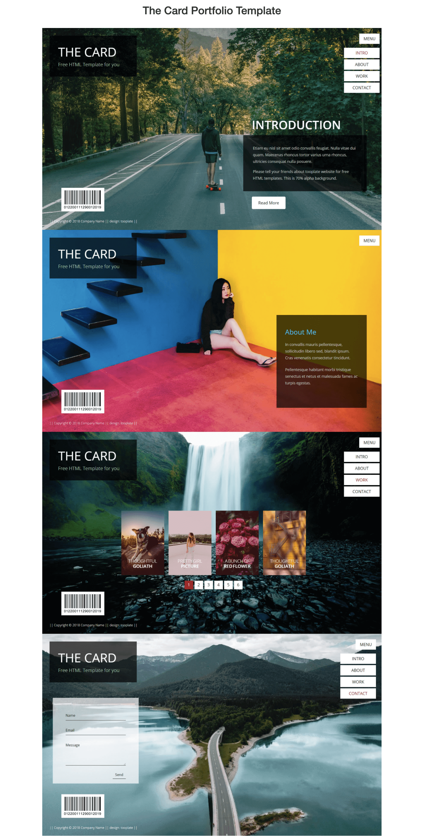
- Templates. Services like Tooplate offer a variety of templates that enable you to download their HTML, CSS, and JS files for free. Simply choose a template you like and fill it with your own content. While the level of customizability is low here, this method allows you to make a website fast and with minimum effort.
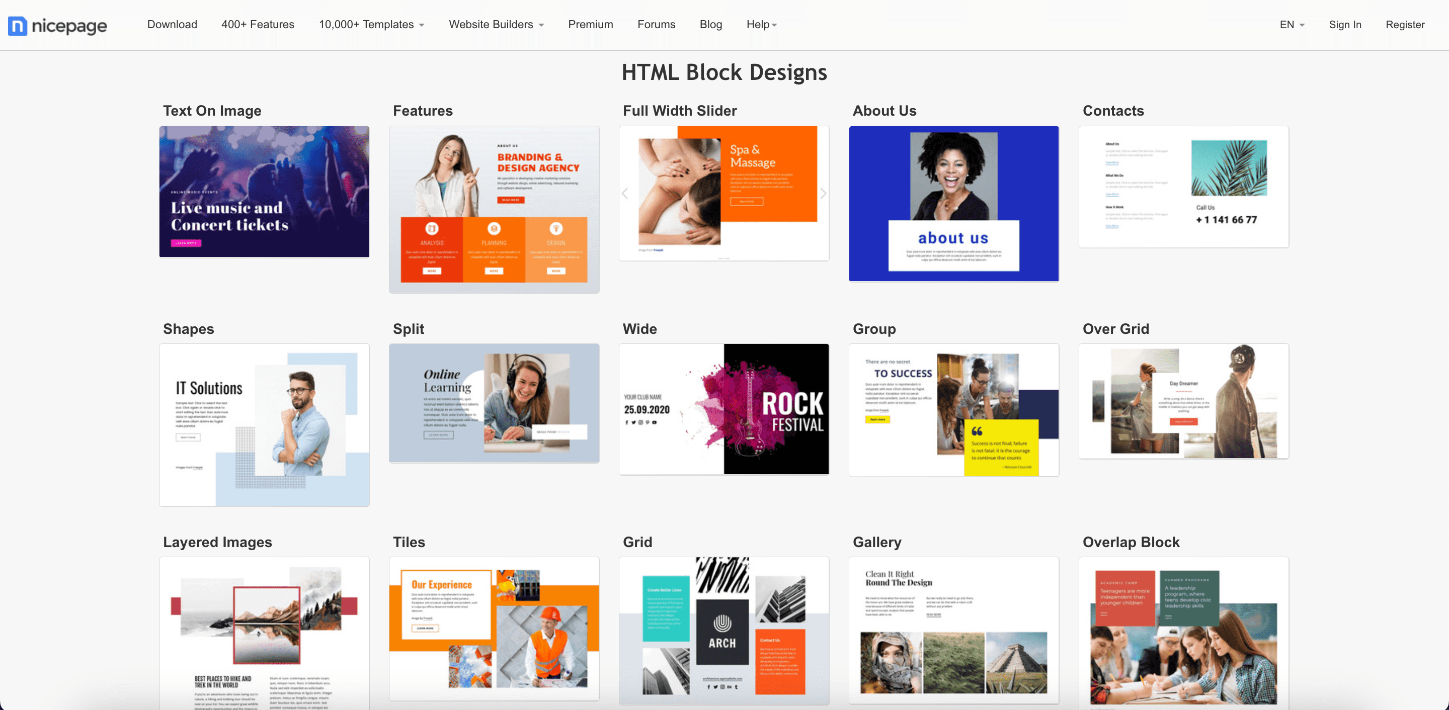
- Website builder. Website builders allow you to use the drag-and-drop principle to create a site. This site-building method doesn’t require any coding skills and is quite easy to use. Simply select a template and customize it or build a website from several different blocks. Just to name a few, Wix, uKit, and Jimdo are commonly used for creating simple websites. See the typical elements offered by Nicepage:
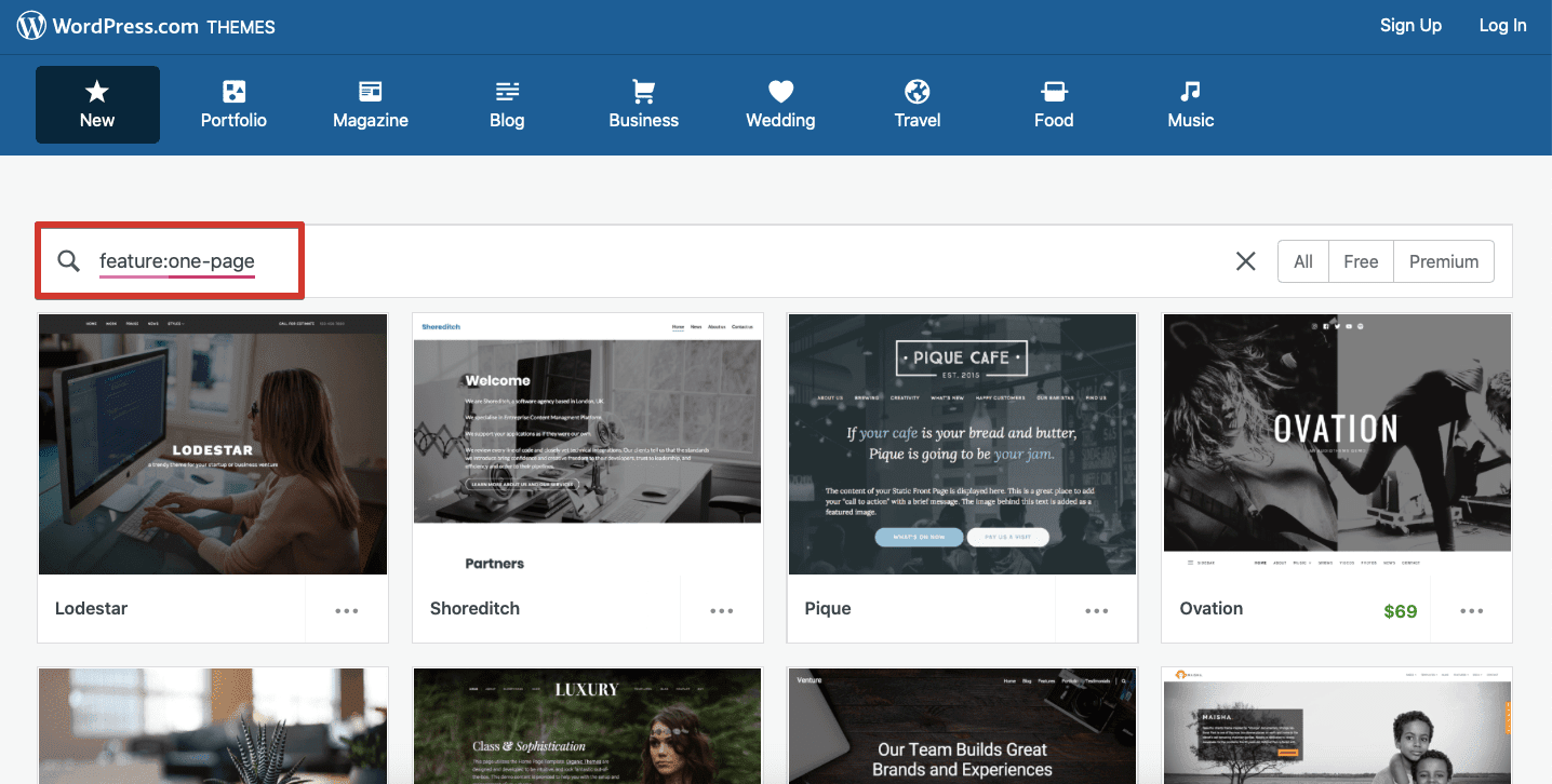
- Content management systems (CMS). Whether you’re using a single-page or multi-page site, choosing the right CMS is crucial for success. WordPress, the most popular system, powers more than 30% of all existing websites. It provides ample customization options and supports many plugins for monitoring site performance. There are tons of free and paid WordPress themes for one-page websites:
To learn more about the different options, check out our article on choosing the best CMS. Consider factors like your site’s scalability potential, your SEO goals, and your niche to find the best fit.
- Hand-coded website. You can make a single-page site from scratch if you have basic knowledge of HTML, CSS, and JS. This will give you more control over your own code but is much more labor-intensive.
So, when choosing a theme or template, focus on the following:
- Available pre-built components
- How customizable the components are
- Section division and navigation between sections
- Integration of CTA buttons
If you have a large enough budget, hiring professional programmers and web designers can result in a unique site with all the right looks and customized functionality. You might find agencies offering an all-in-one solution that includes both design and coding, or you could opt for individual arrangements by hiring freelancers or niche development companies.
So, who should you consider hiring?
- Web designers. A skilled design team can create a website according to your specific requirements, making it stand out from the crowd. Though it’s up to you to decide if it’s reasonable to invest in custom design, some experts in the industry are of the opinion that hiring designers before validating your business idea is a waste of money. Still, you won’t get a second chance to make a first impression.
- Programmers. Frontend and backend developers are essential to ensure your website is shown properly on any device and in any browser. They can also safeguard the data and ensure it is displayed correctly.
- Content creators. The content you create for your website is actually the most crucial factor in driving conversions and propelling your site to the top of the SERPs. You can do it yourself or hire experienced copywriters and SEO specialists to create and refine your content.
How to do SEO for a single-page site
As we’ve mentioned before, single-page website SEO oftentimes leaves much to be desired. To make your site visible and comprehensive to search engines, you’ll need to keep some tricks in mind.
TL;DR:
- Check loading speed and CWV regularly.
- Optimize your website for mobile devices.
- Collect and segment keywords.
- Use different types of content.
- Update your content regularly.
- Divide, structure, and optimize content by section.
- Create headings and H1 tags for each section.
- Compress images and add alt tags.
- Examine the history of an already-used domain if purchased.
- Build backlinks from related and trusted domains.
Now let’s break these tips down into their finer details.
Strive for a fast loading speed
Since loading speed is a major technical SEO factor, it’s essential to check it and improve it when needed. Numerous site speed test services are available, including Google’s PageSpeed Insights. Its calculated score and recommendations will provide insights into the improvements you’ll have to make. Also, SE Ranking’s Website Audit includes a health check that calculates your website’s speed alongside other technical parameters.
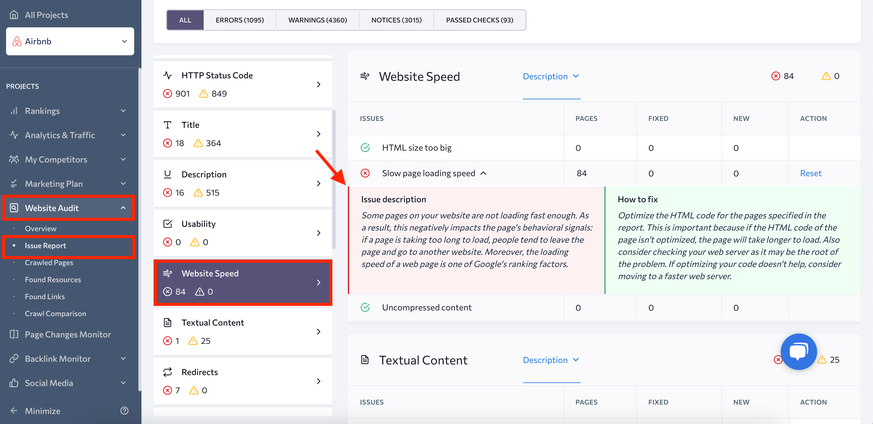
In recent years, Google has increasingly emphasized a set of metrics termed Core Web Vitals. The search giant has also confirmed its transition towards evaluating website page loading speed scores based on CWV.
These metrics measure the speed, responsiveness, and visual stability, providing a comprehensive overview of a user’s site experience. The Core Web Vitals include:
- Largest Contentful Paint (LCP): This metric measures viewport loading performance. LCP should occur within 2.5 seconds from the page’s initial loading.
- First Input Delay (FID): This metric measures interactivity. Pages should have a FID of less than 100 milliseconds.
- Interaction to Next Paint (INP). Google recently introduced Interaction to Next Paint (INP), slated to replace FID in March 2024. INP gauges the latency of user interactions and presents a single value reflecting the percentage of interactions below the latency threshold.
- Cumulative Layout Shift (CLS): This metric measures visual stability. Pages should maintain a CLS of less than 0.1.
SE Ranking’s Website Audit includes Core Web Vitals in its reports. This is intended to help you understand how your single-page website fares against these crucial metrics.
Implement responsive design
It’s essential to design your website to be mobile-friendly as the share of searches performed on mobile devices continues to grow by leaps and bounds.
One key reason for this has to do with Google’s mobile-first indexing. First announced in 2016, this approach means that Google predominantly uses the mobile version of a webpage for indexing and ranking. In the past, Google’s index primarily relied on a page’s desktop content. By May 2023, Google confirmed the full transition, moving the last batch of sites eligible for mobile-first indexing.
This shift reflects the widespread use of mobile devices for web browsing. Since most users now access the internet through their mobile devices, having a website that provides an optimal mobile experience is essential. According to Statista, in the first quarter of 2023, mobile devices generated 58.33% of all website traffic worldwide, and this number is expected to rise.
This is why neglecting to optimize your site for mobile devices could mean missing out on a major opportunity to improve your site’s ranking and reach a wider audience.
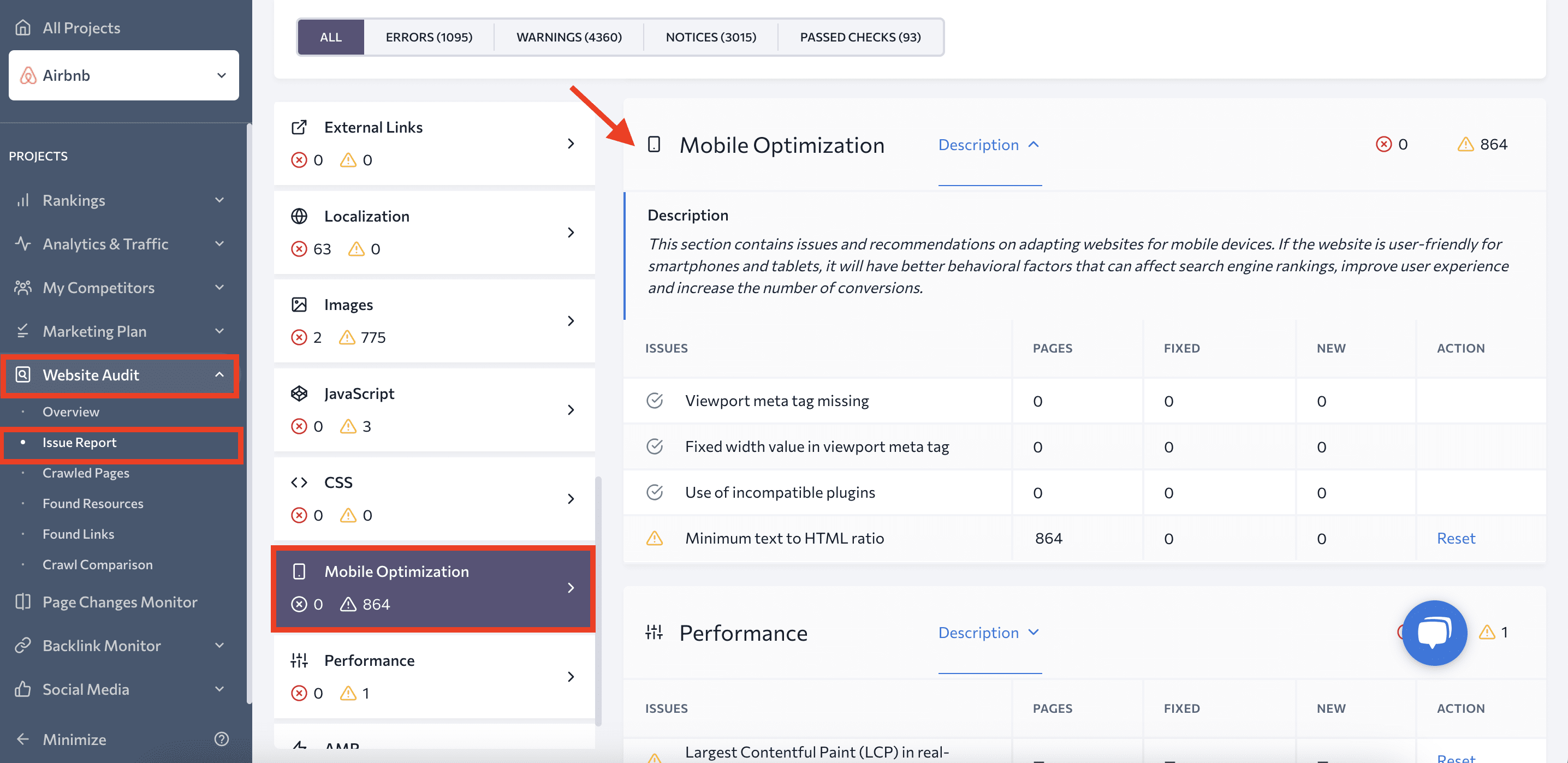
You can test your URL to evaluate how your page appears on a mobile screen and detect if there are any issues with it. It’s also possible to check your website with SE Ranking’s Website Audit. Simply go to the Mobile Optimization section in the Issue Report.
Do keyword research
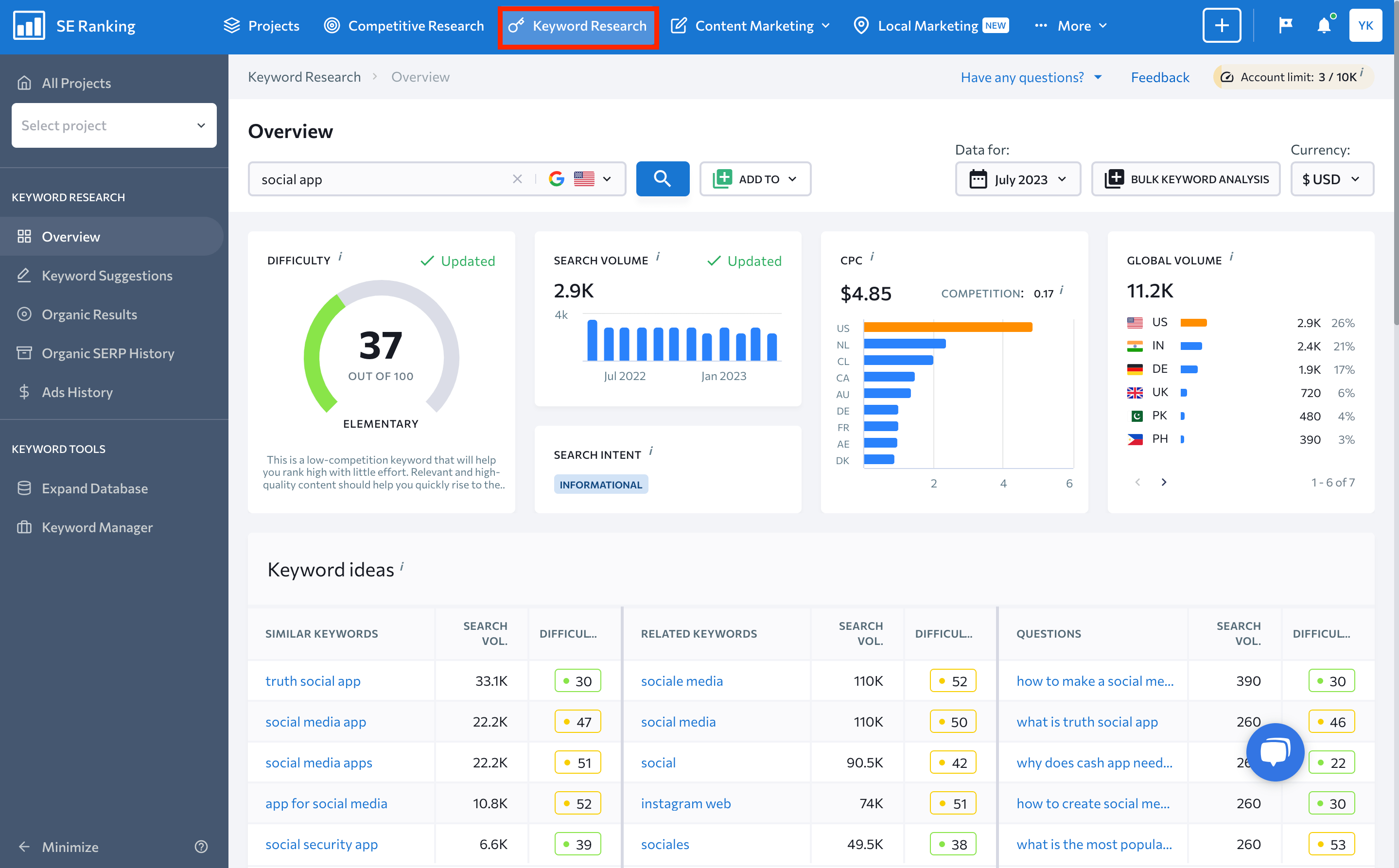
Collecting and segmenting keywords is an essential SEO task for any website setup. But with a single-page site, meticulous semantic work becomes even more crucial. SE Ranking offers specialized tools like Competitive Research and Keyword Research to kick-start your research, helping you identify competitor keywords and explore suggestions.
Diversify your content
Since you only have one page, you need to divide your attention between different types of content and interactive elements. You can use SE Ranking’s Content Editor to analyze the texts your rivals post on their websites.
It’s also just as important to keep your page coherent and tailored to your unique audience. For instance, if your goal is to encourage users to register for a marathon, all elements on your site, should fuel this particular CTA.
Perform regular updates
Keeping your site current and relevant requires consistent content updates. Since you can’t add new pages to a single-page website, you’ll need to update and rewrite your existing sections to keep them fresh.
Frequent updates demonstrate your site’s currency and activity to both users and search engines. If there are changes to your offerings, updates in your industry, or new trends that relate to your website, these should be promptly integrated into your content. Users prefer current information, and failing to provide updates can lead to misinformation and lost opportunities.
These updates don’t need to be drastic. Sometimes, minor tweaks aligning content with current events or trends can make a noticable impact. For example, if you run a tech-focused single-page website, you could regularly integrate the latest tech news or developments into your content.
Remember, an unchanging single-page website becomes static over time, potentially slipping in search engine rankings. A dynamic, regularly updated one-page website, on the other hand, can maintain its relevance, engagement, and visibility—simulating the effect of multiple pages in a multi-page setup.
Divide and optimize content by sections
You can effectively divide, structure, and optimize content per section within a one-page layout. Start with keyword mapping, which is the process of identifying and grouping related content and creating a roadmap for your one-page site. This helps you determine which section targets which keyword.
You can segment your content into different sections using HTML tags like <div> or <section>. Each content section should focus on a specific keyword or related keyword cluster, working as a standalone “page” within your one-page website.
Each section should also have an ID that reflects the keyword or topic it focuses on. Think of this ID as the slug for that section. For example, if you have a section dedicated to your company, you could label it with the ‘about-company-name’ ID. This approach allows you to create anchor links like ‘example.com/#about-company-name,’ providing users and search engines with a clear and specific destination.
Header menus containing these anchor links are frequently incorporated to guide users to different parts of the very same page. By putting a targeted keyword in each anchor link, you simplify both your site’s navigability and crawlability. Moreover, by ensuring that this navigation menu remains visible during scrolling, you can greatly enhance user experience and site navigability.
Add multiple headings
Similarly to the standalone pages on a multi-page website, each section on your single-page site needs to be well-crafted, contain keyword-focused content, and have a prominent heading. Since you’re treating these sections as individual “pages,” consider applying an h1 tag to each section.
Single-page websites provide a unique scenario where using multiple h1 tags can be justified. While it’s unconventional to have multiple <h1> tags on a single webpage, website like these can leverage multiple h1 headings to distinguish and emphasize the unique focus of each section. Having several headings enables you to accentuate several sections and rank for multiple terms.
If you can’t think of any ideas for headings, consider using SE Ranking’s AI Writer. This tool, which is part of the Content Editor, can help you generate compelling headings based on the target keyword for your content sections.
Optimize images
To perform image SEO:
- Compress images to optimize loading speed.
- Use your keywords in alt and title attributes to improve search visibility.
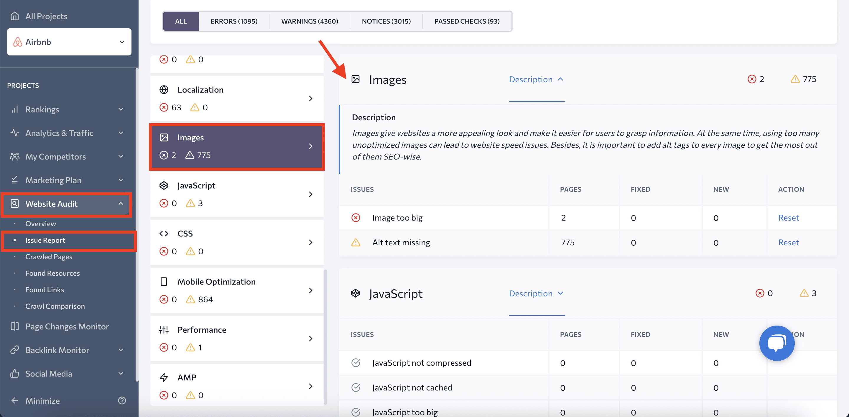
While crucial for any website, image optimization can be more challenging for single-page sites due to their reliance on heavy visual elements. Run a website check using SE Ranking’s Website Audit tool and go to the Images section to identify and fix any issues.
Choose aged domains
Even though domain age isn’t a significant ranking factor, buying an old domain could give you initial advantages during the early stages of website optimization.
Key factors to consider when choosing a domain include the old site’s niche, its backlink profile, and its overall Google history.
SE Ranking allows you to evaluate the value of any domain:
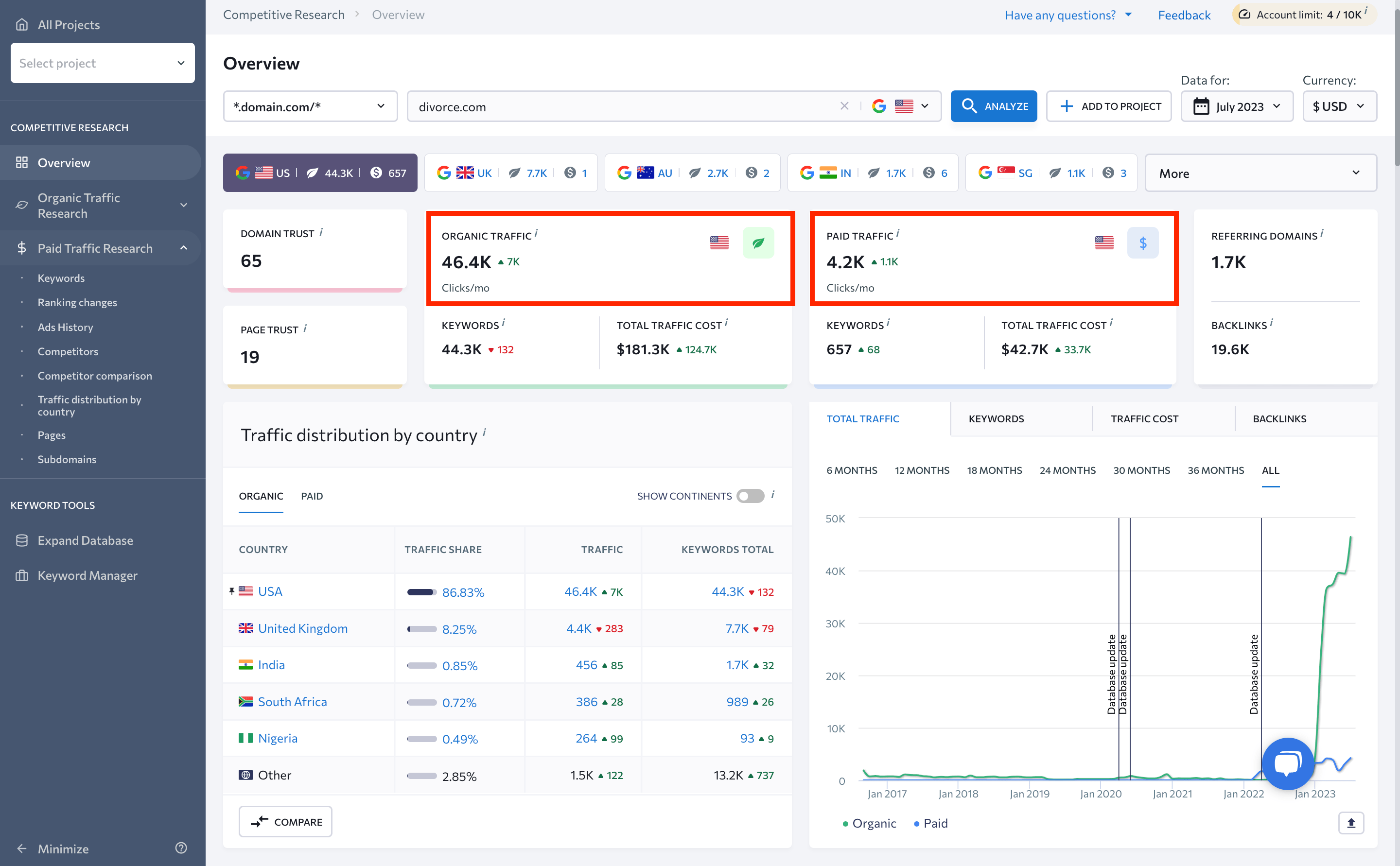
- You can monitor its traffic using the Competitive Research tool.
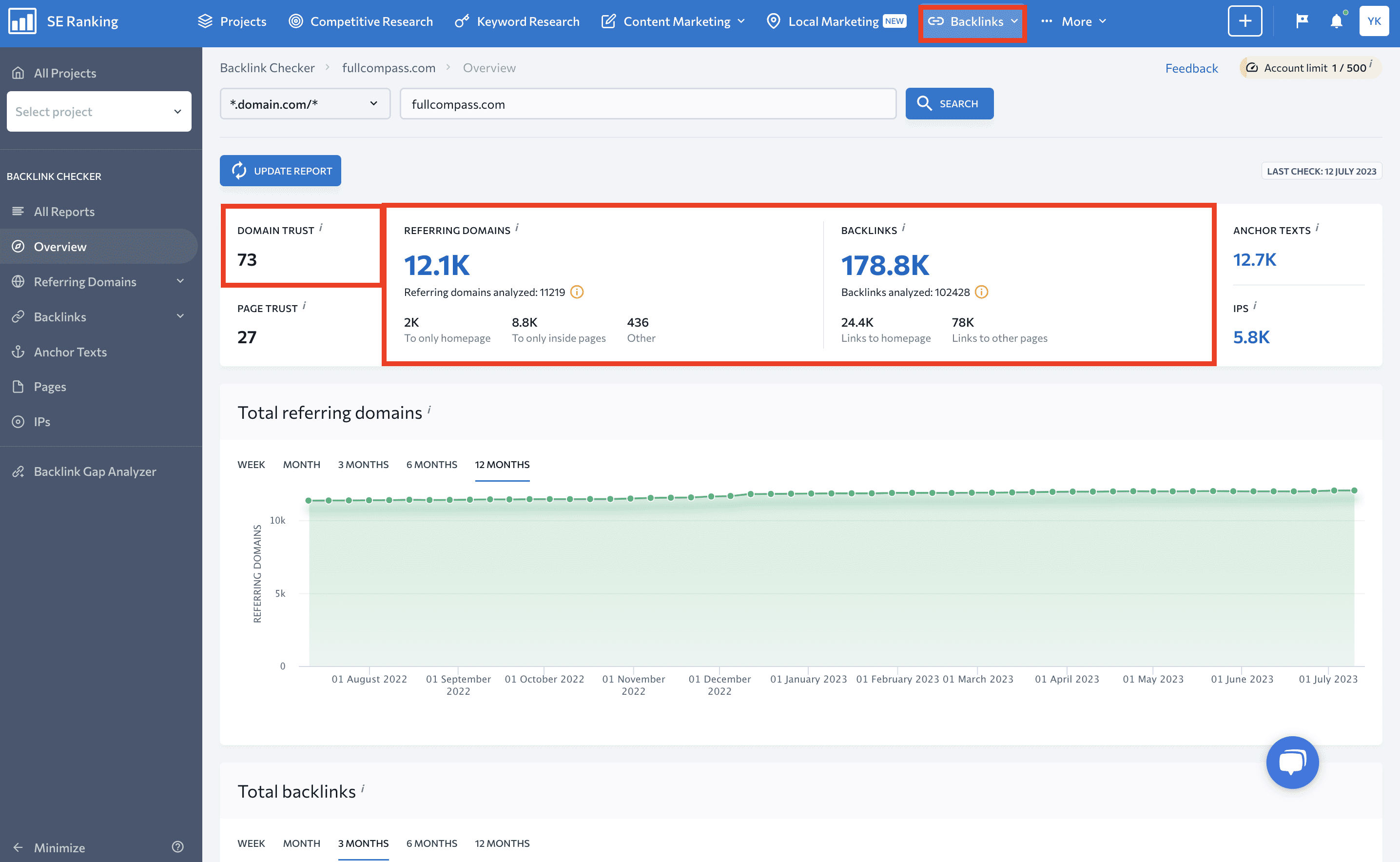
- You can also analyze the domain’s backlink profile via the Backlink Checker tool. In fact, pay special attention to the Domain Trust metric. This metric analyzes the data on referring domains and backlinks to predict a website’s ranking potential.
Some major players in the industry have little to no confidence in the use of expired and repurposed domains. Google’s John Mueller has even referred to this practice as “SEO-flotsam,” indicating minimal SEO benefits. He explained that search engines have had extensive practice dealing with situations like these and have even developed mechanisms to treat them appropriately.
Still, this doesn’t entirely negate the impact of using an aged domain on your SEO. On the contrary, Google has confirmed that a domain’s negative history could hurt its SEO performance, even after a change in ownership. This highlights the importance of thoroughly vetting any aged domain. You should always examine the domain’s past usage, reputation, and backlink profile to ensure it won’t carry over any SEO baggage to your new project.
Get backlinks
Link building is one of the pillars of SEO and demands your dedication to securing external links directed towards your site. These links should originate from authoritative sources and integrate naturally. Failing to do this may result in Google penalties and damage your website’s visibility.
It’s a lot of work.
But how many links can effectively serve just one page? Rather than worrying about link quantity, channel your efforts on quality. Focus on establishing links solely from related and trusted sources.
To check your current backlink profile, go to SE Ranking’s Backlink Checker and enter your domain, as previously outlined. The main dashboard will display the following metrics:
- Domain & Page Trust
- Toxic backlinks
- Broken backlinks
- Total referring domains and backlinks
- New and lost referring domains and backlinks
- Referring domain and backlink anchors
The tool contains special tabs for exploring backlinks, referring domains, anchor texts, pages, and IPs, providing in-depth insights.
You can also analyze your competitors’ backlink profiles or leverage the Backlink Gap Analyzer to find link-building opportunities and make informed comparisons.
Analytics for a single-page website
Gaining insights from your website analytics is crucial for gauging performance and identifying areas that need improvement. The data you’ll get from these insights helps you make informed decisions as far as improving UX and driving business success.
To correctly monitor analytics for single-page websites, there are some distinct factors to consider. Some tools are better at achieving this than others, so we’ll use premium tools like Google Analytics 4 and SE Ranking’s Rank Tracker to describe how to go about this process.
Tracking with GA4
Google Analytics 4 is an exceptional tool for tracking site visits, traffic sources, and user demographics. To set up GA4 properly, add events for every link and button on the page. Also, add scroll tracking to measure visitor engagement.
Follow these steps for proper GA4 setup:
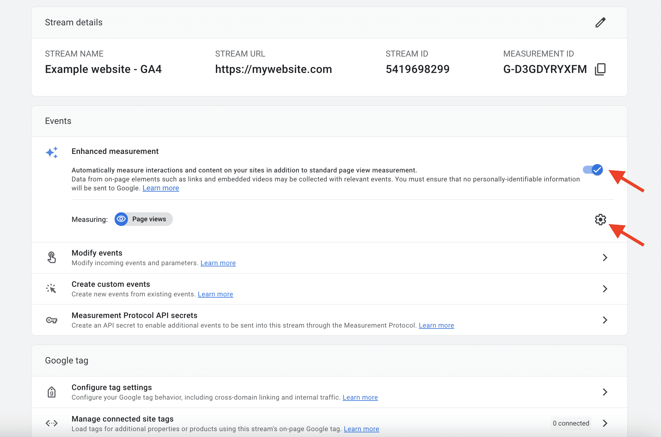
- Access your GA4 account and navigate to Data Streams in the Admin section. Select your web data stream.
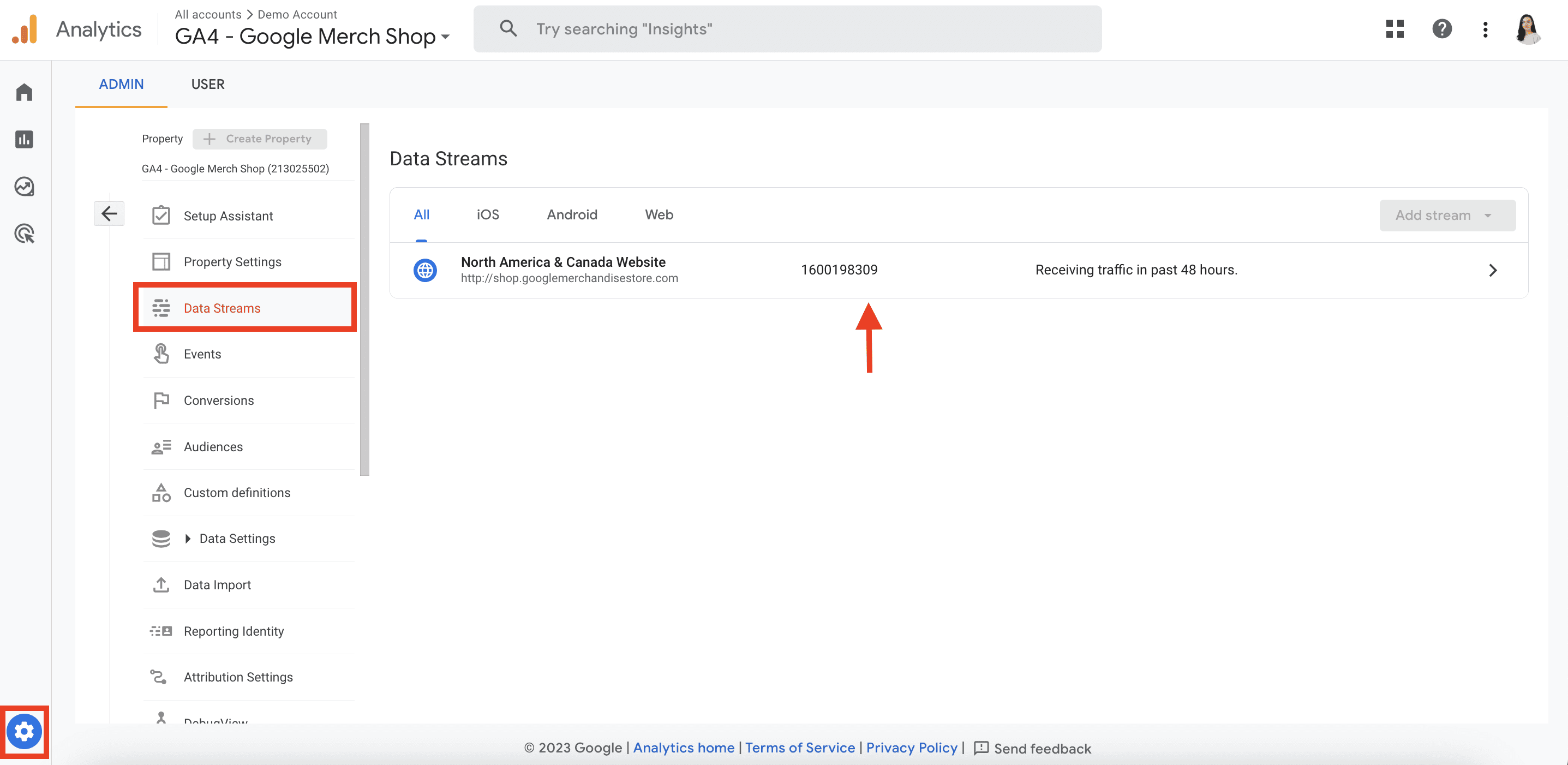
- Verify that the Enhanced Measurement toggle is enabled and click the gear icon to access this feature.
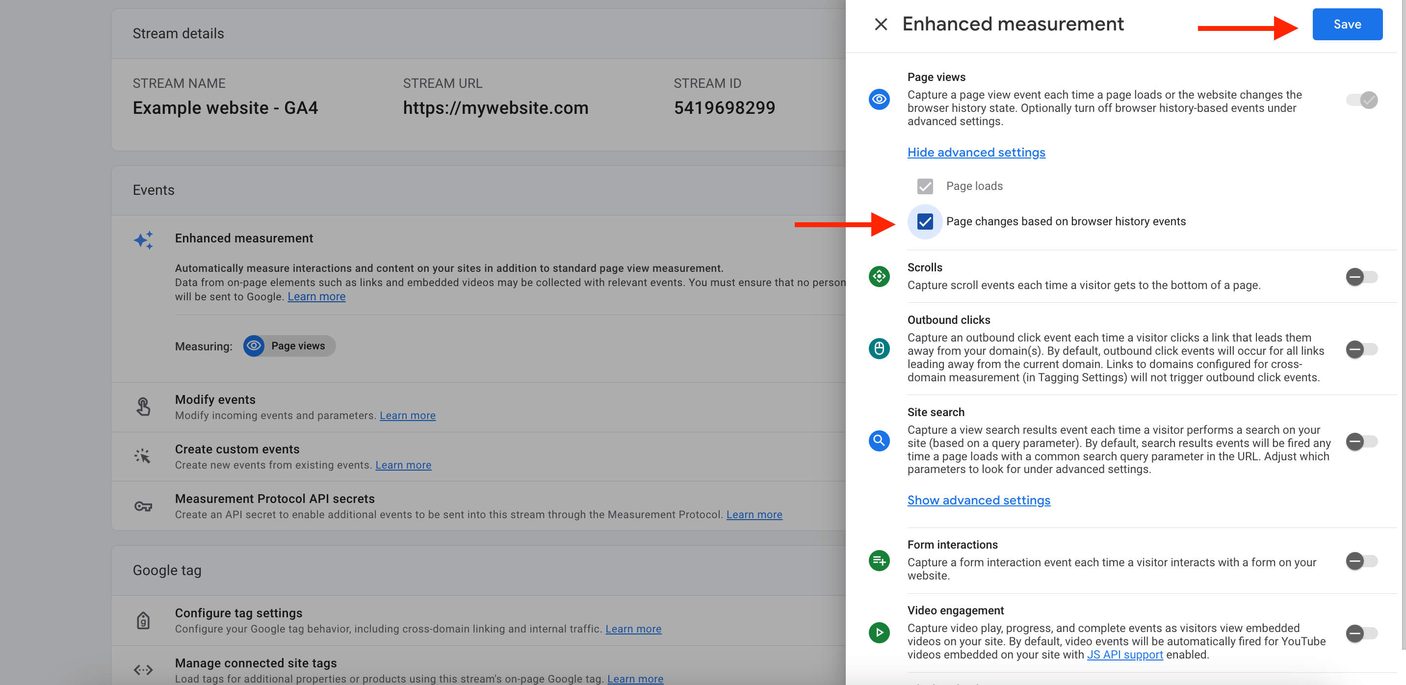
- In the advanced settings of Page views, enable Page changes based on browser history events. Turn off any default tracks unrelated to pageviews to ensure accuracy. Save these changes.
Next, activate the Preview and Debug mode within Google Tag Manager (GTM). As you explore different sections of your single-page website, you’ll see History Change events in the GTM Preview mode.
After you’re finished with these steps, GA4 will now be able to track your single-page website. Consider additional steps such as activating a dataLayer.push code or implementing a history change trigger in GTM in the event of discrepancies.
Tracking with Rank Tracker
SE Ranking’s Rank Tracker offers an extensive analysis of your website’s search performance. With it, you can monitor your website’s ranking for specific keywords across various geographical locations, devices, and languages.
What makes Rank Tracker distinct is its ability to provide clean, impartial rankings. The data it provides does not consider personal search history or user browser settings. This guarantees unbiased results and 100% accuracy.
To access the tool, create a project and then go to the Rankings tab. This will direct you straight to the default Detailed report.
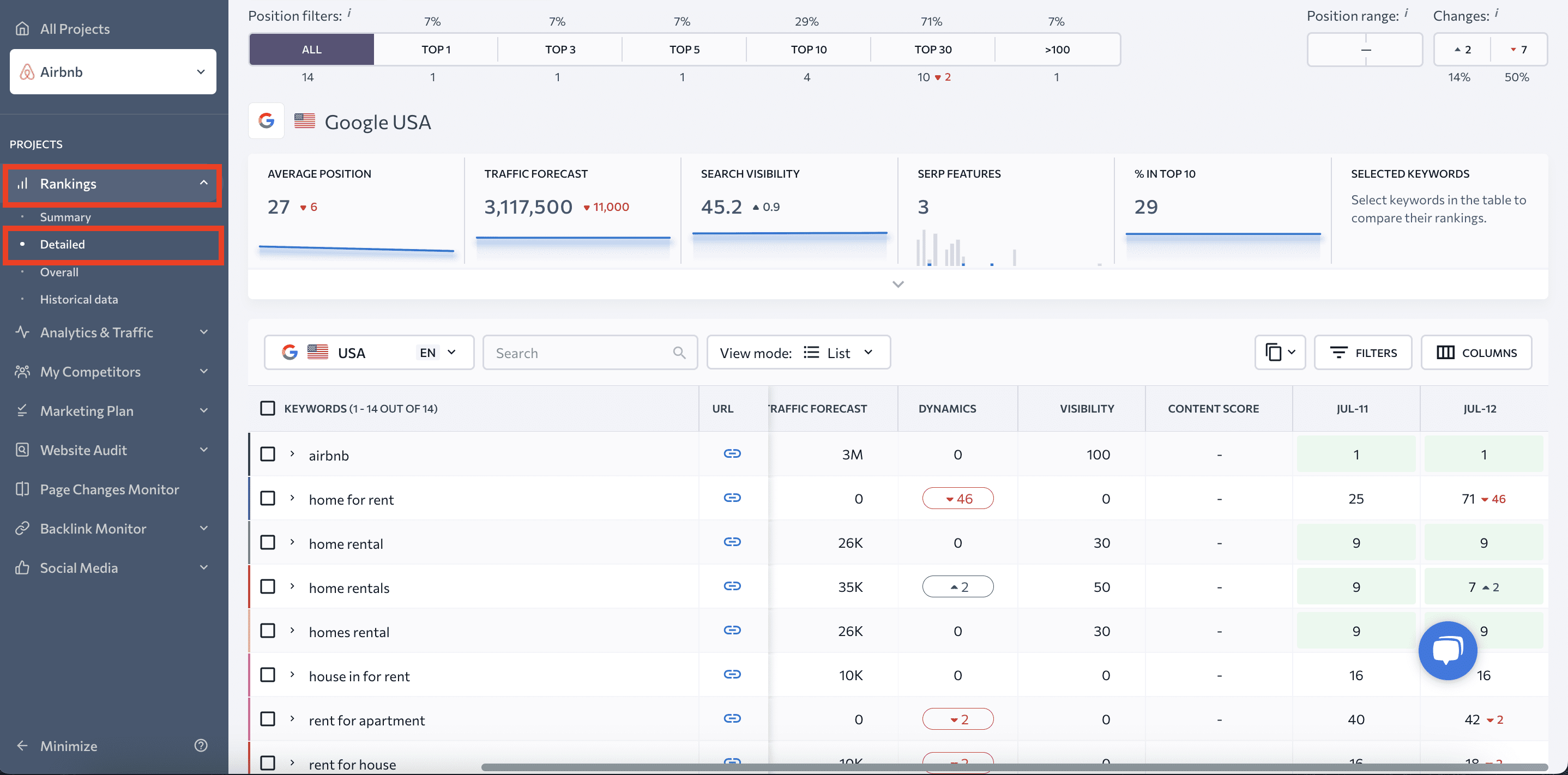
This section includes your website’s:
- Average position
- Traffic forecast
- Search visibility
- SERP features
- Percentage of tracked keywords in the top 10
- Selected keywords
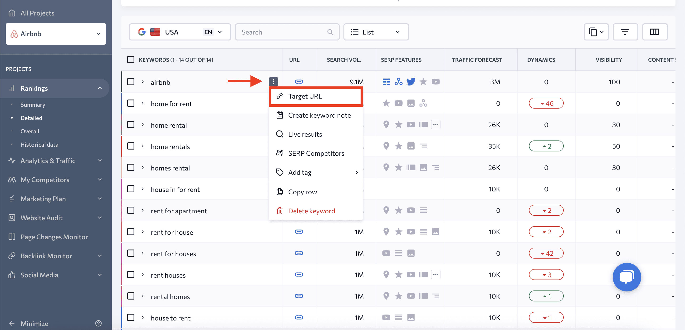
This report also reveals all essential metrics for each search term. The table features target URLs, search volume values, visibility, content score, SERP features, ranking dynamics, and more.
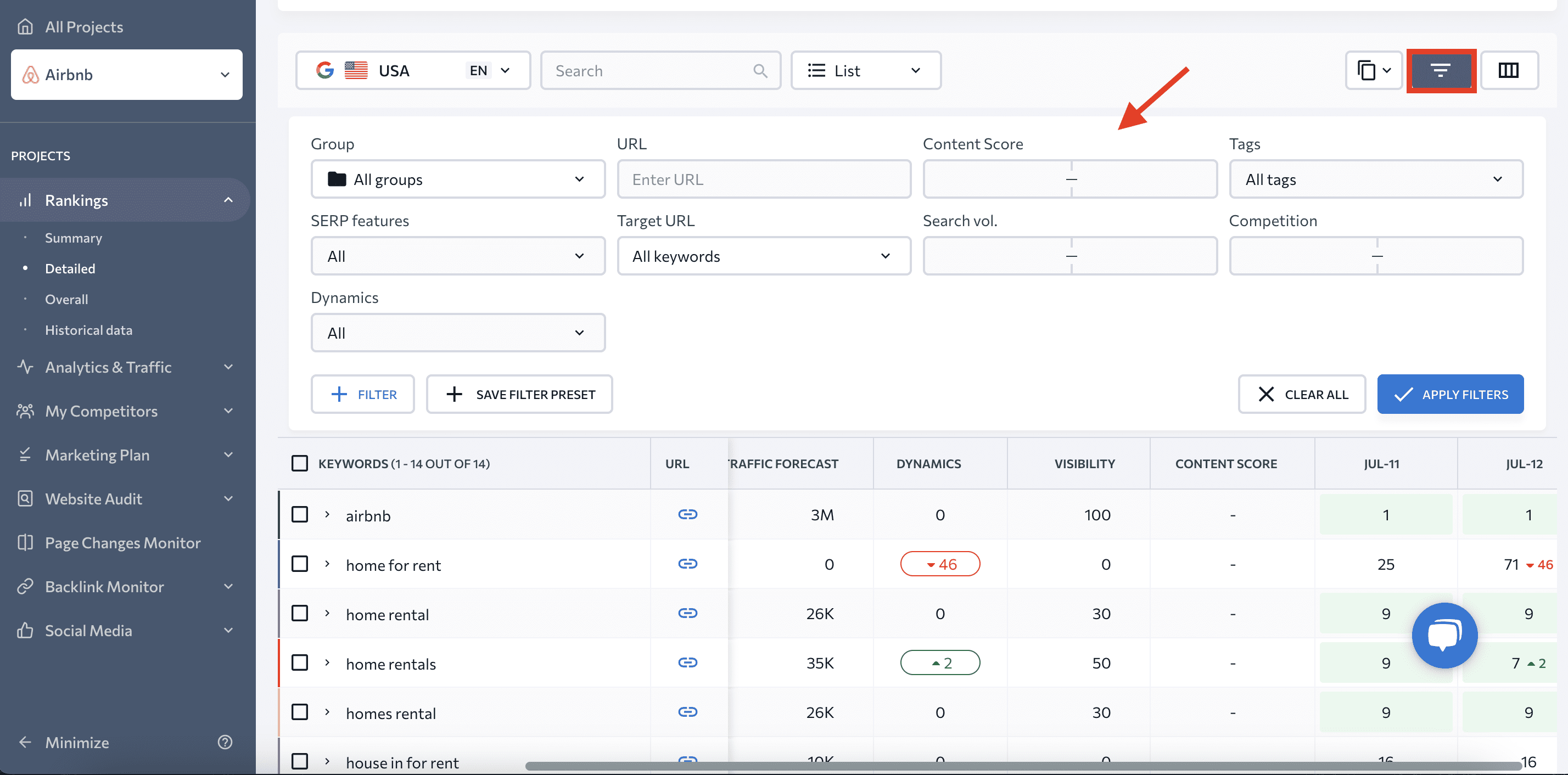
Rank Tracker even gives you the opportunity to:
- Filter your search terms based on your preferred parameters.
- Set target URLs for search terms.
- View rankings for various dates and compare data.
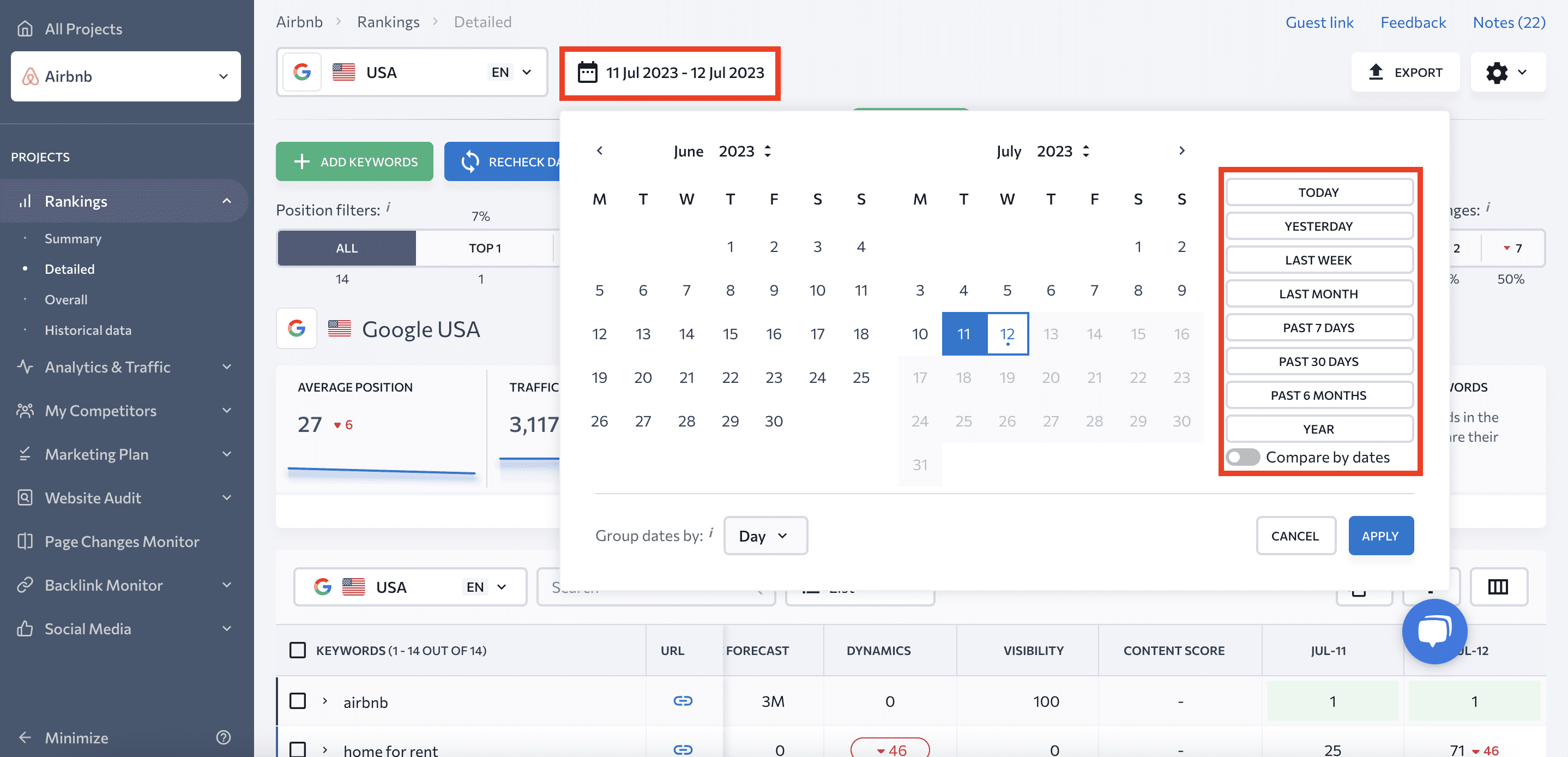
Rank Tracker also provides additional insights into your website performance through three other tabs:
- Summary: From here, you can quickly assess a comprehensive overview of key project indicators, covering diverse project elements like search engines, search terms, competitors, etc.
- Overall: Here, your project’s general ranking data across different search engines is displayed on a single screen.
- Historical data: This report highlights all the ranking changes that have occurred since the baseline ****.
Final words
Single-page websites offer a unique opportunity to present information in a linear fashion, guiding users towards specific actions. It’s easier to launch and test them, and their potential for creative design is endless.
On the other hand, they constrain your spectrum of SEO strategies.
But if you use the single-page website SEO recommendations we’ve mentioned, your chances of creating a single-page website that converts well will surely rise. Let’s recap:
- Choose a customizable template or website builder that works for you or hire a team to design your website.
- Use the power of storytelling and strategically plan your content to grab users’ attention and inform them about your offering.
- Craft a compelling CTA that speaks directly to your audience’s needs.
- Break your page down into sections and provide anchors to them in the menu.
- Work on on-page and off-page SEO but never compromise your content’s quality and coherence.
