Snackable content is easy to consume, understand, and share.
In this article, we’ll break down what snackable content is, the different types, and some of its benefits. We’ll also include five tips on how to create your own.
Let’s start.
What Is Snackable Content?
Snackable content is easy-to-digest content that’s intended to share an idea quickly and effectively.
Unlike long-form content, snackable content needs to be created so your audience can consume and understand it in a matter of moments. This makes it ideal for sharing on social media.
Here’s an example of how Semrush creates snackable content on LinkedIn:
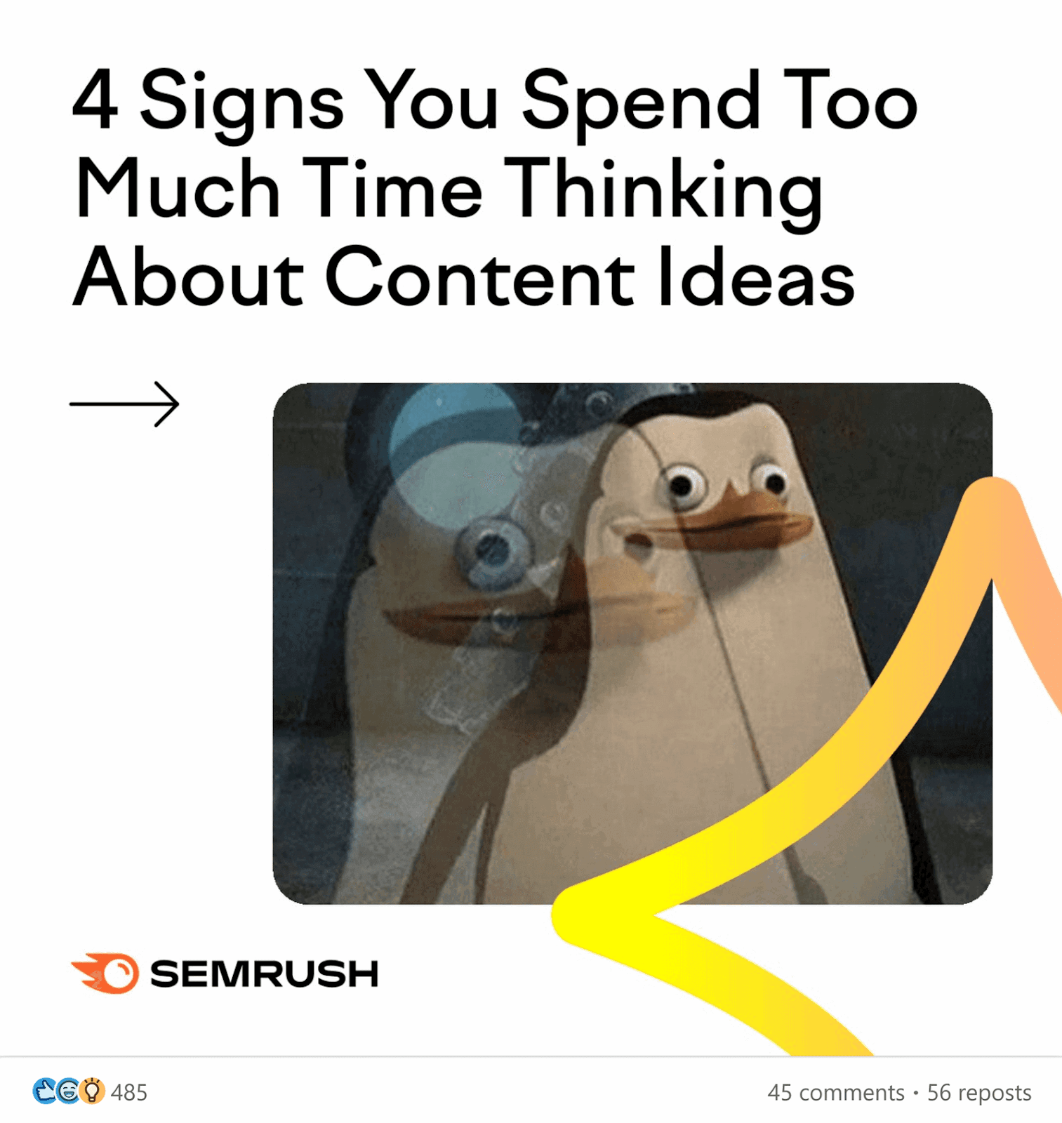
The image-driven slides quickly relate to users and make them aware of a Semrush solution that can help them overcome a common problem.
Snackable content can stand on its own or be part of a longer piece of content. Like an infographic within a blog post.
Here’s an example of this in a Backlinko guide:
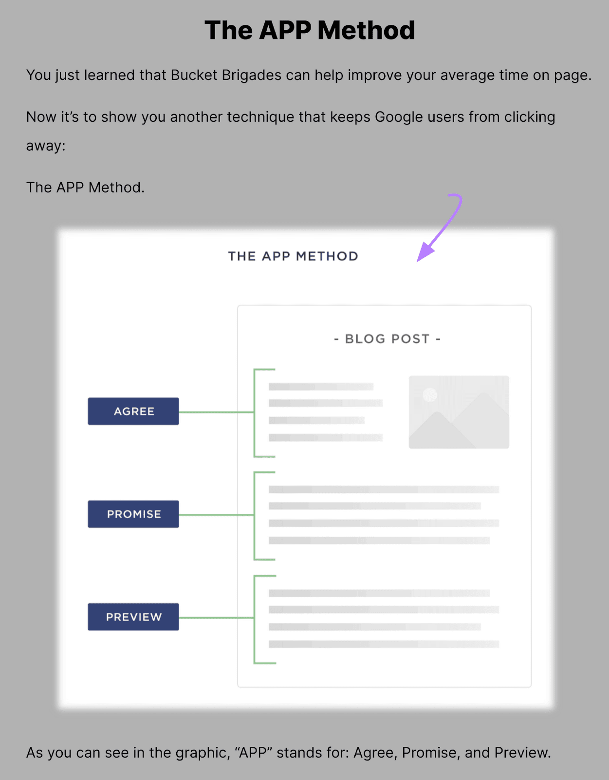
Besides breaking up a wall of text, the visual helps readers to better visualize your point.
And snackable content can also be great for entertaining and providing users with a quick laugh.
In short, you should make space for it in your content mix.
What Are the Different Types of Snackable Content?
Here are five common forms of snackable content and what they’re best for:
1. Memes
The concept of a meme has been around since the 1970s, when it was defined as a cultural information unit that’s replicated and spread. But we know them today as viral images or videos with text.
Memes are a highly shareable type of content because they’re engaging and entertaining. This is exactly the type of content users are looking for on social media platforms like Instagram and Twitter.
Users may send the post via DM (direct message), post it to their stories, or tag another user in the comments.
These images can have a short life span because they tend to rely on pop culture references.
With memes, you’re participating in a popular movement. And putting your own brand-related spin on it.
Here’s an example of a meme we created for Instagram using screenshots from a well-known reality TV show:
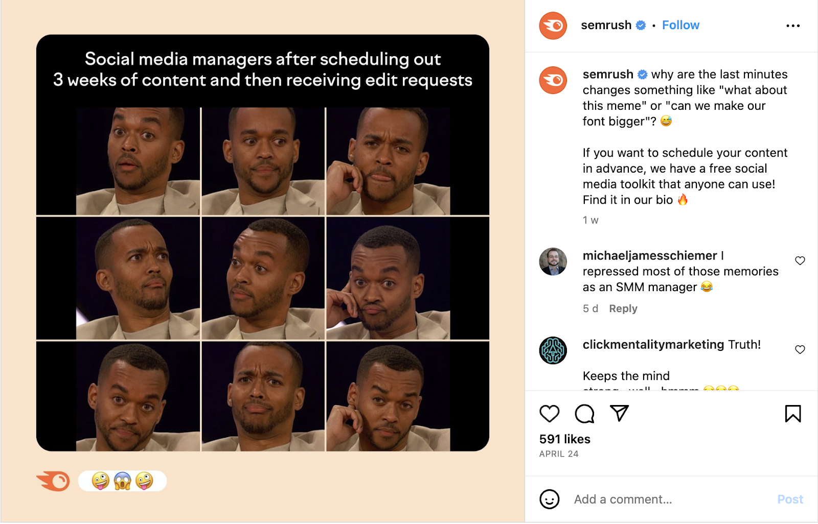
It relates pop culture (a current TV show) to a common issue (last-minute changes) for a segment of our target audience (social media managers).
Make sure to stay on top of audience research to ensure your brand is creating the right memes at the right times for the right people.
2. GIFs
A GIF is a type of image file (graphics interchange format) that’s usually animated—like a digital flipbook.
GIFs mostly reference memes or moments from TV shows and movies. In content marketing, brands use them to convey emotions and reactions.
They’re a common type of snackable content because they’re so short and applicable for many different scenarios.
For example, you’ll see many brands use GIFs on Twitter to convey emotion like this:
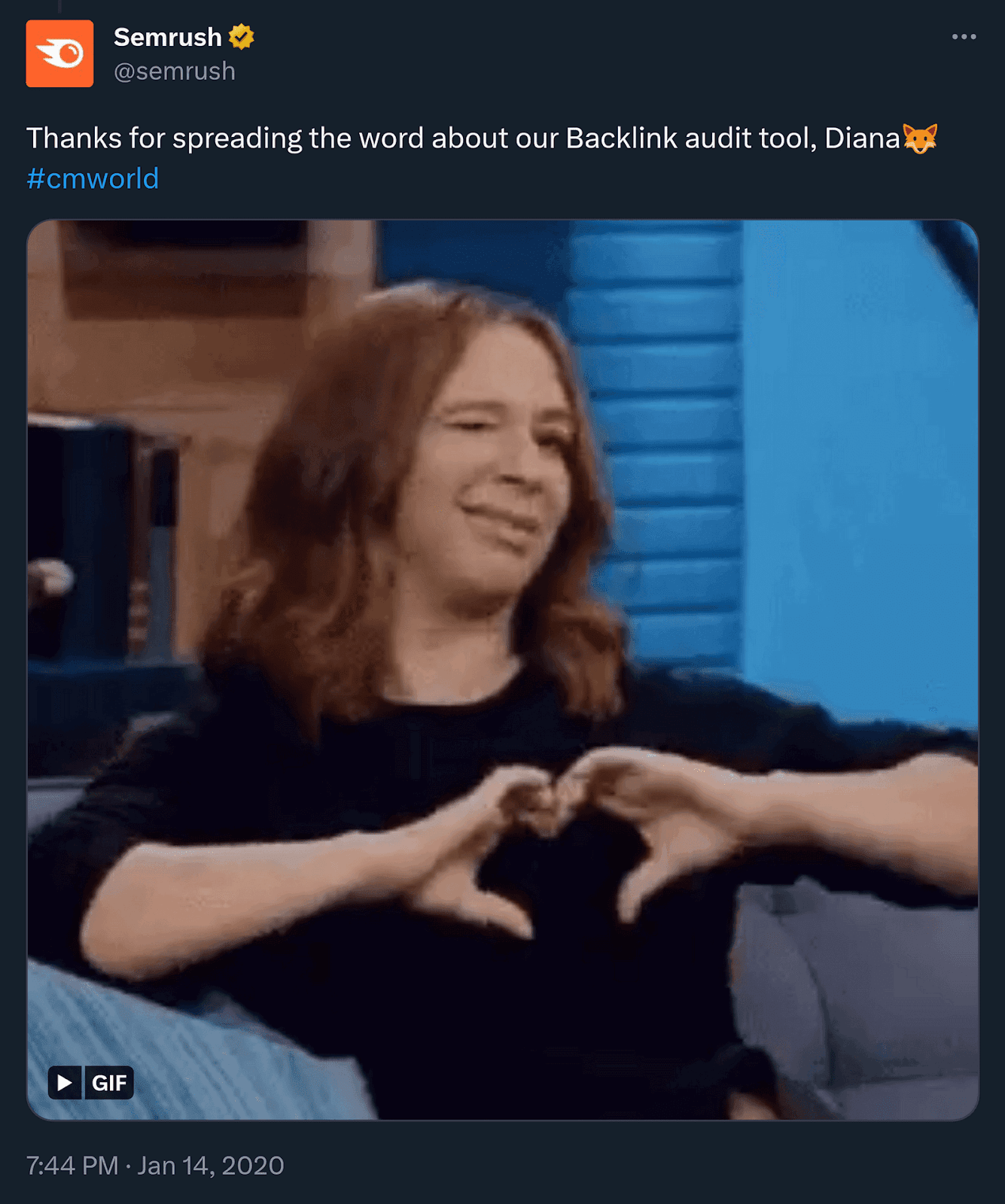
GIFs can convey more meaning than plain text, making them ideal for humanizing your social posts.
Sometimes, companies use GIFs in long-form content (like blogs) or website landing pages.
For example, VWO uses GIFs on its homepage to demonstrate how to use its A/B testing tool:
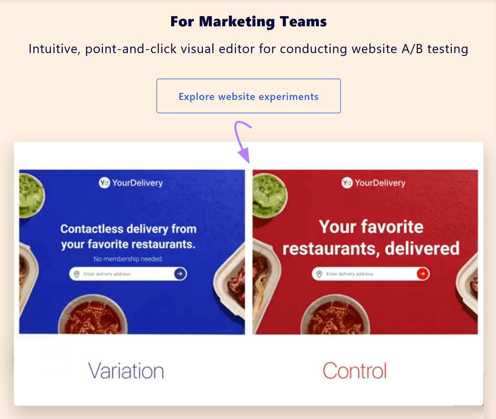
It helps users understand the tool better than text would.
You can also incorporate GIFs into your social media engagement strategy when responding to comments.
3. Infographics
Infographics are visualizations used to communicate complex or detailed information at a glance. And more effectively and concisely than text alone.
They were one of the top three content assets created by marketers in 2022. And they’re not going anywhere.
Here are a few from Gartner illustrating the complex B2B buying journey is:
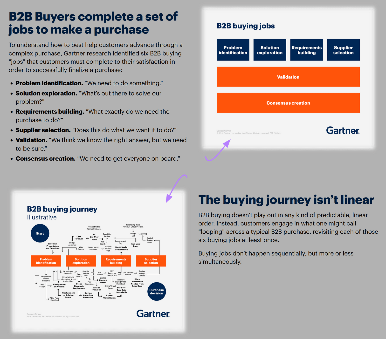
Users can glance over the illustrations to understand the key points.
This content style is also more shareable than a link alone.
And infographics can summarize an entire topic or article.
Here’s an example—an infographic summarizing our 10 SEO copywriting tips to improve content:
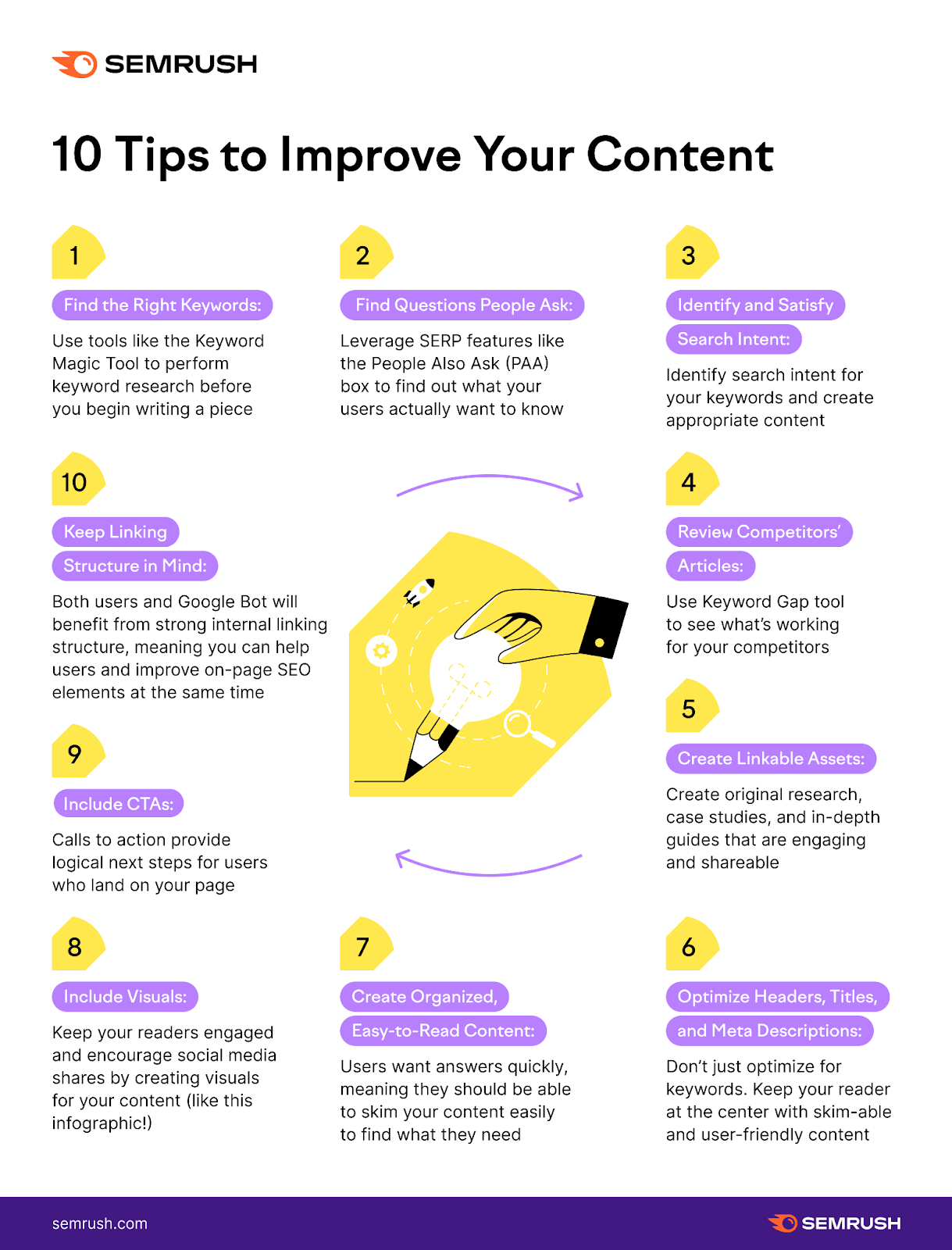
Whichever type of infographic you create, it should present key information in a visually appealing way.
4. Short Videos
Short-form videos tend to be anything under 60 seconds.
Marketers typically use these videos to increase brand awareness and encourage engagement—especially on social media.
According to our State of Content Marketing report, close to half of marketers and business owners say short-form video content performs best:
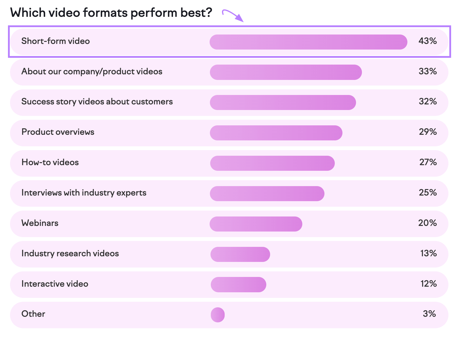
Short-form videos include FAQs, product demos, customer reviews, event highlight reels, and previews.
For example, the podcast “This American Life” shares 30-second snippets from its hour-long shows on social media:
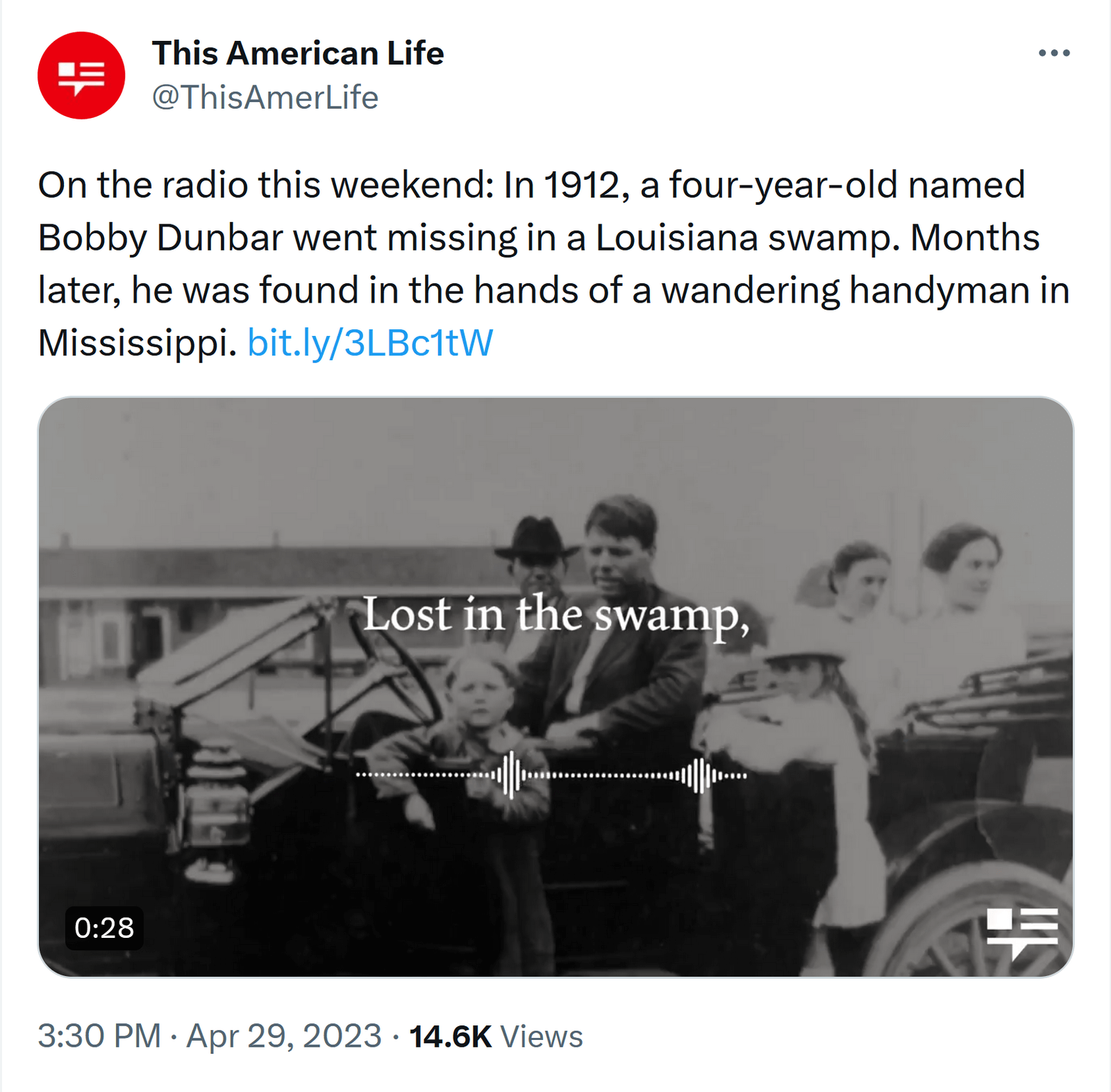
This snackable content makes it easy for users to tag their friends in the comments to help generate interest in the full episodes.
Short videos aren’t just for social media marketing, either. They now appear everywhere brands have a presence.
For example, you could use one on one of your site’s landing pages to demonstrate a product or service in action. Like Shopify Plus:
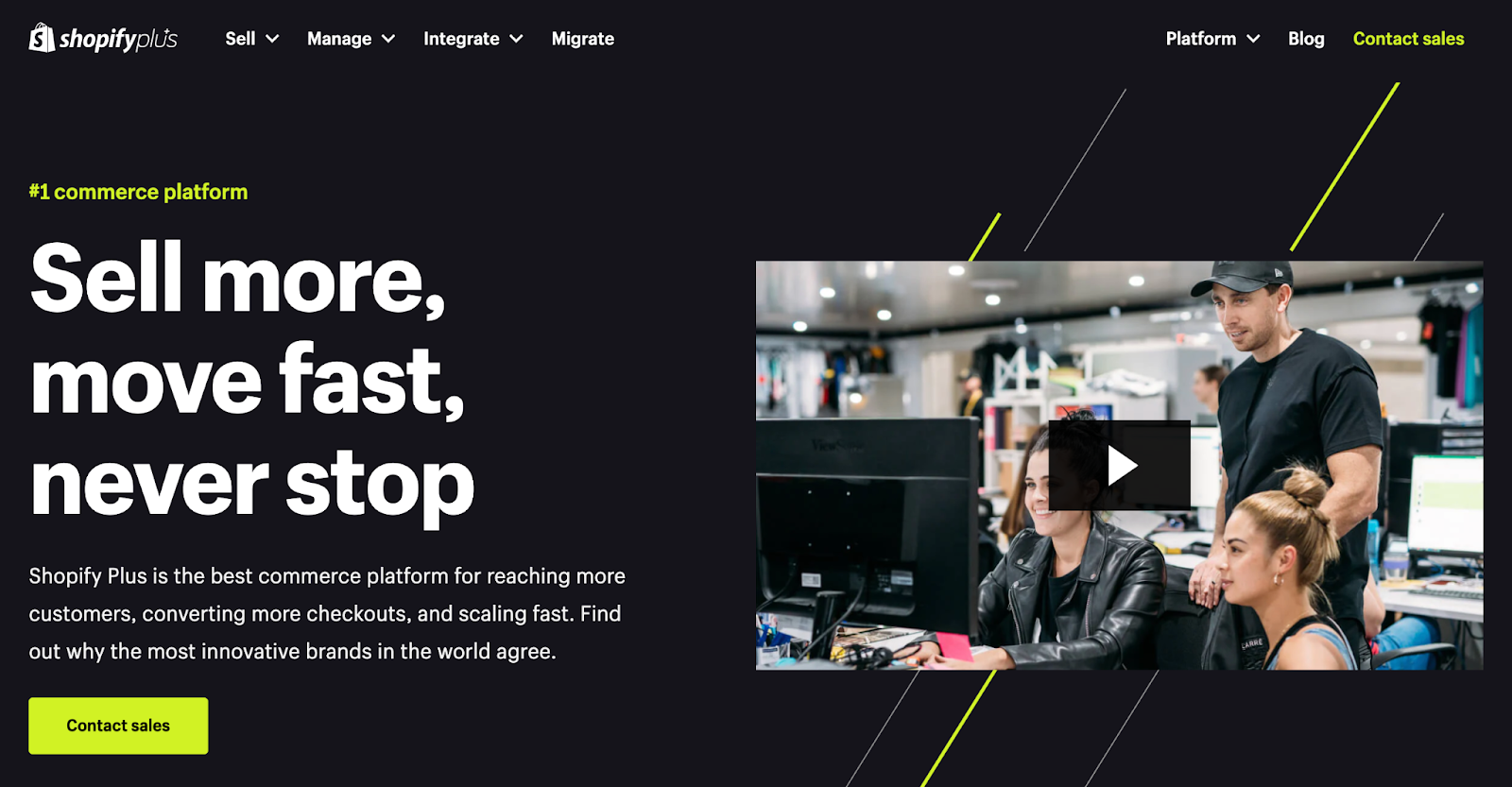
The video provides a quick overview of how the service works for potential customers.
And just like infographics, these videos should get the message across quickly to hold your audience’s attention.
5. Interactive Content
Interactive content invites users to complete one or more actions. To encourage engagement.
Polls, games, and quizzes are all interactive snackable content examples.
They can also help you gather information about your target audiences.
That way, you can better tailor future snackable content to their preferences.
Here’s a Twitter poll from HubSpot showing what we mean:
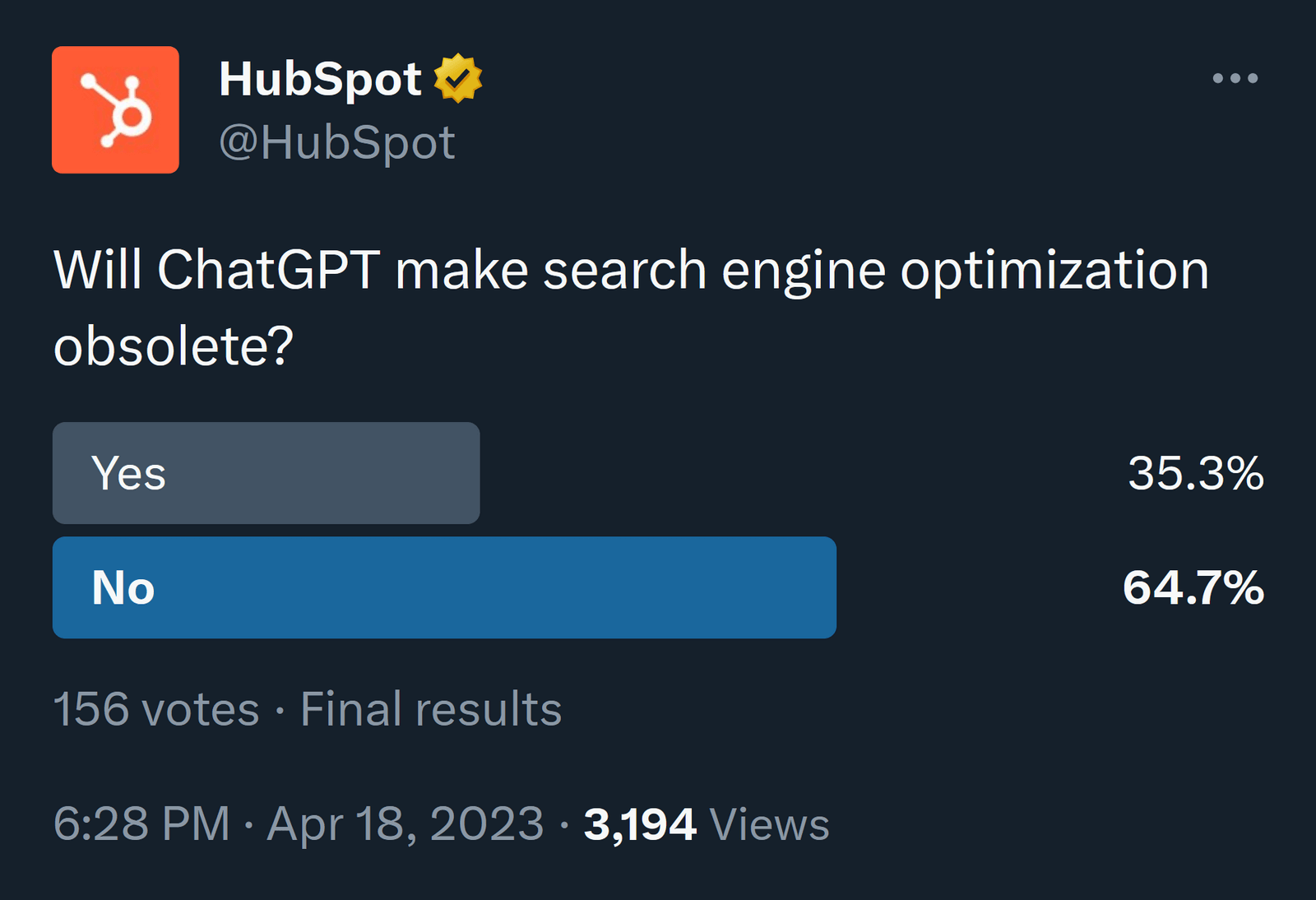
The brand used the poll to spark conversation and lead into a related episode of HubSpot’s podcast where users could learn more.
Another example of interactive snackable content is Instagram’s question stickers.
Here’s one from Duolingo India encouraging users to share their current streak on the app:
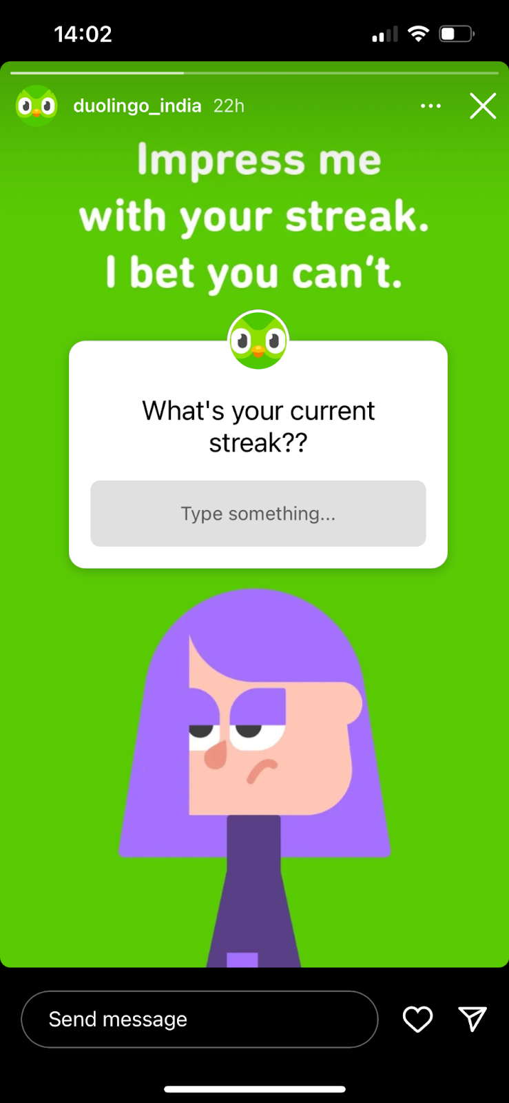
You can also use interactive content on your website.
Here’s a great example of an image slider from Under Lucky Stars that shows what cities would look like without light pollution:
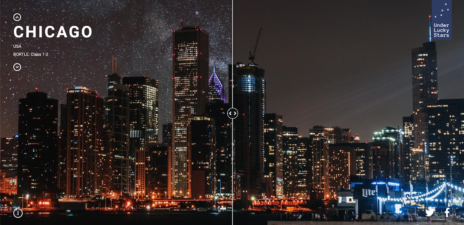
Having interactive content like this can inspire, engage, and inform users. And set you apart from the competition.
Why Use Snackable Content in Your Content Mix?
Snackable content can be made quickly. So you can publish more content in less time.
Why does this matter?
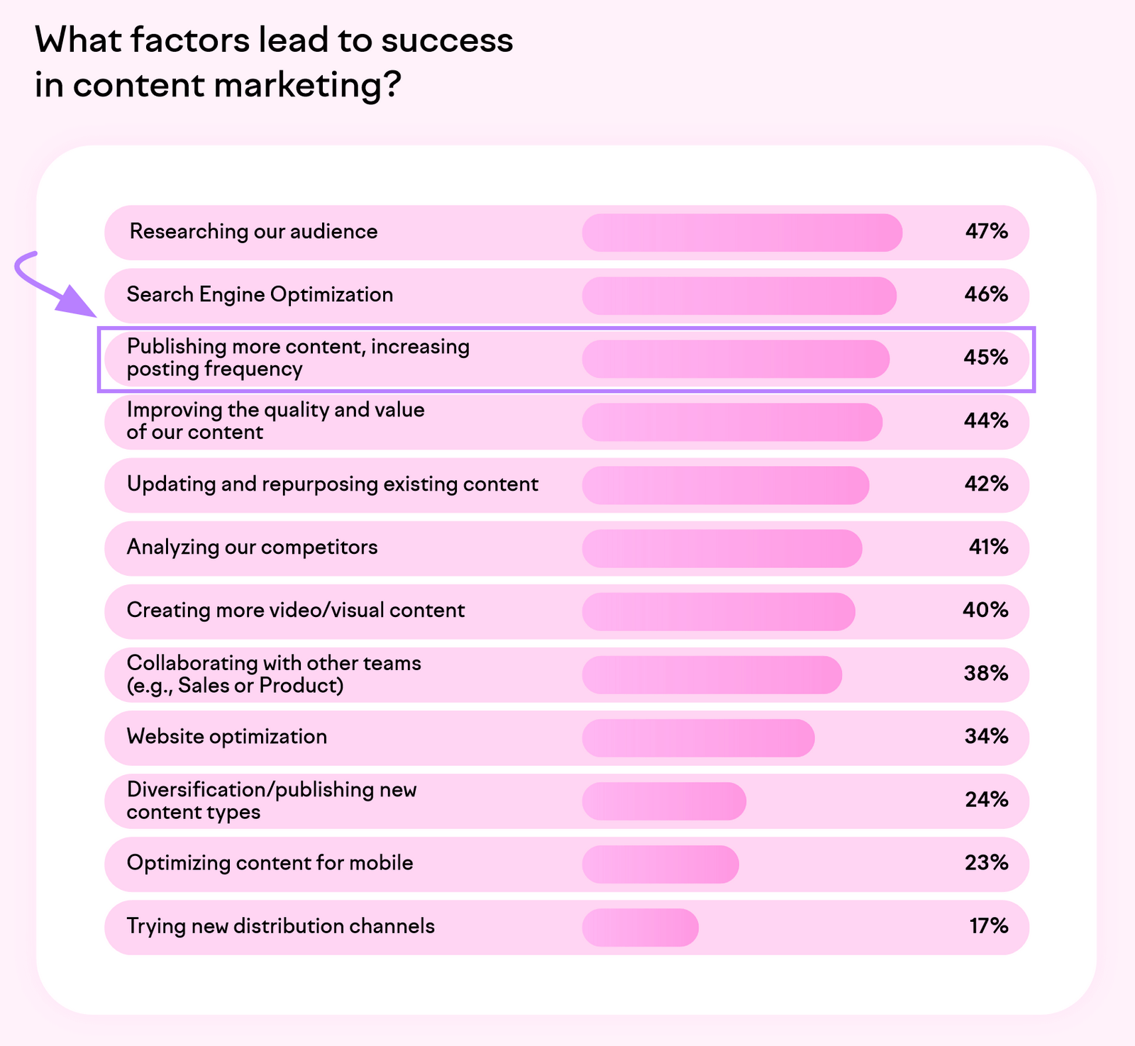
Because our State of Content Marketing report shows that marketers and business owners say publishing content more frequently is key for success.
And snackable content works because it:
- Helps express your brand’s personality: Content like memes and GIFs reflect your values, sense of humor, and more
- Effectively delivers information: Snackable content is concise and accessible—even on the go
- Provides a better user experience: Different people consume content differently, so snackable content helps to meet certain users’ preferences
Plus, snackable content can be used to drive users to your longer content.
One isn’t necessarily better than the other. You likely need both for a successful content marketing strategy.
Tips for Creating Attention-Grabbing Snackable Content
An effective snackable content strategy is visual, relatable, optimized for mobile, and data-driven.
When you create your own, follow these tips:
Combine Visual Elements with Text in Social Posts
Researchers have said for decades that half of our brains are devoted to vision. But adding text provides another layer of context to help users quickly understand your message.
This Pinterest guide even suggests using a text overlay to help more people discover your posts.
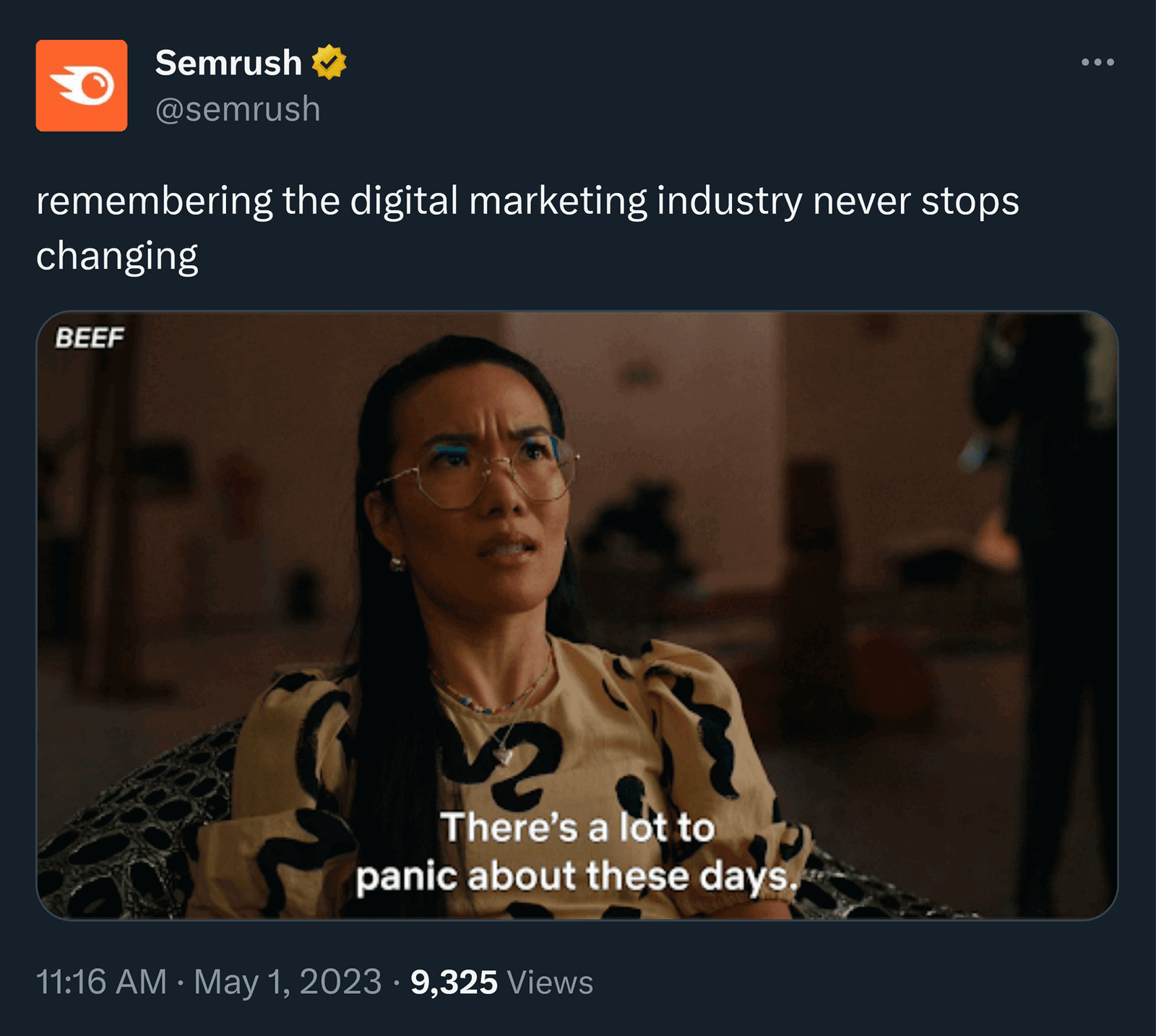
Here’s an example of how we included additional text with a meme in a tweet to make it relevant to our intended audience (while injecting humor):
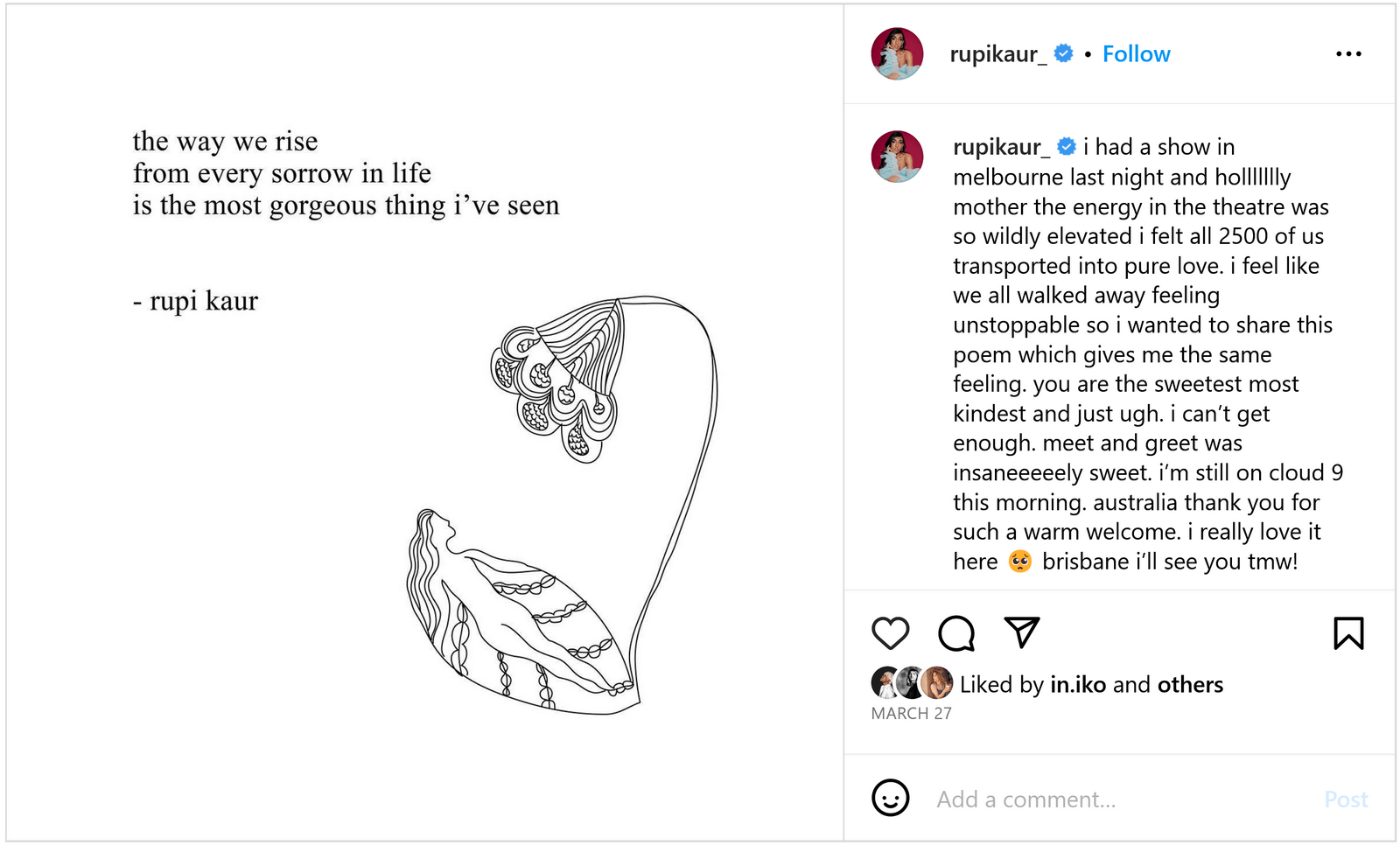
Quote graphics are another good option. And can be some of the most shareable content on social media.
Some creators and influencers have built huge followings with them.
Here’s one from poet and illustrator Rupi Kaur:
Tip: If you’re going to repost a quote from someone else, make sure they actually said it before you share. Quote Investigator can help.
Whichever style you choose for your visuals, make sure they’re aligned with your brand identity and audience.
Pick One Message to Focus On
Focus your snackable content on one clear idea. To make sure people don’t get mixed signals.
Tesla did just that in 2014. The company announced a new titanium underbody shield in a post on Medium with GIFs embedded:

Just one GIF makes the message clear: The new underbody drastically improves safety.
Unsure of the kinds of messages your audience relates to?
Find relevant topics your competition is covering using Semrush’s Keyword Gap tool.
Enter your domain and up to four competitor domains you’d like to analyze. Then, click “Compare.”
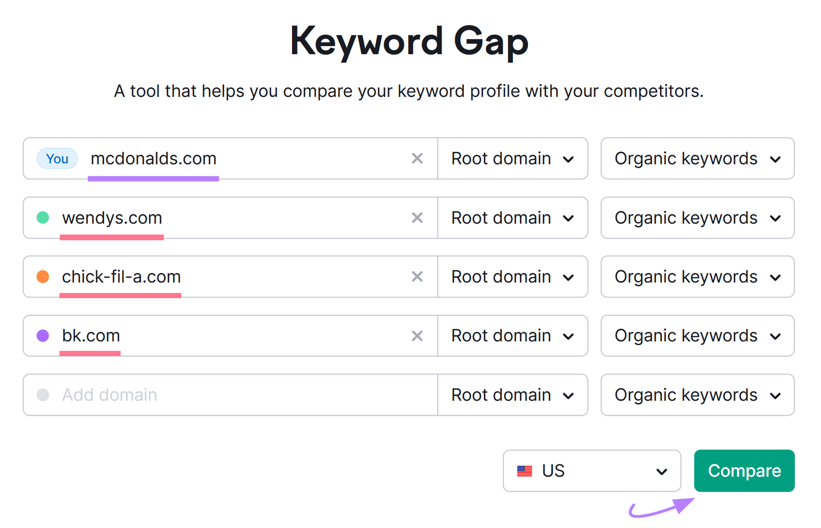
You’ll see “Top Opportunities” and a “Keyword Overlap” chart.
To see keywords your competitors rank for that you don’t, make sure the “Missing” tab is selected in the table at the bottom.
Like this:
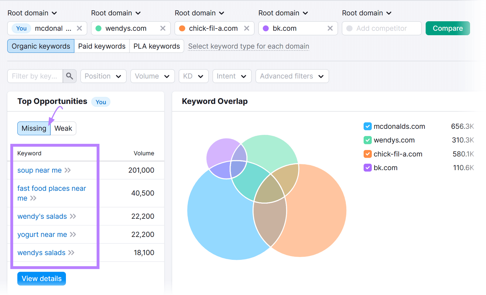
This report can give you ideas for content you’ll want to publish on your website. And translate into snackable content for other channels.
Repurpose Content Across Channels
You can recycle long-form content into snackable content on other channels to preserve resources. And potentially replicate the initial piece’s success.
Content repurposing involves changing the format of one piece of content to create a new piece of content. This could mean creating a video from an article. Or turning the results of a few social polls into an infographic.
Looka repurposed their written guide on choosing a logo font into a snackable YouTube video:
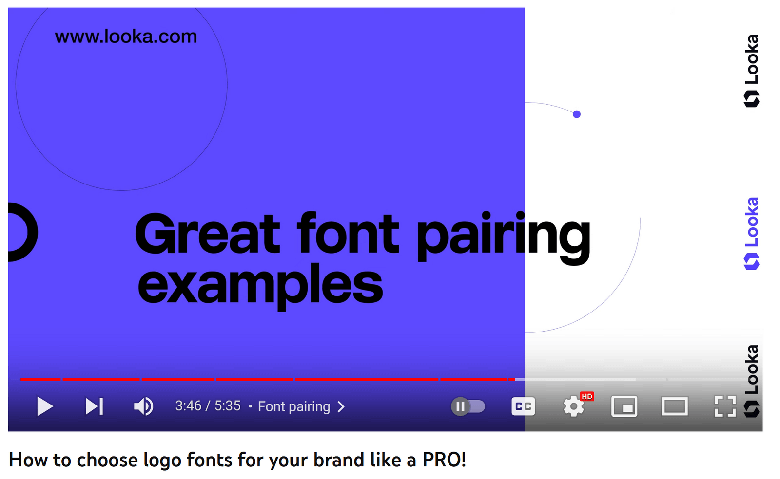
The brand could even repurpose it further into TikToks or Reels to reach even more audiences.
You may already have the components of snackable content based on your existing pieces in front of you. That webinar or ebook you shared could be a gold mine for short videos or infographics.
You could also repurpose:
- A blog post into multiple LinkedIn posts
- An Instagram post into a TikTok video
- A YouTube video into multiple GIFs
- A Twitter poll into an interactive quiz on your website
Whichever format you choose, keep the social media platform or website in mind when you repurpose. And always do a quality check before you publish.
Optimize for Mobile
A lot of people are viewing your snackable content on their smartphones. So, you need to make sure it’s formatted correctly and is easy to view on mobile devices.
The average mobile user in the U.S. now spends close to five hours a day using their mobile phones.
If your content is optimized for these users, anything you post will be a lot more shareable and enjoyable to interact with.
Here are four ways to optimize your snackable content for mobile users:
- Format content for scanning. Use plenty of white space, clear typefaces, and contrasting colors.
- Tailor the image size to the platform. Upload high-quality graphics in the correct dimensions to make sure they’re not pixelated or badly cropped.
- Keep copy short. Copy for social posts gets truncated on mobile in fewer characters than on desktop, so keep text short.
- Check that your site works on mobile devices. Use Google’s Mobile-Friendly Test to see how easily mobile visitors can use your website.
To run the test, enter your domain and click “TEST URL”:
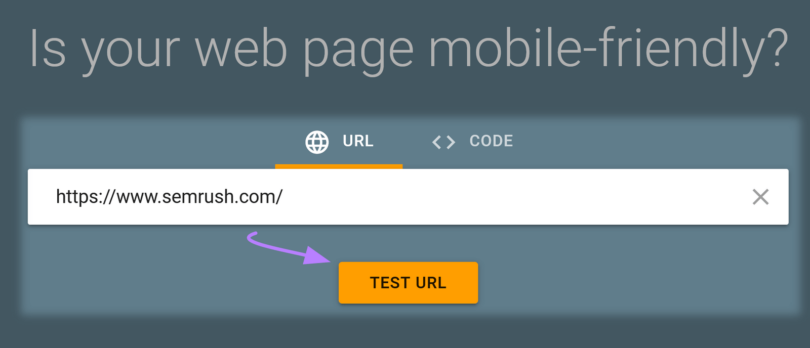
The results will indicate whether there are any improvements you should make.
Learn from Your Top Performers
Analyzing performance metrics for your snackable content can help uncover what works best.
Most social media platforms have their own analytics sections to do this.
For example, you can use account insights on Instagram (if you have a business or creator account) to look at metrics like:
- Plays
- Accounts reached
- Accounts engaged
- Content interactions
From here, you can see which types of snackable content are performing best. Then make more of the same. Or try variations for those not doing as well.
You can also use Semrush’s Social Analytics tool to monitor Facebook, LinkedIn, and Instagram.
Take Facebook, for example.
In the “Posts” section, you can see your top posts, posts that upset people, and post types.
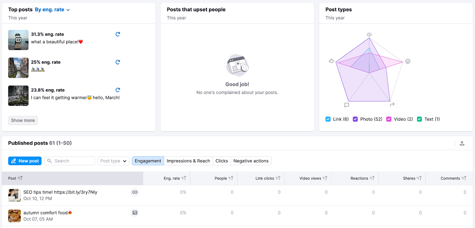
You can also filter your top posts by engagement rate, clicks, people, and reactions.
Doing this regularly will help you meet your audiences’ expectations. And avoid wasting time creating content they don’t care about.
Start Creating Snackable Content
While snackable content can be used in many places, it should certainly be part of your social media efforts.
Not sure where to start?
Check out our Social Media Toolkit to see what competitors are doing, find your best-performing posts, and monitor incoming messages.
Source link : Semrush.com
