The AEM Style System allows the template creator to define style classes in the component’s content policy as well as page policy so that the content author can select them while modifying the component on the page. These styles can be visual variations of components, making them more versatile.
Use Case:
The Style System offers a consistent solution to both templates and content author requirements:
a) Style classes can be defined by template authors in component content policies.
b) When editing the component on a page, content authors can then select these classes from a drop-down menu to apply the associated styles.
This blog contains examples of how to obtain the AEM Component’s Style System configuration.
How to Get Started
1) Go to your project’s specific folder in CRXDE Lite and create one node under the clientlibs folder.
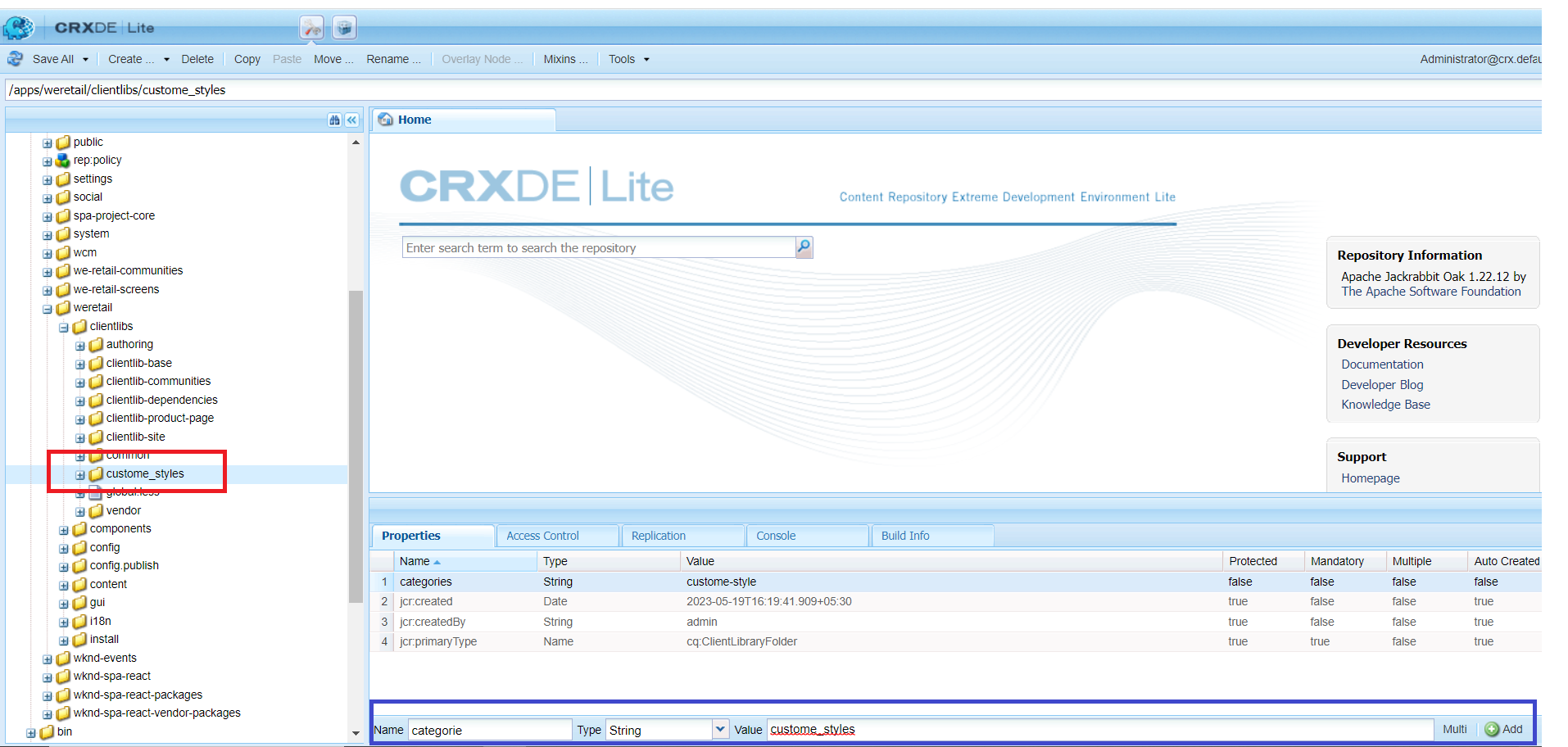
In this screenshot, I created one node (custom_styles) inside clientlibs of the project specific folder, and at the time of node creation, you must add one property, namely category, and assign a value to that property (which I have highlighted in blue).
2) Create a CSS folder and a CSS.txt file after building the node.
Create your CSS files in the CSS folder and map them to the CSS.txt
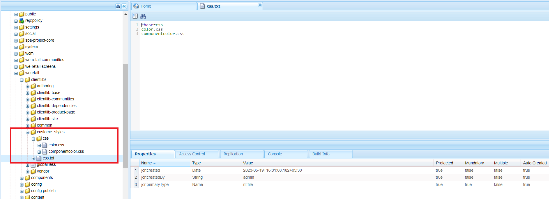
As seen in the screenshot, I created two CSS files (color.css and componentcolor.css) and mapped them to the css.txt file.
3) I utilised two CSS classes for page policy in the color.css file.

4) For content policy, two classes were used in the componentcolor.css file.

5) Now, make one template and navigate to the page policy.

6) We need to set the policy and custom style folders in clients’ Libraries on that Policy Page. (shown on the black box)
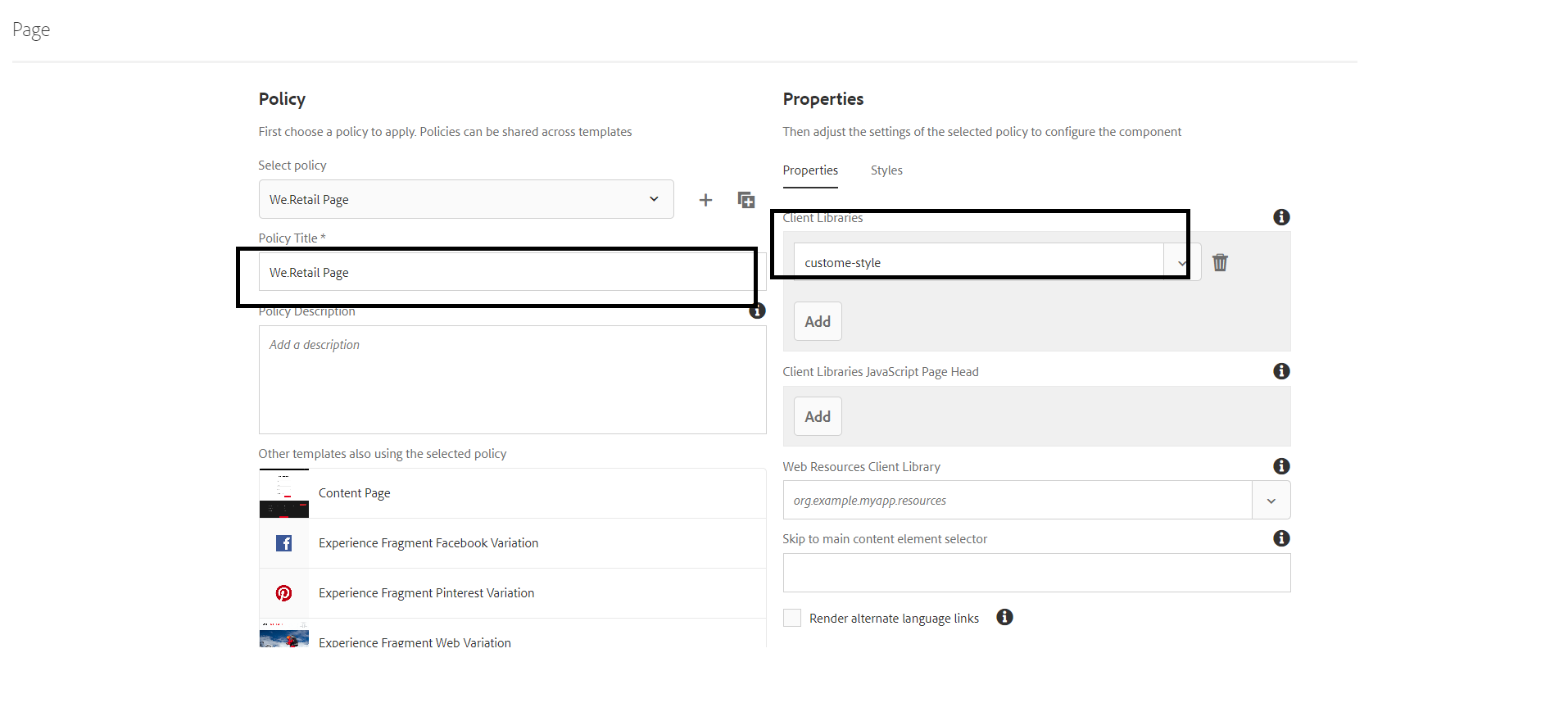
Note: Use your category’s key value, which is already highlighted in the first screenshot in blue color.
7) Now go to the Styles tab and add your custom classes to the page background.
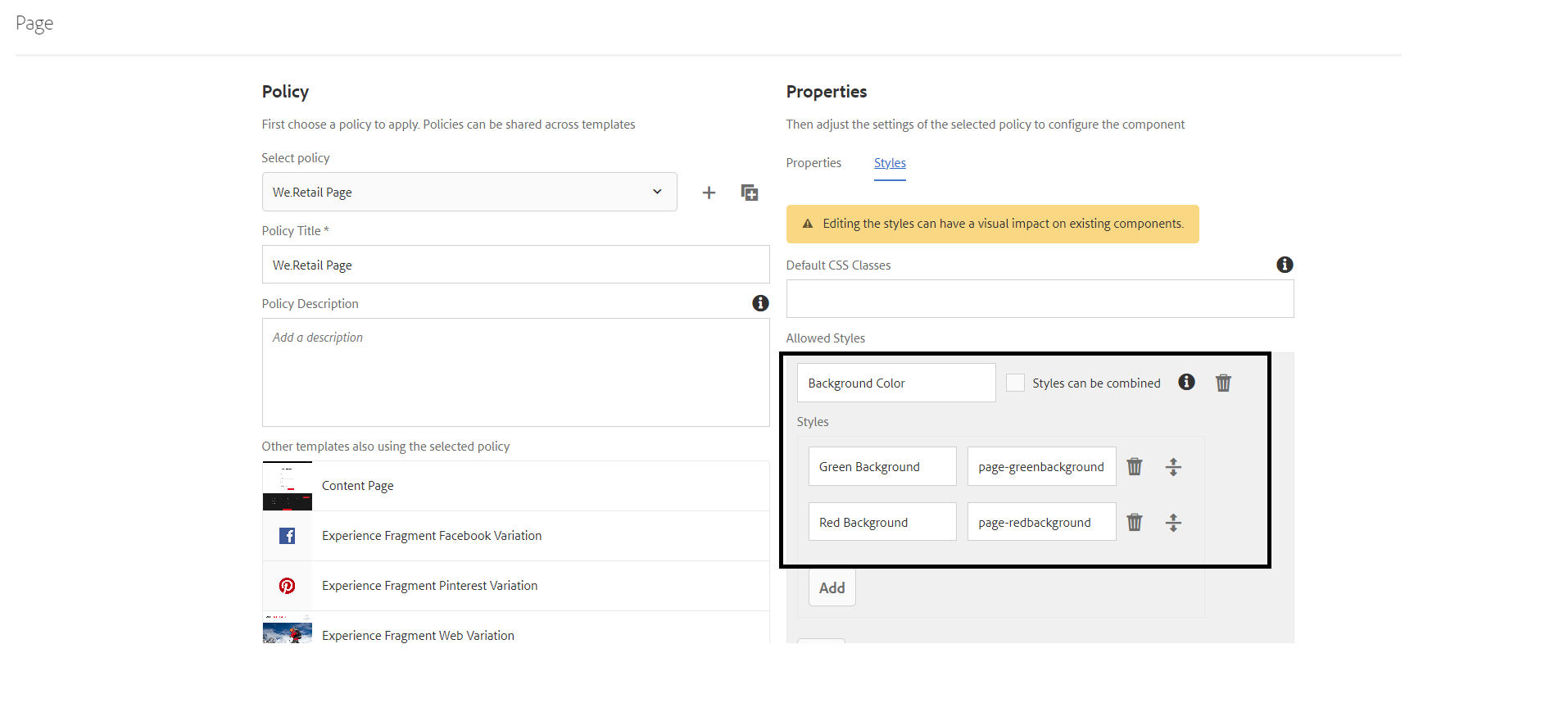
We included our custom classes for the green and red backgrounds here and save them.
8) Return to your editor page and refresh it to see a single brush icon.
When you click on that button, a popup appears, and you can alter the color of your page’s background by selecting one of the options.

9) Now we’ll go through the identical steps for component styles.

10) Set your policy on content policy page, and then under the styles tab, set your custom classes for content and save it.
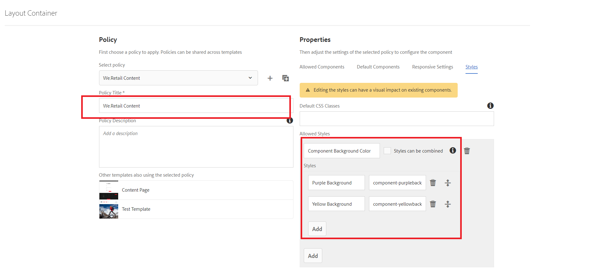
Note: I utilized componentcolor.css file classes in that styles tab.
11) Return to the editing page, and you will see a brush icon in the component adding area, which you can use to change the background color of your component.

Conclusion:
In this blog, we explored the implementation of custom styles using the AEM Style System for both pages and components. By leveraging this system, you can enhance the visual appeal and flexibility of your AEM projects. If you have any questions or comments, feel free to post a remark below.
