Posted by
Shay Harel
Here we go again! Google shakes up the SERP with an unexpected move that saw YouTube lose some significant organic visibility (among a slew of other implications that seem to keep piling up). Not only that, but June gave us more information on two major Google mover and shakers, the mobile-first index
Sit back, have another sip of that coffee (or beer if you’re reading this after hours), because the June edition of the SERP News is on!
Google Discards the Video Thumbnail – Moves URLs into a New Desktop Carousel
On June 15th we saw an enormous drop in the number page one SERPs that contained Video Thumbnails on

The SERP Features Tracker showing a 92% page one Video Thumbnail loss
At the same time, when Video Thumbnails still appeared, the average number of thumbnails on the page spiked:

As Video Thumbnails left page one of the SERP, the average number of Thumbnails per page increased dramatically
If I could so eloquently ask: What in the world is going on here?
As it turns out, just as I saw these thumbnails drop off, we caught a new carousel making its mark on the SERP. Seeing the new carousel, we began tracking it in earnest on June 18th. Here’s its performance for the first seven days of its ‘SERP life’:
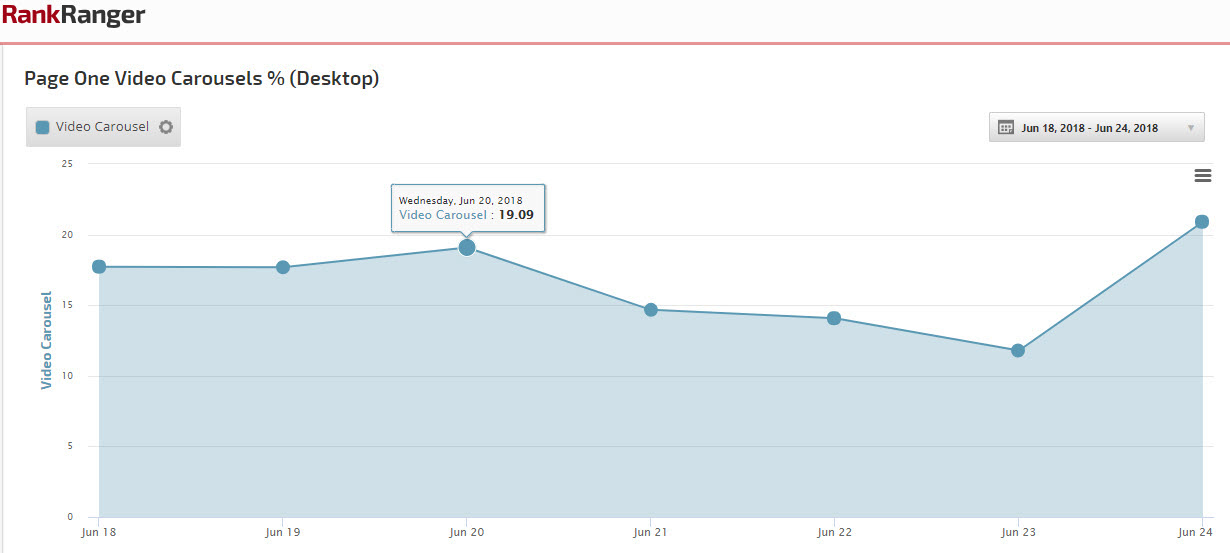
At their peak, Video Thumbnails showed up on roughly 10% of page one SERPs (the new carousel already broke the 20% plane on June 24th). Meaning, not only did Google move URLs that scored the thumbnails into the carousel, but has placed URLs for all new keywords into the carousel (i.e., keywords that did not produce Video Thumbnails previously). Specifically, the new carousel applies to about 25K more keywords within our 500K keyword data set and appears on 40% more SERPS! As an aside, our data shows about 8.5 cards per carousel on average.
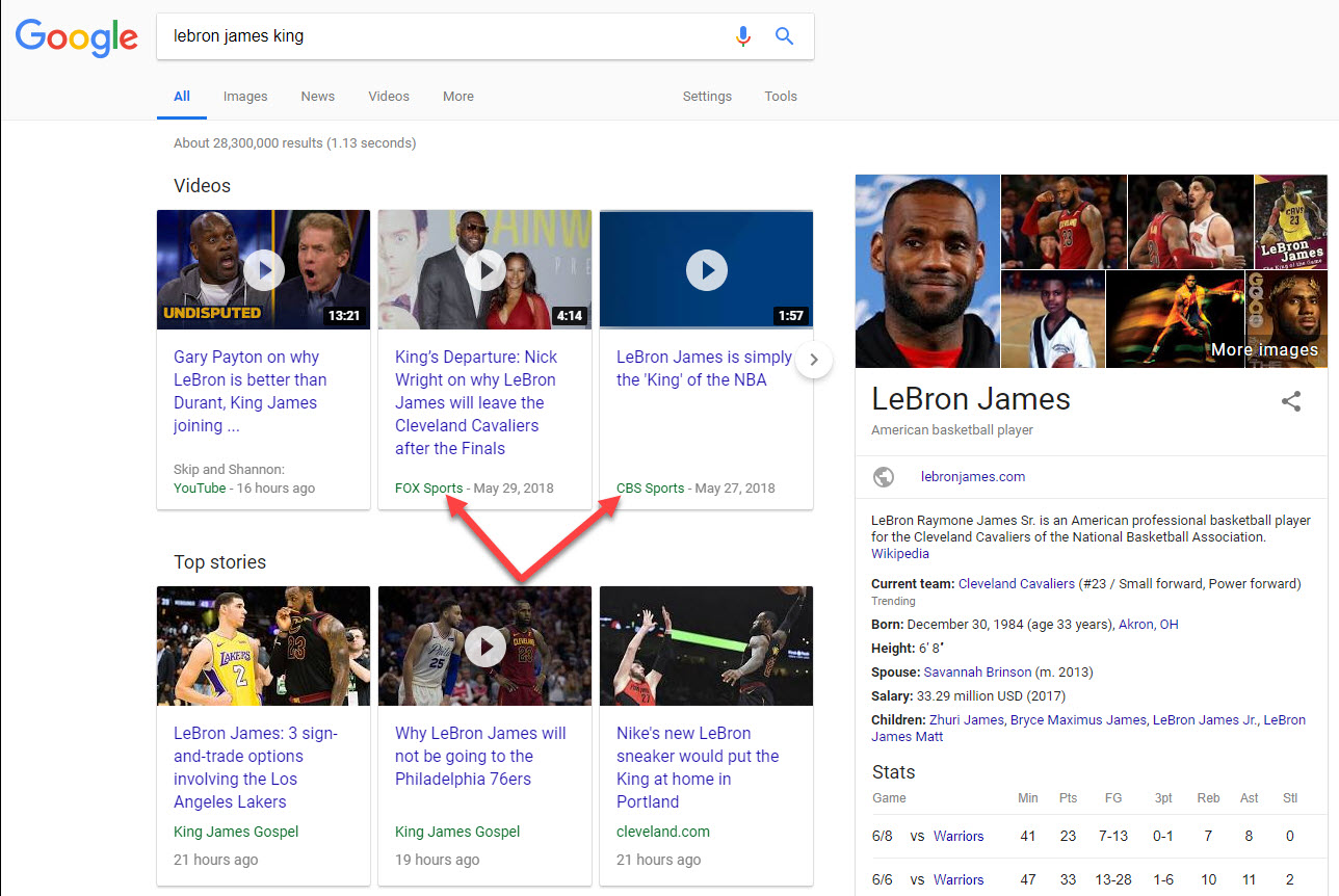
Google’s new desktop video carousel showing both YouTube and non-YouTube videos
There are a whole host of implications that come with the move from thumbnails to carousels, YouTube’s organic visibility being one of them. Pulling data from various niches, I found that YouTube saw a 62% visibility loss as a result of the migration. However, it’s not as simple as that. The new video carousel, as a feature, is extremely visible. It generally displays towards the top of the page and includes a nice big
Just when I thought I was done with this one, I noticed that the number of page one SERPs (desktop) with eight organic results spiked (by 400%) in concurrence with the advent of the new video carousel:

The new video carousel on
I did a quick dip into the data and found that but 57 out of a set of 5,000 keywords that scored a Video Thumbnail on June 4th produced a SERP with just 8 organic results. I ran another 5,000 keywords that on June 24th pulled up a video carousel, and 1,025 of them produced a SERP with 8 organic results… a 1,698% increase!
Not yet satisfied, I looked a bit deeper. On June 4th, our entire dataset of keywords that we use for SERP feature tracking produced 1,336 keywords that brought up a SERP with 8 results.
Guess how many keywords did the same on the 24th? 10,764. Now guess how many of those keywords also produced a video carousel… 8,381… or 78% of all of the keywords that produce 8 organic results SERPs contain a video carousel. In plain English…. the new desktop video carousel, unlike Featured Snippets, unlike Knowledge Panels, and so forth… is an organic result killer.
Think of it like this, Featured Snippets exist on about 12% of all SERPs, which is similar to the percentage of SERPs containing the video carousel. Yet, even with the snippets, page one SERPs that contained but 8 organic results appeared just 1% of the time. Add the video carousel into the mix and we’re up to about 5%. That complicated things a bit don’t you think?
Read our full report: Google is Replacing Video Thumbnails with a Desktop Carousel
Google Opens Up on Mobile Indexing & the Speed Update

Rejoice! Google has opened up about two of its biggest “updates,” the mobile-first index and the Speed Update.
Let’s tackle mobile indexing first (pun intended). Here, through a series of Tweets all about the mobile-first index, Google has said that:
- Even when showing a desktop URL (when it is different than that of the mobile page), Google has indexed the mobile page, not that of desktop.
- Google is still crawling the same number of pages per day, it’s just that more of those pages are mobile pages.
- Mobile-friendliness and mobile-first are not the same thing. You need not be mobile-friendly to be part of mobile-first.
- The Speed Update has nothing to do with mobile-first indexing. In other words, not everything on mobile is related to the new index.
Which brings us to our next topic, the Speed Update, which by the time you read this should be out in the wild in the very near future (if not already). In this instance, Google offered clarification on what the update will do, since
As it turns out, the current speed factor only looks to see if the page is unbearably slow or not. The new Speed Update will take a nuanced look at page speed, thereby giving the update the possibility of a broader sort of impact.
June’s Changes to the Google SERP
There
Google Post Stories & Product Posts Make Their Debut on the SERP
Yet another big month for Google Posts. The search engine is most certainly taking the feature to all new places and in some instances that could work
Google Posts Stories: Looking up the score for one of the games from the recently completed US hockey championship, the Stanley Cup Finals, I found a true beauty. What would you get if you combined an AMP Story with a Google Post? You would get an unbelievably well-designed story that grabbed attention like nothing else:
Have you ever seen anything like this? It’s almost a like “Google Posts Story” of sorts. Clicking takes you to an article/video on the entity’s site. Looks really well done. @rustybrick pic.twitter.com/RgN3TQ6wea
— Mordy Oberstein (@MordyOberstein) June 5, 2018
Should this format become more common/more available, it would be a big win for those entities appearing in a Knowledge Panel. The format is visually striking to the nth degree and is sure to be clicked on. What’s more is that once the story runs, all clicks go to your site! In other words, the new format (like Google Posts in general) is an opportunity to get users to leave Google’s property and head over to your site.
Google Post Products & New Format Test: Along the same lines of using Google Posts to steer users to your site, Google announced that you can now feature products inside the SERP feature. Meaning, you can use the Knowledge Panel to sell your product! At the same time, a new more visual format for Google Posts was spotted on the SERP in what was a limited test. Limited or not, I would very much like to see the feature go more visual since I believe it is one of the most powerful ways for brands and the like to control SERP performance in a world dominated by Google’s own properties.
Another Round of Knowledge Panel Upgrades
Did you expect something else? Google, like last month, and the vast majority of all months that come before it, made another round of changes to its Knowledge Panel. It’s like an update **** affair at this point!
Overhauled College Knowledge Panels: School’s out for summer, but in for the Knowledge Panel. June saw Knowledge Panels for colleges get a serious upgrade.
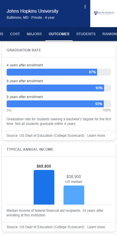
The new “College Panel” aims at helping users choose the right school by offering information on a school’s cost, graduation rate, the average SAT scores of its students, a breakdown of the percentage of students per major, and a lot more. One of the most substantial panels I’ve seen out there to ****.
Return Policy in the Local Panel: A mid-month report showed that Google was placing return policies for some large retailers inside the Local Panel. Should this expand to all businesses, having an advantageous return policy listed could be a difference maker for some users (particularly if such policy is in fact not advantageous to the user
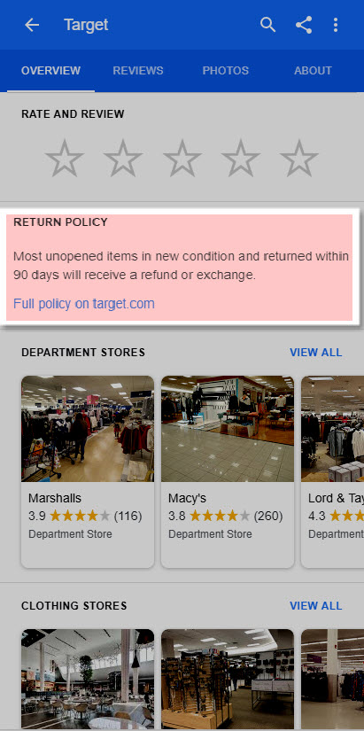
Target’s return policy as featured in a mobile Local Panel
Store Savings & A Product Tab in the Local Panel: Also spotted in June is a slot for ‘store savings’ that gives businesses an opportunity to point you towards their special offers. For example, in the case of Macy’s, users are sent to their online circular. You could just put a link to your homepage there, as Trader Joes does (which I thought was pretty sharp thinking):
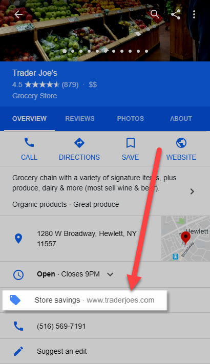
The Local Panel (mobile) showing a link to a store’s offers, which in this case, leads to the entity’s homepage
The same report also indicated that there is a new ‘Product’ tab floating around out there. Back in the April edition of the SERP News, I indicated that Google was showing a tab in the panel to list your services. The new ‘Product’ tab seems to be the same, just for products per se. I personally have not seen it and still see retailers showing the ‘Services’ tab, not the ‘Product’ tab, though I haven’t looked that extensively.
Knowledge Panel Verification: This has been a *** ticket item. Google has been “inviting” those that appear in the Knowledge Panel to verify their information. This does not mean you can control everything shown in the panel. Suggestions, at this point, are limited to the main image Google chooses to show and the basic profile information (i.e., factual information) that appears in the panel (but not the Wikipedia summary).
Local Pack Tests Abound in June
Three Local Pack Filter Tests: The end of the month saw three nifty tests around filter usage in the Local Pack. The first was relegated to hotel results. Here, Google used icons similar to those shown in the “Highlights” section of the Knowledge Panel. The icons were shown in buttons that allowed users to filter by hotel categories.
![]()
Visually dominant filter buttons that utilize highlight icons tested in a Local Pack (Image source: Dr. Pete Meyers via Twitter)
This kind of visually oriented filter can have a big impact on clicks. Think about it like this: You show up in the Local Pack, you feel excited about all of the sales you are sure to make… but then don’t because there’s a big and visually striking button that filters out your listing (or vice versa).
The second filter is a bit more traditional in its look, but not it’s functionality. In this case, Google is showing a filter button based on a parameter mentioned in the query. In the case below, a search for bars within 1 mile of Times Square was executed. Lo and behold, the Local Pack includes a filter for… within 1 mi:
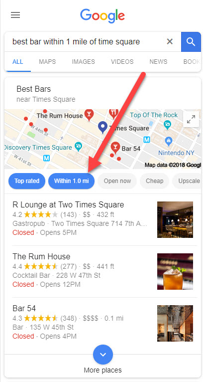
A new Local Pack filter pulls in options based on the distance mentioned in the query
Lastly, Google tested a filter that gives you the ability to eliminate Local Pack listings that you have previously visited from showing in the box.
I’m assuming that Google knows where you have or have not visited by tracking where your mobile device has or has not been (like when you get a request from Google to take a picture of your location), which is both amazing and a bit creepy.
Worse though, there’s no hiding a donut run from my wife (should she know that she has not frequented a certain donut location):
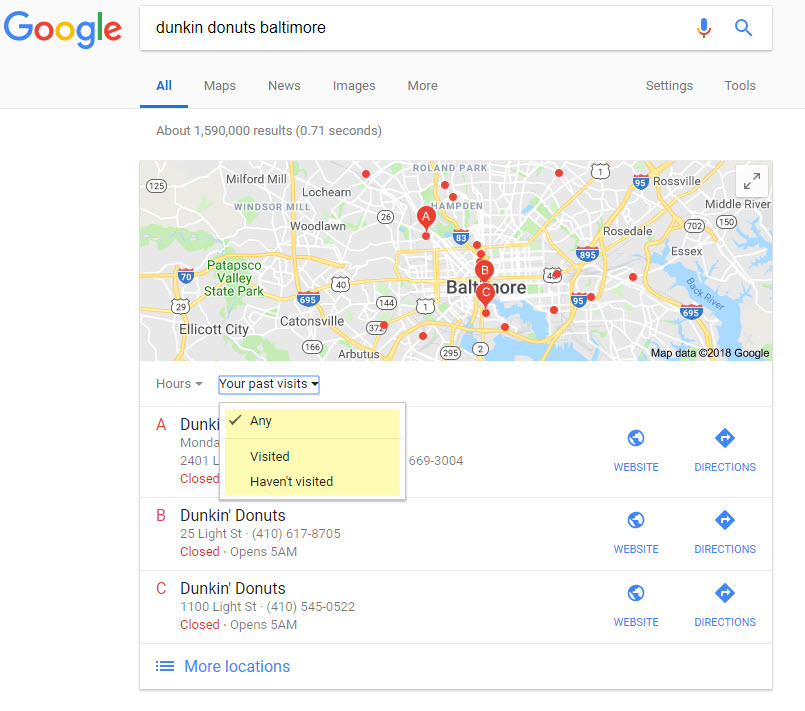
Filter Local Pack results according to locations you have or have not already frequented
The June SERP Roundup
What about the rest of the pack? What other treats did Google offer the world in June? (Because you know there has to be more!)
Local Inventory Ad Images & Location in Organic Results
Let’s keep things local here with two interesting tests:
1) Super-sized Images for Local Service Ads: Google’s guaranteed service ads saw a test where only one vendor was featured. This one true vendor (you know, like one true answer) also got a super-sized image to go along with it, just to give it a bit of SERP dominance for effect!
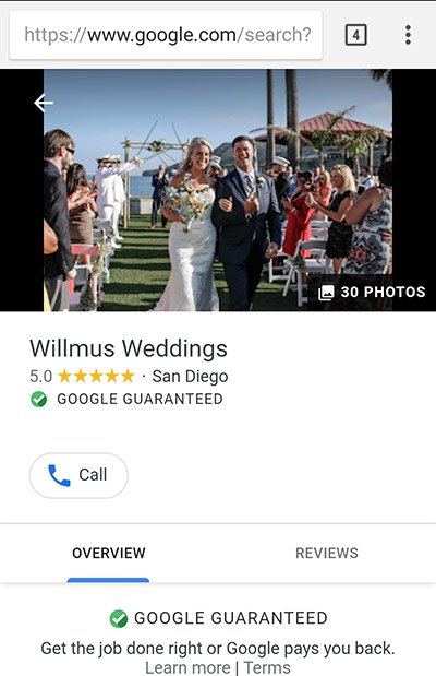
A Local Service
2) Location Indicated in Organic Results: Another June test saw Google throw a site’s location onto the SERP by displaying it next to the result’s description. I’m not sure what the upshot
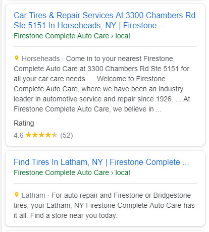
A tires store’s location is listed next to a yellow pin within the organic results
AMP Labeling Comes to AdWords, Which is No Longer AdWords
The greyed-out AMP icon that you know from the Top Stories carousel or from organic results themselves now appears within AdWords ads. This makes a good deal of sense since as of September 2017 AdWords allowed you to direct users to an AMP landing page. Not exactly sure why it took this long for Google to place the AMP icon in its AdWord ads, and I probably never will.
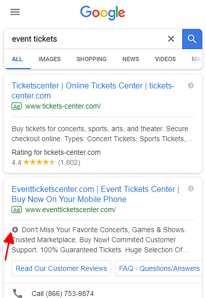
The AMP label within an AdWords ad (Image source: searchengineland.com)
Let’s take this opportunity to wish a heartfelt goodbye to AdWords, and welcome Google Ads. Google has changed the name of its major source of ad revenue. That is all (until Google makes some changes, which they constantly do anyway, so has anything really changed other than the name?).
Google’s Refresh Results Button
I’m a big believer in saving the best for last, so here it is
Salute the SERP

You have to give it to Google, they are master tinkerers! Whether you agree with everything they do or not, they are one mighty creative force. Along those lines, their creativity can greatly benefit you should you capitalize on it correctly. I know I said this above, but brands and businesses should do more to take advantage of the possibilities that come with Google Posts. For brand related queries, the Knowledge Panel is often the foremost competitive force on the page. Yet, that very force opens a backdoor channel to driving users to your site via some really engaging content (be it a Google Posts video, GIF, or this new ‘Stories’ option). Definitely capitalize on it!
And with that, thank you for joining me on our SERP trek, do reach out if you have any questions, comments, or discoveries!
Until we meet again…

