Posted by
Laura Campbell
I caught the news of a new Search Analytics report in the Webmaster Central blog and took it for a spin today. My first try at testing this report was in Firefox and boy does it look awful there!
Webmaster Tools Search Analytics in Firefox
I use multiple browsers throughout the day for testing new SEO platform reports & features, as well as posts like this, and although I am a bigger fan of Chrome than Firefox, I just happened to have Firefox open when I decided to check out the new Webmaster Tools report. My Firefox is set at the same zoom level and font type and size as Chrome, yet this view fills the screen and I had to scroll down to see the table below.
Firefox view was uncomfortable, so I switched browsers and the colorful appearance drew me in. Apparently Google feels quite strongly about which browser we use.

Where is the **** Comparison setting?
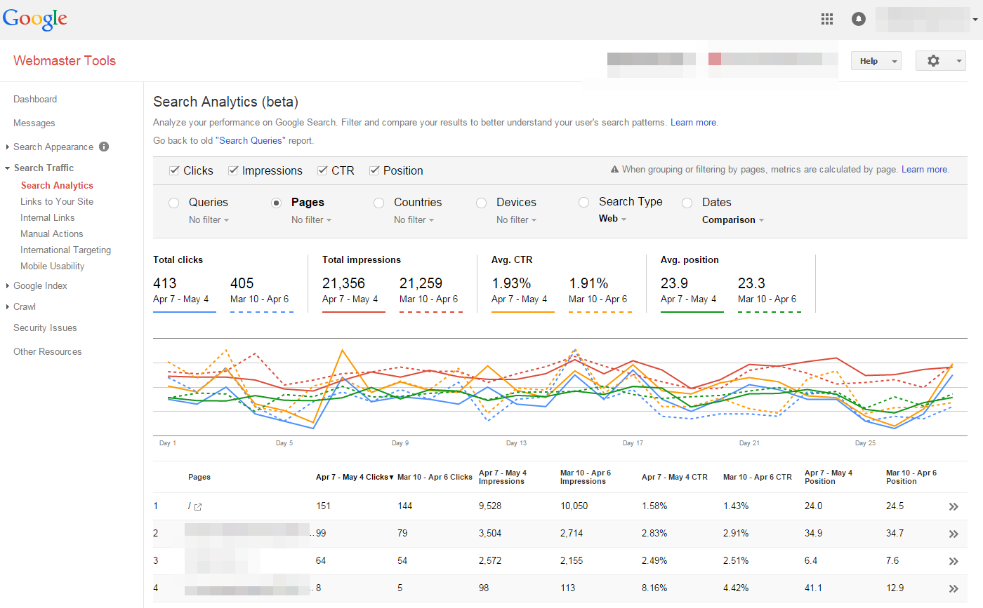
I selected the Pages radio button and then clicked the filter option where I found that I can filter by pages containing a specific URL or compare 2 URLs and that is a nice option that I might occasionally use. I like to compare current to previous period or custom **** period, but I didn’t see that option in the Page filter, so I clicked the Dates radio button and oops! the report content changed to a
list of Dates and Clicks. After realizing that I had to click the down arrow next to the Dates radio button, I selected the Compare **** ranges option that I wanted. But then I had to click the Pages radio button to get back to the data I wanted and for some reason the Impressions, Clicks and
Position boxes were automatically reset and no longer checked.

Please stop resetting my preferences!
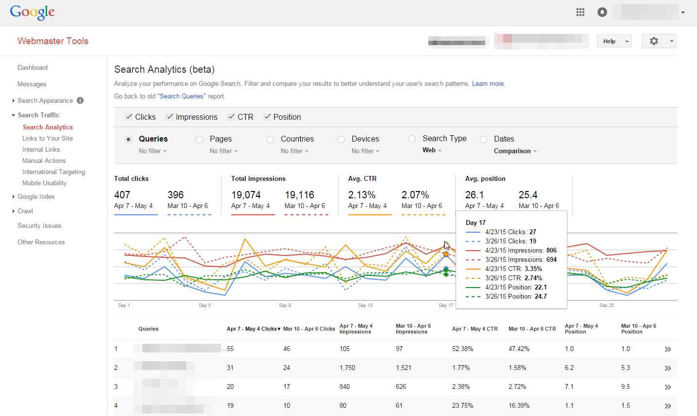
The table defaults to 10 results and I like to see 25 rows at a time, so I changed the Show option at the bottom of the screen and was able to advance from page to page using the arrows. I switched to a different customer’s site and then came back to this one a little while later and the table reverted back to 10 results – it didn’t save my pagination setting. But worse than that, it didn’t save my previous session filters for **** comparison and country.

Clicking on a keyword or page opens a filtered report, but there’s no back arrow or button to return to the full report! After losing my session settings before, I was afraid to click the browser’s back arrow, but the only other option was to click the Search Analytics link in the left menu and start from scratch. Friends and peers consider me to be pretty technically competent, which must mean that this user
interface is not so intuitive.
At first glance all the colors and choices were attractive, but now the report looks cluttered and disorganized so I tried downloading the data to CSV and could invest a few hours creating a report to look the way I want it, but since Google Webmaster Tools integration is available in Rank Ranger, I won’t have to go through all that extra work.
The overall user experience with this new Google Webmaster Tools Search Analytics report left much to be desired, but the good news is that Google certainly has the resources to improve it.

