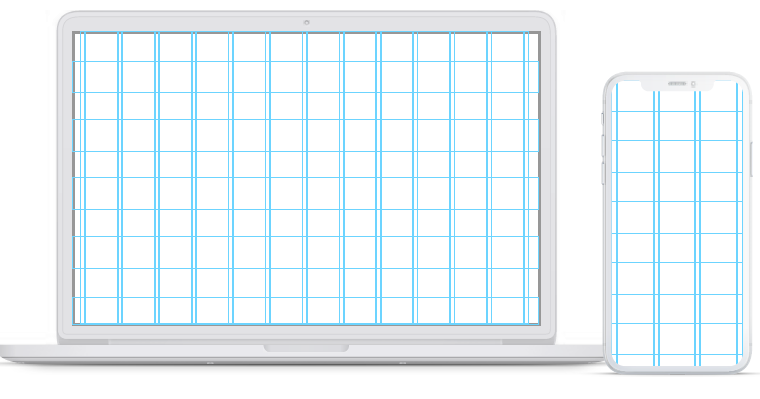
Website Design Basics – Grid is a structure of lines that helps keep your layout together. It’s the structural blueprint of any good project as it helps to create the hierarchy between elements and allows for better understanding and processing.

Even though we don’t see the gridlines in the final project (usually), even a subtle change that goes outside of the pre-set rules will have a significant impact on how we perceive the final result. It’s the subconscious difference between a good project and a great one.
That’s why it’s critical to set the grid early in the project. Creating rules and guidelines near the beginning will allow for greater consistency and faster deployment
HOW TO CREATE A GRID?
On your initial designs, try to build out all the necessary screens and content types before attempting to pick the right grid for the project. Be sure it will cover all possible scenarios. You can also use wireframes to see the kinds of layouts you will eventually build and pick an appropriate grid.

Once you start testing the grid, do it against a couple of screen types – with photos, data tables, forms, or large text blocks. That will help you be ready for every possible scenario from chart and graph heavy dashboards to simple, one-column blog posts.
If your project is going to be complicated, you can try using a more significant number of columns (up to 16) to accommodate a larger number of possibilities.
TYPES OF GRIDS
HORIZONTAL (DEFINING HORIZONTAL LAYOUT)

A horizontal grid is composed of vertical columns and margins between them, called gutters. Both of them can have either pre-set or flexible widths. They allow for a better horizontal alignment of the interface and are the base of a layout. Above, you can see an example grid with nine columns.
The name “horizontal” can be misleading when we see vertical lines, but it’s derived from how we use it to align design elements horizontally.
VERTICAL (DEFINING VERTICAL LAYOUT)
The vertical grid is less prevalent. It can help set the heights of elements, sections, and vertical whitespace. It can work best with a grid-content presentation on blogs or news portals. It’s composed of horizontal lines, aligning the content vertically.
The main goal for this type of a grid is to make the sections easy to scan and discern quickly, making it faster and more comfortable for the user to browse a large amount of content.

FLUID VS FIXED GRID
FLUID GRID
The fluid grid assumes an outer margin and gutter widths and adjusts the column widths to fit the screen. That makes the columns have varied width, and the gutters are whats keeping the alignment together. It’s one of the most common grid types, as it allows for easier adjustments for lots of devices and screen sizes.
Here are two examples of a 4 column grid with a 16 point margin and an 8 point gutter. We only adjust the column widths to fill the entire screen size.

FIXED GRID
The fixed grid works with a set value for both the columns and gutter widths. If our screen is wider than the grid, we end up with blank space on the sides. This type of grid works quite well for websites and news portals, as stretching the content over 1400px will decrease readability anyway. In that case, it’s better to leave the sides blank.
Here are two examples of a 2 column fixed grid with a margin of 16 and a gutter of 8. The column width is set at 36. As you can see on a narrow screen, it can fill the entire width, while on a wider one, it will leave space on the sides.

BASE VALUE
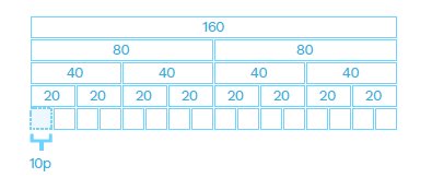
Building a grid should always start with choosing its base value. It’s the smallest number we use to set all the other values. In general, all our grid values should be divisible by that base number.
10 POINT GRID
Number ten is one of the most popular base numbers. The main reason for this is the fact that it’s quite easy to divide other, larger numbers by 10. So the reason for its popularity is mostly practicality and ease – you don’t have to do the math. Ten is also the “nudge value” in most design apps – it’s the value by which you move objects while holding the SHIFT key. In most cases, changing that default value requires an additional plugin.

Because of that ease of use and 10 being the default nudge, it’s good to start your first designs using the 10 point grid. Multiply it by two to create the base of a very simple, easy to implement grid system that you can later tweak.

10 POINT FLUID GRID
Creating a fluid grid using a 10 point baseline is one of the best starting points for any project. As ten itself is probably too small of a number to work well as our gutter (for readability), we go with double that for gutter and quadruple for outer margins. Assuming six columns, we end up with the example below.

The X value comes from the equal division of our screen by the numbers of margins and gutters. With six columns and a 390p width, it’s 35 pixels and will grow the wider our screen gets.

8 POINTS
With 8 point grids, the general rule is the same as with the ten-point one. You choose eight as your base value and then either multiply it by two or – for more flexibility – add 8 to your numbers for additional sizes.

The 8-point grid is currently the most popular grid-type in modern UI design. It requires a bit of extra effort, but it’s well worth trying it. The main benefit is the fact that it gives you more flexibility with spacing – you can fit more complex (and smaller) elements within the same space and have them all still fit the grid.
Many popular screen resolutions are also divisible by 8, which can be helpful when designing for mobile devices.

As you can see in the example above, we can place more elements within the same width.
8 POINT FLUID GRID
Creating an 8-point fluid grid should start with multiplying the base number by two. Eight in itself is too small to be the right choice for separating objects. Having them so close to each other negatively impacts readability, as you can’t easily discern where one block ends, and another begins—knowing that you can start by setting the gutter at 16 and outer margins at 32 (or 24) with fluid column width.
If we’re always multiplying the base number by two, why not set it at 16 in the first place? While the double-base-number works well for the overall layout, the smaller value of eight can come in handy when positioning elements within individual components (like the text on a button).

The X value comes from the screen width left when we subtract our margins and gutters from it. In the case of 6 columns and a 390p screen width, we end up with a 41 point column.

WHY 8 IS BETTER THAN 10?
Why are so many skilled designers choosing the 8-point grid instead of the 10-point? One of the primary reasons is the fact that if we use the multiples of 8, it allows us to have more freedom with setting both external and internal margins in an object. The result is much nicer looking components.

The same component built using the 10-point grid would look like this:

When our minimum nudge value equals ten, it forces us to have much larger margins (of 20). In some edge-cases, it can even reduce readability, or require using additional numbers (like 15) to avoid objects being too far apart or too wide.
Conclusion – Website Design Basics Series
Our UI design team specializes in creating beautiful and functional interface designs for various digital solutions. Our extensive experience ranges from corporate and campaign websites to apps to intranets, dashboard visualizations, and complex enterprise solutions. We believe that creativity and visual design is as important as smart information architecture and interaction design that altogether create a smooth and coherent user experience. Combining user insights, UX best practice, strategic approach to IA and branding we craft simple, effective, intuitive and delightful interface design solutions that fit the product and brand purpose and meet your users’ needs. CONTACT US TODAY
