What Is A/B Testing?
A/B testing is a research method used in marketing, web development, and user experience (UX). It compares two versions of an element—such as a webpage or advertisement—to determine which performs better. Another name for A/B testing is split testing.
In an A/B test, researchers select two or more variables and label them “A,” “B,” “C,” and so on. The site then tests these variables simultaneously across similar audiences to gauge their effectiveness and impact on user behavior.
A/B testing enables marketers, designers, and developers to make data-backed decisions that increase awareness, clicks, and conversions.
You can run A/B tests on entire webpages or individual elements, like image choices and layouts.
Other common applications include:
- Email marketing subject lines
- Content formatting
- Call to action (CTA) buttons
- Ad placement
A/B Testing Example
Picture this: You built an email marketing campaign to generate interest in a new range of products.
You created two sharp subject lines for the opening message: version A and version B.
From an email list of 3,000 people, you make a sample section of 300.
You send your message with version A of the subject line to 150 people. Then you send version B to the other 150 people.
When the test is done, data shows 50 people opened the email with version B. But only 28 opened version A.
You conclude that version B is more likely to engage your audience and opt to use it for the wider campaign.
You’ve successfully run your first A/B test.
A/B Testing vs. Multivariate and Multipage Testing
Multivariate and multipage testing are two additional A/B testing techniques for more complex analysis.
Multivariate testing tests a hypothesis (the proposition or idea you’re investigating) with multiple modified variables. The goal? Determining which of many possible permutations performs best against a common goal.
Imagine you wanted to gauge the impact of the above-the-fold elements of a webpage on conversions. You could simultaneously test two landing page headlines and two header images. In total, you’d create four test pages, each with a unique combination of elements.
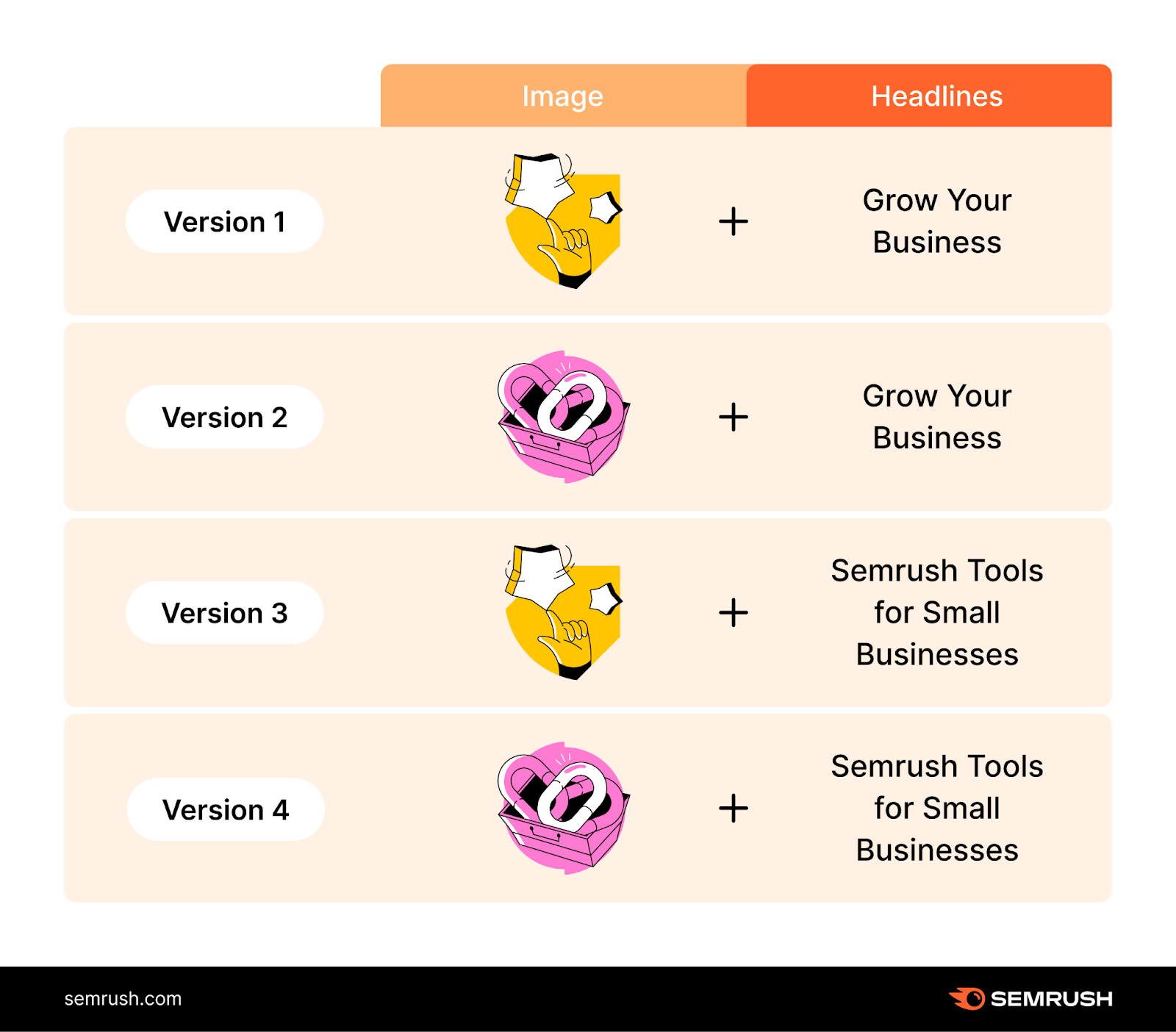
Given its complexity, multivariate testing best suits advanced marketers, designers, and developers. The good news: Get it right, and you’ll save time by skipping lengthy sequential tests.
Multipage testing, on the other hand, involves testing changes to specific elements across multiple pages. It’s useful for testing small adjustments you want to do on a larger scale.
For example, you might experiment with client testimonials to see if they impact conversions.
Instead of adding the comments to a single test page, you’d add them to test versions of all your product pages. Some visitors would see these test iterations with the testimonials, while others would see the unedited versions.
The upshot of this approach? More accurate performance data from a larger sample and a consistent customer experience. Website visitors see the same formats when viewing multiple product pages, even during test periods.
Why Should You Run A/B Tests?
A/B testing takes the guesswork out of marketing campaigns, website improvements, and conversion rate optimization (CRO).
Use it to:
- Maximize the value of existing traffic. Traffic without conversions means little to most businesses. Creating the best version of your site makes visitors more likely to purchase, subscribe, or stay connected.
- Reduce bounce rates. Hook new visitors so they spend more time on your site. The longer they stay, the likelier they are to learn about your brand and begin viewing you as a solution to their problems.
- Increase sales. Refine marketing campaigns to attract your business’s ideal customers (i.e., those most likely to buy and become loyal) and achieve higher conversion rates.
- Learn about your audience. Use test results to understand what works and what doesn’t for your target audience. Build what you learn into future website design and marketing efforts.
But these benefits only apply to effective A/B tests. Get it wrong, and you might waste time and miss out on sales opportunities.
More A/B Testing Examples: What Elements Can You Test?
You can use A/B testing to optimize everything from the specific elements of your website design to the hooks in your email subject lines.
Here are some of the most impactful tests to run.
Headlines
The headline is the first thing visitors see on your webpage. It’s what grabs or doesn’t grab their attention. That alone makes it a worthy A/B testing subject.
To follow best practices, aim to make your headlines:
- Short. Ideally, between six to eight words. You won’t hit this target every time. But this process forces you to think about the value and impact of each word.
- To the point. Your headline is your first impression. Make sure it grabs attention quickly.
- Catchy. Memorable headlines make content more shareable. And shareable content boosts brand awareness.
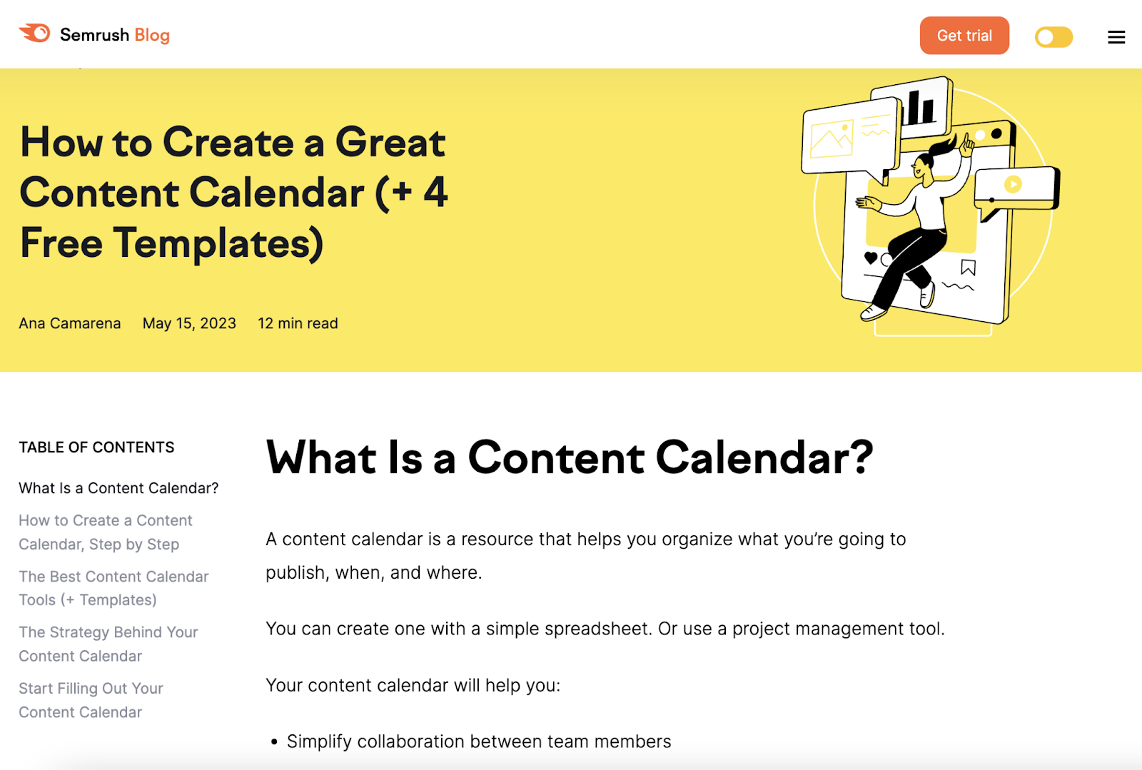
- Reflective of your content. Misleading your readers can cause them to bounce and never come back. For example, the below headline from Semrush references free templates that could be of interest to readers. The content delivers on the headline’s promise.
Try A/B testing a few versions of your headlines with different styles (fonts, sizes, and colors), word choice, and messaging.
If you’re experimenting with website content, you can use the following metrics to measure your changes’ effects:
- Page views. The total number of times a particular page on your website was visited. The stronger headline should draw more views.
- Average time on page. The average length of time visitors spend on a page. If your headlines are misleading, this figure may be low.
- Bounce rate. The percentage of people who land on a page and leave without performing a specific action. A high bounce rate could suggest that your headline is solid but your content doesn’t match.
- Dwell time. The amount of time users spend on a page from the search results before returning to the search engine results page (SERP). If dwell time is low, your headline (and metadata) work, but your content may fall short.
Google Analytics is the best place to find all these content marketing metrics and more.
Calls to Action (CTAs)
A great CTA can be the difference between someone converting (e.g., purchasing your product or subscribing to your email newsletter) and moving on to one of your competitors.

A/B testing allows you to experiment with various elements of your CTAs, including:
- Copy. Your content has made the pitch. Now, a snappy closing line should inspire visitors to act.
- Placement. Your CTA should be obvious without diverting readers’ attention too soon (i.e., before they’ve digested your main message).
- Size. Your CTA should be big enough to attract clicks (or calls) without distracting readers.
- Design. Is your CTA part of a stand-out button or just a link within your text? Both can work—the A/B testing process can show which is best for your audience.
- Font. A wildly different font can be jarring, especially if your CTA forms part of your content’s body. But if you’re using a button, consider testing a few designs.
A CTA’s aim is always to inspire an action—usually a conversion. Measure the impact of any changes you make using:
- Click-through rate (CTR). The ratio of the number of clicks on your CTA to the number of times people are exposed to it. For example, if 100 people visit a landing page and five click the CTA button, then the CTR is 5%.
- Conversion rate. The percentage of visitors who complete a desired action. The action could be requesting a quote, joining your mailing list, or buying a product.
You’ll often see and use CTAs at the bottom of product pages and other landing pages. You can also A/B testCTAs on search engine ads, social media ads, and marketing emails.
Subject Lines
The subject line is your email’s headline. It’s what determines whether people open your message.
Even subtle tweaks can impact your email campaign’s open rates. Avoid settling on the first line you come up with. Instead, write down 10 or more ideas. Then A/B test the front-runners by sending each out to small sample groups.
A solid subject line entices and intrigues email users. But it has to stand out without misleading readers. So focus on your email’s main benefit and talk to your audience in a language and tone they’ll understand.
Here are some email subject line best practices:
- Include numbers (where relevant). They can increase open rates in many cases.
- Ask questions. This can pique email users’ curiosity, enticing them to open.
- Avoid tired cliches. Lines like “open for a surprise,” “there’s a great deal inside,” and “try our product for free” are overused.
In the email below, Pitch’s snappy question (“Ready to get started?”) encourages inquisitive recipients to read on.
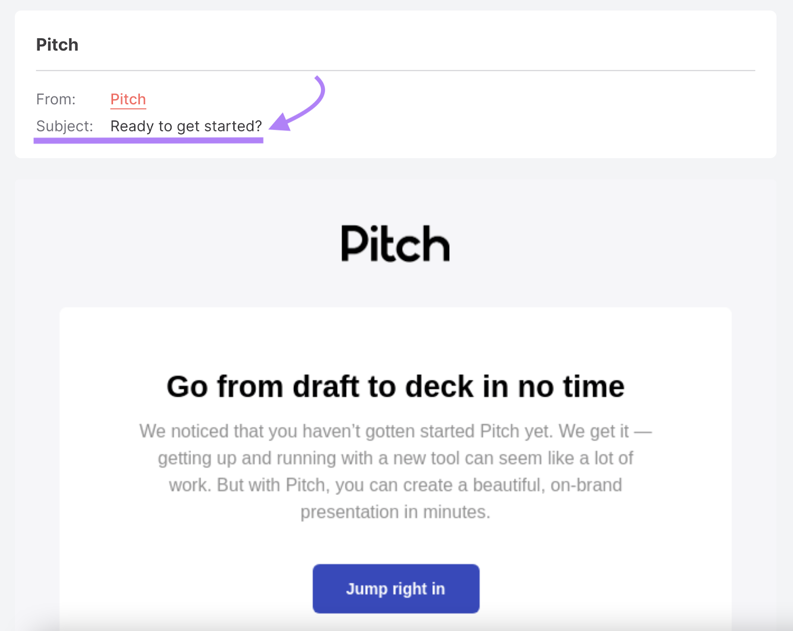
Why does this matter? In almost every case, your subject line’s sole purpose is to get opens. So, when comparing two or more versions of a subject line in an A/B test, you can simply pick the one with the highest open rate.
Layout and Navigation
The best way to smooth conversion pathways for your users? Putting the most appealing and helpful content right in front of them.
Two pages could contain the exact same content. But if one looks cluttered or emphasizes the least valuable information, it will engage fewer visitors.
For example, Chilly’s homepage opens with a short, snappy video clip to create intrigue.
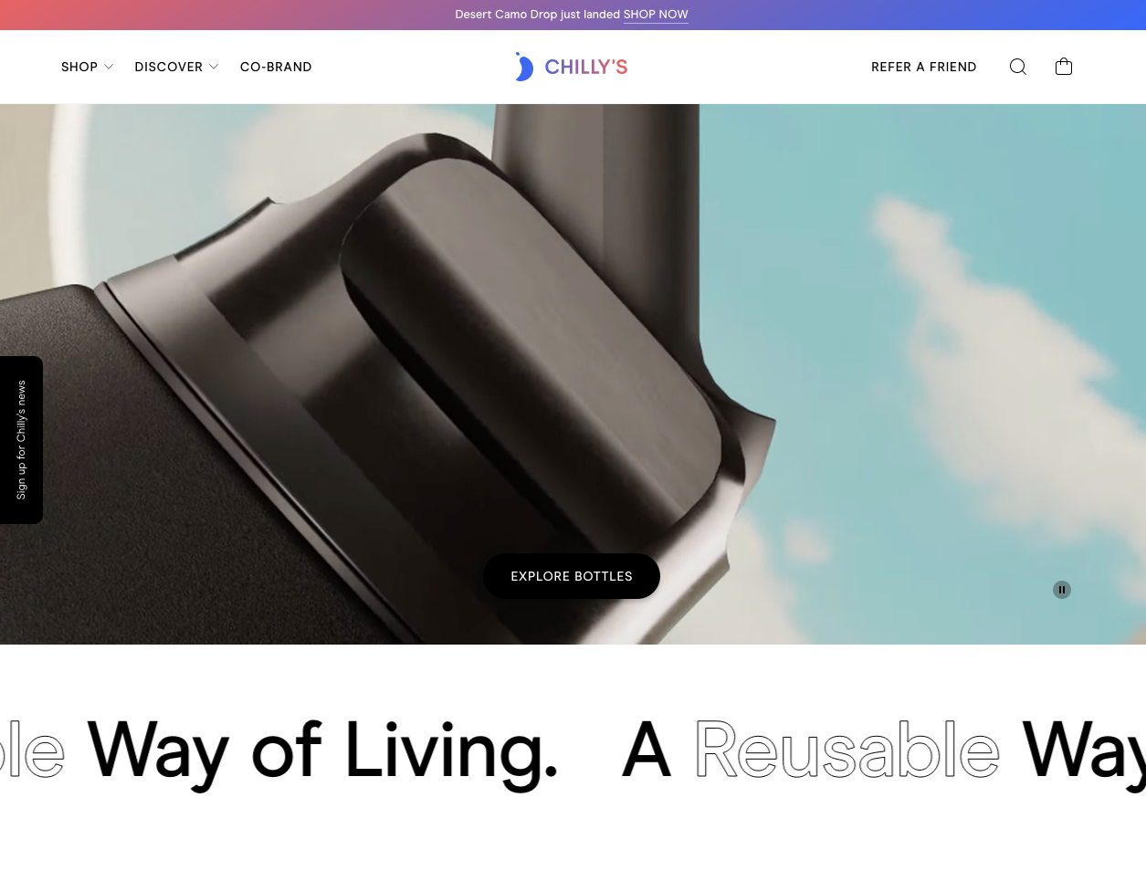
This product video drives clicks to the “EXPLORE BOTTLES” button in the middle of the page. In turn, clicking the button takes users to a streamlined, easily navigable product page.
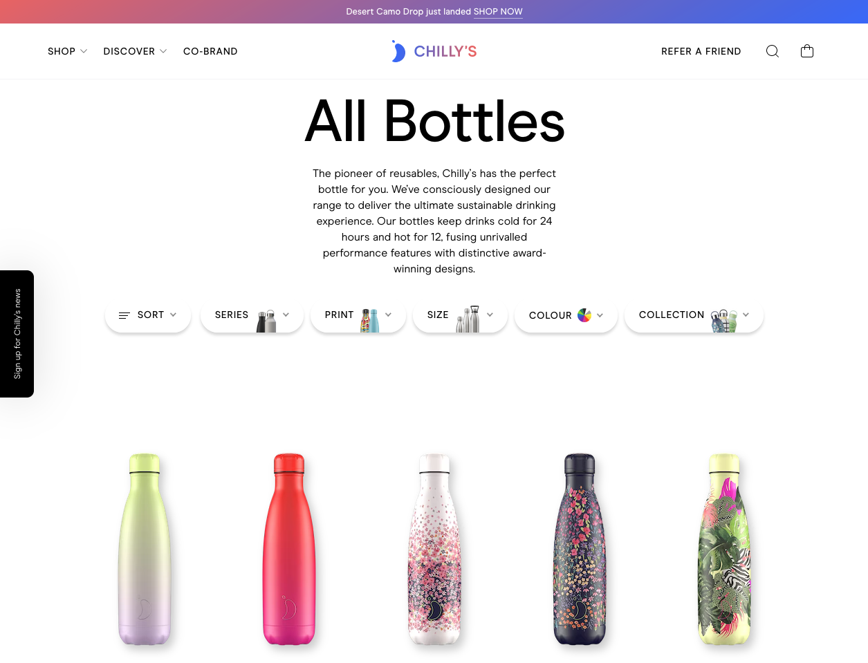
The straightforward heading (“All Bottles”) on this page is the reader’s clue that they’re viewing the entire product line of bottles.
From there, readers can use filtering options to personalize the results before exploring further.
Had Chilly’s placed its homepage clip further down or not used it, visitors might have left before seeing the link or ended up elsewhere on the site.
Confusing and unhelpful page layouts tend to result in:
- High bounce rates
- Low average time on page
- Low conversion rates
- Low dwell times
If you have one on hand, a designer will know the general best practices for laying out visual assets.
Otherwise, consider what users will value most so you know what to prioritize. Then put the most enticing and helpful content within easy reach so visitors can always find what they need.
Social Proof
Social proof in marketing is anything from a third party that supports a product or brand’s value.
Examples of social proof include:
- Testimonials
- Reviews
- Endorsements
- Certifications
- Awards
The aim of highlighting these is to reassure buyers in an objective way. It works because people tend to trust other people more than they trust brands.
A Matter survey found that more consumers trusted recommendations from friends, family, and influencers (61%) than trust branded social content (38%).
And in a separate BrightLocal survey, almost half (46%) of consumers said they trust reviews as much as personal recommendations.
Here’s an example of social proof in action from U.K. candle maker Solent Wick:

The range of name formats, tone of voice, and writing styles implies these are genuine reviews. Each reaffirms to visitors that purchasing is a good decision.
Currently, Solent Wick’s customer reviews are near the bottom of its homepage. If they wanted to test optimizations to the page, the company’s marketing or design team could A/B test publishing the testimonials higher up (i.e., above the fold) or on individual product pages.
They could then measure success by comparing conversion rates or time on page.
Collect social proof at every opportunity. You can use different types with different content. For example, testimonials work well on product pages, while awards and certifications reassure homepage visitors they’re in the right place.
How to Run a Basic A/B Test in 7 Steps
A/B tests come in many different forms. And each follows a distinct process.
Rather than try to cover all of them in one go, we created a step-by-step guide to help you run a standardA/B test on two pieces of content.
Note: If you’re itching for an even deeper dive into SEO A/B testing, check out our guide to SEOsplit testing. And check out the no-code SEO split testing capabilities of SplitSignal.
1. Look for Improvement Opportunities
Build a picture of your website’s current performance using data from tools such as:
- Semrush
- Google Analytics
- Google Search Console
For example, you can use Semrush’s ImpactHero tool to highlight both underperforming and high-performing content.
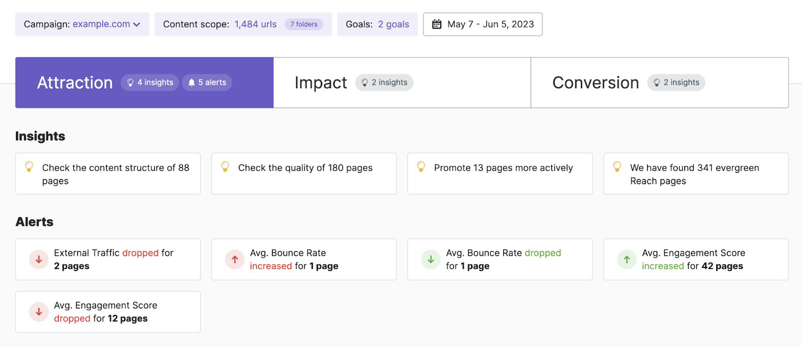
The ImpactHero tool can help you decide what content needs improvement (i.e., what to experiment with using the A/B testing methodology) and which improvements might work to help you achieve your content goals.
2. Identify a Variable
As you explore data in ImpactHero and other tools, you’ll find there are many variables you want to test. Our advice: Focus on one at a time. This makes it easier to identify the reasons for any changes in performance.
For example: Say all your top-performing blogs have headlines containing nine words or fewer. You might decide to run A/B tests on a set of older, lower-performing pieces by shortening the titles and tracking page views to measure the impact.
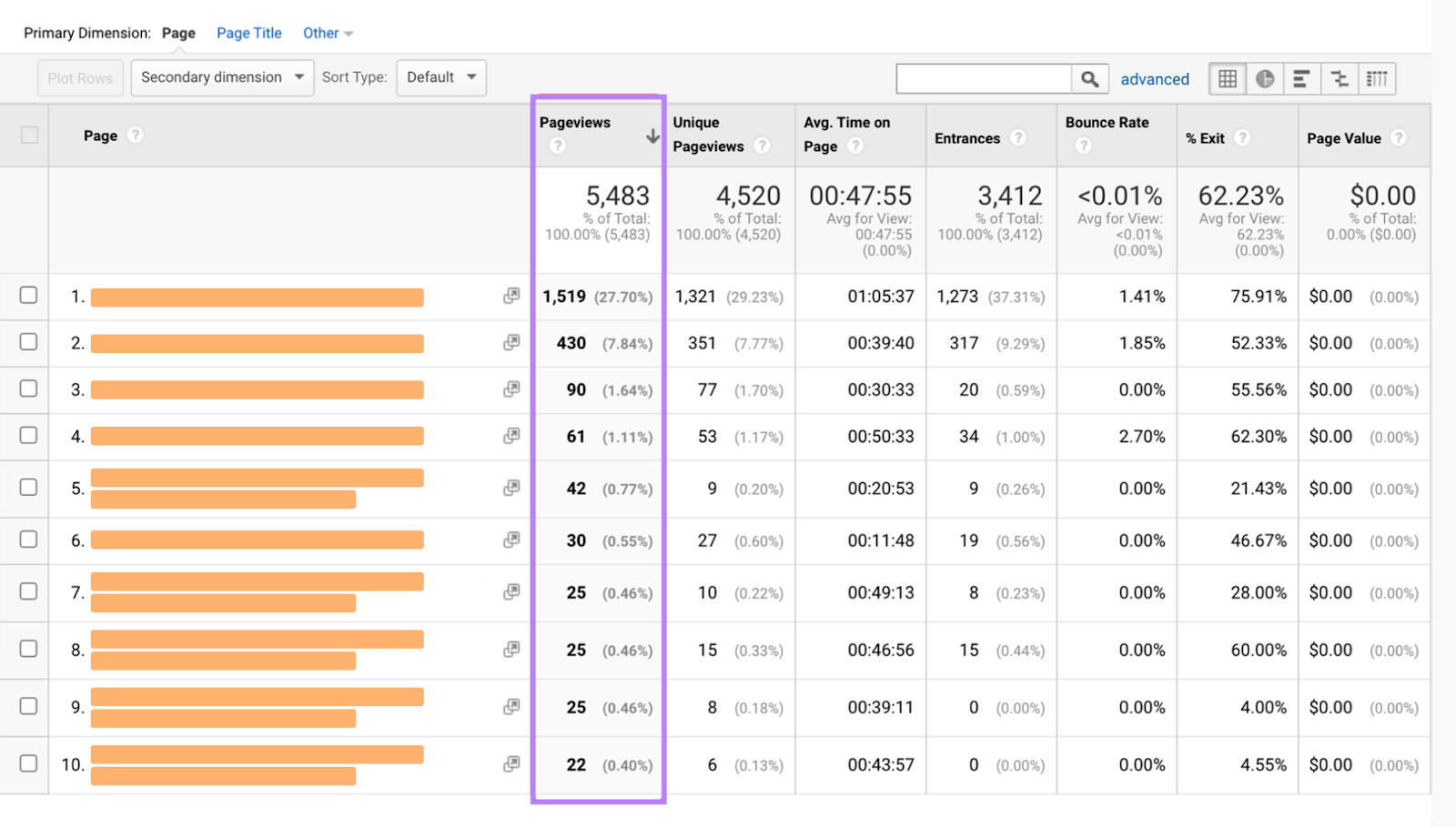
Here, your variable is headline length.
Alternatively, to improve your CTRs for social media ads, you might experiment with different images to see what grabs the most attention. Here, the image is the variable.
3. Settle on a Test Hypothesis
Based on your research, nail down exactly what you’re trying to discover.
Remember: A/B tests are about proving and disproving ideas to enhance performance with data.
In our running example, the hypothesis could be as simple as “shorter headlines are more engaging than longer headlines.”
Consider how proving or disproving that hypothesis will benefit your business. That’s how you’ll know if the tests you’re about to conduct are worthwhile.
For example: “By proving that shorter headlines engage our audience more effectively, we can refine our editorial guidelines to improve our content marketing ROI.”
4. Set Your Goals and Test Period (or Sample Size)
You’ll measure several metrics during your test. But one or two are likely to matter more than others.
Choose a primary metric before you start. This will help you know exactly how to gauge success. You can review our list of test elements for ideas of which metrics to use on each.
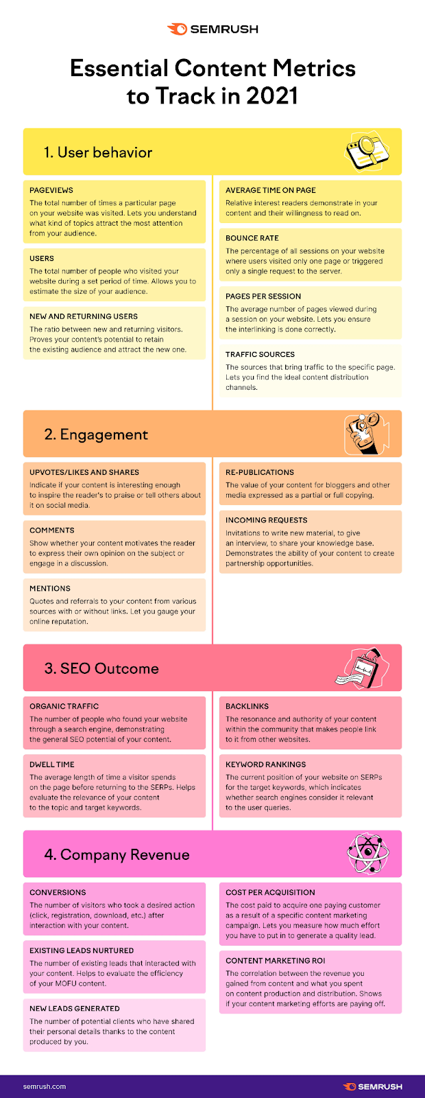
If you’re testing two new features alongside each other, have a metric in mind and take measurements from each audience segment at the end of your test period. That way, you can compare performance directly.
When testing simultaneously, choose a test period to suit your objectives.
Longer tests generally generate more accurate data. But the sooner you have results, the sooner you can act on them—so balance is important.
One month is often a reasonable starting point.
If you’re testing changes to existing content, you’ll need to benchmark existing performance (how it does without any changes) to have a baseline to measure the new version against.
For some test elements, you’ll measure performance based on time.
For example, you could check a blog post’s page views over the previous 30 days before adapting it. And check it again 30 days later.
For others, tracking performance based on sample size is easier.
For instance, if you’re testing email subject lines, you might compare open rates (your primary metric) for the previous 1,000 emails with rates for the next 1,000 emails. That way, the impact of your changes should be clear and accurate.
5. Create Variations Based on Your Hypothesis
Set up your “control” and “challenger” versions.
The unaltered version of whatever you test is the control version.
This could be:
- An existing piece of content, like a year-old homepage
- Something new that relies on an existing process, like a landing pageCTA that follows your usual formula.
The challenger is the altered version that will compete with your control. You’ll need to create this. If you test a minor variable (like heading length), copy the existing content and tweak the details as necessary.
For example, if you want to know whether adding contact information to a product page will help you generate more leads, set up (or find) a page without contact details. Then create a new version with contact details for comparison.
6. Run Your Test
To see how your A/B test impacts search, set up a 302 redirect to your challenger page.
For search, testing a new page directly against an old page won’t give you accurate results. It takes time for search engines to index pages sometimes, and it can take even longer for them to settle into the SERPs. That’s why a temporary redirect to the challenger page is an important step here.
At the end of your test period (e.g., one month), or when you have enough data, compare the challenger page’s results to those of the control version to see which one performed better.
7. Analyze the Results and Plot Your Next Steps
What does your data tell you?
If your variation outperformed your original content, your next steps are simple.
Apply what you’ve learned to other pages on your site, monitoring performance (and, more importantly, changes in performance) as you go.
If your experiment disproves your hypothesis, that’s fine, too. After all—if the data supports every hypothesis you make, you might not be learning anything.
Every null hypothesis is an opportunity to learn and ideate more opportunities for testing.
3 Key Challenges to Unpacking A/B Test Results
Find yourself doubting the outcome of your test? Consider whether one of these common pitfalls might be skewing your data.
Insufficient Sample Sizes
Imagine you tweak the CTA in a Facebook ad. In the first week, all 10 people who click through go on to convert.
Time to rejoice? Not quite. This false positive doesn’t mean you’ve mastered copywriting for social media ads. What’s more likely is your sample size is too small, and you need to run the test for longer.
Keep going. Over time, the data should even out to give you a more accurate idea of performance.
The Novelty Effect
It’s likely some web users visit your site more frequently than others. It could be people who follow your blog posts, regular customers, or competitors.
If one of those visitors suddenly sees something different, it’s likely to grab their attention. Even if it’s as minor as a new button color.
Say you’re testing a new image on your homepage. It might lead a regular visitor to hover on the page longer, but not necessarily because it’s more engaging or impactful—simply because it’s different.
Overcome the novelty effect by focusing your tests on first-time visitors where possible. Why? These visitors are seeing your content with fresh eyes. So they’re likely to behave more naturally—generating more accurate data for you.
External Factors
Factors outside your control can impact your A/B test results.
Some, like holidays, you can work around.
For example, if you run an ecommerce store and want to test email subject lines, avoid comparing performance data from December with January’s.
Consumers may spend more online in the buildup to major holidays. So marketing engagement is likely to be higher.
But other factors, like platform outages, are impossible to predict.
If Instagram goes down while you’re testing ad copy on the platform, engagement will inevitably drop. Any data you collect during that outage is inaccurate and shouldn’t contribute to your conclusion.

One possible solution could be to run your test for longer to collect more accurate data. That should help you generate a more balanced, realistic picture.
Choose Your A/B Test Subjects Carefully
You can’t A/B test every aspect of your marketing strategy or website—nor should you try.
Instead, experiment with the elements most likely to lift the metrics you care about most.
Solid and simple starting points for new A/B testers include CTAs, headlines, and email subject lines.
SplitSignal can help you with all of this. You can set up simple A/B tests without the need for complex code or developers. And, before you make any permanent changes to your site, you can test any changes you want to make to ensure they won’t harm your existing traffic.
Once you’ve been through the basic steps a few times and learned from the process, you can start exploring more complex methods for even bigger results, like SEO split testing and multivariate testing.
Source link : Semrush.com
