What Is a Call to Action (CTA)?
A call to action (CTA) is a prompt that encourages your audience to take a specific action. Like subscribing to a newsletter or making a purchase.
CTAs appear in websites, emails, ads, blog posts, social media, and pretty much everywhere in this digital world.
For example, we use CTAs across our website. Here’s one on our homepage that prompts users to sign up for a free account.

This CTA is clear and highlights the tangible benefit users get after completing the action.
Using effective calls to action is crucial for driving user engagement and conversions.
Without a clear and compelling CTA, visitors may leave your site without taking any action, resulting in missed business opportunities.
Put simply, your business needs CTAs.
Types of CTAs
Buttons
One of the most common CTA formats is a button. These are usually rectangular boxes with text inside.
Example:
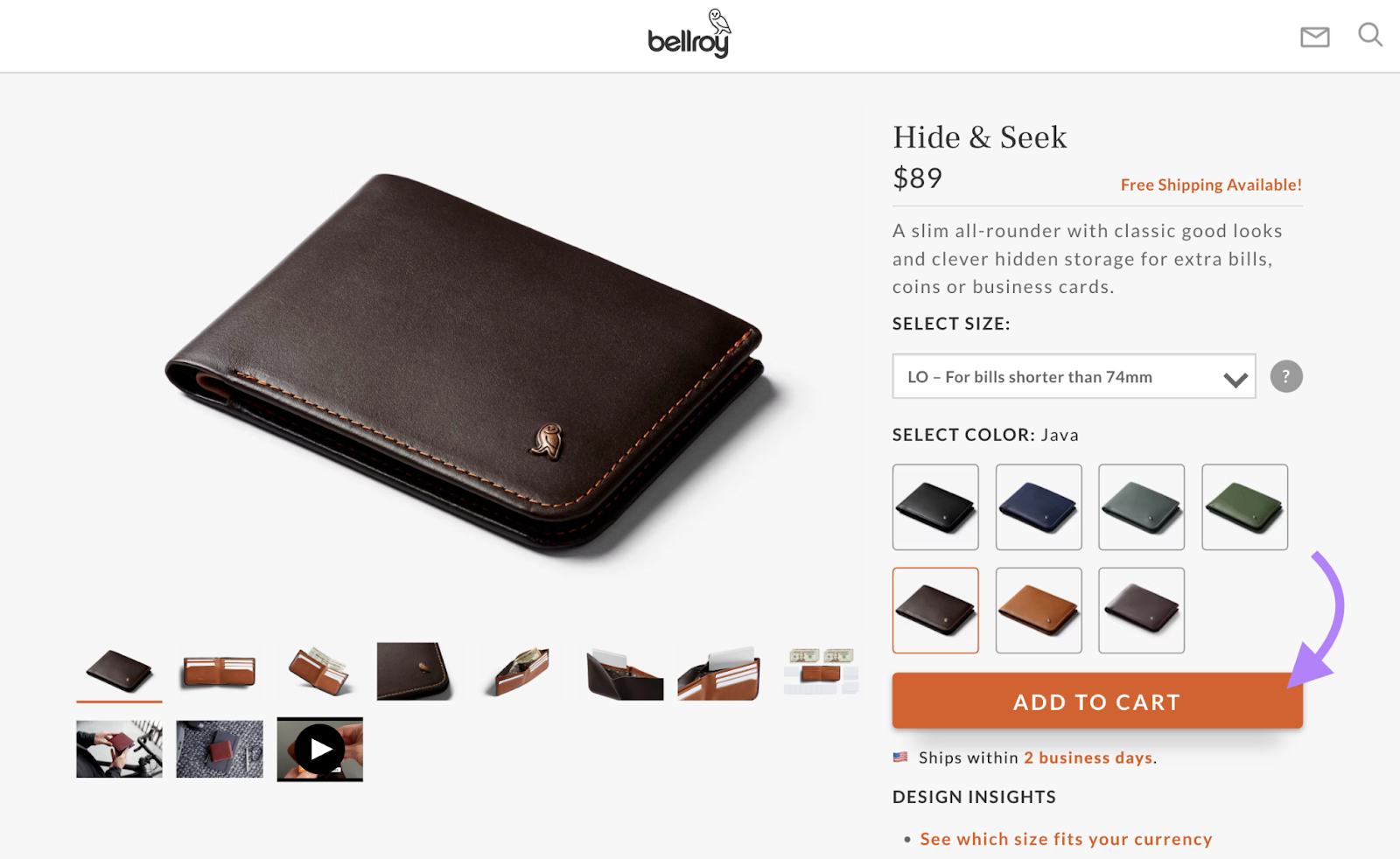
Buttons are typically eye-catching and appear prominently on a page or within content. Their bold colors, effects like drop shadows, and actionable text like “Add to Cart” make them nearly impossible to miss.
Text-Based
Another simple but effective format is the text-based CTA.
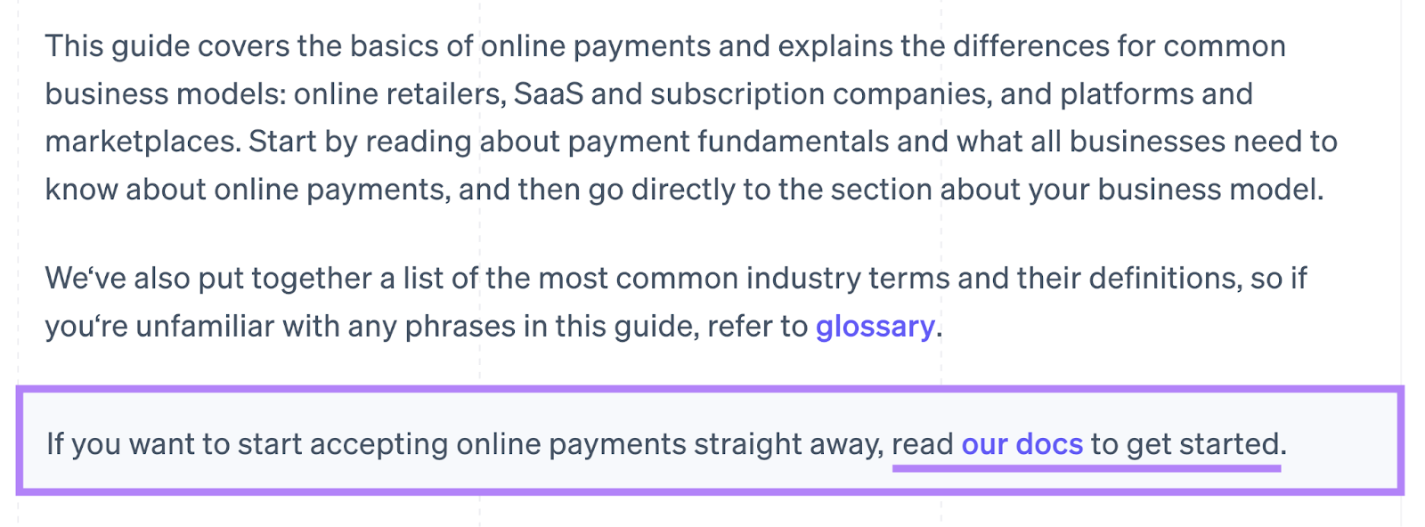
These are short lines of text containing a hyperlink that prompt an action. Examples include “Click here to learn more” or “Download our free guide.”
Text CTAs can be embedded naturally into sentences and within the body content of a page. When well-written, they can blend in while driving clicks effectively.
Example:
Banners
Banner CTAs are large graphical banners that call out a specific action or offer.
Commonly seen at the top, bottom, on the sidebar, or within the content of webpages.
Example:

Banners often have a compelling headline, accompanying copy, eye-catching visuals, and a prominent call-to-action button.
When to Use Calls to Action
Conversion-Focused Pages
Your conversion-focused pages are those designed to convert visitors into leads or customers.
Examples include your homepage, product/service pages, and pricing page. All of them should have CTAs.
When adding CTAs to these pages, consider the following tips:
- Place them strategically. Put CTAs in obvious locations where the eye is naturally drawn, such as above the fold (the part of a webpage shown before scrolling), after benefit listings, or near relevant product images.
- Make them visually prominent. Use contrasting colors, white space, and design elements like buttons to ensure the CTA stands out.
- Use actionable language. Start with a verb like “Get,” “Add,” or “Subscribe” to clarify the desired action.
- Highlight the value. Convey the benefit or outcome the visitor will get by taking the action, such as “Get a Free Trial.”
- Use multiple CTAs. Don’t rely on just one CTA per page. Include some secondary CTAs throughout the page.
- Make it mobile-friendly. For mobile users, ensure CTAs have ample spacing and are clearly visible.
Content Marketing
Content marketing is the process of creating and distributing content to promote your business. Blog posts are one of the most common forms of content marketing.
Incorporate CTAs in your blog posts to drive users toward a desired action. Like subscribing to your blog newsletter, downloading a related resource, or sharing the post on social media.
You could even include a CTA about a product that is related to the topic of the blog post.
Where to place these CTAs?
Within the content itself.
For example, this article from Grammarly has an in-text CTA that encourages users to try its product.
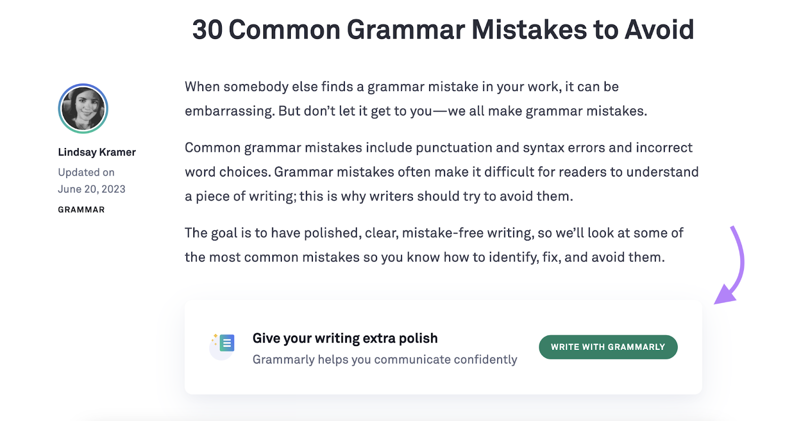
You could add a CTA toward the end of the article or in the right-hand corner. Which is usually empty.
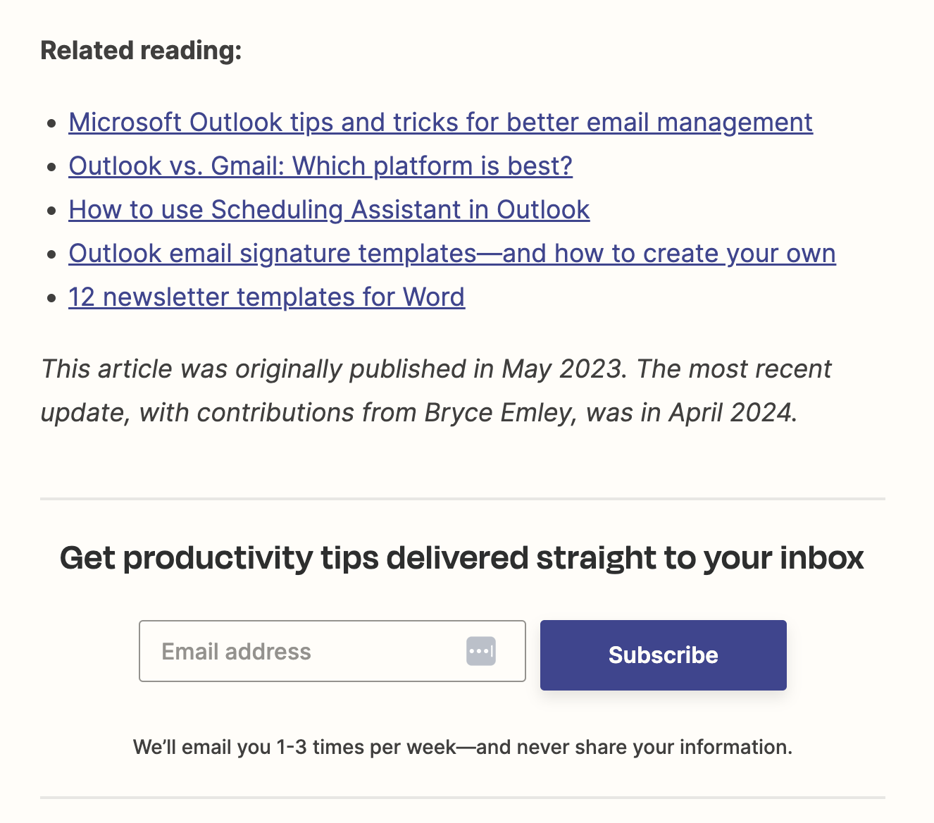
Consider how Zapier prompts users to subscribe to its newsletter. And this same CTA appears at the end of each article on its blog.
Email Campaigns
Broadly, there are two types of emails you could send to your audience regularly. And provide natural opportunities for CTAs:
- Weekly newsletter
- Promotional emails
For weekly newsletters, a simple “Read More” CTA can drive clicks back to your blog or website content.
For promotional emails, use CTAs to encourage users to take advantage of special offers or discounts.
Consider Grammarly’s promotional email that uses a clear and compelling CTA to encourage users to subscribe to its paid plan.
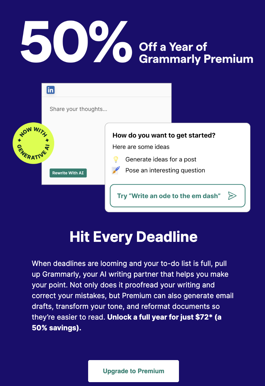
This CTA works well because it highlights the main offer (50% off) using prominent design elements.
Social Media Marketing
Social media marketing involves promoting products or services using social media platforms. Like Facebook, Instagram, and Linkedin.
There are two key ways to leverage social media:
- Posting regular content on these platforms
- Running paid ads
And CTAs play a crucial role in both.
In organic posts, adding a simple “Like if you agree” or “Share with your friends” CTA can boost engagement.
And if more people like, comment, share your post, it increases the reach and visibility of your content.
In paid ads, an ad for a product might include a “Shop Now” CTA. An ad for a service might use a “Learn More” or “Book Now” CTA.
These CTAs play a crucial role in driving conversions.
For example, see PillowtalkDerm’s Facebook ad below, which uses a “Shop now” CTA to encourage people to buy their skincare cream.
This ad features a stunning image of the product accompanied by text highlighting key ingredients and their benefits.

Digital Ads
CTAs are not confined to social media ads. They’re also used in the entire digital ads ecosystem.
Such as ads on search engine results pages (SERPs)—called search ads. And digital ads you see on other websites.
Use clear and effective CTAs in all ad types to drive clicks and conversions.
Like this search ad example:

The CTA is clear and matches the likely search intent of users looking for a stock investing app (i.e., to download an app and start investing).
And here’s an example of a digital ad with a strong CTA:

The ad copy captures interest by using clear copy and bold design elements. So users are more likely to click the CTA to learn more about the advertised offer.
How to Write a Call to Action
Now that you know when to use CTAs, let’s review some best practices to follow when writing CTAs.
Understand Your Target Audience
Understanding your target audience is crucial for creating effective CTAs.
Your target audience is people who are likely to be interested in your products or services.
Understanding their age, location, and interests can help you write copy and CTAs that resonate with their wants and needs.
Basically, the more you know about your audience, the better you can tailor your CTA to them.
To learn about your audience, start with Semrush’s One2Target tool.
Open the tool, enter your website URL, and click “Analyze.”
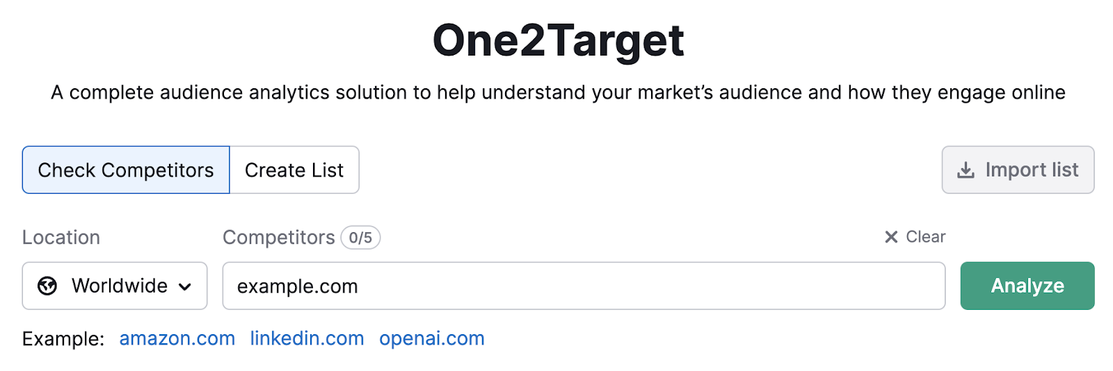
You’ll see a lot of information here. But we’re specifically after “Demographics” and “Socioeconomics” data.
The “Demographics” tab will show your audience’s age, gender, and location information.

The “Socioeconomics” tab will show you their household size, income level, educational background, and employment status.

Using these insights, you can craft CTAs that connect with your specific audience.
For example, if your audience is primarily young adults in their 20s, you might use a more casual and energetic tone in your CTA. Something like “Get Started Now!” or “Join the Fun!”
If your audience is older business executives, you might opt for a more formal and direct CTA, such as “Schedule a Consultation” or “Download the Report.”
Similarly, if your audience is primarily high-income individuals, your CTA could highlight premium or exclusive features of your product or service. For instance, “Experience Luxury Now” or “Access Exclusive Features.”
Remember, the key is to make your CTA resonate with your target audience. The more relevant and appealing it is to them, the more likely they are to take action.
Analyze Your Competitors’ CTAs
Look at what your competitors are doing.
Visit their website and see what CTA language they use. And how they position their offers.
Use this information to create better CTAs for your business.
For example, if your competitors often use urgency phrases like “Secure Your Spot” or “Get It Before It’s Gone,” those types of CTAs are likely to perform well with your shared audience. You could test similar urgency messaging.
Or if they tend to use direct CTAs like “Buy Now” versus something softer like “Learn More,” consider following suit.
In addition to website CTAs, analyze their search ad CTAs.
Semrush’s Advertising Research tool can help. Open the tool, enter your competitor’s domain name, and click “Search.”
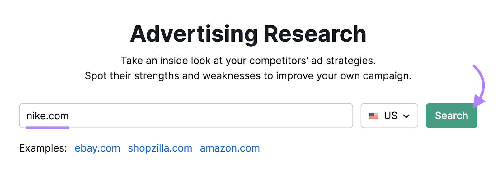
Then, go to the “Ads Copies” tab to see their ads.
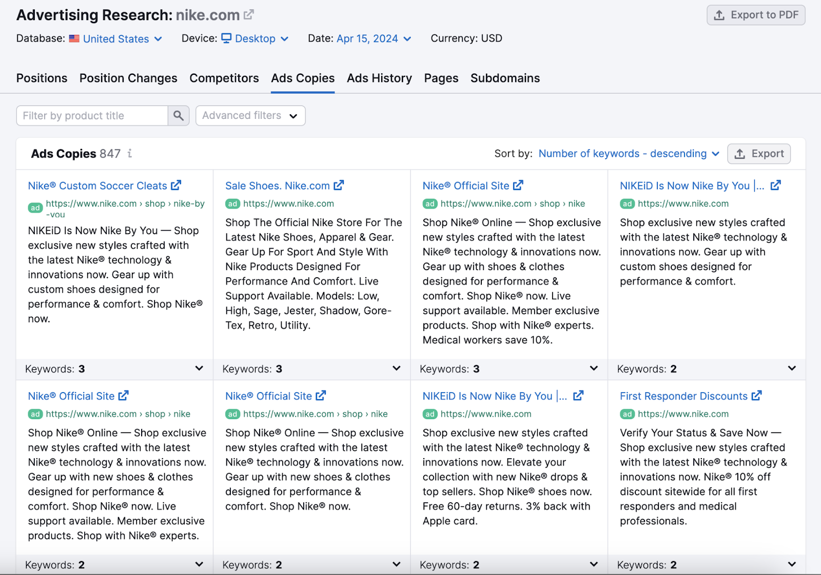
Review the list and take note of the language and CTAs used. Are certain benefits emphasized?
For instance, if your competitors frequently use phrases like “Get Free Trial” or “Get Free Shipping,” consider implementing similar phrases in your CTAs.
Use Action Verbs
When writing CTAs, start with an action verb. Like “Download,” “Subscribe,” “Buy,” “Register,” “Start,” “Get,” etc.
To ensure your CTA is clear, direct, and hard to misinterpret.
Like this:
- Get Your Free Quote
- Subscribe to Our Newsletter
The action verbs “Get” and “Subscribe” immediately convey what the visitor will accomplish by clicking. This removes any ambiguity.
You can also pair verbs with persuasive adjectives:
- Download Our Ultimate Guide
- Join Our Exclusive Community
- Snag This Limited-Time Discount
The use of persuasive adjectives adds a layer of excitement and exclusivity. Which can motivate your audience to take the desired action.
Appeal to Emotion
People are often driven by their emotions. Where appropriate, tap into this.
Consider how clicking your CTA will make the user feel.
Will it excite them? Provide a sense of belonging? Satisfy their aspirations? Relieve a key pain point?
For example, “Become an Insider” speaks to desires around feeling important and part of an exclusive inner circle. “Find Your Calm” targets people seeking more peace and tranquility.
Opt for language that evokes specific emotions tied to your offering.
Create a Sense of Urgency
Phrases like “Act now to get 50% off!” or “Grab This Limited Offer!” encourage users to take action immediately. By highlighting time-bound offers.
Here are some more examples of urgency-inducing CTAs:
- “Get Your Early Bird Discount!”
- “Secure Your Spot!”
- “Seize This Deal!”
- “Hurry and Buy!”
- “Unlock This Discount!”
- “Claim This Limited-Time Offer!”
However, be careful not to come across as too pushy, gimmicky, or deceptive with false urgency. Make sure any scarcity claims are legitimate. Overusing urgency tactics can seem spammy and undermine your efforts.
Employ Clear & Concise Language
Your CTA should be short, clear, and to the point. Avoid using jargon or complex language.
So users can better understand and act on your message.
The simpler and more straightforward your CTA, the better.
Refine your CTA to focus on the essential message and eliminate any unnecessary words.
For instance, change “Submit your information to receive our brochure” to “Get the Brochure.”
Here are some more examples of clear, concise CTAs:
- “Download Guide” rather than “Access our comprehensive digital marketing guide”
- “Book a Demo” instead of “Schedule a free demonstration of our platform’s capabilities”
- “Start Your Free Trial” beats “Begin experiencing our tool with a commitment-free trial period”
Make It Stand Out
Pay special attention to the placement and positioning of your CTAs.
Put them in obvious spots where the eye path naturally falls. Like above the fold, after compelling benefit statements, or next to relevant product images or demos. So they capture the attention of users.
When designing CTAs, use contrasting colors that make the CTA button or text stand out from the surrounding content.
Also, make sure there is enough whitespace around your CTA. This helps to draw the eye toward it.
Call to Action Examples
These examples of effective calls to action will show you how successful brands implement CTAs on their website.
Webflow
Webflow is a no-code website building platform. On its homepage, it uses the clear and actionable CTA “Start Building.”

This CTA cuts straight to the desired action: getting new users to start using Webflow to build a website. The verb “Start” creates a sense of momentum while “Building” directly states what the user will achieve.
Dollar Shave Club
Dollar Shave Club is a subscription service for razors and grooming products. On its website, it uses the CTA “Join The Club.”
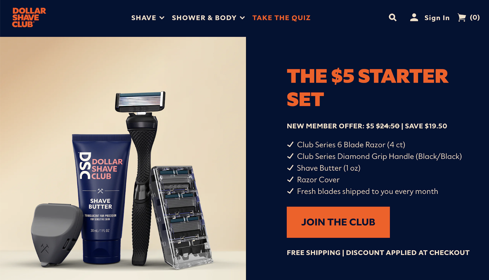
This CTA taps into people’s desire for belonging and being part of a special community. The verb “Join” sparks those aspirational feelings of insider status. Adding “the Club” elevates it from just a transactional purchase to joining a lifestyle brand.
Wise
Wise (formerly TransferWise) is a money transfer service. It uses CTAs like “Send Money Now” and “Open an Account” on its homepage.
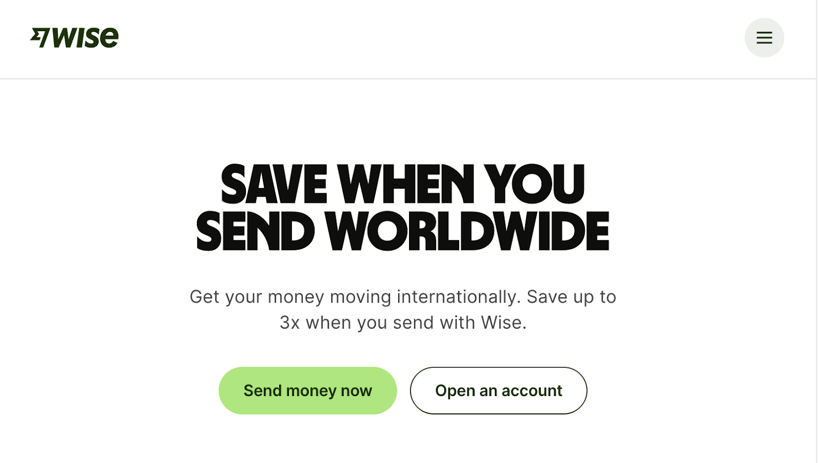
The first CTA is a clear, action-oriented command that encourages users to engage with its service immediately.
The second CTA invites users to become a customer by creating an account. Both CTAs are pretty straightforward and leave no room for misinterpretation.
Start Creating CTAs
You now have a better understanding of how to use CTAs on your website.
So what are you waiting for? Start creating compelling CTAs.
Semrush’s One2Target and Advertising Research tools will come in handy when writing CTAs.
One2Target provides valuable audience insights to shape your messaging. Advertising Research lets you analyze how competitors position their offers and CTAs.
Try them today.
Source link : Semrush.com
