Two things make a good website: content and functionality. Looks are nice to have but come last.
Focus on these two areas to create a website that people will want to visit, return to, and tell their friends about. If the site offers the type of content that people need and makes that content easy to find and interact with, people will overlook even the ugliest designs. Case in point: Hackernews.com — a site with 5M monthly users (source) that looks like this:
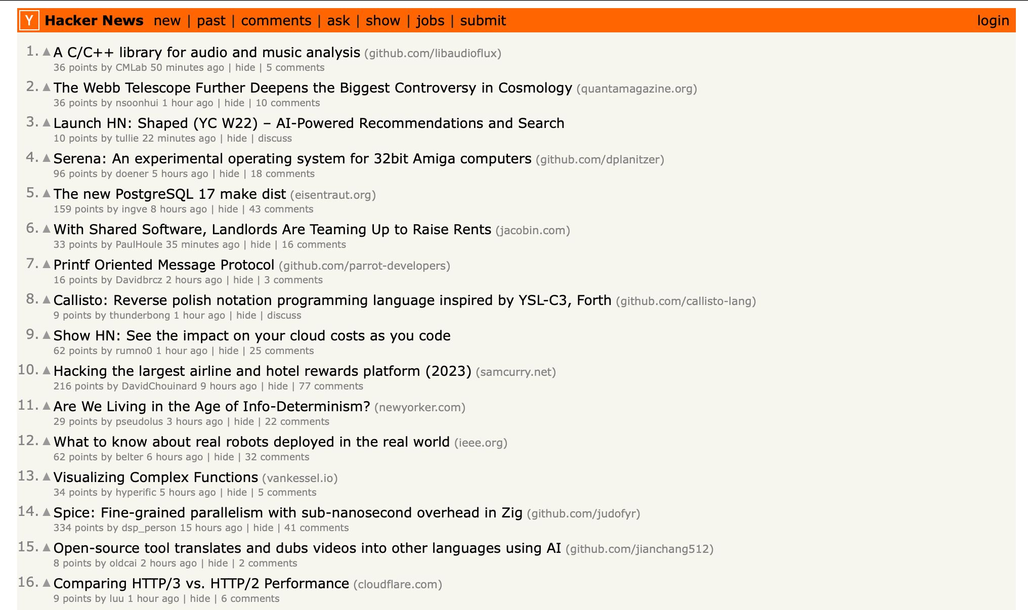
This article covers the essentials of building a successful website, focusing on creating valuable content and ensuring strong functionality (checklist included). You’ll also learn how to avoid common pitfalls and see which tools can help you get started.
Website content includes all the information and media provided to visitors, such as text, images, videos, products, and their descriptions.
No matter how good the design is, poor content will drive visitors away. Conversely, high-quality content can compensate for design shortcomings.
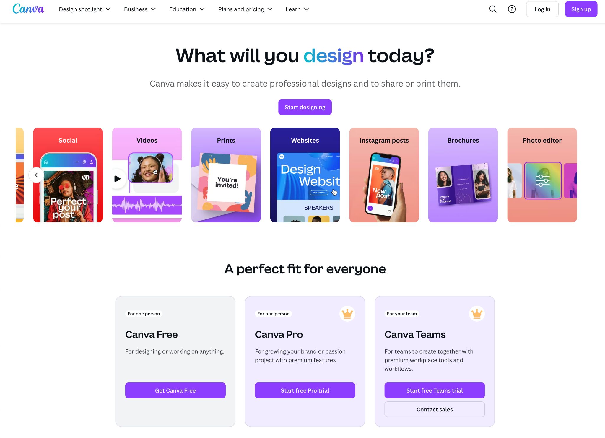
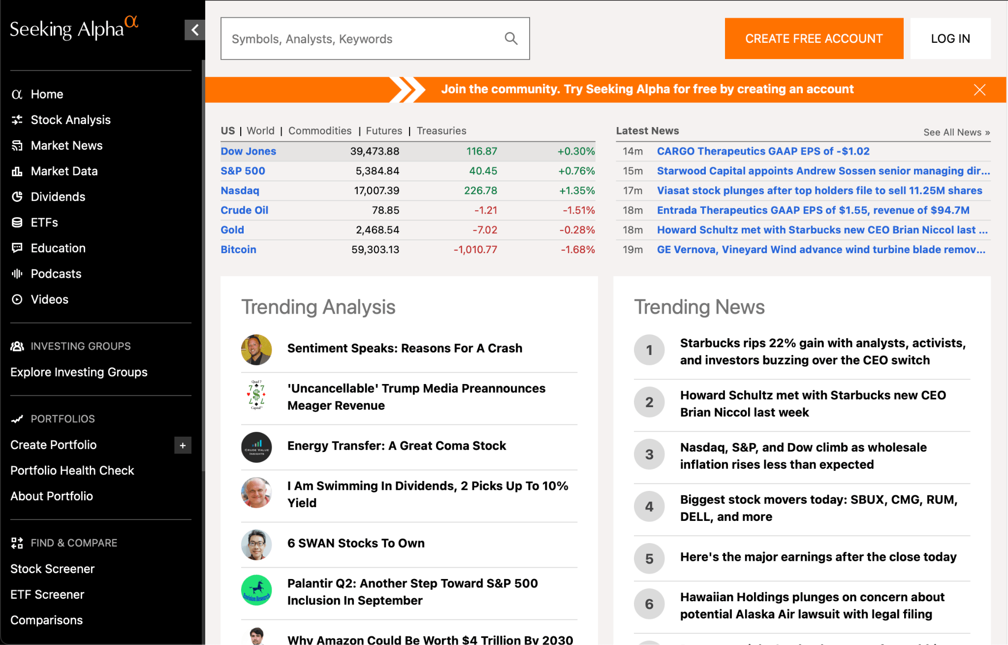
Just look at some top sites. They prioritize simple, clean layouts that highlight their content, like Canva and Seeking Alpha.
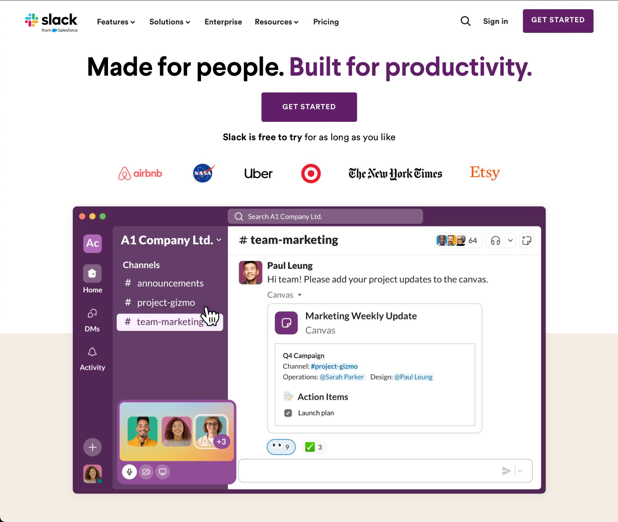
And I think you’d be surprised by how effortless Slack’s website looks — that company recently sold for $27.7B (source).
But you won’t make it with just any content — you need quality content. Quality content can mean different things to different people but in general, you can’t go wrong if you follow these simple rules:
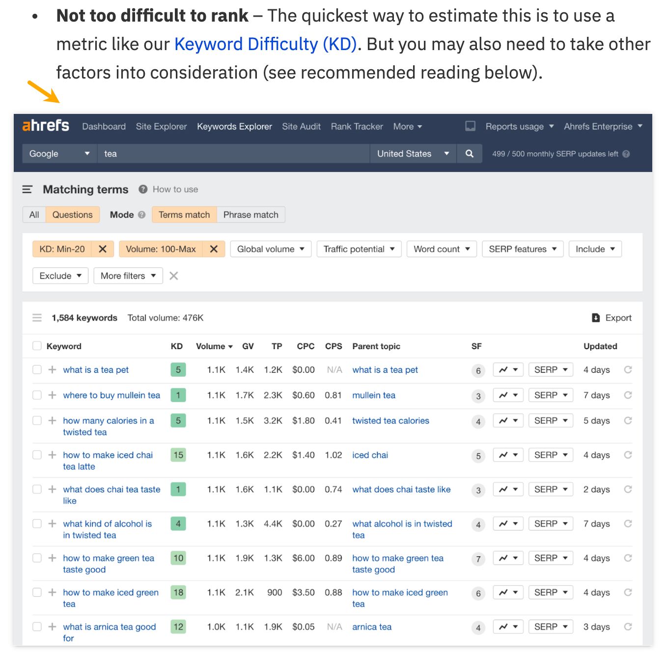
- Relevant to your audience. Content should be tailored to what your audience cares about, making it more likely they’ll find it useful and engaging. One of the ways you can find relevant topics is with keyword research.
- Uses simple language and is well-organized. Make your content easy to understand, avoiding complex jargon or technical terms unless absolutely necessary.
- Unique: The content should offer something new or present information in a fresh way. Unique content helps you stand out from the competition and has a bigger propensity to reach more people through recommendations and SEO.
- Valuable to your business. Last but not least, if your site is business-oriented, the content on your site should help you run that business. It should either show how your product/service can help solve relevant problems or help earn more using another monetization method.
I’d like to pause for a moment on that last point and emphasize that content is not just about giving people something to read or watch. It’s also a great way to introduce your product or service.
At Ahrefs, we use a product-led content strategy. We create content that solves problems using our product, targeting topics with search potential to attract consistent, relevant traffic.
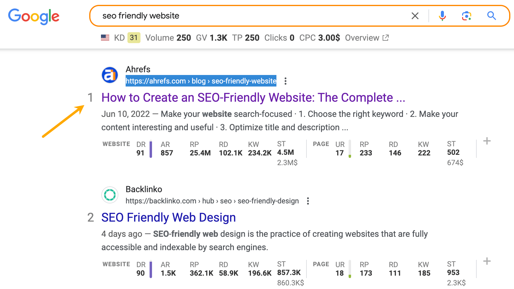
For example, our guide on “SEO friendly websites” ranks #1 in the US, bringing in users interested in practical tips and introducing them to our product.
People find us on Google and click to get the content, not to admire how the blog looks. If you want to see how product-led content works in action, watch this video:
Website functionality refers to how smoothly a site operates, ensuring users can easily navigate, interact, and achieve their goals with it. This includes quick page loading, responsive forms, and intuitive navigation.
If visitors can’t easily find what they’re looking for, or if the site is slow and frustrating to use, they won’t stick around to enjoy that content. That’s why the bounce rate on sites (it’s when a user quickly exits a site after opening it) increases so rapidly with every second of page load delay.
Functionality matters to search engines as well. The technical side of your site can impact its visibility for related keywords. When ranking pages, Google takes into account such technicalities as loading speed, mobile friendliness, and whether it uses the HTTPS protocol.
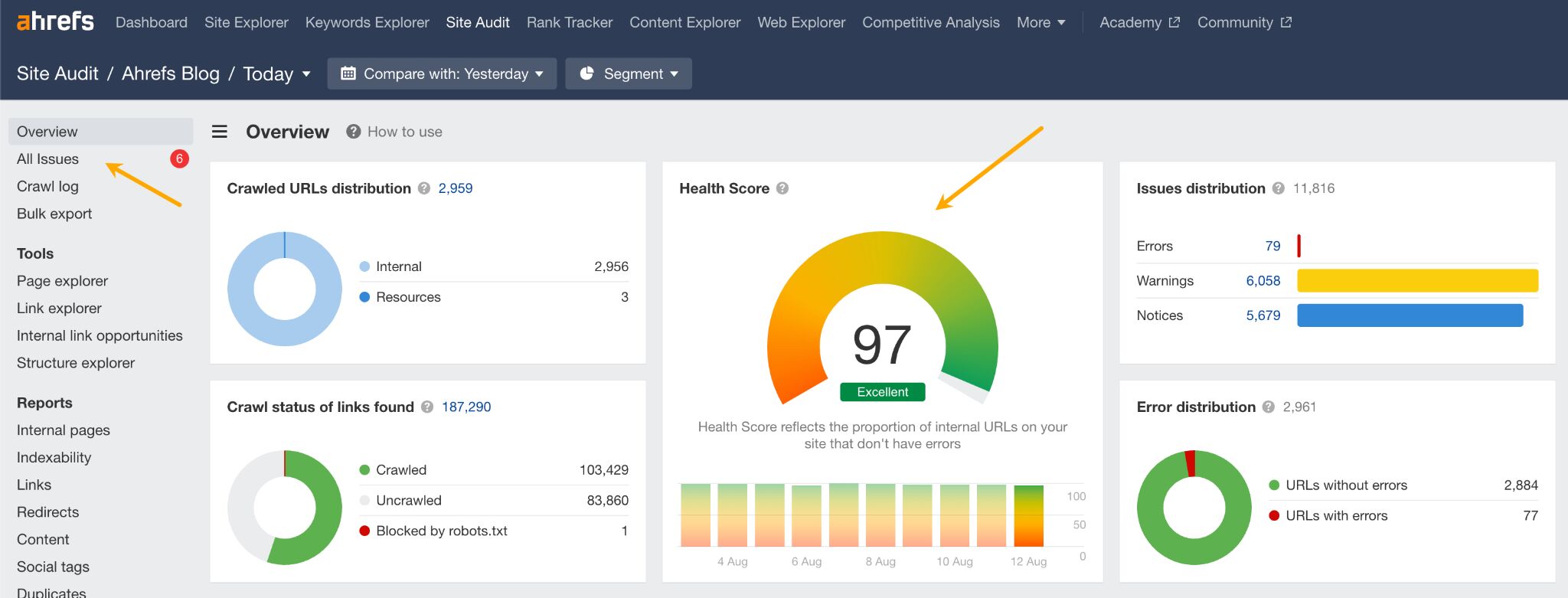
Tools like the free Ahrefs Webmaster Tools make it easy to ensure your site is technically sound. With automated regular site audits, the tool identifies issues on your site and provides advice on fixing them. You will also get an overall health score for easier progress tracking.
This straightforward checklist breaks down the core elements of a good website. You can use it yourself or show it to the person responsible for your website.
| Content strategy | Have a plan for what kind of information and articles you will post on your site. Use our guide. |
| Analytics tools | Use tools to track how visitors use your site and how your site performs in Google, so you can understand what works and what doesn’t. |
| SEO error-free | Make sure there are no technical errors that prevent search engines from finding and indexing your site. You can do it for free with Ahrefs Webmaster Tools(AWT). |
| Good Core Web Vitals (CWV) | Ensure your site loads quickly and responds well to user interactions. Test right inside AWT or Google Search Console. |
| Accessible | Design your site so that everyone, including people with disabilities, can easily use it. Use a tool like Accesibility Checker or WAVE Web Accessibility Evaluation |
| Mobile-friendly | Make sure your site works well on smartphones and tablets, not just on computers. You can test that right inside AWT (usability and performance section in the All issues report). |
| Uses HTTPS | Secure your site to protect user information. You can get a certificate for free here. |
| Uses on-page SEO best practices | Optimize each page with relevant keywords, proper headings, and meta descriptions to help search engines understand and rank your content. Use our guide. |
| Consistent layout | Use the same colors and fonts throughout your website to create a cohesive and professional look. |
| Up to **** | Keep your content current and relevant. |
| Tested on users | Show the website to a few people and ask them to use it as they normally would. Encourage them to be honest about what they find confusing or difficult. |
Building a website is an exciting process, but it’s too easy to fall into common traps. Let me share the ones I’ve seen over the years with a bit of advice on how to overcome them.
- Design by committee. Too many conflicting ideas can lead to a confusing and unfocused design. Try to limit decision-makers and focus on a clear vision. Prioritize decisions based on what’s good for the user.
- Selling too hard. Overly aggressive sales tactics can alienate potential customers. Build trust by providing helpful information rather than pushing aggressive sales tactics (AI tools can help with that).
- Unclear language. Ambiguous or complex wording can confuse users and obscure your message. Tools like the Hemingway app, Grammarly, or ChatGPT can help.
- Poor SEO practices. Fortunately, SEO good practices are easy to follow, and over-optimization easy to avoid.
- Not keeping the site up to ****. Failing to regularly update content and features can make your site appear neglected and out of touch. Even something as simple as setting a monthly reminder to review your site will do the trick.
- Not testing and iterating. Start by trying different things on your site to see what gets the best results. Pay attention to what your visitors like and respond to the most. Once you find what works well, focus on doing more of those things. This is how you go from a “good” site to a “great” site.
Just as it’s exciting, building and managing a site can get overwhelming quite fast. But the right tools can make the process smoother and more efficient. Here are some essential tools to help you get started (all can be used for free).
- Ahrefs Webmaster Tools. A free tool for analyzing your website’s performance in Google. Use Ahrefs to check for SEO issues, track keyword rankings, and see who is linking to your site.
- Wix. A website builder that allows you to create and design a website without needing to code. Choose from customizable templates and drag-and-drop elements to build your site quickly and easily. If you need a bit more control over your design and you’re not afraid of coding, you can use one of the web design frameworks like Foundation or Semantic UI.
- Google Search Console. A free tool from Google that helps you monitor and maintain your site’s presence in Google Search results.
- Google Analytics. A free tool for tracking and reporting website traffic. Set up Google Analytics to see how visitors interact with your site, which pages are most popular, where your traffic is coming from, and more. Use this data to make informed decisions about how to improve your site (Matomo is a good alternative).
- Hubspot. A platform offering tools for marketing, sales, and customer service, along with a content management system (CMS). Use HubSpot to create and manage content, capture leads, and track customer interactions.
- Microsoft Clarity. A free tool for analyzing user behavior on your website. Set up Microsoft Clarity to see heatmaps, and session recordings to understand how visitors interact with your site.
- ChatGPT. An AI language model that can assist with every website building and management task. Use ChatGPT to brainstorm content ideas, and generate text and code for your website.
Final thoughts
Don’t get me wrong. It’s not that the visual side of the website doesn’t matter at all. As the artist Max Kolomatsky demonstrates in this Instagram video, design can greatly improve the perception of a business.
The visual design of a website, while important, isn’t something to lose sleep over. Your site will achieve success more quickly and sustain it longer if you start with a good-enough design — such as a customized template — and focus on delivering real value through your content and functionality.
Visual design is also something easy to “overdo.” When trying to make a website look appealing, it’s common to add too many elements, colors, or effects, which can overwhelm visitors and slow the site down. A website is one of those things that need to be usable, and there’s hardly better advice than Dieter Rams’s “good design is as little design as possible.”
Got questions or comments? Find me on LinkedIn.
Source link : Ahrefs.com
