What if you had a hub on your website where all your visitors could discover your amazing content?
What if this hub helped your audience get solutions and answers, find relevant information, learn about your products/services, and discover new content?
You can – it’s called a resource center.
Also known as a knowledge base, resource library, or content hub, creating one for your website could help your audience find your best content – and ultimately boost things like engagement, website traffic and conversions.
Let’s talk about how.
What is a resource center?
A resource center is a hub where all your best content resides, on a page that’s laid out for a great user experience.
A resource center is typically organized and laid out in a way that helps visitors find content on particular topics or types of content.
Think of a resource center as a library – a categorized, organized collection of your best content meant for readers to browse. Here they can learn more about your niche, find solutions to their problems, get relevant information, and even discover more about your products or services.
As far as the content you’ll find inside a resource center, you’re not limited to blogs.
You can add any type of content you’ve created to your resource library, including gated and ungated content like:
Why do you need a resource center on your website?
Creating a resource center for your website has plenty of benefits – both for your audience and your brand.
- It highlights older content that may otherwise remain hidden in the bowels of your website, boosting audience discovery.
- It’s more engaging and targeted than a chronological timeline of your most recent posts.
- A library full of useful and expert content immediately signals your expertise to visitors.
- It encourages visitors to browse your content and thus stay longer on your site, increasing its “stickiness.”
- It makes your content on specific topics much easier to find. This is great for visitors, but also for people on your team who use your content in their jobs, like your sales team for sales enablement.
- Since it’s basically a library of valuable content, your resource center is extremely link-worthy and may help build your backlink profile.
- Creating topic hubs (also called pillar pages) within your resource center helps search engines better understand the relationships between pages and topics – which may boost your SEO.
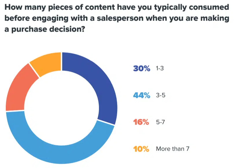
- Overwhelmingly, buyers do extensive research before talking to a salesperson or reaching the decision stage – 70% read at least 3-5 pieces of content before talking to sales. A curated resource center makes this process easier for them.
How to create an organized and helpful resource center
What do you need to create a brand resource center or content library? Start with understanding your audience’s needs, then gather your best content.
1. Understand the needs of your audience
Who will be coming to your resource center, and what will they be looking for?
These are questions you must understand before building yours.
Ultimately, it all comes down to knowing your audience and their information needs in your niche.
If you’ve been creating content for a while that gets traction, you should have a pretty good grasp on this already. However, it’s a smart idea to revisit what you know and make sure it’s still accurate through updated audience research.
Be warned: If your content is ineffective, then creating a resource center probably won’t help the situation. There are plenty of reasons why content can fail to bring a return on investment (ROI), but two major ones are:
- Creating content without a strategy.
- Creating content without fully understanding who you’re writing to.
So, before you can create a resource hub with any value, you must have a content strategy, and you must know your audience’s needs. (You also need a good amount of content published, but that goes without saying.)
2. Gather and organize your content by topic and keywords
First things, first: You’ll need to gather the content that will appear in your resource center. Specifically, you’ll need to gather URLs, page titles, and topics/keywords.
You can also include a category for content type (ebooks, white papers, guides, case studies, podcasts, etc.), but remember this isn’t the most useful way to sort content for your audience.
For example, when users browse your resource page, they probably won’t think, “I need an ebook.” They’re more likely to be looking for a specific topic like “content strategy” or “SEO.”
That means sorting content by type is probably more useful for you and your team – so consider whether including this category is worth it (and whether your team uses your content enough to need to search for specific types).
Of course, the easiest way to gather and organize everything is in a spreadsheet (similar to a content audit).
Create columns for recording the details about each piece (URL, title, topic, keywords, content type, etc.), and gather your best pieces across a wide array of categories.
This part might be tedious, but you’ll be thankful later that you were organized from the start.
3. Create a dedicated resource page on your site
This may or may not be obvious, but your resource page needs a dedicated page on your website.
From this library “home page,” you can either link directly to your content pieces or create landing pages for each one with a short summary and a download link. Or, you could include a mixture of both (i.e., include both gated and ungated content).
Which strategy should you choose? Consider:
- If you’re mostly rounding up posts that have appeared on your blog (guides, how-to’s, and other educational content), you can link directly to these pieces from your resource center.
- If you have a large library of downloadable content pieces/lead magnets like ebooks, case studies, white papers, etc., consider linking to landing pages for each of these.
- For the best mix, consider adding both types of content – downloadable/gated content and free/ungated content.
4. Determine how users will browse and search your resources
Laying out your resource center has an infinite number of possibilities. The key, however, is to ensure your page is easy to read, browse and navigate.
If you don’t have a lot of content yet, then a simple page organized by content topic will suffice.
However, you’ll need to consider a more complex scheme if you have vast amounts of content, such as:
- Creating category pages for each main topic.
- Building dynamic pages with options for filtering, searching, and sorting content.
- Adding visual elements like page thumbnails or previews.
- Creating “featured content” sections for each topic.
Here are some examples for inspiration.
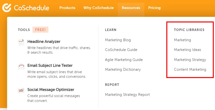
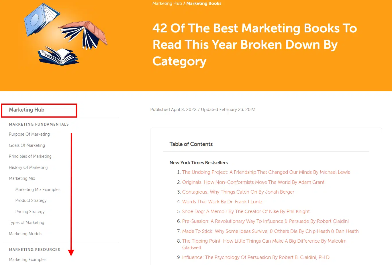
CoSchedule has a unique organizational scheme for their resources – they created individual “topic libraries” with each page dedicated to a specific topic (for example, marketing or marketing strategy).
These libraries/topic hubs are laid out with an article on the right side and a menu of topics and content types on the left:
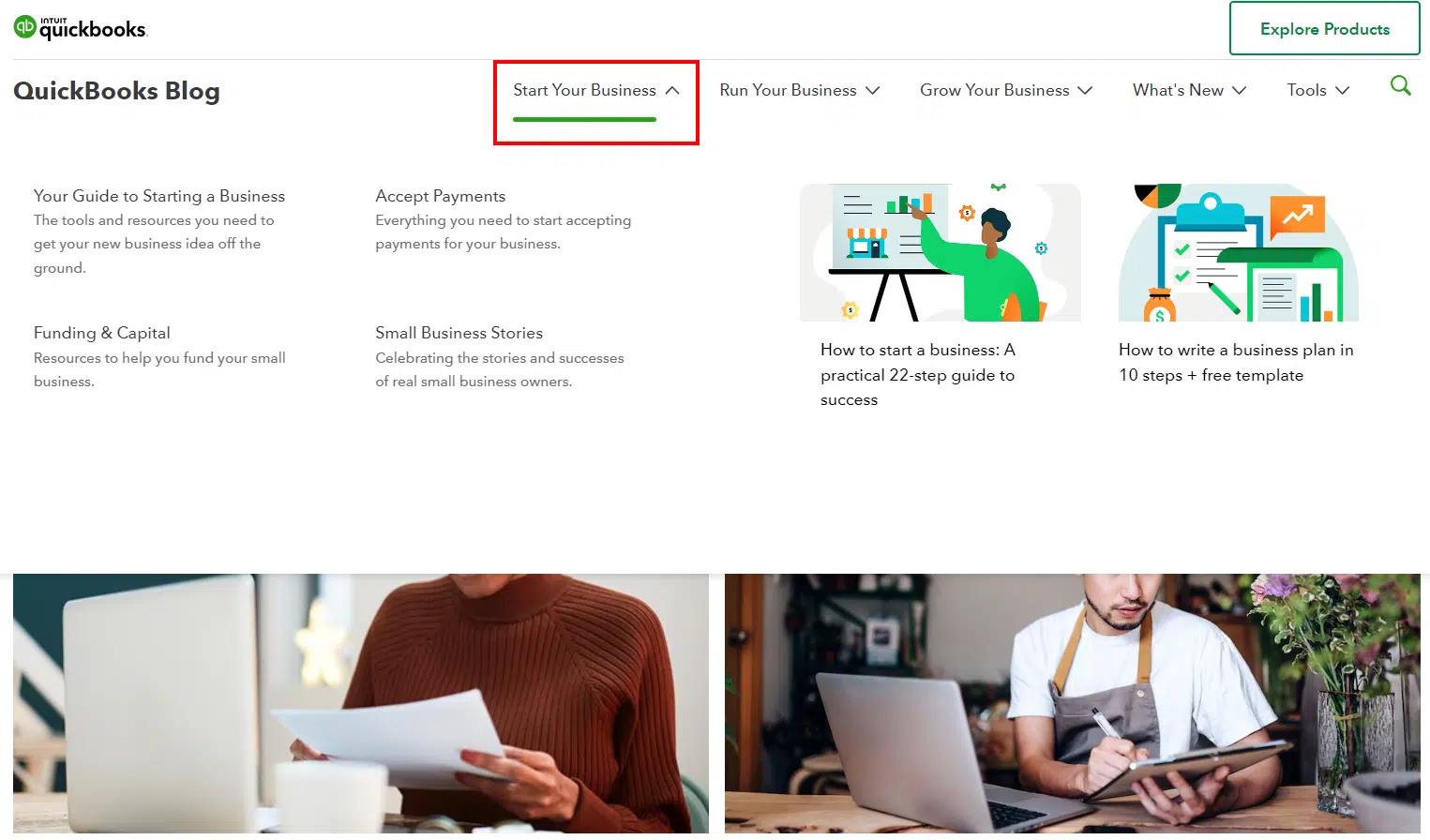
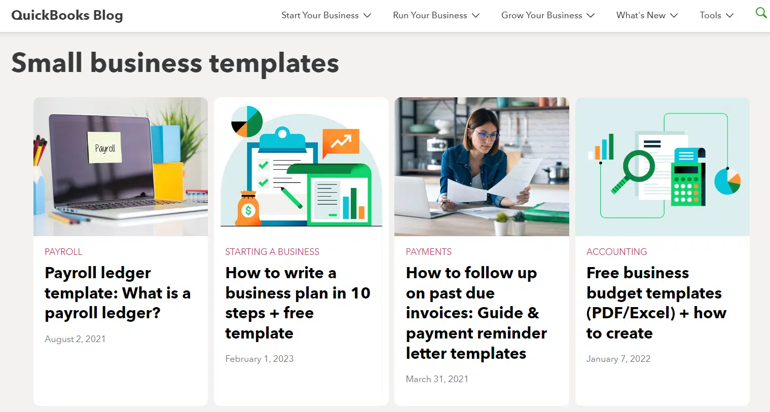
Another unique example is the QuickBooks resource center. Content is sorted by topic in drop-down menus at the top of the page:
And if you scroll the page, it’s also sorted by topic, with a few articles highlighted under each one:
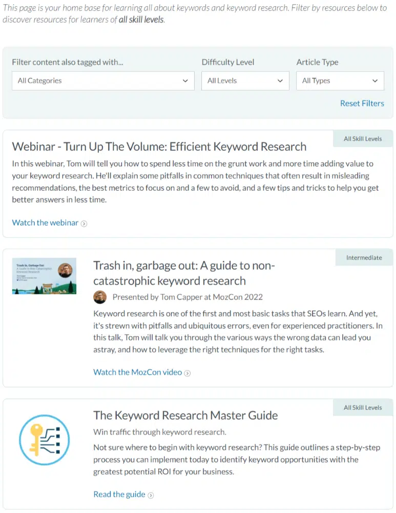
Lastly, Moz’s resource center is a robust and well-thought-out example. It’s topic-focused for the person who has a specific problem, question, or information need.

Each topic category takes you to a hub page for that topic.
All the content is filterable (by related topics, difficulty level, and content type), and multiple content types are represented (articles, videos, webinars, etc.).
5. Optimize your resource center pages
If your resource center is multilayered – for instance, you have a top-level page with multiple sub-pages for topic categories – ensure each page is optimized.
Research and use keywords
Resource center pages – especially top-level topic pages – have the potential to rank in Google.
Make sure you research the keywords your audience uses to search for your topics, and use them in the titles and text you include on these pages.
Focus on the user experience and readability
Your resource library should be effortless to read, browse, and find relevant content.
That’s why working with a web designer or UX designer at the building stage is important to ensure the page looks and functions well.
Improve SEO by adding short descriptions of each content piece
For better optimization, don’t populate your resource center with a plain list of links.
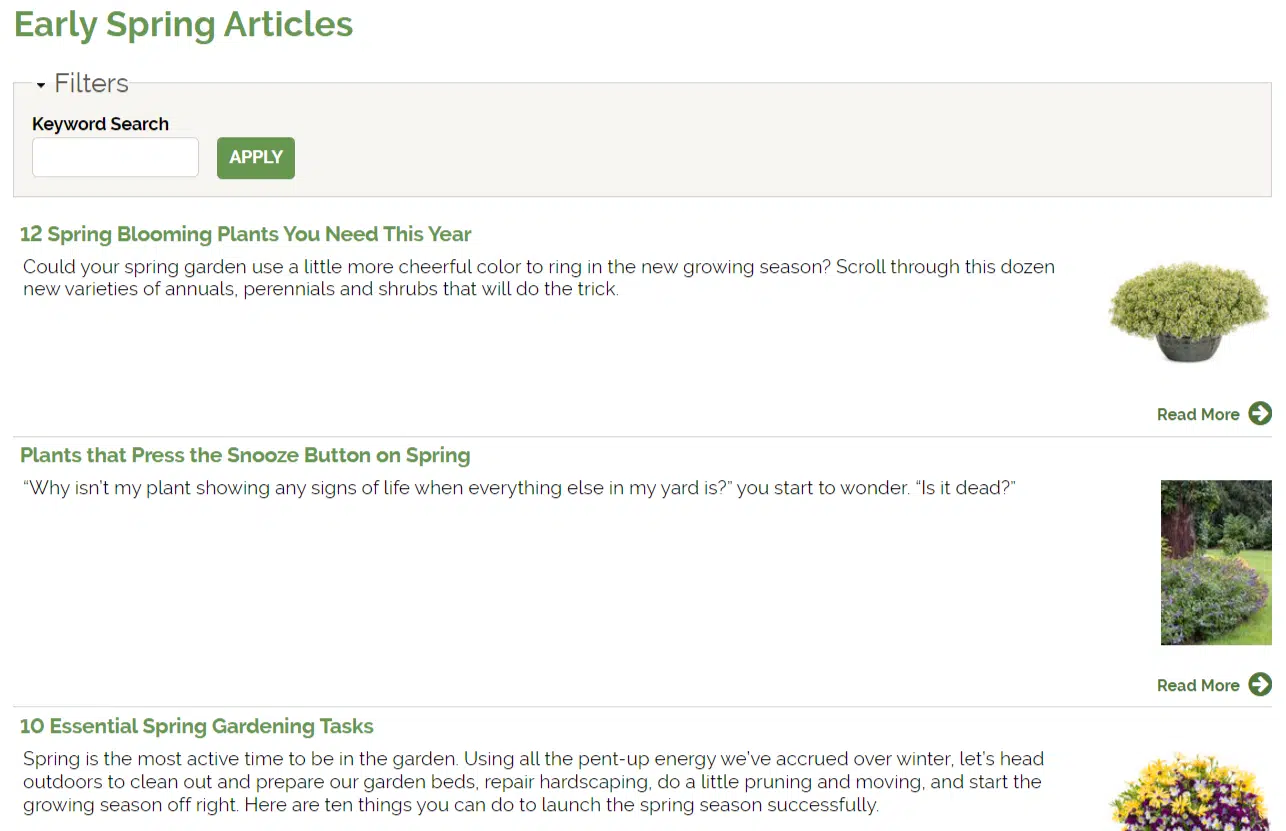
Add short descriptions or summaries to each asset to help readers understand what it’s about and whether it’s relevant to their needs. Bonus: These descriptions can include keywords.
Here’s an example of descriptive text on one of Proven Winners’ topic pages:
Create category pages with descriptive text
Along with descriptive text accompanying each content piece, include this text on your category pages/topic hubs.
Explain the topic, define key terms, and link to related pages your audience will find helpful.
6. Add calls to action
Even though your resource center should focus on giving value through useful and educational content, that doesn’t mean you can’t gently direct your audience toward your relevant paid offerings.
Including strategic calls to action based on your goals is, therefore, very smart.
For example, Moz’s keyword research topic page includes a CTA to their SEO certification course.
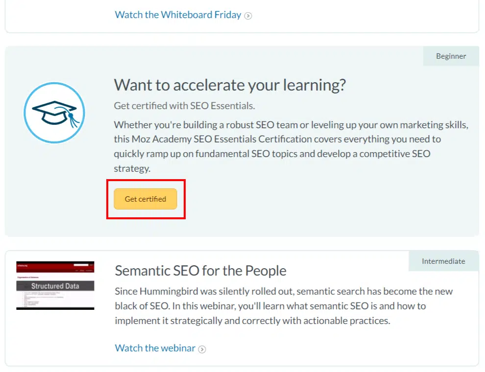
Adding this CTA on this page makes sense because the target audience wants to learn SEO skills. Moz equates taking the paid course to “leveling up.”
Similarly, keep your CTAs in line with your audience’s journey. What would a logical next step be for them after browsing your resource center that would also move them closer to becoming a customer?
That said, don’t spam your readers with CTAs – that will lead to annoyance and may even make them bounce. Use them sparingly but purposefully for the best results.
7. Share and promote your resource center
An optimized, organized resource center chock-full of amazing content is an ultra-valuable resource.
For that reason, don’t be shy about promoting and sharing your content library/hub.
- Include a link to your content resource center in your top navigation menu.
- Add CTAs to your resource center in your blog content.
- Promote your resource center through social media posts.
- Link to it in your email newsletter.
- Post social media updates whenever you refresh your resource library with new content.
Get the daily newsletter search marketers rely on.
More resource center examples
To get a broader idea of what’s possible for your own resource library, check out these additional examples of brands that did it right.
Kareo
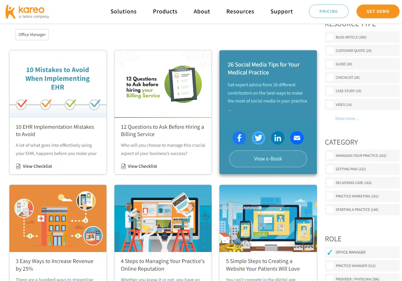
Kareo creates software for managing medical practices. Their resource center is well-organized and easily browsed with filters and a search function.
Content is organized by type and topic. You can even filter it to find relevant content for roles like office manager or provider/physician.
Zoom
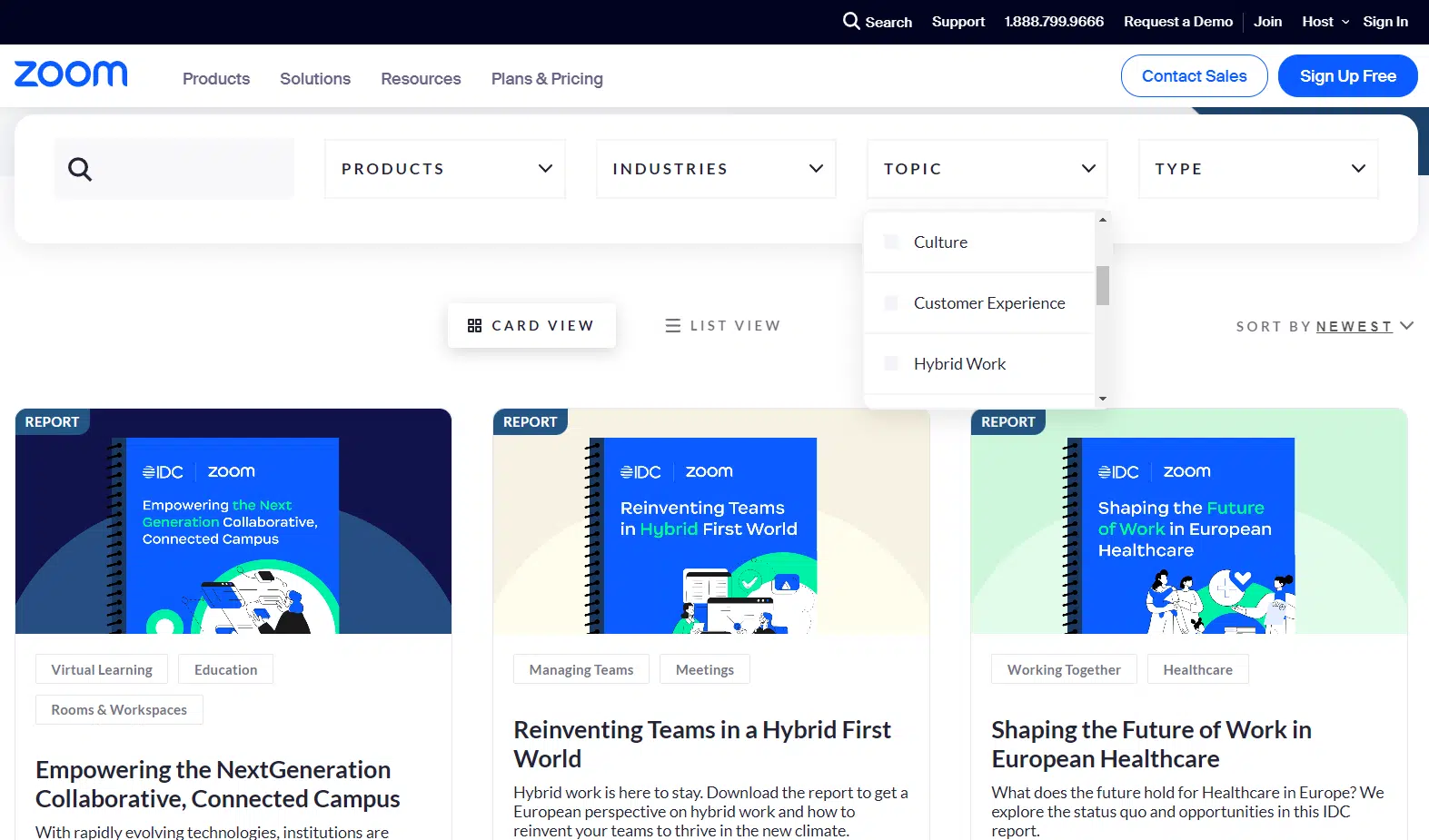
Zoom’s resources page has advanced filters and sorting options that help you find the exact topic you’re looking for.
Content types range from reports to white papers, guides, blog posts, ebooks, and videos. You can also filter by product and industry. Each content piece includes a preview thumbnail and descriptive text.
Canva
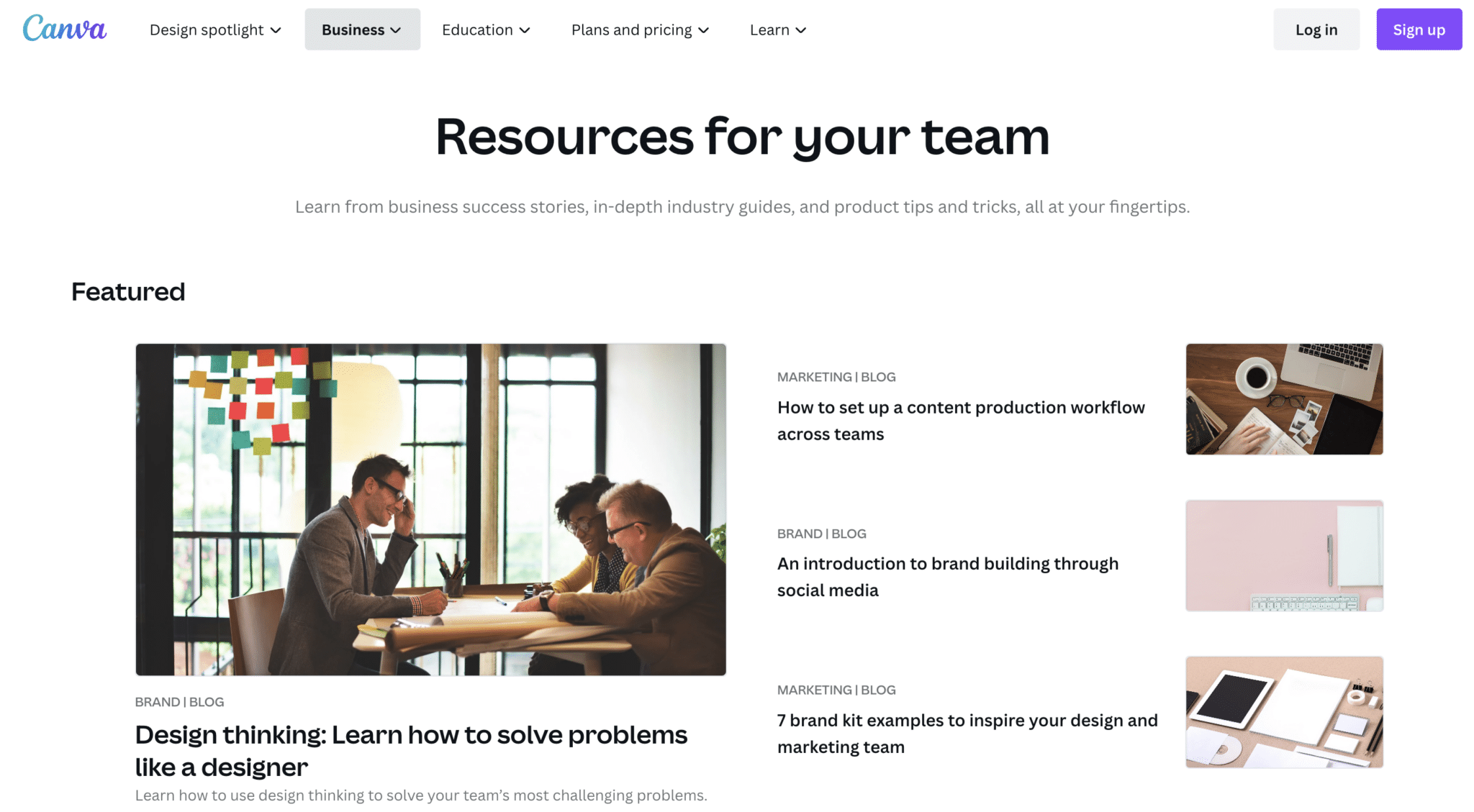
Canva’s resources page is relatively simple. It includes a featured resources section at the top.
Keep scrolling, and you’ll find a grid of their most recent content, including a simple way to filter by content type and industry.
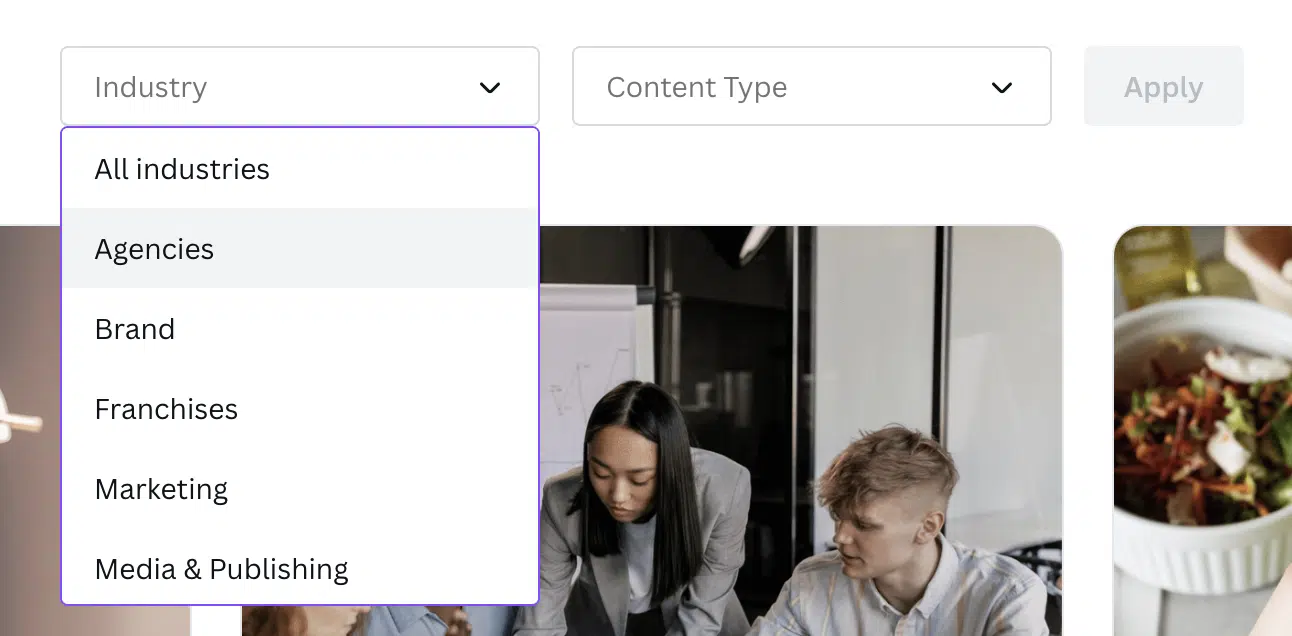
It’s not robust like other examples, but it gets the job done.
American Alliance of Museums
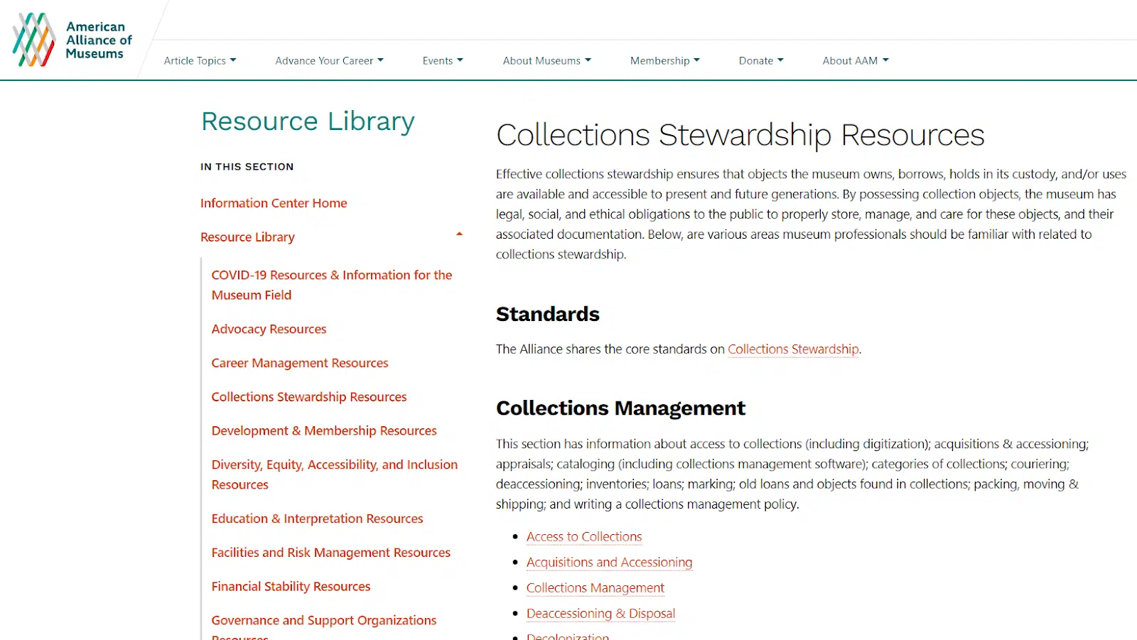
The American Alliance of Museums is an organization for museum professionals like curators, conservators, historians, and archivists. Their resource library is a great example of an organization’s approach to a content hub.
Their resources are gated (only members can access them with a login), but they offer a preview to non-members through exhaustive, optimized category pages (the articles themselves are locked).
WebFX
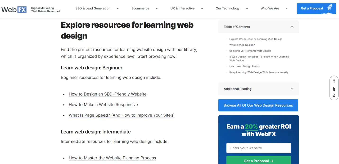
WebFX has a unique resources page with multiple layers. Each topic category has its own page. At the top of each, you’ll find a list of sub-topics to browse.
After that, their most recent and featured articles on that topic are displayed in a grid. Underneath these is a pillar-type page with links to articles on related topics throughout.
Create a resource page and prove your authority
A resource center, library, or hub is a great idea if you have a lot of valuable content (think months or years’ worth) on your site.
Without a place to centralize all of this content and make it discoverable, your older pieces will continue to get buried as you produce new ones.
But introduce a resource center, and suddenly the rabbit hole turns into a beautiful spread of content that anyone can easily find and access.
When you create a content library, you become the curator of your brand content. How you organize, categorize, and lay out that content will determine how useful your library is to your audience.
Do it well, and you’ll have an incredible resource in and of itself that will help drive engagement, web traffic, and conversions.
Opinions expressed in this article are those of the guest author and not necessarily Search Engine Land. Staff authors are listed here.
Source link : Searchengineland.com
